A good apparel website template for a basics label should almost disappear. When you sell white tees, oxford shirts, straight trousers and simple layers, the clothes and their fit are the whole story, and loud banners only get in the way. This guide is for founders of small minimal labels in Bangladesh, and for freelancers who build their stores, who want a calm, clear shop that turns quiet confidence into steady orders.
We will look at what a minimal clothing brand actually sells, how to plan a capsule range that is easy to restock, how to photograph and describe plain pieces so they still feel worth buying, and how to set up payments and delivery for local buyers. The second half shows how a theme built for this style handles each of those jobs on the page.
Our example throughout is Shada – Minimal Clothing WordPress Theme. It is a quiet theme in off-white and black with one stone highlight, square edges and Inter Tight type, made for labels that sell tees, shirts, trousers, layers, matching sets, shoes and bags. Nothing on it shouts, which is exactly the point for this kind of brand.
What a Minimal Clothing Brand Really Sells
A basics label does not sell trends. It sells the promise that a plain piece will fit well, feel good and last. Buyers often know exactly what they want before they arrive: a white tee that does not go see-through, trousers that hold their shape after washing, a shirt that works for office and weekend. Your job is to confirm that promise fast and remove any doubt about size and fabric.
That makes repeat buying the real engine of the business. A customer who finds a tee they love will come back for three more in different colours, and again next year when the first ones wear out. A minimal clothing brand grows through trust and restocks, not through a new collection every month. Every part of your store should make that second and third order easier than the first.
Plan a Capsule Range Before You Build
Start with a capsule, a short list of core pieces that cover daily life. For many labels that means tees, shirts, trousers and one or two layers, each in a few neutral colours. Keep the first range small enough that you can afford deep stock in the popular sizes. Running out of the medium white tee hurts a basics label far more than missing a seasonal print would.
Fabric, fit and naming
Choose one or two fabrics per product type and stick with them, so buyers know what to expect on every reorder. Write the fabric, weight and fit in plain words on every product. Give products simple names like 'Oxford shirt' or 'Straight trouser' rather than clever ones. Measure each size yourself and build a size guide, because a minimal piece has no prints or details to distract from a poor fit.
Photos that make plain pieces look right
Shoot every item on the same light, neutral background, from the same angle, with one close-up of the fabric. Consistency is the brand. When a shopper scrolls a grid where every photo matches, the store feels organised and the clothes look considered. Avoid busy props and heavy filters. A clean front shot, a back shot and a texture detail usually say more than a styled scene.
Why the Apparel Website Template Should Stay Quiet
Many store themes are designed to impress in a demo: sliding banners, flashing badges, coloured countdowns everywhere. For a basics label that noise competes with the product. The right apparel website template keeps the layout calm, uses one or two typefaces and lets photos and prices carry the page. Buyers who already know what they want should reach the product in two taps.
It still needs the working parts of a real shop: size choice and a size guide, reviews, a wishlist, a short checkout, mobile wallet and cash on delivery payments, courier booking and order tracking. If you are new to building on WordPress, the WordPress documentation explains themes, menus and pages, which makes it easier to judge any apparel website template you test.
A Tour of Shada, Block by Block
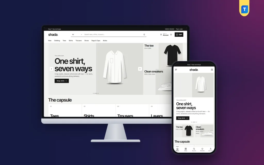
Shada keeps its header simple: a black top bar, a lowercase wordmark, an underline search field with a category picker and a plain text menu. Opening a category shows numbered text columns with one calm promo card beside them. Under the header, as an apparel website template for basics, Shada gives the product the middle of the screen and leaves plenty of empty space around it.
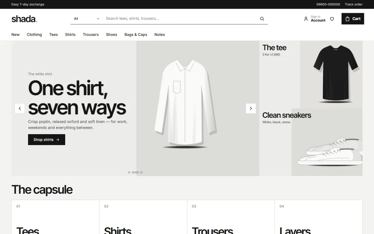
The desktop screenshot shows that restraint clearly. The demo's top bar mentions an easy exchange and a hotline beside Track order. The menu runs New, Clothing, Tees, Shirts, Trousers, Shoes, Bags & Caps and Notes. The hero slider features a white shirt with the line 'One shirt, seven ways', and two side cards beside it show a black tee and clean sneakers. Below sits the capsule, four numbered tiles for Tees, Shirts, Trousers and Layers.
Twenty blocks, switched and ordered your way
Shada has 20 homepage blocks. You switch any of them off and drag the rest into order, and on a phone arrow buttons do the same. The capsule suits a 'start here' edit of core pieces. New gives two rows of the newest products, Most worn shows best sellers in tabs by category and Wear it together is a banner for matching sets. Line in focus shows one line with its products, and Notes lists your latest three posts.
Other blocks include a promise strip for delivery, cash on delivery, exchange and cotton, category pictures, three department blocks with eight products each, line logos, promo cards, a trending row, occasions, top rated and an 'Everything else' grid with Load more. Today only runs a countdown with stock bars for one-day prices, and Under a budget offers price tiles that open products in that range.
Honest cards and a calm product page
Product cards are borderless. The photo sits on a calm ground, followed by the line name, stars, units sold and an outline add-to-cart button, with sizes appearing on hover. On the product page, shoppers choose a size, open the size guide if they are unsure and read reviews inside a fold. If nobody has reviewed a piece yet, a popup asks for the first one.

Most of your buyers will browse on a phone, and Shada handles that without losing its calm. The phone header shows the menu, logo and cart, and cards shrink so two columns of tees fit without crowding. In the mobile screenshot, the hero image sits above its headline and button, the tee and sneaker cards line up side by side, and the capsule follows. A bottom bar in the demo keeps Shop, Search and Wishlist within thumb reach.
Getting Your Store Live With Shada
In Appearance, Themes, Add New, Upload Theme, select the Shada zip and press Activate. Then go to Shada, Setup and install the bundled Themeve Commerce plugin in one click. It handles the cart, checkout, payments and couriers, and appears under the Shop menu. Add the licence from your Themeve account under Shada, License so updates keep coming. Shada runs on WordPress 6.0 or later, tested up to 7.1, with PHP 7.4+.
Next, open Shada, Demo Import and bring in the Everyday Basics demo. It loads 30 products from 6 sample lines, three menus and every page, including About, Delivery, Exchange, Size Guide, Our Stores, Notes, FAQ, Track Order and Wishlist. The lines, names and pictures are samples, so replace them with your own range while keeping the rhythm of the pages. Many owners have a working store the same day.
Then open Shada, Theme Options. Sections run in plain order, from Homepage layout to Footer & contact. Choose one of five palettes, Ink, Stone, Fog, Moss or Night, or set each colour by hand, and pick a font pair: Swiss, Grotesk, Mono or Soft. A search box jumps to any setting, a sticky save bar stays on screen, and Google Fonts can be turned off. Try the live demo and the demo dashboard before you decide.
Selling Basics to Bangladeshi Buyers
Shada's checkout covers bKash, Nagad, SSLCommerz, cash on delivery and manual payment, and parcels go out with Steadfast or Pathao courier. Sign in happens in a popup, buyers can save pieces to a wishlist, check out on a single page and see an Order placed popup. The Track Order page then shows where the parcel is. Coupons, invoices, SMS and OTP, Telegram order alerts and a store locator are included too.
Cash on delivery remains the comfortable choice for first orders, so make it easy, and confirm larger orders by phone. Once a buyer has received a good tee, they are far more willing to pay by mobile wallet next time. Put a short care card in each parcel. Basics live or die on how they look after twenty washes, and good care advice protects both the garment and your reputation.
On Facebook and Instagram, a basics label works best with consistency rather than volume. Post the same clean product shots you use on the site, show fit on real people of different heights and answer size questions publicly so others learn too. Shada connects the Facebook Pixel with the Conversion API, so you can see which posts and ads bring orders. Use the Today only block sparingly, so a one-day price still feels like a real event.
Mistakes Minimal Labels Often Make
The first mistake is confusing minimal with empty. A plain tee still needs fabric details, measurements, care notes and good photos, or buyers have nothing to judge it by. The second is launching with too many colours and running out of the ones that sell. The third is choosing a busy theme and then trying to hide half of it. Pick a calm apparel website template from the start instead of fighting a loud one.
Other mistakes include inconsistent photos, vague size charts and sales that run so often nobody pays full price. Some labels also forget repeat buyers entirely, with no wishlist, no follow-up message and no reason to return. Build your store and your habits around the second order. That is where a basics label earns its living and where steady growth really comes from.
Frequently Asked Questions
Is Shada only for a black and white store?
No. Ink is the default look, but you can switch to Stone, Fog, Moss or Night, or set every colour yourself in Shada, Theme Options. That lets an earthy or soft-toned label keep the calm layout while matching its own brand colours on every page.
What is the capsule block for?
It is a row of four numbered tiles near the top of the homepage. Use it to point shoppers to your core pieces or main categories, such as tees, shirts, trousers and layers, so a first-time visitor understands your whole range in a single glance.
Do I need to write any code?
No. Blocks, colours, fonts, header, product cards and footer are all changed from Theme Options, and the logo is set in Appearance, Customize, Site Identity. You can export your settings before a big change and reset if you want a clean start.
Which themes suit busier or modest fashion shops?
For a busy shop with many categories, size stock and bulk orders, see Fabri Bazer – Clothing Store WordPress Theme. For abayas, hijabs and modest wear, Abaran – Abaya and Hijab WordPress Theme is the closer match. Shada fits labels built on a small, calm range.
Keep It Simple and Let the Clothes Speak
A basics label succeeds with a tight capsule, honest fabric and fit details, consistent photos and service that makes the second order easy. Your store should feel as considered as the clothes. If you are building a minimal clothing brand and want a shop that stays quiet so your tees, shirts and trousers can do the talking, start with Shada – Minimal Clothing WordPress Theme.