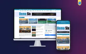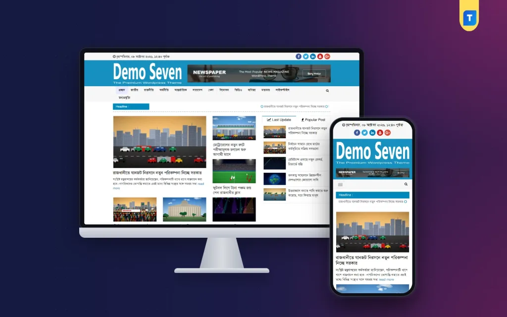
Good newspaper website design borrows a century of lessons from print about guiding the eye: one big headline above the fold, smaller stories around it, clear rules between sections and a masthead you recognise from across the room. The trick is adapting those lessons to scrolling screens. This guide explains the parts of a news layout one by one, for Bangladeshi publishers, designers and freelancers who want a site that looks credible and feels comfortable to read.
We will go from the top of the page down: header, menu and ticker, the main grid, section blocks, the sidebar, the article page and finally the phone view. For each part we look at what it must do and the common design errors. Our worked example is the WordPress Bangla Newspaper Theme, a responsive WordPress theme for Bangla newspapers, online magazines and news portals, optimised for speed, readability and monetisation.
The Principles Behind Good Newspaper Website Design
Three ideas carry most of the weight. The first is hierarchy: readers should know within a second which story matters most, which matter next and where the sections begin. Size, position and contrast do that work. The second is rhythm: blocks of similar shape repeat down the page, so the eye learns the pattern and can scan fast. The third is restraint: fewer colours, one or two fonts and enough white space to let each headline stand alone.
These principles matter more for a Bangla news website than for a typical blog. News pages carry dozens of headlines at once, and Bangla text is visually dense, with vowel signs and conjuncts that need room. When everything on the page shouts at the same volume, readers feel tired and leave. When the hierarchy is clear, they scan, pick a story and keep reading, which is the whole point of the front page.
The Header: Masthead, Menu and Ticker
The header is your masthead, so it should be instantly recognisable and never cluttered. A typical news header has three layers. A thin top bar for the date, time and social links. A brand band with the logo and, often, a leaderboard banner ad. Then the section menu, followed by a breaking news ticker. Each layer has one job, and mixing them, for example by squeezing ads into the menu, makes the whole page look cheap.
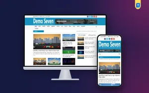
The demo of this theme follows that pattern closely. A light grey top bar shows the full Bangla weekday, date and time on the left and round social icons on the right. Beneath it, a bright blue band holds a large white logo with a wide banner beside it. A light grey menu bar lists every Bangla section with thin dividers and a search icon at the end, and a blue Headline label opens the scrolling ticker below.
Colour as identity
Notice how one strong colour, the blue of the band and the Headline label, runs through the page. That is good newspaper website design: one brand colour used for the masthead and for key labels, with neutral greys and white everywhere else. Since the theme lets you change colours, fonts, logos and footer credits from the dashboard, you can apply your own masthead colour in the same disciplined way.
The Main Grid: Lead Story and Supporting Stories
Below the header, the front page needs a clear grid. Most news sites use three columns on desktop: a wide column for the lead story, a narrower one for secondary stories and a sidebar. The lead gets the biggest photo, the largest headline and a short excerpt. Secondary stories get smaller photos and headlines only. This contrast in size is what tells readers, without any words, which story the editor thinks matters most today.
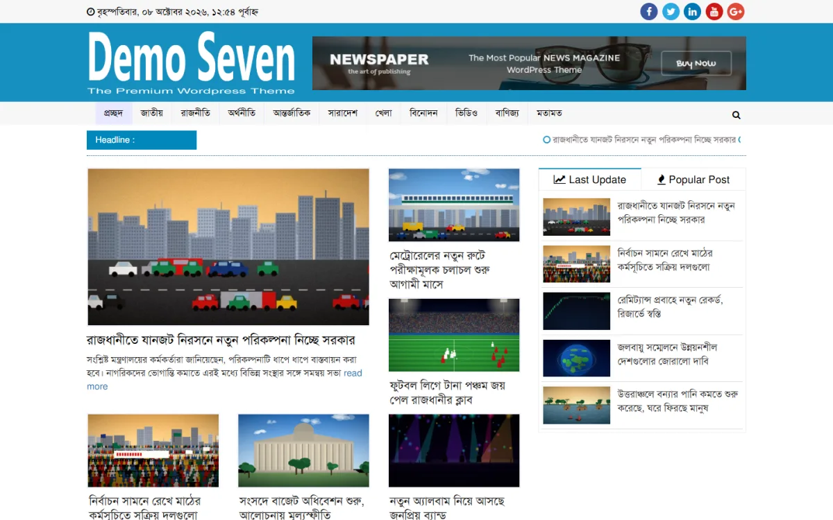
In the demo, the lead story fills the left column with a large photo, a bold Bangla headline, a two-line excerpt and a read more link. The middle column stacks taller cards where the picture sits above the headline, giving a different rhythm from the lead. Below, a row of three equal cards begins the next band of stories. The result is varied but orderly, which is exactly the balance a front page needs.
Image shapes and consistency
A grid only works if images share the same proportions. Decide one ratio for featured images, often a wide horizontal crop, and stick to it. Mixed shapes break the rows and make the page look unfinished. Resize and compress photos before upload so the layout stays fast. The theme includes photo and video galleries, so stories with many pictures can use a gallery instead of forcing extra images into the grid.
Section Blocks and the Sidebar
Further down, the front page turns into section blocks: politics, economy, international, sports and so on. Each block should have a clear title bar, a lead item and a few smaller items, repeated in the same pattern so readers learn it once. Order the blocks by what your readers care about most, which you can learn from analytics after a few weeks. The theme's homepage widgets display breaking news, trending categories, featured posts and editorial highlights in these spaces.
The sidebar is for navigation and discovery, not decoration. A Last Update and Popular Post box helps readers find fresh and much-read stories without scrolling the whole page. In the demo, these appear as two tabs with small icons, each listing five stories with thumbnails. Below such a box you might add a Facebook page widget or a small ad, but avoid stacking six widgets, because a crowded sidebar competes with the main stories for attention.
Designing the Article Page for Reading Comfort
Readers spend most of their time on article pages, so this is where reading comfort counts most. Keep the text column to a comfortable width, use a clear Bangla font at a generous size and give lines enough height for vowel signs above and below. Put the headline, date and author at the top, then the main photo with a caption, then the story in short paragraphs. Related stories at the end keep readers on the site.
Ads belong in the article too, but with care. One unit after the first few paragraphs and one at the end usually earn well without breaking the reading flow. The theme is Google AdSense optimised and adjusts ad sizes to every screen. Avoid ads that load late and push text down, since that sudden jump is one of the most common complaints about news sites in Bangladesh and elsewhere.
The Phone View Comes First
Most visitors to a Bangla news website arrive on a phone, so the mobile layout is not a smaller copy of the desktop, it is the main design. Columns collapse into one, the menu hides behind a button and every block must still show the same hierarchy. The lead story stays largest, secondary stories follow, and nothing should need sideways scrolling or pinching to read.
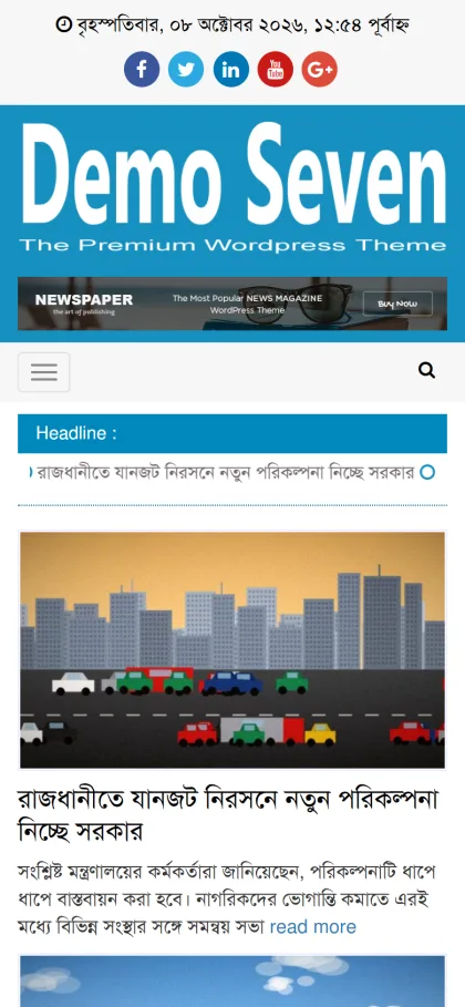
On a phone, the demo puts the Bangla date and social icons at the top, then the blue band with the logo and banner, then a bar with the menu button and search. The blue Headline bar runs full width, and the lead story appears with its photo, a large Bangla headline and the excerpt. The design is fully mobile responsive, so the same hierarchy that works on desktop survives on a five-inch screen.
From Design Plan to a Live Site
Install WordPress, upload and activate the theme, and use the one-click demo import to load the full layout within minutes. Then make the design yours: set your masthead colour and logo, choose fonts, and edit the footer credits. Create your Bangla categories and arrange the homepage widgets in the order your readers need. The WordPress documentation explains menus, widgets and categories if you need help.
Before launch, publish real stories in every block and review the page on a desktop and two different phones. Look for headlines that wrap badly, images with the wrong shape and blocks that feel empty. Add an SEO plugin and submit your sitemap in Search Console; Google's Search Central documentation explains how clear page structure helps search engines read your content.
Newspaper Website Design Mistakes to Avoid
The most common errors are using too many colours, mixing several fonts, filling every gap with ads and giving every headline the same size, which destroys hierarchy. Others include sliders that rotate too fast to read, sidebars packed with widgets, inconsistent photo shapes and tiny Bangla text on phones. Avoid nulled or pirated themes as well, since hidden code can slow pages and damage your search reputation.
Frequently Asked Questions
How many columns should a news homepage have?
Three columns on desktop works well for most portals: lead, secondary stories and sidebar. On phones everything collapses into one column. Fewer columns are fine for small sites with fewer daily stories, as long as the lead story still stands out clearly from the rest.
Can I change the colours and fonts of this theme?
Yes. Colours, fonts, logos and footer credits can all be changed from the dashboard without code, so you can match your own masthead and brand. Keep to one brand colour and one or two fonts, and the layout will stay calm and readable.
Can I use the theme on more than one website?
Yes. It has a built-in lifetime license and can be used on unlimited websites without an external license or renewal, which suits publishers with several titles and freelance designers. Each site can carry its own colours and logo while sharing the same proven layout.
Which other layouts can I compare?
For a different look, see the WP Bangla News Theme and Dainik Alo, a Bangla newspaper WordPress theme. Comparing them helps you decide which front page rhythm suits your newsroom. Look at the header, grid and phone view of each with the principles above in mind.
Closing Thoughts
Strong newspaper website design is mostly about discipline: a clear masthead, one brand colour, a grid with real hierarchy, consistent images, a useful sidebar and article pages that are easy to read on a phone. Get those right and readers trust your site before they read a word. If you want a ready Bangla layout built on those ideas, explore the WordPress Bangla Newspaper Theme and shape it around your own sections.