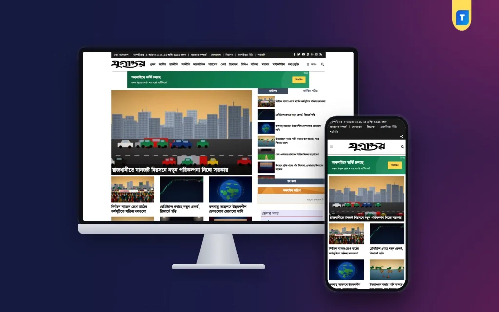
The best newspaper website design is not the one with the most colours or the biggest slider. It is the one that lets a reader find the news in seconds, read it without effort and come back tomorrow. This guide explains what that means in practice, with clear points you can check against any design you are considering.
It is written for editors, publishers, bloggers and developers who plan a news site, a web edition of a printed daily or an online magazine. You will find the key layout rules, a scoring list, a mobile checklist, advice on ads and a short section on ready-made options.
What makes the best newspaper website design
There is no single winner, because a district daily and a business magazine have different needs. But the strongest designs share a set of qualities. Judge every design against this list.
- Clear hierarchy. The most important story looks the most important.
- Fast loading. The page opens quickly on a phone with mobile data.
- Readable text. Bangla and English type are sharp and large enough.
- Simple navigation. A reader can reach any section in two taps.
- Quiet advertising. Ads pay the bills but never hide the story.
- Consistency. Every page uses the same spacing, fonts and colours.
- Easy editing. The staff can update the page without a developer.
If a design fails two or more of these points, keep looking.
Learn from the printed page
Print newspapers have been refined over a hundred years. Many of their rules still work on screen. You do not need to copy the look. You only need to copy the thinking.
- The masthead. The name of the paper sits at the top, clear and calm.
- The lead story. One story gets the biggest headline and picture.
- Columns and blocks. Stories are grouped under section headings.
- Headline sizes. Three or four sizes create order. More than that creates noise.
- White space. Gaps between blocks let the eye rest.
Readers who grew up with a printed daily feel at home when the website follows the same logic. That trust is hard to build with a fashionable but confusing layout.
The anatomy of the best newspaper website design
Break the page into zones and check each zone separately.
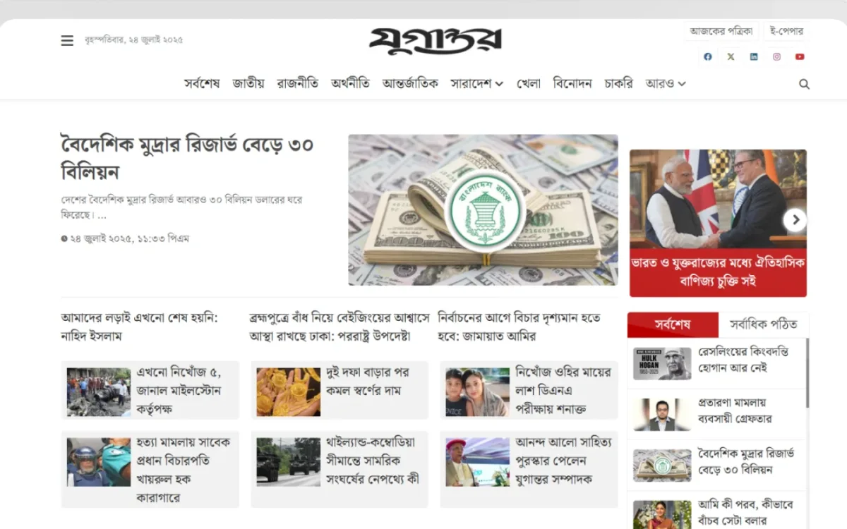
Header zone
Logo, date, a short menu and a search box. Keep it compact. A tall header pushes the news down the screen. Add a top banner area for one ad.
Lead zone
The main story, with a large picture, plus three or four supporting headlines. This is the most valuable part of the page. Update it often.
Section blocks
Each news desk gets a block with a heading and five or six recent headlines. Sports, politics, business, entertainment, education and opinion are common choices.
Sidebar
Latest stories, most read stories and one or two ads. A poll or a social box can fit here, but only one or two extras.
Footer
About, Contact, Privacy Policy, Terms and the editorial policy. These pages show that real people run the site.
Typography and Bangla text
For a Bangla paper, type is the first thing to test. Some fonts break the joined letters, or look thin on a small screen. Do this test before you decide.
- Paste a full Bangla paragraph with joined letters into the demo.
- View it on a cheap Android phone.
- Check that no letter is cut, overlapping or missing.
- Make sure the line height gives each line some air.
- Compare the headline size and the body size. The gap should be clear.
If your reporters still type in Bijoy, plan how that text will become Unicode before it reaches the site. Pasting old encoded text into WordPress produces unreadable letters. A converter tool inside the site, or a fixed routine for the desk, solves this early.
Mobile first, not mobile later
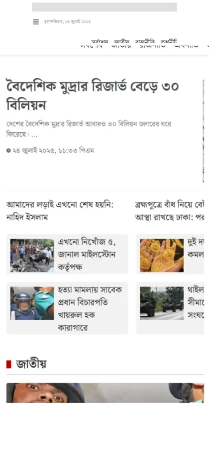
Most readers in Bangladesh open news on a phone. The best newspaper website design is judged on a small screen first.
What to check on a phone
- The menu opens with one tap and closes cleanly.
- Headlines wrap in no more than three lines.
- Images do not stretch or overflow.
- Buttons and links are easy to tap with a thumb.
- No ad covers the headline or the first paragraph.
- The page is usable on a slow connection.
Tips for faster mobile pages
- Upload pictures at the size you need, not the size your camera makes.
- Use one image per story at the top, and add more only when they add meaning.
- Keep plugins to the useful few.
- Choose hosting that matches your traffic.
Ad placement that respects the reader
Most news sites depend on advertising. A good layout gives ads room but keeps the story first. Here is a balanced plan for a daily news site.
- A wide banner under the main menu.
- A second banner a little lower on the page.
- Ad blocks before and after a main group of stories.
- Two spaces in the sidebar.
- One space inside long articles.
Do not place more than one ad above the first headline. Avoid pop-ups that cover text. Each ad network has its own rules about placement and content, so read them before you apply. A design may be friendly to AdSense, but approval always depends on your content and your policy pages.
Photo, video and archive pages
A modern paper is more than text. Photos and video draw readers, and archives keep older work alive.
- A photo archive page shows picture stories in a grid.
- A video archive page lists news clips and interviews.
- A polls page keeps old surveys for readers to open.
- Category pages let readers browse one desk at a time.
- Sub-category pages help big sections such as sports.
These pages also help search engines and readers find older content. Without them, a story vanishes from view after one day.
Rules for pictures and captions
- Use your own photos or pictures you have the right to publish.
- Write a short caption that says who or what is in the picture and where it was taken.
- Credit the photographer by name.
- Keep one standard size for lead pictures, so the page stays tidy.
- Compress every file before upload.
Pictures that follow one standard make the whole site look more professional, even when the stories come from different reporters.
Layout choices for different kinds of paper
The best newspaper website design for a national daily differs from the best one for a small town weekly. Adjust the plan to your size.
A busy daily news portal
- A tall lead area with several linked headlines.
- Eight to twelve section blocks.
- A fast "latest" list in the sidebar.
- Several ad areas, since traffic is high.
A district or local paper
- A short menu with local sections such as markets, schools, roads and events.
- Fewer blocks, but updated every day.
- A strong photo section, since local readers love pictures of familiar places.
An online magazine
- Larger pictures and more white space.
- Fewer stories, with longer text.
- Photo and video pages for features.
- A calmer ad plan with one or two large spaces.
Write down which of these three you are closest to. It makes every later choice simpler.
A scoring sheet for newspaper designs
Use a simple table in a spreadsheet. Give each design from one to five points for each item below, then add them up.
- Lead story clarity
- Menu and category access
- Bangla text quality
- Phone layout
- Page speed
- Ad areas
- Photo and video support
- Dashboard ease
- Price and licence terms
A design with a score above 38 out of 45 is a strong candidate. Below 30, move on. Ask two colleagues to score the same designs independently and compare the results. You will often be surprised.
Choosing a newspaper website design template
If you do not have a design team, a ready-made newspaper website design template is the practical route. It costs far less than custom work and can be live in days. Use these questions before you buy.
- Is the template made for news, or is it a general blog theme?
- Does it show a demo that you can open on your phone?
- Does it handle Bangla text properly?
- How many ad areas does it have, and where are they?
- Are there archive pages for photos and video?
- Can you use it on more than one site?
- Is there an extra yearly fee for updates or support?
Write the answers next to each product name. The comparison becomes obvious.
A ready-made option from Themeve
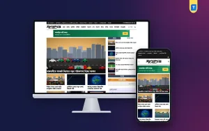
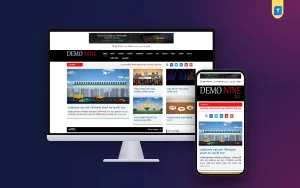
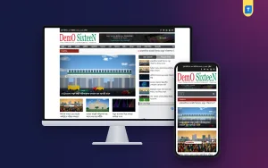
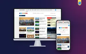
One option to consider is the best news magazine WordPress theme on Themeve. It follows a newspaper-style layout: a wide banner at the top, a lead area, story blocks under clear headings, and a sidebar with the latest and popular lists.
Facts from the product page:
- Six ad widget areas: top banner, second banner, before and after the nine-post block, and two in the sidebar.
- A Facebook like box area.
- Photo archive, video archive and polls archive pages.
- A Bijoy and Unicode converter page.
- Latest and popular lists.
- Category and sub-category templates.
- Support for Bangla and English content.
- Responsive layout for phone and desktop.
- Unlimited website use, with no renewal fee.
Open the demo on your phone and run it through your scoring sheet. It will not suit every publisher, and that is fine. The goal is to compare it fairly with other choices.
Setting it up the right way
A good theme still needs careful setup. Follow this order.
- Install WordPress on reliable hosting and turn on HTTPS.
- Install the theme and upload your own logo.
- Create the categories before you build the menu.
- Fill the ad areas with placeholders, then replace them with real code after approval.
- Publish at least twenty original stories with pictures.
- Add the About, Contact, Privacy Policy and editorial policy pages.
- Test every page on two different phones.
- Submit the sitemap to Google Search Console.
If you use the best news magazine WordPress theme above, the ad areas and archive pages are already built in, so steps 4 and 5 go faster. Take a back-up before every major change. It saves hours when something breaks.
Mistakes that spoil a news design
- Too many colours. Pick one main colour and one accent.
- Too many fonts. One for headlines and one for body text is enough.
- A fast-moving slider that hides stories.
- Auto-playing video with sound.
- Tiny text for the sake of fitting more on the page.
- Menus with twenty items.
- Copying another paper's name, logo or layout in detail.
The best newspaper website design is quiet. It lets the news speak.
Once the site is live, ask five regular readers to try it. Give each a simple task: find the sports section, open yesterday's top story, share a story on Facebook. Watch where they hesitate. Every pause points to something you can improve, and a small fix made this week is worth more than a big redesign next year. Repeat this test every few months, because your readers and your content will change.
If you want to read more on the technical side, the official WordPress documentation is a good, reliable reference.
Frequently asked questions
What is the best newspaper website design for a new Bangla news site?
A clear, newspaper-style layout with a strong lead area, section blocks, a short menu and fast mobile pages. Colours matter much less than order and speed.
How many ads should a news page have?
Enough to earn, but few enough to read. Four to six well-placed areas on the home page is a common range. On article pages, keep ads away from the first paragraph.
Can I use one newspaper website design template for several sites?
That depends on the terms. Look for a product with unlimited website use, so you can run several sites or build for clients without extra fees.
Does the best newspaper website design help me rank on Google?
Good design helps readers stay, and a clean structure helps search engines read your pages. But no design can promise a position. Original, useful stories matter most.
Do I need a developer to run a news theme?
Not for daily work. Menus, ads and branding are managed from the WordPress dashboard. A developer helps only with deep custom changes.
Can I show photos and videos on a news site?
Yes. A good news theme gives you photo and video pages as well as normal story pages. Use them for picture stories, interviews and short clips.