Looking at clothing website examples is the fastest way to learn what works before you build your own store. You see how other shops order their pages, show their products and ask for payment. Then you copy the habits that help buyers and skip the ones that only look clever.
This article walks through the main types of clothing shop websites, what each one does well, and how to turn those lessons into a plan for your shop. It also covers a calm, minimal style that suits basics and everyday wear, and the choices small Bangladeshi shops face with payments, delivery and mobile visitors.
What to look for in clothing website examples
Do not judge a site by how pretty it looks in a screenshot. Judge it by how easy it makes one job: helping a stranger buy a piece of clothing. When you study clothing website examples, open each one on your phone and note these points:
- How long until you understand what the shop sells?
- How many taps from the homepage to a product?
- Are the price, sizes and delivery clear on the product page?
- Is the checkout short, or does it ask for too much?
- Do you see proof of trust, such as reviews, return rules or a store address?
Keep a notebook or a simple spreadsheet. Write one line for each site: what you liked, what annoyed you and what you would copy. After ten sites, patterns appear.
Six types of clothing shop websites
Most online clothing stores fit one of six types. Knowing the type helps you pick the right model for your own range.
- The basics store. Plain tees, shirts and trousers. Clean white space, few colours, simple filters.
- The fashion drop store. New items every week, countdowns, bold banners and trend labels.
- The traditional wear store. Sarees, panjabi, kurtis. Rich colour, fabric close-ups, occasion pages.
- The multi-brand store. Many labels, with brand pages and strong search.
- The made-to-order store. Measurement forms, tailoring notes and longer delivery times.
- The social shop. A Facebook page that sells through messages, now moving to a website.
Choose the type that matches your stock and your buyers. A shop with twelve products does not need the structure of a multi-brand store.
Lessons from the best minimal clothing website examples
Minimal shops are easy to study because they have few moving parts. Among the minimal clothing website examples you will find, the strong ones share these traits:
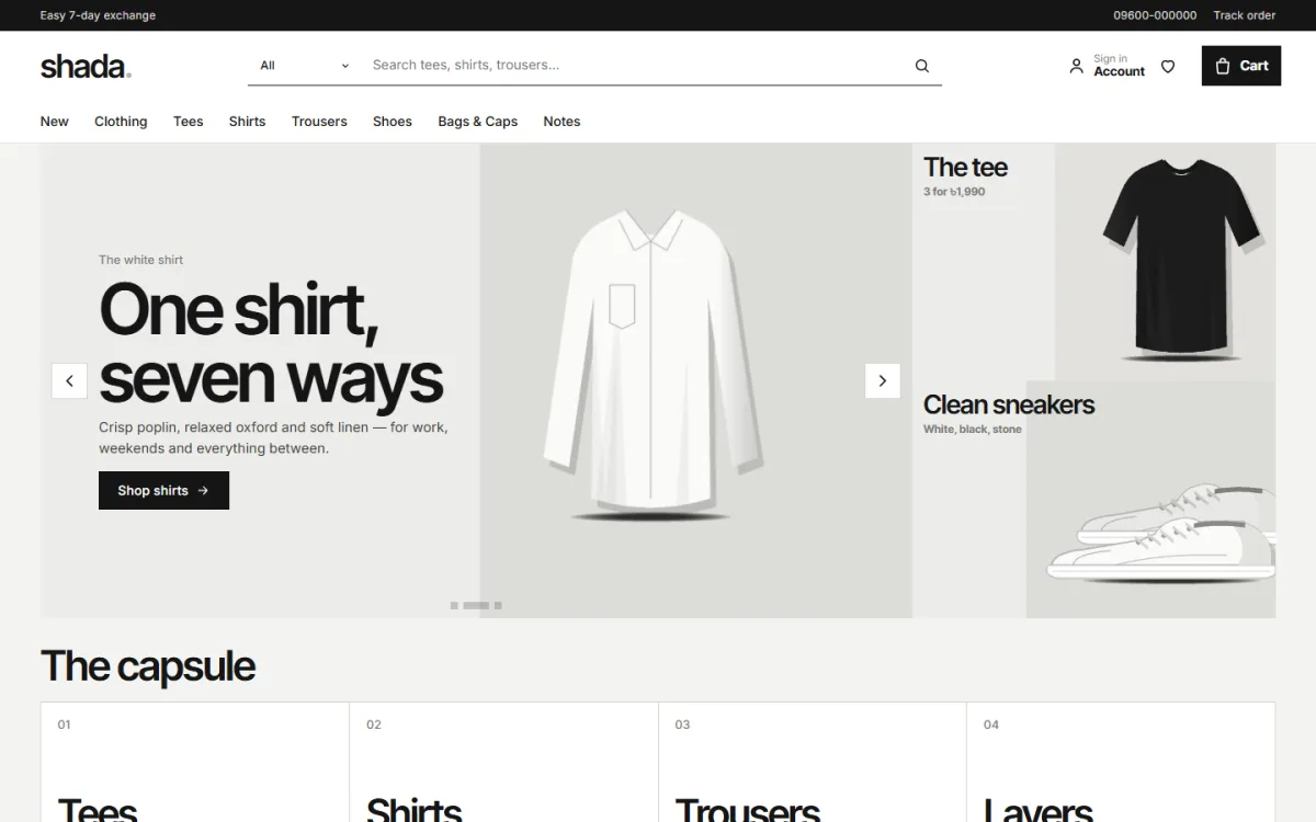
- Few colours. Off-white, black and one soft accent such as stone or moss.
- One typeface family. Often a clean sans-serif used in two weights.
- Square edges and thin lines. Nothing rounded or glossy.
- Borderless product cards. The photo sits on a calm background with the name and price below.
- Few words. Short labels, short headings, no long sales talk.
- Large photos. The clothes fill the screen and the layout stays out of the way.
The idea is simple. When the products are plain and well made, the page should be plain too. Loud banners compete with the clothes.
How a good clothing homepage is organised
Look closely and you will see that nearly every successful shop follows a similar order, even if the styling differs.
- A header with the logo, search, cart and a short menu
- A hero banner or slider with one clear message
- A promise strip: delivery, cash on delivery, exchange
- Category tiles or a "start here" edit of core pieces
- New arrivals in a row or grid
- Best sellers, often in tabs by category
- One time-limited offer
- Price tiles such as "Under 1,000"
- A short story, press mention or reviews
- Footer with links, payments and contact details
You can reuse this order for your own site. Remove blocks you cannot fill yet. Five good blocks are better than ten thin ones.
Product pages that turn visitors into buyers
The best clothing website examples spend most of their effort on the product page, because that is where the sale happens.
- Four to six photos, including the back and a fabric close-up
- The price in a clear size, with any discount shown plainly
- Size and colour choices as buttons, not drop-down menus
- A size guide that opens in a popup, so the buyer does not lose the page
- A short list of fabric, fit and care details
- Delivery time and cost, shown before checkout
- Reviews, with a prompt to write the first one
- Related products below, to help the buyer add a second item
Write product text in short lines. Buyers on a phone will not read paragraphs. If you sell basics, say what makes your cotton or fit different in one sentence.
Photos and phones: the two things that matter most
Most of your visitors will arrive from Facebook or Instagram on a phone. That makes photos and mobile layout more important than any fancy feature.
- Shoot every product in the same light, on the same background, at the same distance.
- Keep one ratio for all photos, such as 4:5, so the grid lines up.
- Name files with the product name, not "IMG_2041". It helps search and your own sanity.
- Compress images to under 300 KB where you can, without visible blur.
- Check that buttons are large enough for a thumb and that nothing sits too close to the screen edge.
- Keep the phone header short: menu, logo and cart.
Open your site on a cheap phone with a slow connection once a month. That is how many of your buyers will see it. If the page feels slow there, remove heavy images and extra scripts until it feels light.
Also think about how photos connect to your Facebook posts. When a post shows a grey tee, the link should open the page for that grey tee, not the homepage. A direct link saves the buyer two or three taps, and every tap you remove raises the chance of a sale.
Examples of good filters, search and navigation
A visitor who cannot find a product leaves. Many clothing website examples fail here because they copy a big shop's menu with a small shop's range.

- Keep the top menu to five or six items.
- Use plain names: Men, Women, New, Sale. Avoid clever labels.
- Add a search box with a category picker.
- Offer filters for size, colour, price and fabric only if you have enough products to filter.
- Show the number of items in each category.
- On phones, put the menu behind one icon and keep the cart visible.
Test your navigation with a friend. Ask them to find a black tee in size L. If it takes more than four taps, simplify.
Payments and delivery for Bangladeshi shops
Examples from other countries often assume card payments and next-day delivery. In Bangladesh, the picture is different, and your website should reflect it.
- Cash on delivery is the first choice for many buyers. Offer it, and think about a small advance for large orders.
- bKash and Nagad are used by almost everyone. Show the payment steps clearly.
- A card gateway such as SSLCommerz covers cards and several mobile wallets in one place.
- Courier booking through Steadfast or Pathao saves you from typing addresses twice.
- Delivery charges by area: one rate for inside Dhaka, one for outside.
- Order tracking so the buyer can see where the parcel is.
Say your exchange rule in plain words: how many days, what condition, who pays the courier. Clear rules lower the fear of ordering online for the first time.
Minimal clothing website design with code or without it
Many owners ask whether they need a developer. A minimal clothing website design with code gives total control, but it takes time, money and care with updates. Most small shops do better with a ready theme that already has a clean layout and a shop engine.
Here is a fair way to decide:
- Choose custom code if you have a developer on staff, a very unusual layout and a budget for maintenance.
- Choose a ready theme if you want to launch within days, change text and colours yourself and get updates.
With a ready theme you do not write code. You change the blocks, colours, fonts and words in an options panel. If later you want a small custom change, a developer can add it on top. A minimal clothing website design with code can start from a theme as well, so you do not begin from nothing.
Turning your notes into a plan
Now take your notes and make a plan. Use the template below and fill it in with one line per item.
- Type: Which of the six types is closest to my shop?
- Range: How many products can I show at launch?
- Style: Calm and minimal, bold and trendy, or rich and traditional?
- Homepage blocks: Which five or six will I use first?
- Pages: Delivery, exchange, size guide, about, contact, track order.
- Payments: Cash on delivery, bKash, Nagad, card.
- Couriers: Steadfast, Pathao or both.
- Photos: Who takes them, and when?
This one-page plan keeps you from changing direction halfway. It also makes it easy to brief a designer or a friend if you ask for help.
A ready-made option: Shada
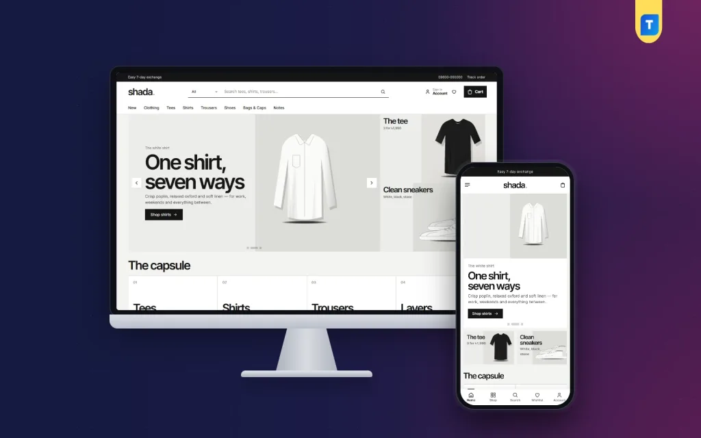
If the calm style above matches your range, Shada is worth a look. It is a minimal clothing theme for labels that sell tees, shirts, trousers, layers, matching sets, shoes and bags.
Facts from its product page:
- 20 homepage blocks, each switchable and movable
- A numbered capsule block with four tiles for your core pieces
- A Wear it together banner for matching sets
- A Today only countdown with stock bars
- Under a budget price tiles
- Borderless product cards with an outline add-to-cart button
- Five palettes: Ink, Stone, Fog, Moss and Night
- Four font pairs led by Inter Tight
- bKash, Nagad, SSLCommerz and cash on delivery
- Steadfast and Pathao courier booking with order tracking
- A 30-product demo from six sample lines
The shop plugin is included, so you can set up the cart, checkout and payments without installing a separate one. You can see more details on the Shada page and open the demo on your phone before you decide.
Mistakes seen in weak clothing website examples
- Too much on the first screen. Three sliders and four pop-ups push buyers away.
- Different photo styles. One bright, one dark, one cropped. The grid looks messy.
- No size help. Buyers guess, order wrong and return the parcel.
- Tiny text on phones. If you must zoom, you will lose the visitor.
- Slow loading. Large images and many plugins drag the page down.
- Hidden costs. Delivery charges that appear at the last step cause abandoned carts.
- Dead links and empty pages. A policy page with no text hurts trust.
Fix these before you spend money on ads. Traffic sent to a weak page is money wasted.
Before you launch: a short checklist
- Replace all sample text and pictures with your own.
- Place test orders with cash on delivery and with a mobile wallet.
- Check emails and SMS messages.
- Look at each page on a phone, a tablet and a laptop.
- Write the delivery, exchange and privacy pages.
- Add your phone number and WhatsApp link to the header or footer.
- Install analytics and the Facebook Pixel if you plan ads.
- Set up automatic backups.
- Announce the website on your Facebook page.
After launch, check which pages visitors leave from and fix those first. Small steady changes beat a big redesign every year.
If you want to read more on the technical side, the official WordPress documentation is a good, reliable reference.
Frequently asked questions
Where can I find good clothing website examples?
Search for the kind of shop you want to run, then browse stores in your category. Save the ones you like and note what you would copy. Demo sites of ready themes are also useful clothing website examples because they show full layouts.
What should clothing website examples teach me?
They should teach you page order, product page layout, checkout length and trust signals. Do not copy colours or logos. Copy the habits that make buying easy.
Is a minimal design good for a small clothing shop?
Yes, if your photos are clean. A minimal layout puts attention on the clothes and loads fast on mobile. It does hide weak photos, so spend time on pictures first.
Do I need code to build a clothing website?
No. A ready theme lets you change layout, colours and text from an options panel. Code is only needed for very custom features.
How many products do I need at launch?
Twenty to thirty is a good start. Add new items every week so returning visitors see something fresh.
Which payment methods should I offer?
Offer cash on delivery, bKash and Nagad at the least. A gateway for cards helps buyers who prefer them.