Good dairy website design makes a daily habit easy. People drink milk every morning and buy doi or ghee every week, so a dairy shop online lives on repeat orders, not one big sale. This guide covers the homepage, product sizes, subscriptions, delivery times, trust signals and phone layout that help a dairy farm or milk shop in Bangladesh keep customers coming back.
Every idea here is practical and cheap. Try a few, watch your reorders, and keep what works.
What makes dairy website design different
Dairy is fresh, cold and needed on time. A buyer who orders milk for breakfast does not care about a late delivery at noon. Three things matter more than anything else:
- Purity: is it real milk, with nothing added?
- Freshness: when was it milked, set or churned?
- Timing: will it arrive before breakfast?
Every part of the site should answer one of these. A dairy shop that says "milked at 4 AM, at your door by 7 AM" in the first screen has already answered two.
The second difference is frequency. A clothing shop hopes for one order a season. A dairy shop wants one order a day or a week. Reordering must take seconds, and the site must remember the buyer.
Start with a clear morning promise
Write one line that says what you sell and when it arrives. Put it in a thin bar above the header and in the hero:
- "Morning delivery 6–8 AM."
- "Fresh milk from our farm, tested every morning."
- "Order by 10 PM for tomorrow's breakfast."
Only promise what your riders can do. A missed breakfast is remembered longer than a good one. Many shops grow trust by starting with a small area and a strict time, then adding areas as routes become reliable.
Categories for a dairy shop
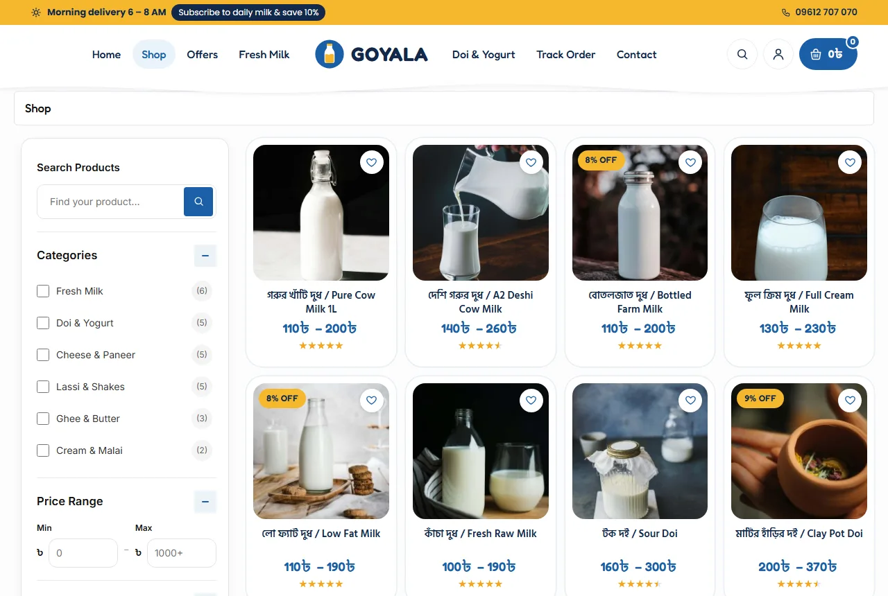
Keep the menu short and familiar: Fresh Milk, Doi & Yogurt, Ghee & Butter, Cheese & Paneer, Lassi & Shakes and Cream & Malai. If you also sell eggs or honey, add them as a small extra category at the end, not at the front.
Show categories as soft tiles with one clear photo each. Pastel colours suit dairy, because they make white milk and pale doi look bright rather than grey. Keep the same photo style across all tiles.
Bangla and English names
Use both names where buyers use both: "মিষ্টি দই / Sweet Doi", "গাওয়া ঘি / Cow Ghee". Many buyers search in English letters, so add "doi", "ghee" and "malai" to titles and tags.
A homepage order for dairy website design
A dairy homepage should feel like a clean breakfast table. Here is an order that works for most farms and shops:
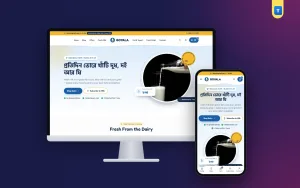
- Hero with the morning promise, two buttons (Shop Dairy and Subscribe) and a photo of your milk.
- Category tiles so buyers jump straight to doi or ghee.
- Subscription plans for daily or weekly milk.
- Fresh this morning: today's batch beside a promo card.
- Purity comparison: your milk next to ordinary packaged milk.
- Family favourites: best sellers in a sideways rail.
- Farm story with a photo and a few honest figures.
- Reviews, FAQ and blog.
Each block should end with one clear button. Too many buttons on one block confuse buyers who are in a hurry before work.
A badge that says what you stand for
A small round badge such as "Farm fresh • No preservatives • 100% pure" beside the hero photo is easy to read and easy to remember. Use only claims you can prove, and be ready to explain them in your FAQ.
Sizes and product pages
Dairy sells in sizes, not pieces. Offer at least two: a regular size for one or two people and a family size. For milk that may mean 500 ml and 1 litre; for doi a small and a large pot; for ghee 250 g and 500 g.
On the product page, show:
- A photo of the real bottle, pot or jar.
- Size buttons with a price for each.
- An "In Stock" pill, so buyers know today's batch is not finished.
- A short line about the source, fat level or how the doi is set.
- Add to Cart and Buy Now buttons.
- Delivery time and return notes in small boxes.
A WhatsApp button helps buyers who want to ask about the fat level or a bulk order for a wedding. When it opens with the product name filled in, your team can answer fast.
Subscriptions without confusion
Subscriptions are the heart of a milk business. They also confuse buyers if they are not explained well. Show three plans at most, side by side:
- Daily: one litre every morning.
- Alternate days: for smaller families.
- Weekend: extra milk and doi for Friday and Saturday.
Each plan card needs a price, the unit, a short line and three or four features, such as "pause any day" or "pay monthly or cash on delivery". Mark one plan as the most popular. A simple Subscribe button that opens a WhatsApp chat with the plan name is enough at the start; your team can set up the route by hand.
When you have many subscribers, add a subscription plugin for automatic billing. Keep the same three plans, so regular buyers are not confused by the change.
Purity and trust signals
Buyers have heard stories about watered milk and mixed ghee. Good dairy website design meets that worry head on, without shouting:
- A purity table with your milk in one column and ordinary packaged milk in the other.
- A short note on testing: what you test, and how often.
- Photos of your farm, your cows and your team, not stock photos.
- A clear return rule if a bottle arrives sour.
Keep the figures honest. "Tested every morning" is better than a big number you cannot back up. If a buyer visits the farm, what they see should match the website.
Tell the farm story
A short story band with one photo, three lines of text and a button to your About page is enough. Who milks the cows? Where is the farm? How does the milk reach the city cold? People like to know the hands behind their breakfast.
Photos that make dairy look fresh
White products are hard to photograph. Milk turns grey under yellow bulbs, and doi looks flat from the side. A few habits fix most problems:
- Shoot near a window in the morning, when the light is soft.
- Use a light blue or cream background, not pure white, so the bottle has an edge.
- Photograph doi pots from above, with the clay rim in view.
- Show ghee in a clear jar with light behind it, so the golden colour glows.
- Add one photo of the product as it arrives: bottle, seal and label.
Keep every photo square and at the same angle within a category. Calm, matching photos are a quiet part of dairy website design, because they make the shop look cared for.
Avoid stock photos of cows in fields far from Bangladesh. One honest photo of your own farm, even on a phone, builds more trust than a glossy picture from somewhere else. In dairy website design, real beats perfect.
Delivery and cold chain
Milk and doi spoil fast. Be clear about areas, times and packing:
- Which areas get morning delivery, and the last order time.
- The delivery charge for each area, such as ৳80 inside Dhaka and ৳120 outside.
- Which products can travel further, such as ghee and butter.
- How bottles are packed and kept cool.
Set your shop's delivery zones to match this. Fresh milk should only be sold where your riders can bring it cold; ghee can go anywhere a courier reaches.
Glass bottles need a return plan. If you deliver in glass, explain how empty bottles are collected and whether a deposit applies.
Checkout and payment
Keep checkout short: name, mobile number, area and address. Show the delivery charge in the cart, not only at the last step. Cash on delivery is still common, and many subscribers prefer to pay monthly by bKash or Nagad. Show the logos you accept on product pages and in the footer.
A free-delivery bar in the cart, such as "Add ৳300 more for free delivery", nudges buyers to add a pot of doi or a jar of ghee to their milk order.
Accounts make reorders faster. A pop-up that accepts a Bangladeshi mobile number or an email with a password is enough. The address is saved, the wishlist holds the usual items, and order history shows what was bought last week.
Dairy website design on phones
Most dairy orders are placed on phones, often at night for the next morning or at dawn. Plan the phone view first:
- A centred logo, a menu button and the cart.
- One main banner with the morning promise.
- Category tiles two or three per row.
- Product cards two per row with the price visible.
- A bottom tab bar with Home, Shop, Cart and Account.
Test on a cheap Android phone over mobile data. Compress photos and choose a light theme without a heavy page builder. A good milk website design loads fast even on a weak signal in a stairwell.
Content that brings buyers back
A small blog helps a dairy shop more than most. Short posts answer real questions and bring visitors from search:
- How to set doi at home with your starter.
- Why ghee turns grainy, and why that is fine.
- How to store paneer for a week.
- Simple lassi and shake recipes for summer.
Write in plain words, add one clear photo and link to the product at the end. Google's guide to helpful content rewards this kind of writing: real answers for real buyers.
Common mistakes
- No delivery time anywhere on the homepage.
- Only one size for every product.
- Subscription plans with hidden rules.
- Purity claims with no explanation.
- Grey photos of white milk taken in poor light.
- Delivery charges shown only at the end.
- No phone or WhatsApp number on the site.
Fixing these small things does more for dairy website design than a new banner or a new colour.
A launch checklist
- The morning promise is in the top bar and the hero.
- Every product has a real photo, sizes and prices.
- Plans are written with price, unit and rules.
- Delivery zones match your routes.
- Help pages explain delivery, returns and bottle collection.
- You placed three test orders from a phone, including one as a new buyer.
After launch
Call your first twenty buyers after a week and ask what was hard. Track reorders, not just orders: how many buyers came back within seven days? That one number tells you if your dairy website design is working.
Update the hero for the seasons: lassi and shakes in summer, ghee and malai before winter weddings, and doi platters before Eid and Pohela Boishakh.
Building a dairy shop with Goyala
These ideas are easier when the theme already has them. The Goyala dairy farm WordPress theme for WooCommerce has a centred-logo header with a morning delivery bar, a farm hero with a turning badge and a price card, pastel category tiles, three milk plan cards, a fresh-this-morning shelf, a purity table, a favourites rail, a farm story band, reviews, FAQ and a blog block.
Every demo product has Regular and Family sizes. Delivery zones, cash on delivery, mobile or email sign-in, a wishlist and a phone tab bar are ready after the demo import. It is a calm, light milk website design you can make your own in a day.
Frequently asked questions
What should dairy website design show first?
Your morning promise, your categories and your best-selling milk. Buyers want to know what you sell and when it arrives.
How many sizes should a dairy product have?
At least two, such as regular and family. Milk often sells best in 500 ml and 1 litre.
Do I need a subscription plugin?
Not at the start. Plan cards with a WhatsApp button work well until you have many subscribers.
Which colours suit dairy website design?
Soft blues, butter yellow and plenty of white. They make milk, doi and ghee look fresh.
Can I ship ghee across Bangladesh?
Yes. Ghee and butter travel well by courier, while fresh milk is best kept to one city.