Good digital product selling website design is mostly about removing doubts. A buyer cannot hold a software key, a template or a subscription in their hand, so the page has to tell them what they get, how fast they get it and why the price is fair. When those answers are clear, people buy. When they are hidden, people message you on Facebook and ask, and many of them never come back.
This guide walks through the design choices that matter for a store that sells only digital goods. It is written for small shop owners in Bangladesh who are moving from chat orders to a real website, but the steps work for anyone. Read it once, then use the checklists while you build.
What makes a digital store different from a normal shop
A normal online shop sells boxes. A digital store sells access. That one difference changes almost every page.
- Nothing is shipped. There is no address, no courier and no delivery charge. Your checkout should not ask for any of them.
- Delivery is the product. Buyers care about how fast they receive the item and where it arrives, usually an email or a download page.
- Details replace photos. A shoe can sell with a photo. A software key needs the edition, the number of devices, the duration and the platform.
- Trust is fragile. People worry about fake keys, expired accounts and sellers who disappear. Your design must answer that worry on every page.
Keep this list in mind. Every design decision below comes back to it.
Start with one clear promise on the homepage
Visitors decide in a few seconds whether your store is for them. The top of the homepage should say three things: what you sell, how it is delivered and how people pay.
A simple headline works better than a clever one. "Software keys, delivered to your email" tells the visitor everything. Under it, add one short line about payment, for example bKash, Nagad or card, and one button that leads to the shop.
Avoid sliders that change every few seconds. Most people never see the second slide. Use one strong message and one picture.
Plan the pages of your digital product selling website design first
Many owners start with colours and fonts. Start with the page list instead. A small digital store needs fewer pages than you might think.

- Homepage with the promise, popular products and delivery steps.
- Shop page with filters by platform, type and price.
- Product page with plans, details and a clear buy button.
- Cart and checkout kept as short as possible.
- Thank-you page that explains where and when the product arrives.
- Account page where past orders can be found again.
- Help pages for delivery, refunds, contact and terms.
Once these seven exist, you can add blog posts, comparison pages or a price list. Do not add pages just to look big.
Digital product selling website design for the product page
The product page is where the sale happens, so spend most of your effort here. A good digital product selling website design shows the buyer the choices that affect price and use.
Put these items near the top, above the fold on a phone:
- The product name and one line about what it does.
- A plan or edition picker, with the price shown next to each option.
- A delivery chip such as "Instant" or "Within 30 minutes".
- The platform it works on, for example Windows, Mac or Android.
- One clear Buy button in a strong colour.
Below that, add a short list of quick facts: number of devices, validity period, language and version. Then add a longer description, a "how you get it" section and a few questions and answers.
Show the price of each plan before the buyer clicks. If they have to select a plan to see its price, many will leave.
Show delivery and platform on every product card
On the shop page, buyers compare many products quickly. Small labels on each card save them from opening every page.
- A platform label: Windows, Mac, Android, web.
- A delivery label: Instant, Same day, Manual.
- A duration label: 1 year, lifetime, monthly.
- A sale badge only when the discount is real.
These labels act like a filter the eye can read. They also cut down on the questions you answer by message.
Make checkout short, because there is nothing to ship
The biggest mistake in digital checkouts is copying a physical shop. Asking for a street address, a city and a postcode for an email delivery only creates friction. On a small phone screen every extra field costs you sales.
A good digital checkout asks for:
- Name
- Mobile number
- Email address, which is where the product will arrive
- Payment method
Add a short note beside the email field: "Your product will be sent here." Mistyped emails are the most common cause of delivery problems, so consider asking the buyer to confirm the address.
Offer the payment methods your customers already use. In Bangladesh that usually means bKash and Nagad, a card option and a manual option for people who pay by bank transfer and send a reference number. Cash on delivery makes no sense for a download, so leave it out.
Explain what happens after payment
The minutes after payment are when doubt is highest. The buyer has paid, nothing visible has happened yet and they start to worry.
Use the thank-you page and the confirmation email to remove that worry.
- State the delivery time you promised on the product page.
- Say where the product will arrive, for example "Check your email, including the spam folder".
- Give a support contact, such as a WhatsApp number, with your working hours.
- Show the order number so the buyer can quote it.
If you deliver manually, be honest about it. "We send keys between 10 am and 10 pm" is better than a promise of instant delivery that you cannot keep.
Write product descriptions that answer questions
Design gets the visitor to read. The words decide whether they buy. Write each description as if a customer were asking you questions in a chat.
- Start with what the product is and who it is for, in one sentence.
- List what is included: duration, devices, language and edition.
- Say what is not included, such as free upgrades or support.
- Explain how activation works in three short steps.
- Mention any limit, for example one account per email.
Use short sentences and plain words. A buyer who understands the product is a buyer who trusts it. Keep the same order on every product so people learn where to look.
Finally, remove anything you cannot prove. If you cannot promise "lifetime", do not write it. One honest line is worth more than three big claims.
Build trust with small, honest details
Trust is not one big badge. It comes from many small details that add up.
- A real contact page with a phone number, an email and a shop address if you have one.
- Clear refund terms that explain when a refund is possible and when it is not.
- Real reviews from real buyers, with dates. Do not invent them.
- Payment logos only for methods you truly accept.
- A privacy page that says what you do with the buyer's data.
Trust also depends on consistency. A strong digital product selling website design uses the same names, prices and promises on the site, in emails and in your social posts.
If your shop also exists on Facebook, link to the page. Buyers like to see that the same name is active in both places.
Choose a layout that works on a phone first
Most of your visitors in Bangladesh will arrive from Facebook on a mobile phone. Design for that screen first and check the desktop version second.
- Use large buttons that are easy to tap with a thumb.
- Keep body text at a readable size, not tiny grey type.
- Put the cart in a fixed spot so it is always reachable.
- Test the checkout on a real phone with a slow connection.
- Compress images so pages open fast.
A heavy page that takes ten seconds to open loses the visitor before the design has any chance to work.
Colour, fonts and style: keep them calm
The look of your digital product selling website design should support the sale, not compete with it. Pick one main colour, one accent colour and plenty of white space. Software buyers often associate clean, light layouts with reliable products.
Use two fonts at most: one for headings and one for body text. Check that the text has enough contrast against its background. Light grey text on white looks stylish but is hard to read outdoors, which is where many phone users are.
Use the same button style on every page. When the Buy button changes shape or colour from page to page, buyers hesitate.
Look at digital products website examples before you decide
Before you finalise your layout, study a few digital products website examples from different niches: software keys, templates, courses, game credit and subscriptions. Do not copy any of them. Instead, write down what each one does well.
Ask these questions while you look:
- Can I tell what is sold within five seconds?
- Do I see the price without clicking?
- Is it clear how and when I receive the product?
- How many steps does checkout take?
- What makes me trust, or doubt, this shop?
Ten minutes spent this way will teach you more than an hour of reading design theory.
A ready-made option: Chabi
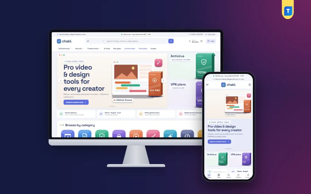
If you do not want to build every part from scratch, a theme made for this job saves weeks. Chabi is a WordPress theme for shops that sell only digital products such as operating systems, office suites, antivirus, VPN and design apps.
It already follows the ideas in this guide:
- An address-free checkout that asks for a delivery email.
- Delivery and platform chips on every product card.
- A plan picker that shows each plan's price.
- Quick facts read from the product specifications.
- A "how you get it" section with delivery steps.
- Payment through bKash, Nagad, SSLCommerz and manual payment.
- 27 homepage blocks you can switch on, switch off and re-order.
There is also a one-click demo with 44 software products, so you can see a full store before you add your own. You can look at the details on the Chabi theme page.
A launch checklist for your digital store
Before you tell customers the site is open, go through this list. A calm launch is part of good digital product selling website design, because it catches the small faults buyers notice first.
- Place a test order for each payment method and confirm that the money arrives.
- Check that the confirmation email reaches Gmail and does not land in spam.
- Open every page on a phone and a laptop.
- Read the refund, delivery and privacy pages once more.
- Check that every product has a price, a plan, a platform and a delivery time.
- Add your contact details to the header or footer.
- Back up the site and keep a copy off the server.
After launch, review your orders every week. Note which questions customers keep asking and answer them on the product page.
Common mistakes to avoid
Most weak stores fail for the same few reasons. Check your own store against this list.
- Asking for a shipping address. It slows checkout and confuses buyers.
- Hiding the price. Show it on the card and the product page.
- Vague delivery promises. Say the real time.
- Too many homepage sections. Pick the ones that help the sale.
- Stock photos of laptops. They tell the buyer nothing. Show the real product details instead.
- No support contact. Even a single WhatsApp number helps.
- Ignoring phones. Test on one before every launch.
If you want to read more on the technical side, the official WordPress documentation is a good, reliable reference.
Frequently asked questions
What is the most important part of digital product selling website design?
The product page and the checkout. They are where the buyer decides to pay. Show plans, prices, delivery time and platform clearly, and keep checkout to a few fields.
Do I need a shipping address at checkout?
No. For digital goods, ask for a name, a mobile number and an email address. Fewer fields mean fewer abandoned orders, especially on mobile.
How many pages does a digital store need?
Seven pages cover most shops: homepage, shop, product, checkout, thank-you, account and help pages. Add more only when they help buyers.
Which payment methods should I offer in Bangladesh?
Most shops start with bKash and Nagad, add a card gateway and keep a manual option for bank transfer. Skip cash on delivery because nothing is delivered by hand.
Can I run a digital store with WordPress?
Yes. WordPress is a common choice because it is flexible and well supported. A theme built for digital goods removes much of the setup work.
How do I make a digital product selling website design feel trustworthy?
Use real contact details, clear refund terms, honest delivery times and real reviews. Small details across the whole site build more trust than one large badge.