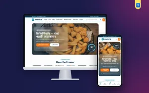
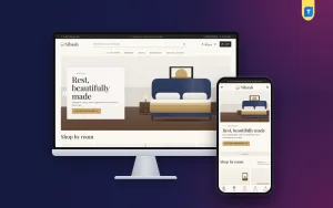
Good electronic store website design helps a buyer pick the right phone, laptop or pair of earbuds without calling you ten times. Gadget buyers compare specs, prices and warranty before they pay. If your site makes that easy, they order from you. If it does not, they open the next tab.
This guide collects practical ideas for a phone, gadget or laptop shop in Bangladesh. It covers the homepage, product pages, filters, payments, delivery and the mistakes that cost sales. Pick what fits your shop and build step by step.
What makes electronic store website design different
A gadget is an expensive, careful purchase. A buyer may spend ৳30,000 on a phone and keep it for three years. That changes what the site must do.
- Specs matter. Buyers want RAM, storage, battery and screen size in a clear table.
- Trust matters. Official warranty, original box and return rules must be easy to find.
- Price matters. Buyers compare shops, so show the real price and any saving.
- Stock moves fast. New launches sell out and old models drop in price.
A clothing or grocery layout will not answer these needs. The design must be built around comparison and trust.
A homepage that sells launches and deals
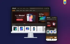
The top of the page should show what is new. A slider with two or three launch slides works well, such as a new phone, a laptop deal and an accessories bundle. Keep one clear button on each slide.
A side banner next to the slider can hold your "premium picks" or the most asked-for product. On phones, keep only the slider so the first screen stays clean.
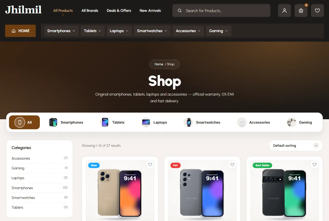
Below that, place category tiles in a row: Smartphones, Tablets, Laptops, Smartwatches, Accessories, Gaming. Buyers who know what they want jump straight in. Buyers who are just looking start browsing.
Further down, a "trending now" block with Newest, Best Seller and Best Value tabs gives regular visitors a reason to scroll. A grid of new arrivals, five per row on wide screens and two on phones, shows that fresh stock keeps coming. Thoughtful electronic store website design keeps each homepage block short, so the page never feels like a warehouse list.
Flash sales and countdowns, used honestly
A flash sale with a countdown can lift sales on slow days. The rule is simple: the end time must be real. If the timer resets every time the page loads, buyers notice and stop trusting you.
Use a short band with hours, minutes and seconds, and two tabs such as Newest and Popular. Put only a handful of real deals in it. Ten fake "70% off" tags hurt more than they help.
Launch banners with a "pre-book" tag are another strong idea. When a popular phone is about to arrive, let buyers reserve it with a small advance or a simple order. You learn the demand before stock lands.
Shop by brand
Many buyers start with a brand in mind. A "shop by brand" block with brand tiles and a few products under each makes that path short. Keep brand logos clean and the same size.
If you are an official-distributor style shop, this block is your main selling point. Show the brands you stock in depth, not a long row of logos with one product each.
Tall banners for single product types, such as a tablet, headphones and a watch, work in the same way. Each one leads to a small, focused list instead of the full shop.
Product cards that answer quick questions
A card should answer three things at a glance: what it is, how much it costs and whether it is a deal. A strong card shows:
- a discount pill when the item is on sale;
- a clear picture on a plain background;
- a two-line title with model and storage;
- the old price crossed out and the new price;
- Add to Cart, a heart for the wishlist and a quick-view button.
Quick view saves time for buyers who compare. They can check specs and price without leaving the list. In electronic store website design, every saved tap matters on a phone.
Product pages built for comparison
The product page is where the sale happens. Keep it calm and well ordered. Put the gallery on the left with zoom and thumbnails, and the summary on the right with the title, stars, price and a "You save" line.
Under the price, add the facts buyers ask for most:
- warranty, for example "1 year official brand warranty";
- what is in the box;
- return rules, such as "7 days easy return";
- delivery time: 1–2 days in Dhaka, 2–4 days across Bangladesh.
Then use tabs for Specifications, Delivery & returns, Warranty and Reviews. A spec table with brand, model, variant and general details is easier to read than a long paragraph.
Write the spec table yourself from the box and the brand sheet. Do not copy long marketing text. Short, correct facts are what buyers want, and they help the page show up when people search for a model name.
For storage and colour, use proper options such as 128 GB and 256 GB, each with its own price and stock. Buyers hate adding a phone to the cart only to learn the colour they want is gone.
EMI and price display
Expensive gadgets sell better when buyers can see a monthly cost. A small "0% EMI from ৳2,500/month" line under the price helps buyers who pay by credit card. Explain on a help page which banks and cards qualify, and what the real cost is.
Be honest about the total. If EMI adds a bank charge, say so. A blog post on what 0% EMI really costs builds more trust than a big banner. Good electronic store website design keeps the price, the saving and the EMI line close together so nothing feels hidden.
Filters and search that save time
A buyer with ৳20,000 and a favourite brand should reach the right phones in three taps. That needs a good filter panel on shop and category pages:
- current category, locked on category pages;
- price range;
- average rating;
- stock status, so out-of-stock items can be hidden;
- on sale;
- brands.
On phones, open the filters in a panel with Apply and Reset buttons. A live search in the header that shows matching products as the buyer types is just as useful. Add a category picker beside the search box so "case" can be limited to Accessories.
Phone-first gadget website design
Most of your buyers will shop on a phone, often a mid-range one on mobile data. Plan the phone layout first, not as an afterthought.
- A bottom tab bar with Home, Shop, Cart and Account works like an app.
- A side drawer holds the full category menu.
- Cards sit two per row with large photos.
- Buttons are big enough for a thumb.
- A WhatsApp order button sends the product name in the chat.
Strong gadget website design also means speed. Compress photos, keep plugins few and choose a theme with small script files and no page builder. Test on a cheap phone over mobile data before every big sale.
Payments, delivery and fake orders
In Bangladesh, cash on delivery is still the most used payment for gadgets under ৳10,000. For higher prices, many buyers prefer bKash, Nagad or a card. Offer cash on delivery from day one and add online payment as soon as you can.
Show delivery charges early. A simple setup is ৳80 for home delivery and free delivery above a set amount, such as ৳5,000. Put the rule in the top bar and in the cart.
Fake orders are a real cost for gadget shops, because each one ties up stock and a courier trip. Asking buyers to sign in with a mobile number or email before ordering cuts most of them. A Track Order page then answers "where is my parcel?" without a phone call.
Reviews, FAQs and trust signals
A reviews block with an average score, star bars and real review cards gives new buyers confidence. Mark reviews from real buyers as "verified" and show which product they bought.
A short FAQ on the homepage answers the common worries: Is it official? What if it is faulty? How long does delivery take? Can I pay in EMI? Put a help card with your phone and WhatsApp next to it.
Five promise cards, such as official warranty, easy return, fast delivery, secure payment and real support, work well above the footer. Keep each promise to a few words, and only promise what you deliver.
Content that helps buyers choose
A small blog section brings search visitors and answers questions before they become calls. Useful post ideas for a gadget shop:
- how to choose a phone under ৳20,000;
- battery care tips for phones and laptops;
- tablet or laptop for a student;
- what 0% EMI really costs;
- how to check a phone is official.
Google's guide to helpful content is a good reminder here. Write to help buyers decide, from your own shop experience, not to fill a page with keywords.
Common mistakes in electronic store website design
- Spec details only in photos, so buyers cannot read or search them.
- No warranty or return information on the product page.
- Fake countdowns and fake discounts.
- Prices left unchanged after a market drop.
- Out-of-stock items with no label.
- Heavy sliders that freeze cheap phones.
- Copying photos and text from brand sites without permission.
Fix these first. They cost more sales than any colour or font choice. Most of them take less than a day to put right.
Measuring what works
Pick a few numbers and check them every week: visitors, orders, average order value, cancelled orders and how many buyers return within a month. Change one thing at a time, such as a shorter checkout or a new flash sale, and watch the numbers for two weeks.
Ask a few real buyers to order from your site while you watch. Where they pause or ask a question is where your electronic store website design needs work. Five short tests like this teach more than any report.
Colours and style for a tech shop
A dark theme with one warm accent colour makes product photos stand out, the way a showroom uses dark walls and bright lights. Brown, amber or orange accents feel friendly next to black and navy. Use the accent only for buttons and prices.
Keep one font family, clear headings and plenty of space. Good gadget website design looks calm, so the products do the talking.
Photos need the same care. Shoot every product on the same plain background, from the same angle, with one photo of the box and one of the phone in a hand for scale. Matching photos make a small shop look organised. In electronic store website design, a neat grid of consistent photos does more for trust than any banner or badge.
A launch checklist
- Every product has clear photos, a spec table, a price and stock.
- Storage and colour options are set with their own prices.
- Warranty, box contents and return rules are on every product page.
- Filters work on phones.
- Delivery charges and times are visible.
- Cash on delivery works, and online payment is planned.
- You placed a test order from a cheap phone.
Check this list again before each sale season. A tidy electronic store website design is easier to keep accurate when prices move every week.
Build it with the Jhilmil theme
The Jhilmil gadget and electronics theme for WordPress already follows most of these ideas. It has a launch slider, scrolling category tiles, a flash sale with a countdown, pre-book banners, shop by brand, product cards with quick view and a reviews block with verified badges.
Product pages show a spec tab, warranty, delivery and returns, a "You save" line and a switchable EMI line. Shop pages have a brand filter. On phones there is a bottom tab bar. It runs on WooCommerce, so you can add bKash, Nagad or card payments with any plugin. Import the demo and start with 27 products in 6 categories.
Frequently asked questions
What does electronic store website design cost?
With WordPress, the free WooCommerce plugin and a ready theme, most of the cost is hosting, the domain and product photos.
Should I show prices on every product?
Yes. Hidden prices push buyers to other shops. Update them when the market moves.
What is the most important page in electronic store website design?
The product page. Clear specs, warranty, price and delivery details close the sale.
Do I need EMI on day one?
No. Start with cash on delivery and bKash, then add card EMI when your bank or payment partner supports it.
How many products should I start with?
Start with 30 to 50 items you can deliver fast. Add more once orders run smoothly.