Looking at good food website examples is the fastest way to learn what a food site should do before you spend money on your own. The best ones are not always the prettiest. They are the ones where a hungry person finds what they want, trusts it and orders in a minute.
In this guide we describe the main types of food websites, what each does well, and what you can copy for a small shop in Bangladesh. We do not name outside brands. Instead we break each type into parts you can reuse, with checklists you can follow.
Why study food website examples first
Most owners start by choosing colours. That is the wrong end. Start by seeing how working sites solve problems. When you look at ten sites, patterns appear fast.
- Which sites show prices straight away, and which hide them?
- Where is the search box?
- How many taps does it take to add an item?
- How do they show that food is fresh or genuine?
- What do they say about delivery before you reach checkout?
Keep a notebook or a phone album. Take screenshots and write one line under each: "good because..." or "confusing because...". After an hour you will have a clear brief for your own site.
Food website examples by type
Food sites are not all the same. Each type has its own job, and you should compare your plan with the right type.
Online grocery and daily needs stores
These sell rice, oil, dal, eggs, milk and household goods. They need fast search, pack sizes on every card, a quantity control and a short checkout. Shoppers fill big baskets, so speed matters more than style.
Fresh vegetable and fruit sellers
Prices change daily, and delivery time matters. The strong sites show today's rates, the next delivery slot and the season. Photos show real produce, not glossy stock images.
Organic and farm-to-door shops
These sell trust. They show the farm, the maker and the harvest. Short stories, producer names and honest labels carry the page.
Restaurant and cloud kitchen sites
The menu is the star. Good ones have a clear menu with photos, opening hours, a delivery map and a simple order button. Many fail by hiding the phone number.
Recipe and food blog sites
Here content is the product. Readers want clear steps, ingredient lists and cooking times. The best ones link ingredients to a shop.
Specialty food sellers
Honey, dates, spices, pickles, sweets and dried fish are good examples. They rely on gift ideas, packs and reviews, and they often sell through Facebook first.
What good food websites do well
Across all types, the strongest sites share the same habits. Use them as your base.
- They put food first. The first screen has real products, not a long welcome.
- They are fast. Pages open in a few seconds, even on mobile data.
- They are clear about money. Price, pack size, delivery charge and total are visible.
- They are easy to search. The search box is large and suggests results.
- They look the same everywhere. Cards, buttons and fonts repeat.
- They show proof. Reviews, farm names, photos and contact details.
- They handle mistakes. Out-of-stock labels, return rules and tracking.
Learn from sites that fail
You also learn from bad sites. Visit a few and write what annoys you.
- A menu with fifteen items and no pictures.
- Pop-ups that cover the product before you read it.
- A delivery charge that appears on the last step.
- Photos that are too dark, too large or from another shop.
- No phone number, or a number that is hard to find.
- A cart that closes when you try to change quantity.
- Forced account sign-up before payment.
If something annoys you as a visitor, it will annoy your customers. Write your own "do not do" list and keep it beside your screen while you build.
Organic products website design: what to copy
Organic buyers read more than other shoppers. They ask where food comes from and how it was grown. Good organic products website design answers those questions in the first few seconds.
- A short line under the product name: where it comes from.
- The farm or producer name, with a link to a page about them.
- Season and harvest dates, if you know them.
- Clear packing and storage notes.
- Honest words. Do not call a product certified unless it is.
- Real photos of the farm and your packing table.
Organic sites also work best with calm design. Light colours, plenty of space and natural tones help the food look fresh. Avoid bright flashing banners.
Food website ideas from Bangladesh bazaars
Our bazaars already teach good design. A shop on the street shows the price, the weight and the freshest goods at the front. You can copy these habits online.
- A daily rate board: list today's price for onion, potato, tomato and other staples, with an arrow for up or down.
- Ready boxes: a small, family and big vegetable box with the contents listed.
- Season tabs: winter, summer and monsoon vegetables.
- Delivery slots: "Today, 5 PM to 8 PM" in the header.
- Cash on delivery: shown on the first screen, because many buyers look for it first.
- Local words: shak, sobji, mandi, bazar.
These ideas make an online shop feel familiar. Familiar is a strong reason to try a new store.
Photos, words and trust on food sites
Strong food website examples treat photos and words as part of the product. A shopper who cannot touch the item reads every detail.
Photos
- Shoot near a window with soft daylight.
- Keep one background colour for all products.
- Show loose produce and the pack you deliver.
- Use the same crop and size on every card.
- Compress each file so it stays light.
Words
Write short product lines. Say what it is, where it comes from, the weight and how to store it. For vegetables, add a cooking idea in one sentence, such as "good for bhaji or curry". Avoid long claims about health. They are hard to prove and shoppers do not trust them.
Trust
Add your phone number, your address and a real name or face. Show customer reviews, even if you have only a few. Explain returns for damaged items in two sentences. Many first-time buyers look at these three things before they order.
Layout patterns worth borrowing
When you review food website examples, look at layout first. Four patterns appear again and again.
The shelf layout
Rows of compact cards by category. It suits grocery and vegetable stores. Keep each row short and add a "View all" link.
The story layout
One big image, a short text and a few products. It suits farms and gift sellers. It builds trust but can hide the price, so add a strip of best sellers.
The menu layout
A list of dishes with photos, descriptions and prices, grouped by meal. It suits restaurants and cloud kitchens.
The content layout
Articles and recipes with product links beside them. It suits food bloggers who also sell. Use it as an extra section on a shop, not as the main page, unless content is your main business.
A ready-made option: Sobuj
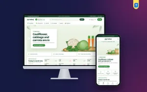
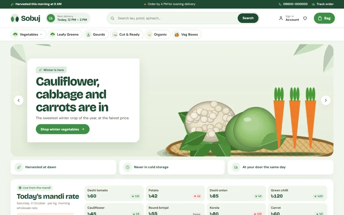
Sobuj is a vegetable shop WordPress theme for sellers who move greens, not gadgets. It suits shak, gourds, roots, onion and garlic, beans, cabbage, cauliflower, cut and ready trays, organic produce and weekly veg boxes. The look is pale mint and deep forest green, with leaf-shaped tags.
Here is what it includes:
- A daily mandi rate board with green and red arrows, typed by you
- The next delivery slot shown in the header
- Season tabs that open on the current season
- Three ready sobji boxes with one-tap Add
- A round Add button that turns into a quantity stepper
- Compact vegetable cards, about 230px on phones
- 25 homepage blocks you can switch off and re-order
- bKash, Nagad, SSLCommerz and cash on delivery
- Steadfast and Pathao courier with order tracking
- Five colour palettes and four font pairs
The one-click demo has 43 products from 6 farmer groups, so you can see a full store and then replace it with your own. You can open the Sobuj demo and judge it with the checklist in this guide.
How to review any food site in ten minutes
Reading about food website examples helps, but a hands-on review teaches more. Keep it short and the same every time, so you can compare one site with another. Use a timer and stop at ten minutes. A long review tires you and the notes lose focus.
Use the same quick method on every site you study, so your notes can be compared.
- Open the site on your phone, not a computer.
- Count seconds until the first product appears.
- Search for a common item, such as "rice" or "onion".
- Add two items and change one quantity.
- Look for the delivery charge before checkout.
- Go to checkout and note how many fields you must fill.
- Look for contact details and return rules.
- Score the site from one to five for speed, clarity and trust.
After ten sites, add up the scores. Read the notes on the top three and the bottom three. Your own plan should look more like the first group.
Mobile and speed checks
Most of your customers will arrive from a Facebook post or a message on a phone. That is why speed and thumb-friendly design come before any decoration. A site that looks plain but opens at once will sell more than a pretty one that makes people wait.
Your best food website examples will all feel quick on a phone. Hold your own site to the same standard.
- Turn off Wi-Fi and open the home page on mobile data.
- Check that the first products appear in under four seconds.
- Tap every button with your thumb. Make any small ones bigger.
- Check that the cart opens without leaving the page.
- Check that the keyboard shows numbers for the phone field.
- Remove sliders that load large images you do not need.
If the page is slow, fix images first. Large photos cause most delays on food sites.
Build your own plan from what you learned
Turn your notes into a one-page brief. It does not need to be long.
- Type: grocery, vegetable, organic, restaurant, specialty.
- Customer: who buys, how often, from which areas.
- Top five jobs: what people want to do first.
- Must-have blocks: search, categories, best sellers, deals, delivery info.
- Payment: cash on delivery, bKash, Nagad, card.
- Delivery: areas, charges, slots, courier.
- Look: two colours, two fonts, one photo style.
Share the brief with whoever builds the site, even if that is you. A written plan prevents most delays.
Common mistakes when copying food website examples
- Copying a large overseas site that has a team of fifty. Your small shop needs a simpler page.
- Copying photos or text. This is unfair to the owner and can harm your search results.
- Adding every feature you saw. Pick the ones that match your customers.
- Ignoring local habits, like cash on delivery and area-based delivery charges.
- Skipping a phone test.
- Making the site look too different from what shoppers expect.
Learn from the structure, then add your own products, your own voice and your own photos. Good food website examples are a starting point, never a template to trace line by line.
If you want to read more on the technical side, the official WordPress documentation is a good, reliable reference.
Frequently asked questions
Where can I find good food website examples?
Search for your type of shop, such as online grocery or vegetable delivery, and look at the first ten results. Open each on your phone and take notes.
What should food website examples teach me?
They should show how others display price, pack size, delivery and trust signs. Focus on structure and habits rather than colours.
How is organic products website design different?
It stresses origin, producer names and honest labels. Buyers want to know where the food comes from, so give that story space.
How many products should a new food site have?
Thirty to sixty is enough. It is better to have fewer items with good photos and correct prices.
Do I need online payment from day one?
Cash on delivery is enough to start. Add bKash and Nagad soon after, since many customers prefer them and they reduce fake orders.
Can I build a food site without coding?
Yes. A ready theme with a demo import lets you change content, colours and blocks from settings. Your main work is products, photos and delivery rules.