Good furniture website design does one job: it makes a buyer feel safe spending a large amount of money on something they cannot touch. This guide explains what furniture buyers look for on a website, page by page, and how to build each part without a developer.
We build shops for furniture and sofa sellers, and the same problems appear in almost every project: buyers worry about size, quality and delivery. Solve those three on the page and the orders follow.
Why furniture website design is different
A T-shirt costs little and fits most people. A sofa costs a lot, must fit through a door and has to last for years. Buyers think longer, compare more and need more proof.
That is why furniture website design needs more than nice photos. It needs sizes in plain view, explanations of how pieces are made, a clear delivery plan and an easy way to talk to you. Every section of the site should answer one of these doubts.
Lead with room photos, not product cut-outs
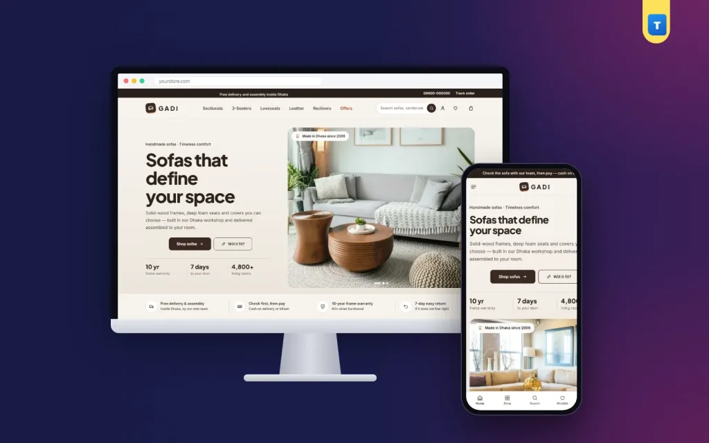
People do not buy a sofa; they buy a living room they can picture. Start the homepage with a wide room photo that shows a sofa in a real setting, with a short headline and one button to the shop.
Further down, a "shop the room" photo with hotspots works well: buyers tap the sofa, the side table or the rug and go straight to that product. It shows how pieces fit together and often adds a second item to the order.
Put the size everywhere
The most common question in a furniture shop is "will this fit?". Answer it before the buyer has to ask.
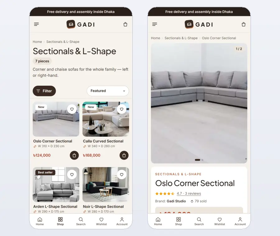
Print the width and depth under the name on every product card, so buyers can compare sizes in the grid. On the product page, show width, depth and height clearly, with a simple drawing if you have one.
The best furniture website design ideas go one step further with a size tool. The buyer enters the width of their wall and their door, and the site shows only the sofas that fit. It saves them a tape-measure trip and saves you from returns that cost a full delivery.
Lighting and photography tips
Shoot furniture in daylight, near a large window, with the camera at seat height. This angle shows the real shape and makes rooms feel spacious. Take one wide room photo, one straight-on product photo and three or four detail shots of the fabric, legs and joints. Keep the same light and angle for every product, so your shop looks consistent and professional.
Show how it is made
Two sofas can look the same in a photo and be very different inside. Explain your frame, springs, foam and fabric, layer by layer, and state your warranty in plain words.
A short "how it is made" section with four steps or four layers builds more trust than a long paragraph. If you have workshop photos, use them. Real hands and real tools convince buyers that you are a maker, not a reseller.
Explain delivery before the checkout
Large items raise practical questions: who carries it upstairs, is assembly included, how long does it take? Answer them on the homepage with a simple delivery timeline, and again on a Delivery & Assembly page.
Show the delivery charge for each district at checkout, so there are no surprises. For high-value pieces, many shops ask for a small advance by bKash or Nagad and take the rest as cash on delivery. A clear advance rule protects you from fake orders without scaring real buyers.
Use your showroom online
If you have a showroom, your website should send people there. Add a showroom card with photo, address, opening hours and a "book a visit" link. A showroom sale with a countdown gives a reason to visit this week, not someday.
Many furniture buyers browse online and buy in person, or the other way round. Good furniture website design connects both instead of treating the website as a separate shop.
Make the product page do the selling
The product page should show large photos from several angles, the price, the size, the fabric or colour options and one clear "Add to cart" button. Fabric options work best as swatches with their own photos, so buyers see the real colour.
Reviews from real customers, ideally with photos of the sofa in their home, are worth more than any description. Keep them in a fold that opens with one tap, so the page stays tidy.
Gifts and small items
Cushions, throws, side tables and lamps are easy add-ons and good gifts. Suggest them on every sofa page and in a small gift section. They raise the order value and bring in buyers who are not ready for a big piece yet.
Design for phones as well as large screens
Many furniture buyers find you through a Facebook or Instagram ad on their phone. Test every page on a small screen. The size line must stay readable, the size tool must work with a thumb and the checkout must fit on one screen.
Large room photos are important, but they must load quickly. Avoid heavy page builders and sliders. Load photos lower on the page only when the visitor scrolls to them.
Navigation and filters for a furniture range
Keep the main menu simple and room-based: living room, bedroom, dining, office and offers, with sofa types such as sectionals, 3-seaters and loveseats underneath. On category pages, add filters for seats, material, colour, firmness and price. A buyer looking for a grey fabric 3-seater should reach the right products in a few taps.
Show the number of products for each filter and let buyers sort by price or newest. In furniture website design, good filters replace the help a salesperson gives in a showroom.
Fabric and colour choices
Many sofas come in several fabrics and colours. Show each option as a swatch with its own photo, so buyers see the real colour on the actual sofa. Mention the fabric type and how easy it is to clean. If you can send fabric samples, say so; many buyers order a sample before a large purchase.
Pricing, advances and financing
Furniture prices are high, so be clear and upfront. Show the full price, any discount and the delivery charge before checkout. If you ask for an advance on cash-on-delivery orders, explain the rule in one sentence on the product page. Clear money rules remove doubt and reduce abandoned checkouts.
Made-to-order and pre-orders
Many furniture makers build pieces after the order. Let buyers pre-order with a clear making time, such as "ready in 14 days", and a small advance. Show the expected delivery date on the product page and in the confirmation message. Honest timelines are a big part of trust in furniture website design.
Content that brings buyers from Google
Furniture buyers search for help: how to choose a sofa size, which fabric suits a home with children, how to arrange a small living room. Short guides that answer these questions bring visitors who are planning a purchase. Each guide should link to a few matching pieces. Over time, helpful content brings steady buyers without ads.
After the delivery
Ask every buyer for a review and a photo of the piece in their home a few days after delivery. Room photos from real customers are the best proof a furniture shop can have. Share care tips by SMS, such as how to clean the fabric, and remind buyers about matching pieces a few weeks later.
Corporate and bulk orders
Offices, hotels, cafés and schools buy furniture in quantity. A corporate quote form with quantity prices makes these orders easy to start. One corporate order can be worth a month of regular sales, so a small section on your site is worth adding to your furniture website design.
Furniture website design templates vs a complete shop theme
Most furniture website design templates give you a beautiful homepage and nothing else. You still have to add a shop plugin, payment plugins, courier tools and size tools, and make them work together.
A complete theme saves weeks. Our furniture WordPress theme, Gadi, already includes the size line on every card, the "Will it fit?" tool, shop the room hotspots, the craft and delivery sections, a showroom card with a sale timer, and a full shop with bKash, Nagad, cash on delivery with an advance, district delivery charges and courier sending.
You import the demo with one click, then replace the sample sofas with your own. Most shops are ready to take orders within a day.
Common furniture website design mistakes
The first mistake is hiding sizes inside a long description. Buyers skim, and if they cannot find the width in a few seconds they leave or call you, which costs you time.
The second is using only studio photos on a white background. They are useful for details, but buyers need at least one room photo to judge scale and colour.
The third is a slow site. Many furniture website design templates rely on heavy sliders and animations that look good on a fast laptop and crawl on a phone. Keep effects to a minimum and let the photos do the work.
The last is a checkout that asks for too much. Name, phone, address and district are enough to deliver a sofa. Everything else can wait until you call to confirm.
Seasonal planning
Furniture sales rise before Eid, before weddings and when families move house at the start of the year. Plan your homepage for these moments a month in advance.
A "new home" edit with a sofa, a coffee table and a rug, or an Eid edit with fresh cushions and covers, gives buyers ready ideas. Refresh the hero photo and the offers with each season, so returning visitors always see something new.
Trust signals that work
Show your business address, phone number and showroom hours in the footer. Add a short "Why us" section with honest promises, such as a frame warranty, careful delivery and easy contact. Photos of your workshop and team prove that you are a real maker. Answer messages quickly; furniture buyers often have one more question before they order, and a fast reply often decides the sale.
Measure and improve
After launch, watch which pieces get the most views, which sizes buyers check with the size tool and where people leave the checkout. Move popular pieces higher on the homepage, add more photos to products that get views but few orders, and simplify any step where buyers drop off. Small monthly improvements based on real numbers keep a furniture shop growing steadily.
Keep a simple record of returns and the reasons for them. If one sofa is often returned because of colour, add a daylight photo. If another is returned for size, make the measurements clearer. Each fix makes the next order safer.
Quick checklist before you launch
Open your site on a phone and check: is the size visible on every card, can a buyer check whether a sofa fits, is your warranty explained, is delivery and assembly clear, and does the checkout fit on one page with a payment method buyers trust? If all five are yes, your furniture shop is ready for its first orders.
Want to see these ideas on a working website? Open the Gadi live demo and browse it on your phone and your computer.
Frequently asked questions
What makes good furniture website design?
Room photos, visible sizes, a size tool, clear information about materials and warranty, a simple delivery plan and a short checkout.
Which colours suit furniture website design?
Warm neutrals such as cream, espresso and terracotta let the furniture photos stand out. Keep one accent colour for buttons.
Should a furniture shop take advance payment?
For high-value pieces, a small advance by bKash or Nagad reduces fake orders. Show the rule clearly before checkout.
Can I use a WordPress theme instead of a custom site?
Yes. A furniture theme with built-in shop features gives you the same result in days instead of months.