Good grocery store website design is not about fancy effects. It is about helping a hungry, busy person find rice, vegetables or honey, add them to a basket and pay without a phone call. Everything on the page should serve that goal.
This guide covers the design choices that matter: layout, navigation, product cards, trust, checkout and mobile use. It is written for small and growing shops in Bangladesh, including farm-to-door sellers and neighbourhood stores, and it ends with a checklist you can use today.
Start with the customer's job
People do not visit a grocery site to admire it. They arrive with a job to do, and your design should make that job short.
- "Buy this week's vegetables before 6 PM."
- "Reorder the honey I liked last month."
- "Find out if you deliver to my area."
- "See today's price for onion and potato."
Write the top five jobs for your own customers. Then check your home page. Can each job start within one tap? If not, rearrange the page until it can.
Grocery store website design principles that work
These principles hold for any food shop, big or small.
- Show products early. The first screen should have real food, not a long welcome message.
- Make prices obvious. Show the price and the pack size together on every card.
- Keep paths short. From landing to cart should take three taps or fewer.
- Be honest. Use real photos and clear stock status.
- Design for thumbs. Large buttons, simple menus, no tiny links.
- Stay consistent. The same card shape, the same button colour, the same spacing.
- Be quick. A slow page loses a shopper before the first photo appears.
If you keep these seven in view, most other decisions get easier.
Build a layout that follows a market walk
A good home page works like walking through a market. First a welcome, then the main stalls, then the deals, and at the end a reason to come back.
The top of the page
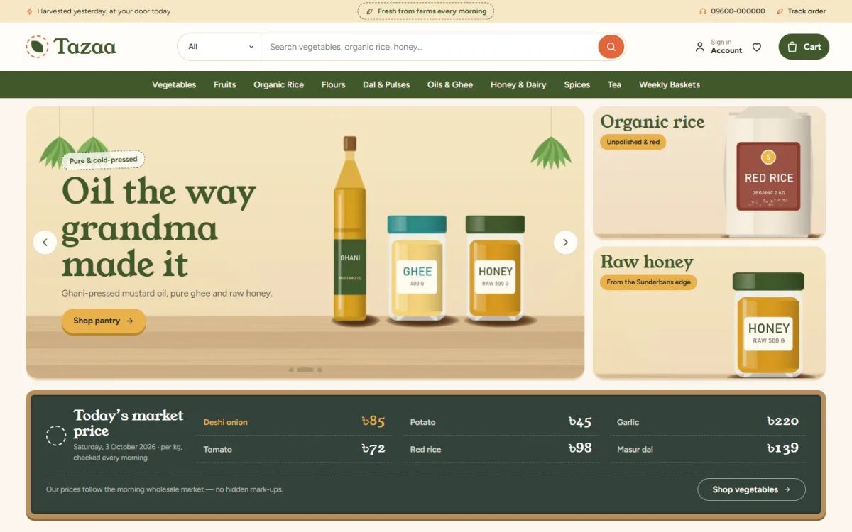
Place a thin bar for your delivery note, then the logo, search and cart. A search box is the most used tool on a grocery site, so make it wide and clear.
The first screen
Show a banner with one clear offer or one clear promise, such as "Fresh from the farm, delivered tomorrow". Put round category tiles right under it.
The middle
This is where products live. Use short rows of best sellers, new arrivals and seasonal picks. Two rows of compact cards on a phone give more choice per screen than one giant row.
The bottom
Add brands or farms, a short promise strip, customer reviews and a few helpful blog posts. Finish with a full footer that includes your phone number, address and delivery page.
Design product cards for fast shopping
The product card is the most important piece of grocery store website design, because the shopper sees it hundreds of times. Make it earn its space.
- A clear photo with the same crop on every card.
- The product name in two lines at most.
- The pack size under the name.
- The price, with the old price crossed out if on sale.
- An Add button that becomes a quantity control after one tap.
- A small badge only where it adds meaning: New, Seasonal, Offer.
Keep cards compact. A grocery buyer scrolls past many items and decides in seconds. Cards that take half the screen slow that decision down.
Photos that sell food
Photos carry most of the load in grocery store website design, because customers cannot smell or touch the food. Shoot in daylight, near a window, on a plain surface. Show the real pack and the real produce, not a stock image of a different farm.
- Use the same size and crop for every product.
- Show vegetables loose and in the bag you deliver.
- Add one close-up where texture matters, such as rice, lentils or honey.
- Keep every image under 200 KB so pages stay fast.
Speed on mobile data
Many customers use mobile data with a weak signal. Test your site with Wi-Fi turned off. Remove auto-playing video and heavy sliders. Load images only when they come into view. A page that opens in three seconds will keep more shoppers than a beautiful page that opens in eight.
Organic food website design: show where food comes from
Organic buyers pay for trust. They want to know who grew the food, how, and where. Good organic food website design makes that story visible without long paragraphs.
- Show the farm or maker name on the product page.
- Add a small logo row of the farms you buy from.
- Write one honest line about each producer.
- Mention the harvest date or season where you can.
- Explain what "organic" means for your shop. If you do not hold a formal certificate, do not claim one.
- Show real photos of the farm, the packing table and the delivery bag.
A "farm of the month" block is a simple way to give one supplier a story every month. It is also fresh content for Facebook.
Let prices be seen and trusted
Vegetable and fruit prices move often. Customers know that, and they notice when a site shows an old price.
A simple price board on the home page works well. List five or six items with today's price per kg, the date, and a short note. Update it each morning. It also tells regular buyers that your shop is alive.
For other products, avoid fake discounts. If you show a crossed-out price, it should be a real previous price. Honest pricing builds repeat customers faster than any banner.
Plan navigation people understand
Clear navigation is the quiet part of grocery store website design. Nobody praises it, but everybody notices when it is missing.
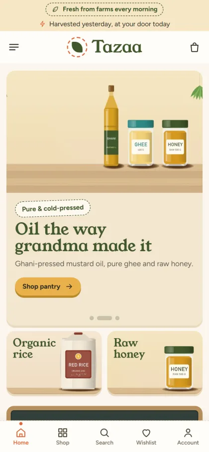
Keep the main menu to six or eight items. For a grocery shop that could be:
- Vegetables and fruit
- Rice, dal and oil
- Honey and spices
- Dairy and eggs
- Baskets and combos
- Offers
Use the same words your customers use. If they say "sobji", write sobji. Use pictures in the category menu for shoppers who read slowly or prefer to tap what they see.
Add a search box that suggests products while typing. Many shoppers will skip the menu and search for "mustard oil" straight away.
Use colour, type and space with restraint
Natural colours suit food: olive, cream, tomato red, mustard and warm brown. You do not need all of them. Pick one main colour, one accent and a neutral background.
- Check that text has strong contrast against the background.
- Use one heading font and one body font.
- Keep the line length short on phones.
- Leave space between cards so fingers do not hit the wrong item.
- Use the accent colour for the Add button and for nothing else.
If you try several looks, test each one on a real phone. A palette that looks soft on a laptop can look pale outdoors in the sun.
Design the checkout for Bangladesh
Checkout decides whether the work above becomes money. Keep it short and local.
- One page: name, phone, address, district and area.
- Delivery charge shown as soon as the area is chosen.
- Cash on delivery, bKash, Nagad and card choices.
- A clear order total with no surprises.
- A strong "Order placed" message with an order number.
- A tracking page that customers can open without calling.
On a phone, keep the Place Order button within thumb reach. Do not force account creation before payment. Let people register after the order, or use their phone number as the login.
Plan for returns and substitutions
Fresh food sometimes arrives damaged, or an item runs out. Say how you handle it before it happens.
- State how long customers have to report a problem, such as the same day.
- Ask for a photo of the item.
- Offer a refund, a replacement or a credit note.
- Say whether you substitute out-of-stock items and how the customer can opt out.
Write this in short sentences on your Delivery page and link it in the footer. Clear rules reduce arguments and build trust.
A ready-made option: Tazaa
Tazaa is an organic grocery WordPress theme for farm-to-door sellers and fresh market shops. Its look is a morning market stall: cream paper, a wooden board, olive green and a splash of tomato orange.
These parts match the points in this guide:
- A chalkboard market price board that you type yourself, with up to six items
- Seasonal picks with six linked items
- Weekly baskets with a banner
- Compact cards with pack size and a quantity stepper
- Farm logos and a farm of the month block
- 23 homepage blocks you can switch off and drag into your own order
- One-page checkout with bKash, Nagad, SSLCommerz and cash on delivery
- Steadfast and Pathao courier with a Track Order page
- Five colour palettes and four font pairs
The one-click demo includes 39 products from 6 invented farms, so you can replace names and photos with your own suppliers. You can try the Tazaa demo to see the layout on your own phone.
Tune your design after launch
A shop is never finished. Review it once a month and change one thing at a time, so you know what worked.
- Look at your most viewed products and move them higher.
- Look at categories that nobody opens. Rename them or merge them.
- Check where shoppers leave the checkout, and remove the field that causes it.
- Replace banners that get no taps.
- Read customer messages. Each repeated question is a design gap.
Small steady changes beat a full redesign every two years. Your grocery store website design should grow with your orders, not fight them.
Weekly baskets and repeat orders
Many families buy the same things every week. A ready basket, such as vegetables for a family of four, turns a ten-minute shop into one tap. Show what is inside, the total price and the weight. Let customers swap one or two items before they pay.
Also offer a simple way to repeat the last order. A shop that remembers the customer will keep the customer. This kind of feature costs little and does more for sales than a new banner.
Test your design with real people
You are too close to your own site to judge it. Ask five people to try a short task and watch without helping.
- "Find a kilo of rice and add it to the cart."
- "Find out the delivery charge to your home."
- "Change the quantity to three."
- "Place an order with cash on delivery."
- "Find where to see your order status."
Write down every pause, wrong tap and question. If three of five people stumble in the same spot, fix that spot first.
Grocery store website design checklist
Use this final check before launch and again every few months.
- The first screen shows real food and a clear search box.
- Each card has a photo, name, pack size, price and Add button.
- Categories use words and pictures customers understand.
- Prices are current and honest.
- Producer or farm names are visible.
- Delivery areas, charges and times are easy to find.
- Checkout takes one page and supports local payment.
- The site loads in under four seconds on mobile data.
- Phone number and address appear in the header or footer.
- Returns and substitutions are explained.
If you want to read more on the technical side, the official WordPress documentation is a good, reliable reference.
Frequently asked questions
What makes good grocery store website design?
Speed, clear prices, compact product cards, simple navigation and a short checkout. Good design helps the shopper finish a basket, not admire the page.
How much does grocery store website design cost?
The cost depends on whether you hire a designer or use a ready theme. A theme costs far less and gets you live sooner. You still pay for hosting and a domain.
Do I need special organic food website design?
Not special, but you should show the source of your food. Farm names, producer stories, seasons and honest labels matter more than decoration.
How many categories should I have?
Between eight and twelve for most shops. More than that makes menus long and hard to scan.
Should I show prices on the home page?
Yes. Shoppers choose faster when they can see prices at once, and a daily price board builds trust with regular buyers.
Can I change the design later?
Yes. Colours, blocks and fonts can be changed from the theme settings without touching your products, so you can improve the shop step by step.