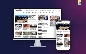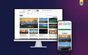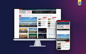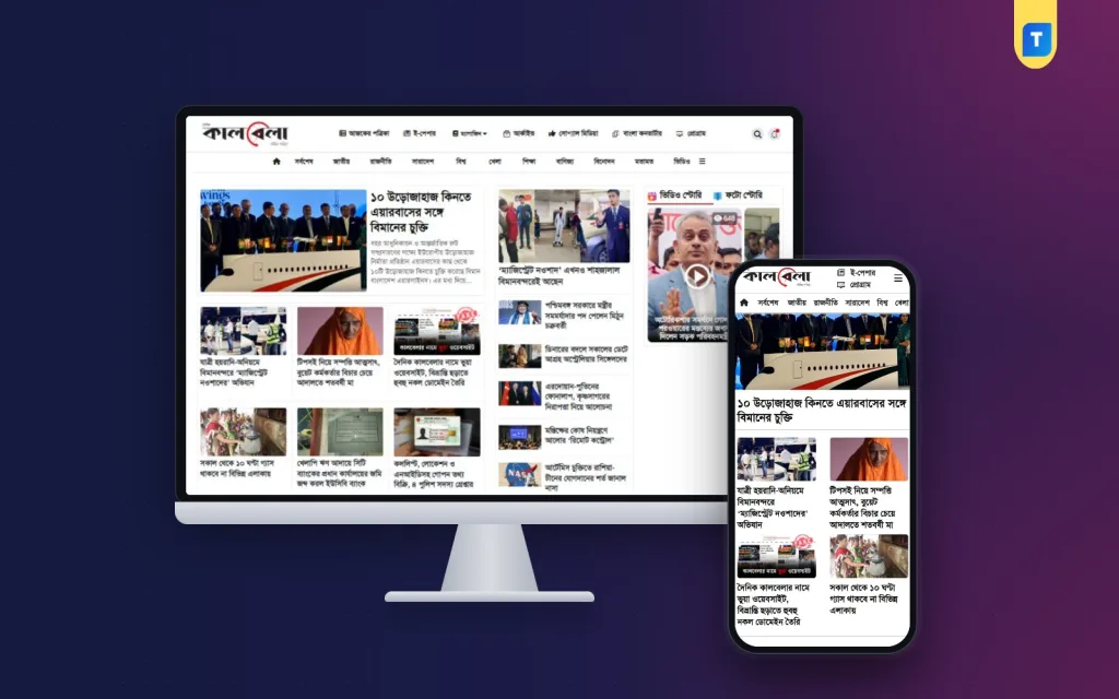
Latest news website design follows trends, but the trends that matter are small: faster pages, bigger text on phones, cleaner ads and simpler menus. Most readers do not notice a good design. They notice a bad one, when a page jumps, a menu hides or an ad covers the headline. This guide shows what current news sites do well and how you can apply it to your own Bangla portal.
It is meant for publishers, editors, bloggers and web developers. Each section ends with points you can check on your own site this week. You do not need to rebuild everything. Often three or four changes make the biggest difference.
What changed in latest news website design
Ten years ago a news home page tried to show everything at once. Today the better sites show less, but show it better. These are the shifts you can see on many well-run news sites.
- Mobile first. The phone layout is planned before the desktop layout.
- Bigger type. Body text is larger and has more space between lines.
- Fewer sliders. Moving banners are replaced by one clear lead story.
- Cleaner cards. Each story is a simple block: picture, headline, small label, time.
- Lighter pages. Fewer scripts, smaller pictures, faster loading.
- Clear labels. News, opinion, video and sponsored posts are marked.
- Dark mode and font controls. Some sites let readers adjust the reading view.
None of these needs a large budget. They need decisions, and the discipline to remove what does not help the reader.
Start with the reader, not the screen
Before you open a design tool, write down who reads your news and how. A student in Dhaka on a mobile data plan reads differently from an office worker on broadband.
- Where do your readers come from: Google, Facebook, WhatsApp or direct visits?
- Which device do they use most?
- When do they read: morning, lunch, late night?
- What do they want first: headlines, sports scores, local updates?
- How long do they stay?
Your analytics tool shows most of this. If the site is new, ask ten people and watch how they use a news site. The answers shape every design choice that follows.
Three reader examples
- The commuter. Reads headlines on a phone in ten minutes. Needs a short lead list, big tap targets and a page that opens on a weak signal.
- The sports fan. Wants scores and match reports fast. Needs a clear sports section in the menu and a place for live updates.
- The local resident. Cares about news from a district. Needs a local category that is easy to find and updated daily.
A latest news website design that serves these three people well will serve most of your audience.
The home page in latest news website design
The home page is a daily front page. Keep it light and organised.
Top area
Logo on one side, menu in the middle, search on the other. On a phone, collapse the menu into one button. Keep the header height small.
Lead area
One main story, with one strong picture, and a short list of other top headlines. Avoid auto-rotating sliders. Many readers never see the second slide.
Story blocks
Give each desk a heading and a few headlines. A block with five clear headlines is better than a block with fifteen links.
Trending and latest
Two short lists help readers who want what is new or what is popular. Keep each list to eight items.
Footer
Policy links, contact details and social links. Keep it tidy and add nothing that distracts.
Article page design that keeps readers
Most visitors arrive on an article, not on the home page. This page is where your design earns its money.
- A headline that fits in two or three lines on a phone.
- Author, date and section under the headline.
- A large first image with a caption.
- Body text of at least 17 to 18 pixels, with generous line height.
- Short paragraphs and clear subheadings.
- Quotes and lists formatted so they stand out.
- A related stories block after the last paragraph.
Do not put a large ad above the headline. Do not hide the text under a cookie bar or a sign-up box. If a reader has to close two things before reading, many will leave.
Speed is part of design
A beautiful page that loads in eight seconds is a failed page. Speed shapes first impressions, and slow pages lose readers on mobile data.
Easy speed gains
- Resize and compress every image before upload.
- Remove plugins you do not use.
- Choose a lightweight theme made for news.
- Use caching on your hosting or with a plugin.
- Load only the fonts you need.
- Limit third-party scripts, especially ad and tracking scripts.
How to test
Open the site on a mid-range phone using mobile data. Count the seconds until you can read the first headline. Then test again on a different time of day. If it feels slow to you, it feels slow to readers.
Colour, type and spacing
You do not need a designer to get these right. Follow a few plain rules.
- Use one main colour for the logo and links, and one accent for small labels.
- Keep the background white or very light. Black text on white remains the easiest to read.
- Use one font family for headlines and one for the body, or one for both.
- Test Bangla text on a phone. Joined letters must be clear at small sizes.
- Give every block the same space around it.
- Use bold type only for headlines and key labels.
When in doubt, remove something. A simple design looks more trustworthy than a crowded one.
Ads without damage
Ads are a fact of life for news sites, but they can be placed with care.
- Reserve space for each ad, so the page does not jump when it loads.
- Place one banner below the menu, one in the sidebar and one inside the article.
- Avoid ads that auto-play sound.
- Do not put ads between the headline and the first paragraph.
- Check each placement on a phone.
Ad networks check content quality and policy pages, not just design. A design that is friendly to ads helps, but it does not decide approval. Read the network rules and publish original work.
Accessibility basics
An accessible site is easier for everyone. It also looks more professional. These checks take little time.
- Text and background have strong contrast.
- Links look different from normal text.
- Pictures have a short description in the alt text.
- Buttons are large enough to tap.
- Headings follow a proper order, with H2 above H3.
- Videos have a title and a clear play button.
Choosing a Bangla news website design template
For most small teams, a ready-made Bangla news website design template is the fastest and cheapest path. Before you choose, check the following:
- It is built for news or magazine sites, not for shops or portfolios.
- Bangla headlines and body text look right on a phone.
- The layout is responsive.
- Ad areas exist and you can control them.
- You can change the logo, colours and fonts without code.
- You can use it on more than one site.
- Updates and support are clear in the terms.
Open the demo on your own phone. Scroll the home page and one article. If it feels clean to you, it will feel clean to readers.
A ready-made option for Bangla publishers
If your plan needs a clean base, look at this news magazine website WordPress theme from Themeve. It is made for Bangla newspapers, online magazines and content sites that publish every day.
The product page lists these facts:
- A clean, professional layout for news, blog and magazine websites.
- Mobile-friendly, responsive pages.
- AdSense-friendly ad spaces.
- Clear Bangla typography.
- Controls for the logo, colours and fonts.
- Editable footer text.
- Header and footer menus.
- A one-time purchase with use on unlimited websites.
- Lifetime updates, and support on WhatsApp.
It will not write your stories or bring readers on its own. It removes the design work so that your time goes into reporting.
A 30-day plan for a new look
You can move from an old design to a new one without stopping publication. Here is a simple monthly plan.
- Week 1: Study three news sites you like, test your own site on a phone and list what annoys you.
- Week 2: Choose a theme or layout, set up a copy of your site on a test address and import a few sample stories.
- Week 3: Set the logo, colours, fonts and menus. Place ads. Test everything on two phones.
- Week 4: Move the new design to the live site during the quietest hours. Watch the numbers and fix small problems.
Take a full backup before the switch. Keep it for at least a month in case you need to go back.
If you pick the news magazine website WordPress theme described above, weeks 2 and 3 are shorter, since the layout, menus and ad spaces are ready to fill. Spend the saved time on your first thirty stories.
Common mistakes in news design
- Following every trend without asking if readers need it.
- Using a heavy theme with many features you never use.
- Stuffing the home page with fifty headlines.
- Choosing colours that look good in a mock-up but are hard to read.
- Ignoring the phone view until the end.
- Changing the design every month.
- Copying a competitor's logo or layout in detail.
Readers value consistency. A calm design that stays the same for a year is better than a fashionable one that keeps changing.
A quick review you can do today
Open your home page on a phone and answer these questions in writing. They take ten minutes and show where the latest news website design on your own site needs work.
- Can I see the lead story without scrolling?
- Can I read the headline without zooming?
- Do I reach sports and politics in two taps?
- Does anything move or jump while the page loads?
- Does any ad cover a headline?
- Can I find the Contact page from the footer?
Fix the first "no" you find, then test again. Repeat until every answer is yes.
Measuring whether the design works
After launch, look at a few numbers each week. Do not drown in charts.
- How many pages does each visitor open?
- How long do they stay on an article?
- What share of visitors leave after one page?
- Which devices do they use?
- How fast do pages load on mobile?
If readers open more pages and stay longer after a change, keep it. If not, undo it. Make one change at a time, so you know which one worked. A good latest news website design is never final. It improves a little each month, based on what your readers do.
If you want to read more on the technical side, the official WordPress documentation is a good, reliable reference.
Frequently asked questions
What is the latest news website design trend that matters most?
Mobile-first layouts with fast pages. Most readers use a phone, so a layout that reads well on a small screen, loads quickly and keeps ads under control matters more than any visual effect.
How often should I redesign my news site?
Not often. A major redesign every two to three years is enough for most sites. In between, make small improvements based on reader data.
Is a slider still a good idea for the home page?
Mostly no. Many readers never see the second slide, and sliders slow the page. One strong lead story with a few headlines works better.
Can a ready-made Bangla news website design template look professional?
Yes, if it is built for news and you finish it with your own logo, colours and a clean menu. What makes a site look professional is order and consistency, not a custom price tag.
Does latest news website design help my search position?
Design helps indirectly. Fast pages and clear structure keep readers longer and help search engines read your content. No design can promise a ranking, so keep the focus on original reporting.
Can I use one theme on several news sites?
That depends on the terms. A theme sold for unlimited websites lets you run more than one site, or build for clients, without extra fees.