Good makeup website design makes a buyer feel she is standing at a real counter, even though she is looking at a phone. She sees the colour, understands the product, trusts the shop and pays in a few taps. Bad design does the opposite: it hides the shade, buries the price and sends her back to Facebook to ask questions.
This guide explains how to plan a makeup and cosmetics website from the first sketch to launch day. It is written for small brand owners and shop owners in Bangladesh. You will find layouts, lists, a pre-launch checklist and answers to common questions.
Start with the buyer, not the template
Before you look at any layout, write down who will use the site. A website for a bridal make-up artist who also sells kits is not the same as a website for a skincare label that sells serums and face oils.
- Name your main buyer: bride, student, office worker, gift buyer or reseller.
- List the five questions she asks most in your messages.
- List the three things that make her hesitate: shade, price, or trust in the brand.
- Decide the one action you want on every page: add to bag.
This short exercise decides your menu, your homepage blocks and the words you write. It takes twenty minutes and saves weeks of changes later.
The core pages every makeup website design needs
Most cosmetics sites need only a small set of pages. Build these first and add more later.
- Home: the shop window, with a clear offer and links to categories.
- Shop: a grid of products with filters.
- Product page: photos, shades, price, description, reviews.
- Cart and checkout: one page, few fields, local payment methods.
- Delivery and returns: short and honest.
- About: who you are, with a face and a name.
- Contact: phone, WhatsApp or Messenger, and address if you have a shop.
- Order tracking: so buyers stop calling to ask where the parcel is.
Homepage structure for a cosmetics shop
Think of the homepage as a short conversation. First it says what you sell, then it shows the best items, then it answers doubts. A simple order works well.
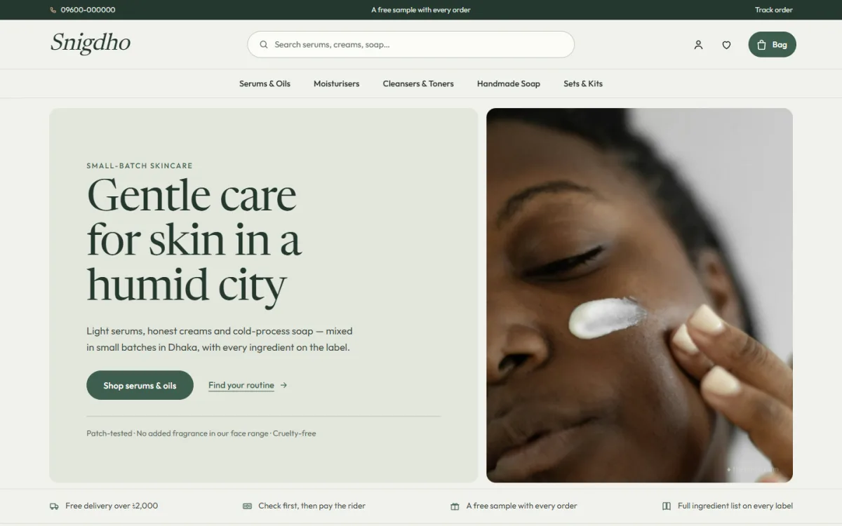
- Hero: one strong photo, one headline, one button.
- Promise line: delivery time, cash on delivery, original products.
- Categories: round or square photos for lips, eyes, face, skin, hair.
- New arrivals: the latest eight products.
- Best sellers: grouped in tabs by category.
- A routine or a look: a guide that shows how products work together.
- Reviews: real words from real buyers.
- Founder note or story: a short, signed paragraph.
- Blog posts: tips that bring people from Google.
Keep each block light. A page that tries to show everything shows nothing well.
Colour, fonts and mood in makeup website design
Mood is the part of makeup website design that buyers feel before they read a word.
Beauty brands sell a feeling, and the site must carry it. Colour and type do most of that work.
Choose a small palette
Pick one main colour, one soft background and one accent. A skincare brand may use pale green and cream. A make-up brand may use deep berry and blush. Use the main colour for buttons so buyers learn where to click.
Choose two fonts
Use one serif or display font for headings and one clean font for reading. More than two fonts makes a page look messy. Keep body text at a comfortable size, as many shoppers read on small phones.
Leave white space
Empty space makes a product feel premium. Do not fill every corner with banners and badges.
Product photography that sells colour
A cosmetics shop lives or dies by its pictures. You do not need a studio, but you do need a plan.
- Use soft daylight and a plain pale background.
- Take a clean packshot of every product from the front.
- Add a swatch photo for every shade, on skin and not only on paper.
- Show size with a hand or a coin beside small items.
- Use the same crop, light and angle for all photos.
- Do not edit the colour to look richer than it is. Returns will follow.
For skincare, show the texture too: a drop of serum, a swipe of cream. It tells the buyer more than words.
Help buyers choose shade, skin type and size
Clear choice tools are what separate strong makeup website design from a plain product list.
This is the part that sets a good beauty store apart. Make choosing easy and you will get fewer messages and fewer returns.
- Show shade dots on cards and let buyers filter by colour.
- Add skin-concern links: dry, oily, sensitive, dull, fragrance-free.
- Show size clearly: 30 ml, 50 g, a pack of three.
- Write who a product is for and who should skip it.
- List key ingredients in plain words.
A simple three-step routine, such as cleanse, treat, moisturise, helps new buyers who do not know where to start. Each step can link straight to the right products.
Cosmetics website design ideas that build trust
Buyers worry about fake products, harsh ingredients and late parcels. These cosmetics website design ideas answer those worries before they are asked.
- Show your real name, phone number and address.
- Write where the product comes from and how it is made or sourced.
- Add batch dates or a "made in small batches" note if it is true.
- Show real reviews, with the first name of the buyer.
- Explain your return rule in two lines.
- Add a clear contact option on every page.
A trust page does not need a long speech. A few honest lines beat a page of big promises.
Payment, delivery and offers for Bangladesh
Make payment feel familiar. Most customers will want one of three ways to pay.
- bKash or Nagad, with the number and a reference shown on the checkout page.
- A card gateway such as SSLCommerz.
- Cash on delivery, with an advance for large orders if fake orders are a problem.
For delivery, state the time and charge for Dhaka and for other districts. Connect a courier like Steadfast or Pathao so you can create parcels from the order screen. A tracking page lets buyers check status themselves. It cuts phone calls and builds confidence.
Mobile experience first
A phone-first view is the most important part of makeup website design today, because your buyers shop on small screens.
Most visitors will come from a Facebook or Instagram link on a phone. Design for that screen first and the desktop view will follow.
- Show two products per row on phones so shoppers scroll less.
- Make the add-to-bag button full width on cards.
- Keep the menu short, with search always visible.
- Use one-page checkout with sign-in in a popup.
- Compress photos so pages load quickly on mobile data.
- Test on a cheap phone, not only your own.
Offers, bundles and gifts
Offers are part of cosmetics website design ideas, but they work only when the page stays calm.
A well-placed offer lifts order value without extra advertising.
- Sale band with a real countdown, such as "batch ends".
- Gifts by budget, with links for different price points.
- Sets and bundles that include a travel size.
- Free delivery above a set amount.
- Festive edits for Eid, Puja, weddings and Pohela Boishakh.
Only use a countdown when the sale really ends. Buyers notice when the timer resets.
Writing and search tips for a cosmetics site
Words matter as much as pictures in makeup website design. Good copy helps buyers decide and helps Google understand your pages.
- Give every product a unique name and a description written by you.
- Start the description with what the product does for the buyer.
- Use words buyers type, such as "lipstick for dark skin" or "face oil for dry skin".
- Write short alt text for each photo.
- Add a category description of two or three lines on every shop category.
- Publish one helpful post a month: a routine, a shade guide or an ingredient explainer.
Do not promise medical results. Say what the product is for and what is in it, and let reviews speak for the rest.
Speed, security and results after launch
A pretty site that loads slowly loses sales. Treat upkeep as part of makeup website design, not as an extra.
- Resize photos before you upload them. A 4 MB photo is too large for a product card.
- Use a fast host with a data centre close to your buyers.
- Keep WordPress, your theme and plugins updated.
- Take a backup before every big change.
- Use strong admin passwords and limit who can log in.
- Delete plugins you no longer use.
Check your site on mobile data once a week. If a page takes more than a few seconds to open, find the heavy image or plugin and fix it.
Measure what works
You do not need complex reports. Look at a few numbers each week and change one thing at a time.
- Which products get the most views, and which of those sell.
- Where visitors come from: Facebook, Google or direct.
- How many people add to bag but do not pay.
- Which shades or sizes are out of stock most often.
- How many questions still reach your inbox.
If many people add to bag but do not pay, check delivery charges and payment steps first. Surprise costs at the last step are the most common reason.
A ready-made option for skincare brands
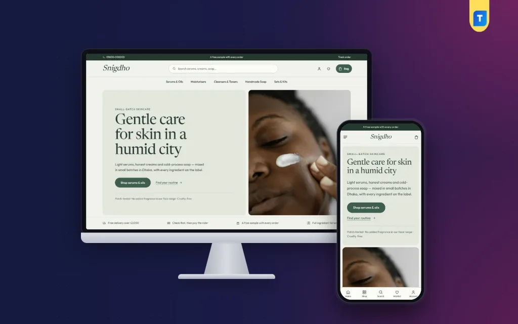
If you sell skincare and use WordPress, a theme built for the job saves a lot of design work. Snigdho is a skincare brand theme made for small-batch makers of serums, face oils, moisturisers, cleansers and soaps.
It has 14 homepage blocks you can switch off or move, a routine in three steps with photos and links, skin-concern cards linked to product tags and an ingredient glossary with six ingredients.
Product plates show sizes in ml and g, and a customer can add a size in one tap. It also supports bKash, Nagad, SSLCommerz and cash on delivery, with Steadfast and Pathao courier tracking. The one-click demo includes 47 skincare products.
You can see the layout on the Snigdho page and try the demo before you decide. Pick any tool that suits your products and lets you edit every block yourself.
Common mistakes and a pre-launch checklist
Mistakes to avoid
- Using many fonts and bright colours that fight each other.
- Posting photos with different backgrounds and sizes.
- Hiding the delivery charge until the last step.
- Skipping ingredients and usage on product pages.
- Copying descriptions from the maker or other shops.
- Adding too many popups that block the page on a phone.
- Launching without a test order.
- Showing a model's lips in one shade and selling ten others without photos.
- Making the buyer create an account before she can pay.
- Leaving old offers on the page after they have ended.
Pre-launch checklist
Before you share the link, walk through your own makeup website design as a buyer would. Search for a product, pick a shade, pay and track the parcel. Every stumble you feel is one your customers would feel too.
- Choose a short domain and a clear shop name.
- Add at least 20 products with good photos and full descriptions.
- Set up shades, sizes and skin-type tags.
- Write delivery, returns, privacy and contact pages.
- Connect bKash, Nagad and cash on delivery.
- Connect your courier and send a test parcel.
- Check the site on two phones and one laptop.
- Read every page once, aloud, for spelling.
- Share the link on your Facebook page and with past buyers.
A last pass over your cosmetics website design ideas will often show you a block that adds nothing. Remove it. After launch, watch which pages people leave. A confusing product page is the usual cause, and the fix is often a clearer photo or a shorter description.
If you want to read more on the technical side, the official WordPress documentation is a good, reliable reference.
Frequently asked questions
What makes good makeup website design?
It shows true colours, helps buyers pick a shade, loads fast on a phone and accepts the payment methods local customers use. Everything else is decoration.
How much does makeup website design cost for a small shop?
Costs vary with the tools you pick. A ready-made WordPress theme with hosting is usually far cheaper than a custom build, and it is enough for most small shops.
How many products do I need to start?
Twenty is a good start, if each has clear photos and a full description. Add more as you learn what sells.
Do I need a blog on a cosmetics site?
Not at the start, but short posts on routines and ingredients bring visitors from Google and give you content to share on Facebook.
Can I show shades without a model?
Yes. Use swatches on a hand or arm, and name each shade in plain words. Show at least one photo on skin for each shade.
Should I offer cash on delivery?
For most Bangladeshi shops, yes. Many buyers still prefer to pay at the door. Ask for a small advance on large orders to cut fake bookings.