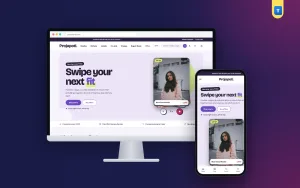
Marketplace website design is harder than designing a small shop. When you sell hundreds of products in ten different categories, every extra click costs you buyers. This guide explains how to plan the header, homepage, category pages, product pages and checkout of a multi-category online store, so visitors find what they want and order without friction.
We have built large catalogues for general stores, super shops and gadget-and-fashion sellers. The same lessons apply to all of them, whether you sell 200 products or 5,000.
What makes marketplace website design different
In a single-category shop, most visitors know what they want. In a big store, many arrive with a vague idea, such as "a gift under 2,000 taka" or "something for the kitchen". Your marketplace website design has to guide two kinds of visitor at the same time: the one who searches and the one who browses.
That is why big stores rely on strong navigation, a powerful search and a homepage full of entry points: categories, deals, brands and collections. A small shop can get away with a pretty homepage. A large store cannot.
Plan your categories before you design anything
The best marketplace website design starts on paper, not in a theme. List every product type you sell and group them the way a buyer thinks, not the way your warehouse is organised. "Kitchen" and "Home décor" make sense to a buyer. "Supplier A items" does not.
Aim for ten or fewer top-level groups, each with three to eight sub-categories. Give each group one clear photo and a short name. When this structure is right, the menu, the homepage tiles, the filters and the breadcrumbs all fall into place.
Write down the five products people buy most in each group. These become your featured items, your deal candidates and the products you show first in each category.
The header is your most important design element
In a large store, the header does most of the work. Plan it in three rows.
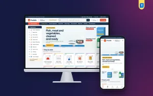
The top row is thin and carries one message, such as free delivery above a certain amount or a current sale. The middle row holds the logo, a large search box with a category picker, the wishlist, the account link and the cart with its total. The third row opens a full category menu, shows your main links and highlights deals.
Keep the header sticky, so buyers can search or open the menu from anywhere on the page. On phones, simplify it to menu, logo and cart, with the search box underneath. Let the search box tuck away while the visitor scrolls down and return when they scroll up, so it never covers products.
Design a category menu people can actually use
A mega menu with sixty plain links is overwhelming. Group categories into ten or fewer top levels, add a small icon to each, and show how many products each one has. A promo photo inside the menu is a good place for your current offer.
Good marketplace website design also repeats the categories on the homepage as photo tiles. Some visitors never open menus, and tiles catch them.
Search: the shortcut to the sale
Visitors who search usually buy more than visitors who browse, because they already know what they want. Make the search box wide, place it in the centre of the header and let buyers limit it to one category.
Live search, where results appear while typing, saves another step. Make sure product names include the words people actually type, such as "power bank 20000mAh" rather than only a model code.
Homepage layout for a multi-category store
An effective online shopping website design template for a large store usually follows this order:
A hero that combines a category list, a main slider and two side banners. Trust cards for shipping, payment, returns and support. Featured category tiles. A flash sale with a countdown.
Below those: Product tabs for new, best sellers and items on sale. A collection band for themes such as "work from home". A deals grid with large, clear values. A brand row. Reviews and customer photos. A short FAQ. Your blog.
Each section should lead to a category, a collection or a product. If a section only looks nice, cut it. A shorter homepage that loads fast sells more than a long one that loads slowly.
Flash sales and deals without the chaos
Deals drive traffic to big stores, but too many red banners make a site feel cheap. Use one flash sale block with a countdown and a "sold" bar under each item. The bar shows that other people are buying, which creates urgency in an honest way.
For other offers, a bento grid works well: one large card for the main deal and five smaller photo cards with a soft colour wash and one big number each, such as "40% off" or "From 499 taka". It is easy to read on a phone and looks organised.
Brands build trust in a big store
If you sell known brands, show their logos in a row on the homepage. Buyers who recognise a brand trust the store more and often click straight through to that brand's products. Use your own photos and logos you have permission to use, and keep the row to the brands you actually stock.
Category pages are where buyers decide
Many visitors land on a category page from an ad or a search engine, not on the homepage. In marketplace website design, these pages deserve as much care as the homepage.
Start with round pictures of related sub-categories in one row. Add a filter card for price, brand, size or colour, with a single slim scroll so it does not take over the page. Show how many products match, and offer sorting by newest, price and popularity. On phones, keep the filter and sort toolbar fixed at the top so buyers can adjust results without scrolling back.
Product cards that work across categories
Cards are a small detail with a big effect in marketplace website design. A big store sells very different products, from lipsticks to car chargers. The card design must suit all of them. Use a single photo ratio, a name that fits on one line, the price with the old price struck through, a rating and a small add-to-cart button.
Compact cards let buyers see more products per screen. On phones, two cards per row is the sweet spot between detail and choice.
Product pages built for comparison
Buyers in a big store often compare similar items. Show a large main photo with thumbnails, a clear price box with the saving, short perk cards for delivery, returns and warranty, and a specifications table for technical products. Put reviews and customer photos below.
Related products and "frequently bought together" suggestions help raise the order value, which matters when delivery costs are fixed per parcel.
Social proof at scale
Trust is part of marketplace website design, not an extra. A big store needs proof that it is reliable. Show your overall store rating, a selection of reviews from different categories, real customer photos and, if you have one, a short customer video. Ask for reviews after every delivery, so the proof keeps growing.
Checkout for Bangladeshi buyers
The checkout is the last step of your marketplace website design and the one where most orders are lost. Keep it on one page. Ask for name, phone, address and district, and show the delivery charge for that district straight away. Offer bKash, Nagad and cash on delivery. For high-value electronics or bulk orders, ask for a small advance to reduce fake orders.
After the order, send it to your courier, show a clear confirmation and give buyers a Track Order page. Every unanswered "where is my parcel?" call costs you time.
Collections and seasonal campaigns
Big stores sell more when they tell small stories. A collection such as "Back to school", "Eid gifts" or "Rainy season essentials" mixes products from several categories into one easy choice. In your marketplace website design, give collections their own band on the homepage with tabs and sliding rows, so you can swap them every few weeks.
Plan campaigns around the calendar: Eid, Pohela Boishakh, winter, back to school and year-end sales. Prepare the banners and collections a month early, so the homepage changes on the right day without a rush.
Mobile-first marketplace website design
Most visitors to a big store use a phone, often with one hand. Put the search box right under the logo, keep a bottom bar with the main links within reach of the thumb, and show two product cards per row. Make the category menu a full-screen panel with large tap areas.

Test the whole path on a phone: open the menu, pick a category, filter, open a product, add it to the cart and check out. If any step needs zooming or careful tapping, fix it before launch. A good online shopping website design template already solves most of these problems, which is why starting from one saves so much time.
Speed and performance
Big homepages can become slow quickly. Avoid page builders that load heavy code everywhere. Load photos only when they come into view, use one image size per card type and keep sliders to a minimum. Test on a mid-range phone with mobile data, not only on a fast laptop.
Fast pages also help with search engines, because speed is part of how Google judges page experience.
SEO basics for a large catalogue
Give every category page its own title, a short introduction and a unique description. Write product names that match what people search for. Keep URLs short and readable. Add structured data for products, so Google can show prices and ratings in search results. Keep cart and checkout pages out of search results.
Common marketplace website design mistakes
A menu with too many top-level items. A small search box hidden in a corner. Category pages with no filters. A homepage slider with six slides. Different photo sizes in the same grid. Delivery charges that appear only at the last step. Each of these makes a big store harder to use, and each is easy to fix.
Build it with a ready theme
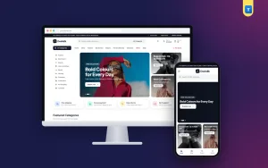
Building this marketplace website design from scratch takes months. A ready theme gets you there in days. Our multipurpose ecommerce WordPress theme, Doshdik, includes a three-row sticky header with a category search and an "All Categories" mega menu.
On the homepage you get a hero with category list and side banners, trust cards, ten featured category tiles, a flash sale with sold bars, product tabs, a "Shop your way" band, a deals bento grid, brand rows, reviews with video, a FAQ and a blog block.
It also includes a product page with a full-width gallery and a price box with the saving, a category page with round sub-category pictures and tidy filters, and the full shop.
The shop part covers bKash, Nagad, cash on delivery with an optional advance, district delivery charges, Steadfast and Pathao courier, order tracking and fake order protection. The one-click demo shows a finished store with 64 products in 10 categories, which you then replace with your own.
Checklist before launch
Test on a phone: can you find any category in two taps, can you search inside one category, do category pages have filters and counts, do deals show a clear value, does the delivery charge appear before payment, and does the checkout fit on one screen? If all six are yes, your store is ready.
Want to see these ideas on a working website? Open the Doshdik live demo and browse it on your phone and your computer.
Frequently asked questions
What is marketplace website design?
It is the layout and structure of a large online store with many categories: navigation, search, homepage sections, category pages, product pages and checkout.
How many categories should a marketplace website design show in the menu?
Ten or fewer top-level categories, each with sub-categories inside. More than that becomes hard to scan.
Do I need a multi-vendor system for a big store?
Not if you sell your own stock. A single-seller store with many categories is simpler to run. Add multi-vendor features only when other sellers join.
Which online shopping website design template should I use?
Choose one made for large catalogues, with a mega menu, category search, deals blocks and local payments built in, so you do not have to add them yourself.