Strong mobile accessories shop design ideas make a small, low-priced product look worth buying. Cases, chargers, cables, earbuds and power banks all look alike in a photo, so your design has to show the difference at a glance. A tidy layout is often what turns a quick look into an order.
This guide gives you practical ideas for the layout, categories, product cards, offers and checkout of an accessories shop. The examples suit small sellers in Bangladesh who sell through Facebook and want a real website with bKash, Nagad and cash on delivery.
Understand who buys mobile accessories
Accessories are cheap and bought often. That changes how people shop, and so it changes the design.
- Most buyers know their phone model and need something that fits it.
- They decide quickly, often within a minute.
- They are price-sensitive and compare with Facebook pages and market shops.
- They worry about fake or weak products, especially chargers and cables.
- They often add two or three items in one order.
Good mobile accessories shop design ideas start from these habits: fit first, price second, trust always.
Organise categories by what people search
Clear categories reduce the work for the buyer. Use the words customers use.
- Chargers and cables: fast chargers, car chargers, wireless chargers, data cables.
- Audio: wired earphones, wireless earbuds, headphones, speakers.
- Power banks: grouped by capacity.
- Cases and covers: by phone brand and model.
- Screen protectors: glass and film, by model.
- Holders and gadgets: stands, selfie sticks, ring lights.
- Smart watches and bands.
Add a second way in: shop by phone model. A buyer with one phone should be able to tap the model and see only items that fit.
A shop-by-model example
Shop by model is the idea that saves the most time. It works like this.
- Create one category or tag for each popular phone brand.
- Add a sub-level for the top models you see in your area.
- Tag every case, glass and charger with the models it fits.
- Put a "Find your phone" box on the home page and on category pages.
The buyer picks a model once and never sees an item that does not fit. That one feature cuts questions in your Facebook inbox and cuts returns.
Home page layout that works for accessories
An accessories shop has many cheap items, so the home page must move people to the right shelf fast. This order has worked for many small shops.

- Header with logo, search, cart and phone number.
- A banner slider with the best three offers.
- Round category icons for the main groups.
- A strip of "under 500 taka" and "under 1,000 taka" tiles.
- A sale block with a countdown.
- Best sellers and new arrivals.
- Shop by brand logos.
- Trust strip: genuine products, easy returns, fast delivery.
- Footer with address, hours and help links.
Keep the first screen simple. One strong offer beats five weak ones. Put the offer in plain words, with the price in taka and an end date, so nobody has to guess what the deal is.
Mobile accessories shop design ideas for product cards
The product card does most of the selling in a shop with many small items. Use a clear pattern for every card.
- A square photo on a plain background.
- Product name with brand and type, for example "Fast Charger 33W".
- Two or three key facts: power, length, compatible models.
- Price with the old price crossed once, when there is a discount.
- A rating, if you have honest reviews.
- One clear Add to cart button.
Avoid long names that get cut off on a phone. Keep the card text short and put the detail on the product page.
Product pages that remove doubt
Chargers and cables are products where a bad purchase hurts. Your product page should calm that fear.
- Photos of the product, the box and the connector.
- A short list of compatible phones.
- Specs in plain words, such as 33W, 1.2 metres, USB-C.
- Warranty or replacement days in a visible line.
- A note that the product is genuine, if it is.
- Reviews with photos, where you have them.
- Related items: a case that matches the glass protector, for example.
Trust ideas for cheap products
Even a 300 taka cable needs trust. Buyers have been burned by fakes before.
- Say plainly where the stock comes from and who gives the warranty.
- Show a real shop address and a phone number in the header.
- Use a short return rule, for example seven days for faulty items.
- Show customer photos where you can.
- Answer questions on the product page, not only in private messages.
Use bundles and offers
Accessories have a low price, so the order value stays small unless you help it grow. Offers are the simplest way.
- Bundles: case plus glass protector at a small discount.
- Free delivery over a limit: a clear target such as 1,500 taka.
- Buy two, save: useful for cables and cases.
- Flash sale: a short timer for a few items, with a stock bar.
- Vouchers: a small coupon for a first order.
Show the saving in taka, not only as a percentage. "Save 120 taka" is easier to feel than "15% off".
Photography ideas for small items
Photos matter more here than on almost any other shop. A clear picture tells the buyer you are real.
- Use one background colour for all products.
- Shoot from the front, the side and a close-up of the connector or detail.
- Show the product being used, for example a phone on a charging stand.
- Add one picture of the box contents.
- Keep the same image size, so the grid stays tidy.
Natural window light and a white sheet are enough to start. You do not need a studio.
Checkout and delivery in Bangladesh
Small orders cannot carry a long checkout. Make it short.
- Let the buyer order from the cart without creating an account.
- Ask for name, phone, full address and payment choice on one page.
- Offer bKash, Nagad and cash on delivery.
- Show the delivery charge before the final button.
- Send the order to your courier and share a tracking link.
- Confirm risky orders with a quick call or SMS.
For small items, a clear delivery charge matters. A surprise fee at the last step is a common reason for abandoned carts.
Packing and after-sale details
Design does not end at checkout. What the buyer receives is part of the experience, and it decides whether they order again.
- Pack glass protectors and cases in a hard envelope so they do not bend.
- Put a small card in each parcel with your shop name, page link and phone number.
- Send a short thank-you message with the courier tracking number.
- Ask for a review a few days after delivery, with a direct link.
- Offer a clear way to report a faulty item, with a photo.
These small habits cost little. They turn one-time buyers into regular customers, who tell their friends.
Mobile accessories shop design ideas for small screens
Your buyers are already holding a phone. Design for that screen first.
- Large buttons and a sticky Add to cart bar.
- Two product cards per row on small screens.
- Light images that load fast on mobile data.
- A search box that stays at the top.
- Filters that open as a simple panel.
Learn from examples of electronic appliances stores
An accessories shop can borrow ideas from stores that sell larger items. Looking at examples of electronic appliances shops shows how they handle trust, budget and comparison, which are the same problems you face on a smaller scale.
- Spec cards: key facts on the card itself, so buyers need fewer clicks.
- Warranty pills: a small label showing the warranty length.
- Compare: side-by-side tables for two or more items, which suits power banks and earbuds well.
- Shop by budget and by need: tiles that start with the buyer's goal.
- Deal countdowns: a clear timer with a stock bar.
A related ready-made option: Bijli
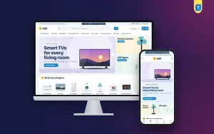
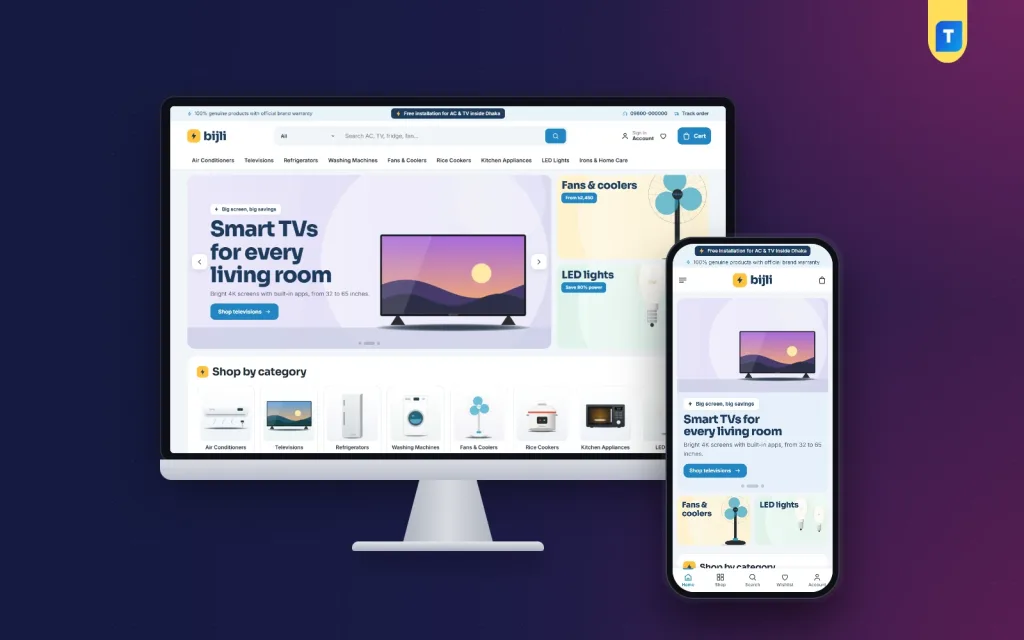
If you sell larger items as well, such as fans, lights or kitchen helpers, Bijli is a WordPress theme worth a look. It is made for electronics and appliance shops, so be clear that its demo shows appliances rather than phone accessories. The same blocks, however, suit a gadget shop.
- 23 home page blocks that you can switch on and off and re-order.
- Spec cards with a warranty pill and an EMI price.
- Compare for up to four products side by side.
- An EMI calculator block.
- Power deals with countdown and stock bars.
- Shop by need, room and budget.
- Five colour palettes and four font pairs.
- A demo with 47 appliances from six brands.
- Login popup, one-page checkout, bKash, Nagad, SSLCommerz and cash on delivery.
- Steadfast and Pathao courier with order tracking.
Good examples of electronic appliances shops often use exactly these tools, and Bijli puts them in one package. You can import the demo, then replace the content with your own products.
Bring Facebook buyers to the website
Most accessories shops in Bangladesh already have a Facebook page. The website should not replace it. It should make it easier to sell.
- Link every post to the exact product page, not only to the home page.
- Use the same prices and the same photos on both.
- Pin a post with the website address and the delivery rules.
- Share your offers page before Eid and other big shopping days.
- Keep the Messenger link on the site for questions.
Over time, your website becomes the place where the catalogue lives, and Facebook becomes the place where you talk to people. Many of the strongest mobile accessories shop design ideas are simply about making that hand-off smooth.
A one-week test plan
- Day one: post three products with direct links.
- Day two: send the link to ten past customers.
- Day three: check which pages got visits but no orders.
- Day four: fix photos or prices on those pages.
- Day five: run a small bundle offer.
- Day six: read all customer messages and note repeated questions.
- Day seven: add answers to the product pages.
Plan your launch
- List your categories and your top 30 products.
- Take photos in the same style.
- Write short names and three key facts for each item.
- Choose a theme and import its demo.
- Replace the demo with your content.
- Connect payment and courier.
- Add a bundle and one first-order voucher.
- Place a test order from your phone.
- Share the link on Facebook with one clear offer.
Common mistakes
These errors show up again and again on new accessories sites. Check your own pages against the list.
- Too many categories with only one product each.
- Poor photos shot in a dark room.
- No list of compatible models for cases and glass.
- Different prices on Facebook and on the site.
- Hidden delivery charges.
- Slow pages caused by heavy banners.
Review your site every month. The best mobile accessories shop design ideas are the ones you test and adjust with real orders. To see a full working layout of the kind described here, you can open the Bijli demo on your phone.
If you want to read more on the technical side, the official WordPress documentation is a good, reliable reference.
Frequently asked questions
What are the best mobile accessories shop design ideas for a beginner?
Keep the layout simple: a clear search box, round category icons, price tiles and clean product cards with three key facts each. Add bundles and a first-order voucher.
How many products should an accessories shop launch with?
Thirty to fifty well-photographed items are enough. Add new ones every week.
How do I show which accessories fit which phone?
Add a shop-by-model menu and list compatible models on each product page. Use tags or categories for each brand and model.
Which payment methods should I offer?
Offer bKash, Nagad and cash on delivery. Add a card gateway if your customers ask for it.
Can I use an appliance theme for an accessories shop?
You can use its blocks, such as spec cards, deals and compare, but check the demo first. Bijli is built for appliances, so you will replace the content and may switch some blocks off.
Where can I find examples of electronic appliances stores?
Look at local and international shops that sell large electronics. Note how they show warranty, specs and monthly payment, then apply the useful parts to your own site.