Good multi vendor ecommerce website design starts with the buyer, not the seller. A shopper wants to find a product fast, trust the person selling it and pay in a way they know. If your design does those three things, the rest is detail.
This guide walks through the design choices that matter: the home page, the seller cards, the product page, checkout and mobile. It also covers the choice between a true multi-seller platform and a single-owner marketplace look, which many shop owners in Bangladesh need to settle first.
Start by choosing your marketplace model
Before any design work, decide how your marketplace will run. The answer changes the design, the cost and the workload.
- Open marketplace: sellers sign up, upload products and manage orders. You earn a commission. You need seller dashboards, payouts and rules.
- Curated marketplace: you pick the sellers and enter their products yourself. Sellers appear as stores, but you handle orders and payments.
- Mall model: a business group or a shopping centre puts its partner shops online under one roof. This is a curated marketplace with a strong store identity.
Many small teams assume they need the open model. In practice, the curated model is easier to run and easier to keep consistent. You control photos, prices and quality, and customers see one clean shop.
Plan the structure of your multi vendor ecommerce website design
A marketplace has more levels than a normal shop. Draw them on paper first.
- Home page: the entry point, with offers, categories and stores.
- Category pages: lists of products with filters.
- Store pages: one page per seller with its products and details.
- Product pages: photos, price, seller, delivery and reviews.
- Cart and checkout: the shortest path from product to payment.
- Account pages: orders, wishlist and addresses.
- Help pages: delivery, returns, contact.
Keep the menu shallow. A buyer should reach any product in three taps or fewer.
Design the home page like a market street
A marketplace home page is closer to a busy street than a quiet shop window. People expect many things, but they still need a clear path. Use blocks, each with one job.
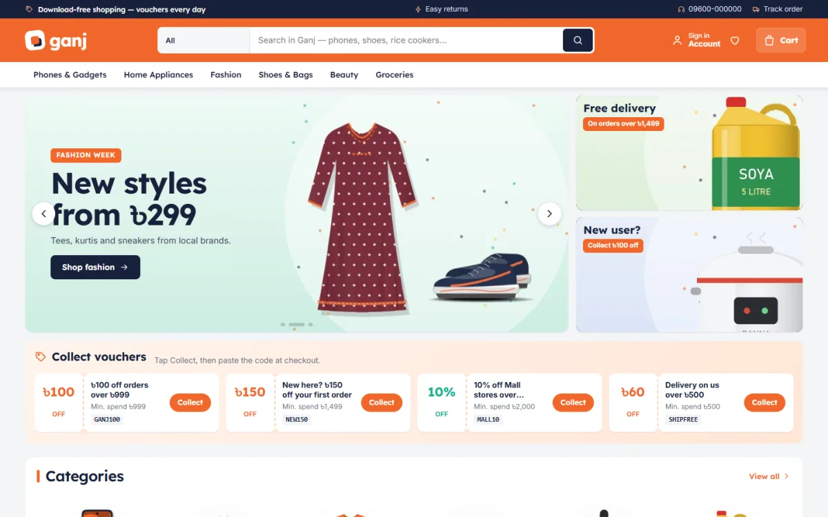
- Hero slider: two or three current campaigns, with offer cards beside it.
- Voucher strip: public coupons that shoppers can collect.
- Category icons: a grid of eight to twelve main groups.
- Flash sale: products with a countdown and a stock bar.
- Shop by store: seller cards with logo and rating.
- Best sellers: tabs by category.
- Shop by budget: price tiles for people who start with money, not a model.
- Department blocks: a banner plus a row of products for each big category.
- Top rated and trending: proof that other people bought.
You do not have to launch with every block. A good theme lets you switch blocks off and drag them into a new order.
Make sellers visible in your multi vendor ecommerce website design
Buyers return to a marketplace for the stores inside it. The design should show that clearly.
Store cards
A store card is a small box on the home page. It should hold the logo, the store name, a rating, items sold and return days. A badge for official stores helps larger brands stand out.
Seller name on every product
Put the seller name on the product card and on the product page. If a buyer has had a good experience with a store, they will look for that name again.
Store pages
Each store page needs a banner, a short description, a product list and the return policy. Keep the layout the same for every store, so the whole site feels like one brand.
Product pages that build trust
When a stranger sells to a stranger, details calm the buyer. Design the product page with these points in mind.
- Clear photos from several angles, all in the same size.
- Price and discount in one place.
- Seller name and expected delivery date near the buy button.
- Short bullet points before the long description.
- Size, colour or storage choices as buttons.
- Reviews that can be opened, and a polite prompt for the first review.
- Related products from the same store and from other stores.
Vouchers, flash sales and other sales tools
Marketplaces grow on offers. Design these tools so they are easy to use.
- Vouchers: show them as tickets. One tap should copy the code, ready to paste at checkout.
- Flash sale: a countdown and a stock bar create honest urgency. Do not run a fake timer.
- Offer cards: small tiles next to the main slider for the best three deals.
- Under a price: tiles such as under 500 or under 1,000 taka.
Plan the sale calendar too: Eid, Pohela Boishakh, 11.11 and year-end. Prepare banners a week early.
Checkout, payments and delivery in Bangladesh
A beautiful design fails if checkout is hard. For Bangladesh, plan the payment step with care.
- One-page checkout: name, phone, address, payment and confirm on one screen.
- bKash and Nagad: show the logos early, not only on the last step.
- Cash on delivery: keep it, and use a phone or SMS check to catch fake orders.
- Courier choice: connect to the couriers you use, and show a tracking page.
- Guest buying: let people order with a phone number and an OTP, rather than forcing a long sign-up.
Every extra field loses some buyers. Ask only what the courier needs.
Design for phones first
Most of your visitors will arrive from Facebook on a phone. Design for that screen first, then check the desktop.
- Use large tap targets and a sticky buy button.
- Keep sliders light and images compressed.
- Make filters open as a panel, not a long list.
- Avoid tiny text on product cards.
- Test on a mid-range Android phone with mobile data, not only on your fast office Wi-Fi.
Colour, type and layout
A marketplace holds many kinds of products, so the design frame should stay quiet. Use one strong brand colour, one accent for sale items and a plain white card.
- Pick one font for headings and one for body text.
- Use square or evenly sized product cards so mixed categories line up.
- Keep sale colours for sale items only. If everything is red, nothing stands out.
- Leave white space around the search box and the buy button.
Test your colours for contrast. Small grey text on a white card is hard to read in sunlight.
Using a multivendor website design template
You can have a designer draw every page, or you can start from a ready-made multivendor website design template and adjust it. For most small businesses the second route is faster and cheaper. Check the following before you buy.
- Does the demo look like your kind of shop?
- Can you switch home page blocks on and off?
- Does it include a cart, checkout and order management, or do you need extra plugins?
- Are local payments and couriers included?
- Does the dashboard work on a phone?
- Is the seller question stated honestly: does it add seller logins or not?
A ready-made option: Ganj
Ganj is a WordPress theme built for the curated and mall models. It gives you the look and flow of a marketplace, with many sellers under one roof.
What it includes:
- Seller store cards with logo, Mall badge, live rating, items sold and return days.
- Collectable voucher tickets, where a tap copies the code.
- A flash sale block with countdown and stock bars.
- Offer cards beside the hero slider.
- Seller name and delivery date on product pages.
- 24 home page blocks that can be switched and re-ordered.
- Five colour palettes.
- One-page checkout with bKash, Nagad and cash on delivery, plus Steadfast and Pathao courier delivery.
- A one-click demo with 29 products from seven sellers.
Please note: Ganj does not add separate seller logins, seller dashboards or commission payouts. You run products, orders and payments yourself from the Shop menu. If you manage stock for partner stores, that is a good fit. If you need open seller sign-up, choose a different tool.
If you want to see how these blocks fit together before you decide, open the demo of Ganj on your phone and scroll from the slider down to the footer.
Photos and content that make the design work
Design is only half of the page. Weak content ruins a strong layout, and a marketplace has the extra problem that many people supply that content.
- Photo rules: write a one-page guide for every seller. Square images, plain background, at least 800 pixels wide, no watermarks from other sites.
- Title rules: brand, product type and one key fact, for example size or storage. Avoid all capital letters.
- Description rules: three short bullet points first, then a few lines of detail.
- Price rules: show the final price in taka. If there is a discount, show the old price once, not three times.
- Store profile rules: one logo, one banner and two lines about the store.
A strict guide feels hard at first, but it is what makes multi vendor ecommerce website design look professional. Buyers read consistency as safety.
Step-by-step launch plan
- Choose the model: open, curated or mall.
- List your sellers and categories.
- Collect logos, banners and product photos in a common size.
- Install the theme and import the demo.
- Replace demo stores and products with yours.
- Set your payment methods and courier.
- Create voucher codes for the first campaign.
- Write delivery, return and contact pages.
- Test an order on phone and desktop.
- Announce the launch on your Facebook page with a link to the flash sale.
Common design mistakes
- Too many blocks on day one, with empty sections.
- Different photo sizes from each seller.
- Hiding the seller name, so buyers do not know who sends the parcel.
- Slow banners that block the first screen.
- A checkout that asks for an email address nobody uses.
- No return policy, which makes first-time buyers nervous.
Good multi vendor ecommerce website design is mostly discipline: fewer blocks, cleaner photos and clear information.
How to measure whether the design works
After launch, watch a few simple numbers each week. You do not need a complex tool.
- Search use: if many visitors search and then leave, your product names or categories are unclear.
- Cart to order rate: a big drop means checkout has a problem, often a payment or delivery surprise.
- Most-clicked blocks: keep these high on the home page. Move blocks nobody touches.
- Return reasons: note them for each store. Repeated reasons point to a photo or description fix.
- Phone share: if most visitors use phones, give mobile problems priority over desktop polish.
Make one change at a time, so you know what caused the result. Keep a log with the date and the change.
Final checklist before launch
- Home page loads fast on mobile data.
- Every store has a logo, a rating and a return policy.
- Product photos use the same ratio.
- Vouchers work at checkout.
- bKash, Nagad and cash on delivery are tested.
- Courier details reach the right account.
- Policy and contact pages are live.
- You have placed at least three test orders.
If you want to read more on the technical side, the official WordPress documentation is a good, reliable reference.
Frequently asked questions
What makes good multi vendor ecommerce website design?
Clear search, visible seller names, simple product pages, trusted payments and a fast mobile layout. Fancy effects matter less than these basics.
How much does it cost to build a marketplace website?
A custom build can cost a lot and take months. A ready-made WordPress theme costs far less and can be live in days if your content is ready.
Do I need sellers to log in?
Only if you run an open marketplace. If you manage stock yourself, you can show sellers as stores and run everything from one dashboard.
Does Ganj support seller dashboards or commissions?
No. Ganj shows sellers as stores inside your one shop. It does not add seller logins or payout tools.
Which payment methods should I offer?
bKash, Nagad and cash on delivery cover most buyers in Bangladesh. Add a card gateway if your customers ask for it.
How do I handle fake cash on delivery orders?
Confirm risky orders by phone or SMS and use OTP checks. Good multi vendor ecommerce website design includes tools for this, so your courier is not sending parcels that nobody wants.