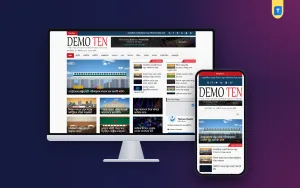
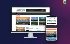
News magazine website design is the craft of arranging headlines, photos, sections and ads so that readers find a story in seconds and keep reading. A good layout feels calm and clear. A poor one feels like a crowded noticeboard, and readers leave.
This guide shows how to plan the design of a news magazine site step by step. You will see which page areas matter, how to handle Bangla text, where to place ads, and what to check on a phone. Every section has a list you can use as you work.
What news magazine website design really means
The phrase mixes two ideas. A news site is built around speed: new stories, short reports, constant updates. A magazine site is built around depth: features, columns, large photos and a pleasing look. News magazine website design joins both, so a reader gets fresh news and good long reads from the same home page.
The design has to answer four questions fast:
- What is the biggest story right now?
- What else is new?
- Where do I find my favourite section?
- Is this site trustworthy?
If the home page answers these without effort, the design is working.
Start with your readers, not with colours
Most people start by picking colours and fonts. Start instead with the reader. Write down who they are and how they reach you.
- Do most readers come from Facebook and open links on a phone?
- Do they read in Bangla, English or both?
- Do they want quick headlines, or long features?
- Do they use slow mobile data?
- Are they local readers, or spread across the country and abroad?
A short example
Imagine a district news site. Its readers are mostly young adults who open links from Facebook on a mid-range phone, with limited data. They want the headline, one photo and a short report. They rarely scroll through long menus. For these readers, the design should use a single lead story, a clean latest list, big tap targets and light pages. Fancy sliders and heavy animation would add cost and give nothing back.
The answers decide your layout. A site for commuters reading headlines on a phone needs short blocks and big tap targets. A site for readers who enjoy features needs more space for photos and long text.
Plan the home page of a news magazine website design
The home page is the shop window. Plan it as a set of blocks, from top to bottom.
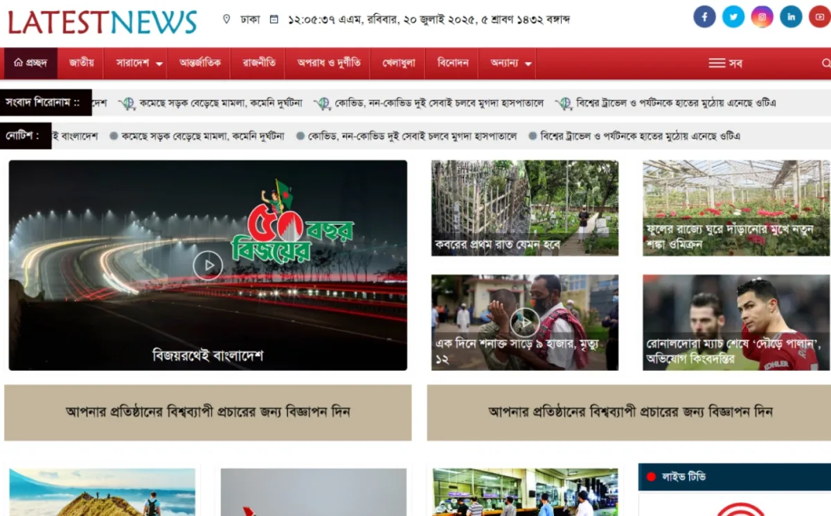
- Header. Logo, date, a search icon and the main menu.
- Breaking news strip. One line with the latest urgent headline.
- Lead area. One large story, with two or three smaller ones beside it.
- Latest news list. Fresh items in time order.
- Section blocks. Politics, sports, business, entertainment and your local desks.
- Feature or magazine area. Long reads, interviews and opinion pieces.
- Photo or video block. A visual break in the middle of the page.
- Sidebar. Most read stories, subscribe box and social links.
- Footer. About, contact, privacy policy and editorial rules.
Do not try to show everything. Choose what matters most and let the rest live inside section pages.
Do not forget the inner pages
Many readers never see your home page. They land on a story from a shared link. For this reason, news magazine website design must cover the inner pages as carefully as the front.
- Article page: headline, writer, date, photo, readable text and related stories at the end.
- Category page: a clear title, a lead item and a tidy list of the latest stories in that section.
- Search results: headlines, dates and short summaries.
- Author page: a short profile and a list of that writer's work, which builds trust.
- Error page: a friendly message with a search box and links to popular sections.
Layout rules that make a news site easy to read
Good layout is mostly discipline. These rules work on almost every site.
- One main focus per screen. The eye should land on the lead story first.
- Clear hierarchy. Big headline, smaller headline, then plain list items.
- Generous spacing. White space helps tired eyes, especially on phones.
- Consistent style. Same fonts, same photo ratios, same colours across the site.
- Few colours. One main colour, one accent and neutral greys.
- Grid alignment. Blocks that line up look professional and trustworthy.
Typography for Bangla and English news
Text is the product of a news site, so typography deserves care.
Bangla text
Bangla letters have joined shapes and small marks. Use a font size large enough that those marks stay clear. Body text of at least 17 to 18 pixels on phones is a good start. Give lines enough height so that stacked letters do not touch.
English text
A plain, readable font works better than a decorative one. Keep line length moderate, around 60 to 80 characters, so readers do not lose their place.
Reading comfort
- Use dark text on a light background for the main story text.
- Keep paragraphs short, two to four lines on a phone.
- Add subheadings in long features, so readers can scan.
- Highlight links with a clear colour and underline.
- Do not place text over busy photos.
Headlines
- Use a strong, bold style that stands apart from body text.
- Keep headlines short enough to fit in two lines on a phone.
- Avoid all capital letters for Bangla and English headlines.
Design for mobile first
Most readers in Bangladesh open news on a phone, often from a Facebook link. Design the phone layout first and the desktop second.
- Use a single column for story lists.
- Make menus easy to tap, with enough space between links.
- Keep the first screen light, so the lead story appears quickly.
- Compress photos, since slow data punishes heavy pages.
- Test on an ordinary mid-range phone, not only on your own.
- Avoid pop-ups that cover the story.
Photos, video and visual balance
Strong visuals make a magazine feel alive, but they must support the story, never fight it.
A magazine look depends on strong images. A news site depends on speed. Balance both with a few simple habits.
- Use one photo size for list items and another for lead stories, and keep them consistent.
- Crop to the same shape so rows look tidy.
- Write short captions that add information.
- Use your own photos where you can. Do not take pictures from other sites.
- Embed video in the article, but do not auto-play sound.
- Add short descriptions to images for readers who use screen readers.
Where to place ads without hurting the design
Ads pay the bills, but they can spoil a clean layout. Plan their position before you add any code.
- One wide unit below the header or the lead story.
- One box in the sidebar on desktop.
- One or two units inside long articles, between paragraphs.
- Nothing that covers the headline or the first paragraph.
- No ads that look like menu buttons or story links.
Follow the rules of your ad program. Never ask readers to click ads. A few well-placed units earn better than many crowded around the text, and they keep readers on the page.
Speed is part of the design
Search engines and readers both prefer pages that open quickly. For news, a delay of a few seconds can mean a lost reader.
A beautiful page that opens slowly is a poor design. Speed belongs in your plan.
- Pick a light theme with clean code.
- Resize photos before upload.
- Use a caching plugin.
- Limit the number of plugins to what you really use.
- Choose hosting that copes with traffic spikes from social media.
- Test on mobile data and watch how long the lead story takes to appear.
Pick a theme: what to look for
Good news magazine website design starts with the right base, because a theme sets the grid, the fonts and the speed. Few publishers build from zero. Most start from a theme. Check these points when you compare options, and when you search for the best news portal theme WordPress offers for your case.
- A layout that fits your plan: lead area, section blocks, sidebar.
- Bangla and English support, if you need both.
- Category pages for every desk.
- A responsive design that looks good on phones.
- Ad-friendly areas.
- Options in the dashboard, so you do not need code for common changes.
- A licence that fits how many sites you will run.
- A live demo you can test on your own phone.
The best news portal theme WordPress has for a small team is the one that matches your plan, loads fast and does not need a developer for daily work.
A ready-made option for news and magazine layouts
If you want a theme built for fast-moving stories, Latest News WordPress Theme is one choice. It is made for news portals that post many items a day, such as local reports, politics, sports and entertainment.
- A clean, fast interface with a dynamic layout for live updates.
- Bangla and English content support on the same site.
- A fully responsive design for phone, tablet and desktop.
- Space for photos and embedded video inside articles.
- Ad-friendly areas, where you paste your own code after approval.
- An SEO-friendly page structure and category pages for each desk.
- Changes from the normal WordPress dashboard, with no coding.
- An unlimited-use licence for as many of your own domains as you need.
You can see the demo and current price on the Latest News product page. Payment works with bKash, Nagad or Rocket, and the download reaches your account after the payment is checked.
Common design mistakes
Most weak designs fail for the same few reasons. Check your own plan against this list, and fix problems while they are still cheap to fix.
- Too many blocks on the home page. Readers get lost.
- Too many fonts and colours. It looks messy.
- Tiny Bangla text. Readers strain and leave.
- Heavy sliders. They slow the page and few people use them.
- Ads above everything. Readers see no news.
- No clear dates. News readers care when a story was posted.
- Ignoring the phone. Most of your traffic is there.
When you review a draft, ask one friend who has never seen the site to find the latest sports story and the contact page. Watch where they hesitate. Every pause points to a design problem. This small test costs nothing and often shows more than hours of looking at the screen yourself. Repeat it after each larger change, and write down what you learn for the next update.
A final design checklist
Before launch, test your news magazine website design against this list.
- The lead story is clear within one second.
- Menu names match what readers expect.
- Body text is easy to read on a small phone.
- Photos are the same shape and load fast.
- Ads sit in a few clean spots.
- Every story shows the date, writer and category.
- The footer links to about, contact and privacy pages.
- The site works on mobile data without long waits.
If you want to read more on the technical side, the official WordPress documentation is a good, reliable reference.
Frequently asked questions
What is the best news magazine website design for beginners?
A simple one: a lead story, a latest news list, a few section blocks and a sidebar. Add extras only when readers ask for them.
How many sections should the menu have?
Five to eight is enough for most sites. Put the rest under a "More" link or inside category pages.
Should I use a slider on the home page?
Usually not. Sliders are heavy, and few readers click past the first slide. A static lead story works better.
Can I change the design later?
Yes. With a good theme, you can change colours, logo, menus and widgets from the dashboard without losing your stories.
Does news magazine website design affect income?
It can. A clear, fast layout keeps readers longer, and ad areas in good spots perform better. No result is promised, since income also depends on traffic and content.
Which is the best news portal theme WordPress offers for Bangla sites?
Look for Bangla text support, fast loading and a layout for many sections. Test a demo on your own phone before you decide.
Do I need a developer?
Not for daily work. A well-made theme lets you add stories, edit menus and change the logo from the normal dashboard.