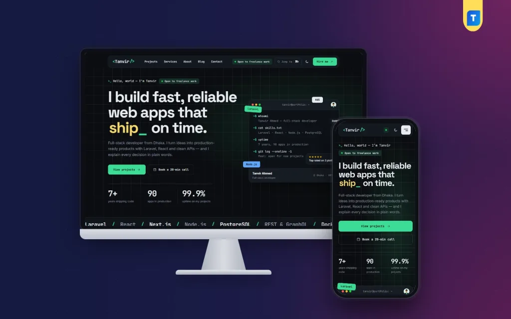
Good personal portfolio website design ideas start with one question: what should a stranger know about you after thirty seconds? A portfolio is not a gallery of everything you have done. It is a short, honest answer to "can this person solve my problem?"
This guide is for freelancers, developers, designers and writers in Bangladesh who want a portfolio that brings real enquiries. You will find layout ideas, a content checklist, common mistakes and a simple plan to launch in a weekend. Pick what fits your work and skip the rest.
What a personal portfolio website must do
Before you look at colours and fonts, be clear about the job of the site. A portfolio has four jobs, and every design choice should serve one of them.
- Say who you are. One clear line: what you do, for whom.
- Prove it. Two to six projects with results, not just screenshots.
- Remove doubt. Show your tools, process, prices or ranges, and how fast you reply.
- Make contact easy. One form, one email, one WhatsApp number.
If a section does not help with one of these jobs, cut it. Most weak portfolios fail because they try to show everything and say nothing.
Know your visitor first
Design changes depending on who is looking. A client hiring a developer checks different things from a recruiter or a fellow designer.
- Clients want proof of results, a price range and a simple way to start.
- Recruiters want your stack, your experience and a downloadable CV.
- Agencies want your availability, rates and a reliable process.
- Foreign buyers want clear English, time zone, payment methods and fast replies.
Choose one main visitor. Write the homepage for that person and keep the others in secondary links. A freelancer who sells to foreign clients needs a different first screen from a graduate looking for a job in Dhaka.
Personal portfolio website design ideas for the first screen
The first screen decides whether people scroll. These layouts work well because they answer "who and what" immediately.

- Name and one-line promise. "Full-stack developer who builds fast online shops." Add one button: "See my work" or "Hire me".
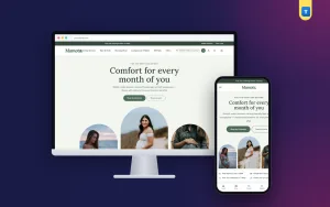
- Photo plus short intro. A real, well-lit photo builds trust. Keep the intro under 40 words.
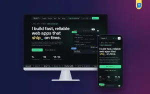
- Terminal or code-style intro. For developers, a small typed line such as a command prompt feels natural and shows your field without a long explanation.
- Featured project hero. Show your best project large, with a one-line result beside it.
- Status badge. A small label such as "Open to freelance work" tells visitors you are available right now.
Avoid sliders that change on their own, long loading animations and a hero that only says "Welcome to my website". Visitors do not need a welcome. They need a reason to stay.
Choose a colour and mood that matches your work
Colour tells people what kind of professional you are before they read a word. Keep it simple: one main colour, one accent, plenty of space.
- Dark background with a bright accent. Popular with developers, DevOps engineers and game designers. It feels technical and focused.
- Light, clean background. Good for writers, consultants and photographers. It feels calm and readable.
- Warm tones. Suit illustrators, coaches and creative studios.
A useful idea is to offer both modes: dark by default with a switch for light. Some people read better on light screens, especially outdoors in bright sunlight, which is common on phones in Bangladesh.
Whatever you choose, check contrast. Grey text on a dark grey background looks stylish and is hard to read. Test your site on a cheap phone, not only your own laptop.
Typography ideas that look professional
Two fonts are enough. Use one for headings and one for body text. Here are pairings that work as a pattern:
- A monospaced font for headings and a clean sans-serif for text, for developers.
- A serif heading with a sans-serif body, for writers and consultants.
- A rounded sans-serif for both, for designers and friendly service providers.
Keep body text at 16 pixels or larger and lines to about 60-75 characters. If your audience includes Bangla readers, test a Bangla font too, because some English fonts look uneven beside Bangla text.
Structure: the sections a portfolio needs
You do not need twenty pages. Good personal portfolio website design ideas are mostly about order and clarity, not about extra features. A single long page with clear blocks often works better than a menu with many items. This is a proven order:
- Intro and main button
- Selected projects or case studies
- Skills or tech stack
- Services and prices (or a "starting from" range)
- About you, with a short story
- Testimonials or client names
- Blog or notes (optional)
- Contact form
Let visitors jump to any part from the header. If your site has many pages, a quick search or command palette helps people find projects without hunting through menus.
Show projects as case studies, not screenshots
A screenshot says "I made something". A case study says "I solved a problem". This is the biggest upgrade you can make to any portfolio.
For each project, write four short parts:
- Problem. What did the client need?
- What you did. Your role and the main steps.
- Stack and timeline. Tools used and how many weeks it took.
- Result. Orders, speed, saved hours, or a client quote.
If you do not have client work yet, build two or three practical projects of your own: a small shop for a local business, a booking page, a dashboard. Real-looking work with a clear story beats an empty portfolio.
Add a live link when possible. Visitors trust something they can click.
Personal portfolio website design ideas for developers
Developers have extra ways to show skill. Use them lightly so the page does not turn into a toy.

- Tech stack table. Group tools by area: front end, back end, database, hosting, tools. It is easier to scan than a cloud of logos.
- Contribution grid. A small activity grid shows steady work over time.
- Command palette. A keyboard shortcut that opens a jump menu feels natural for people who live in a code editor.
- Pricing packages. Hourly, fixed price and monthly retainer options help clients pick without a long email chain.
- Project estimator. A small tool that gives a price range and timeline by project type filters out unserious enquiries and saves you time.
Be careful with effects. A typed intro is nice for three seconds. A page that makes people wait to read is not.
Personal portfolio website design ideas for designers and creatives
Designers should let the work speak, but organise it well.
- Use a grid with consistent image sizes and short captions.
- Put your best three projects at the top. Hide the rest behind "More work".
- Show process images: sketches, drafts, before and after.
- Add the project type as a filter, such as logo, packaging or social media.
Photographers can use full-width images with minimal text. Writers do better with short article cards and a clear list of topics they cover. In every case, include one sentence about the kind of client you want, because it attracts better enquiries.
Contact form ideas that bring better enquiries
A contact page with only "name, email, message" gets vague messages. Add small choices that guide the visitor.
- Project type: website, app, design, support.
- Budget range: a few clear bands, so you know whether it fits.
- Timeline: this month, next month, flexible.
- A WhatsApp button, since many Bangladeshi clients prefer to chat.
State your reply time ("I answer within 24 hours") and keep that promise. Also test the form yourself every month. A broken contact form costs more than any design flaw.
Mobile and speed checklist
Most visitors will open your portfolio on a phone, often on a mobile data connection. Use this checklist before you launch:
- Images compressed, under 200 KB each where possible.
- Buttons large enough to tap with a thumb.
- No text smaller than 16 pixels.
- No horizontal scrolling.
- The form works on a small screen.
- The page loads in about three seconds on a mid-range phone.
- Your name, role and contact link are visible without scrolling.
A ready-made option: Akkhor
If you do not want to build a design from nothing, a ready-made theme can save weeks. Akkhor is a developer portfolio WordPress theme made for web and app developers, DevOps engineers and technical freelancers. It follows several of the ideas above.
- Dark by default, with a switch to a light look.
- A command palette that jumps to pages and projects.
- A terminal-style intro that types itself out.
- 13 homepage blocks that you can switch on, switch off and re-order.
- A tech stack table, a contribution activity grid, case studies with stack, timeline and live link.
- Hourly, fixed and retainer pricing packages, and a project estimator.
- A contact form with project-type and budget choices.
- 5 colour palettes and 6 font pairs.
It is a personal website with no shop attached, so it stays focused on you and your work. You can replace the demo content with your own. Whatever theme you pick, check that it matches your visitor and your type of work. You can see the full feature list on the Akkhor product page.
Mistakes to avoid
- Too many projects. Six strong ones beat twenty average ones.
- No contact details on the homepage. Make it findable in one tap.
- Vague words. "Passionate creative thinker" tells no one anything. Say what you build.
- Old work. Remove projects that no longer show your level.
- Copying another portfolio. Use ideas, not the same layout and text.
- Hidden prices. Even a "starting from" amount saves both sides time.
- No updates. A site that says "2022" in the footer looks abandoned.
Test your design with real people
You are too close to your own site to judge it. Ask three people who match your target visitor to look at it for one minute, then answer these questions:
- What do I do?
- Which project did you notice first?
- Where would you click to contact me?
- Was anything confusing or slow?
If two of the three give the same complaint, fix it before you do anything else. This small test is cheaper than any redesign, and it shows quickly whether your chosen personal portfolio website design ideas work for real visitors and not only for you.
A simple weekend plan
- Friday evening: write your one-line promise, short bio and project list.
- Saturday morning: pick a layout and colour. Install your theme and set up the homepage blocks.
- Saturday afternoon: write two case studies and collect screenshots.
- Sunday morning: add services, prices and the contact form.
- Sunday afternoon: test on two phones, fix spelling and share the link with one friend for feedback.
Publish first and improve later. A good portfolio today is worth more than a perfect one next year.
After launch, spend ten minutes a week on it. Add one new result, one new testimonial or one small fix. Share the link in your Facebook and LinkedIn profiles, in your email signature and on your WhatsApp business profile, so every conversation can lead to your work.
Over a few months, these small habits matter more than any single design choice, and the best personal portfolio website design ideas are the ones you actually keep up.
Also keep a simple record of where your enquiries come from. If most messages arrive from one profile or one project, put that proof higher on the page. Your portfolio is a working tool, so let real numbers guide the next change instead of guesses. Review the numbers once a month and write down one change to try.
If you want to read more on the technical side, the official WordPress documentation is a good, reliable reference.
Frequently asked questions
What are the best personal portfolio website design ideas for beginners?
Keep it simple: a clear intro, three projects with short stories, a skills list and a contact form. Use one accent colour and two fonts. Simple pages load fast and are easy to update.
How many projects should a portfolio show?
Three to six is enough. Choose the ones that match the work you want to get next, and explain each with a problem, your role and a result.
Do I need a blog on my portfolio?
No, but a few useful posts can show your thinking and bring search visitors. If you cannot keep it updated, leave it out rather than show an empty page.
Should I show my prices?
A range or "starting from" price helps. It filters out visitors with a very different budget and makes enquiries more serious.
Which portfolio website design ideas work for developers?
Dark mode, a tech stack table, case studies with a live link, pricing packages and a short typed intro. Keep effects small so the page stays fast.
Is WordPress a good choice for a portfolio?
Yes. You can edit text yourself, add projects without code and keep full control of your own site. A theme made for portfolios speeds up the setup.
How often should I update my portfolio?
Add new work every few months and review the whole site twice a year. Remove old projects, update your skills and check that every link and form still works.