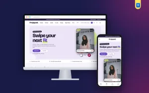
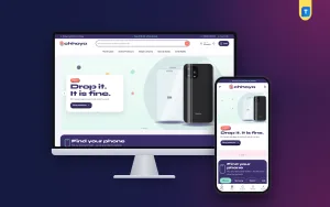
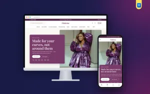
Good portfolio website examples show you what a visitor needs to see before they trust you with a project. They answer four quick questions: what do you do, have you done it before, what might it cost and how can I reach you? A portfolio that answers those four in order tends to win the message.
This guide explains how to study examples, which pages and blocks a strong portfolio has, and how to plan your own from a blank page. It is written for designers, photographers, illustrators, developers and small studios in Bangladesh who get clients through links, referrals and social pages.
What portfolio website examples can show you
Looking at other people's portfolios saves months of guessing. You learn which layouts feel clear, which wording gets to the point and which details make a visitor stop scrolling.
When you review a portfolio, look for these things:
- How fast you understand what the person does.
- How many projects they show on the first screen.
- Whether each project is a single picture or a full story.
- How easy it is to find prices or an enquiry form.
- What the site looks like on a phone.
- Whether you feel you could trust this person with your own money.
Good portfolio website examples also teach you tone. Some sound formal, others sound like a friend. Pick the voice that matches your clients, then keep it the same on every page.
Collect ten sites, not one. Any single site shows one person's taste. Ten sites show you the common rules.
Types of portfolio sites to look at
A portfolio for a photographer is not built the same way as one for a software developer. Choose examples that match your work.
- Visual portfolios. Photographers, illustrators and motion artists. The pictures do most of the talking, so the grid is large and the text is short.
- Case-study portfolios. Designers and brand builders. Each project is a small story with the client, the problem, your role and the result.
- Developer portfolios. Live links, short tech lists and code samples.
- Writer and consultant portfolios. Samples, short bios and testimonials.
- Studio portfolios. A team page, services, selected projects and a contact route for new work.
Searching for portfolio website examples by type, not by fame, gives you ideas you can actually use. Look at two or three of each type that overlaps with your work, then borrow the ideas that fit.
Pages and blocks every strong portfolio uses
Almost every successful portfolio follows the same order on the homepage. Visitors expect it, so it feels easy.
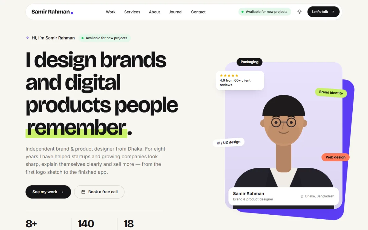
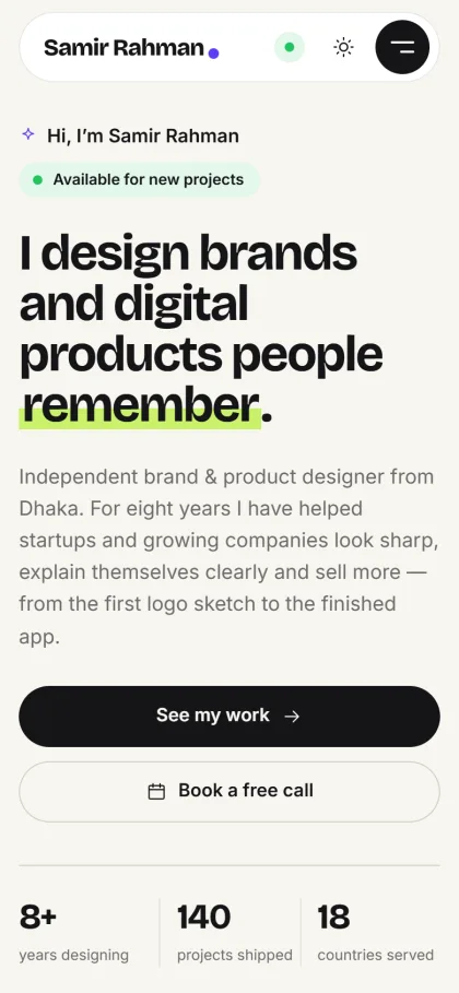
- Intro. A big headline that says what you do, and a portrait or a hero image.
- Numbers or skills. Years of experience, projects done, clients served.
- Client logos. A quiet row of companies you have worked with.
- Services. Three or four offers, each with a short line and, if you can, a starting price.
- Selected work. A grid of your best projects.
- Process. Three or four steps with rough timing.
- About. Your story, tools and skills.
- Testimonials. Short quotes from real clients.
- FAQ. The questions you answer again and again.
- Contact. A form, a phone number and an email.
On top of the homepage, build one page per big service and one page per project. Keep the menu short.
Personal portfolio website examples and what they get right
Personal sites are small, so every choice shows. The strongest personal portfolio website examples share a few habits.
- They put your name and your trade in the first line.
- They show three to six pieces of work, not fifty.
- They explain one or two projects in depth.
- They tell you whether the person is available for new work.
- They give one obvious way to get in touch.
Study portfolio website examples from freelancers at your own level, not only famous studios with big budgets. Their choices are easier to copy. Also notice what they leave out. There are rarely long life stories, clever puzzles or music that starts by itself. The visitor is busy.
How to read case studies in portfolio website examples
A picture of a logo does not tell a client much. A case study does. When you read portfolio website examples that use case studies, check the structure they follow.
- Facts row. Client, year, your role, timeline and a link to the live work.
- The problem. What the client needed, in two or three sentences.
- What you did. The steps, the choices and the reasons.
- The result. A number if you have one, such as sales, signups or time saved. If not, a client quote.
- Pictures. Before and after, process sketches and final files.
- Next project. A link that keeps the visitor browsing.
You do not need ten case studies. Compare how different portfolio website examples handle length: some use one screen, others use a long page with sections. Pick the length that matches the size of the job.
Three well-told ones beat twenty thin ones, and short is fine.
Choosing which work to show
New designers often show everything. Clients prefer a small, well-chosen selection. Use this checklist.
- Show only work you are proud of today.
- Pick projects that look like the jobs you want next, not only the jobs you had.
- Cover two or three types of work so you do not look limited.
- Lead with your strongest project.
- Remove anything older than three or four years unless it is exceptional.
- Get permission from the client before you publish confidential work.
If you have no client work yet, make two or three self-set projects. Pick a real brand problem, solve it, and write it up as a case study. Say clearly that it is a self-set project.
Pricing, packages and the estimator idea
Many freelancers hide prices because they fear losing clients. In practice, a price range filters out people who cannot pay and gives serious clients a reason to write. Examples that show packages or starting prices get more useful enquiries.
- Show three packages, with one highlighted as the usual choice.
- List what is included in each, in plain words.
- State the time it takes.
- Say what is extra, such as more revisions.
- Add a short form that asks for project type and budget.
Some portfolio sites go further and add an estimator. The visitor picks a project type, adds extras, sets a deadline and sees a price range and timeline. It helps clients plan, and it writes half of the brief for you.
Design details that make a portfolio feel professional
- Use one accent colour and keep the rest neutral.
- Choose two fonts and use them everywhere.
- Leave plenty of white space around each project.
- Use large, sharp images, but compress them so the page loads fast.
- Make the contact button visible in the header.
- Offer a dark mode if your audience likes it, but keep text readable in both modes.
- Show an availability note, such as "Available for new projects", and update it when you are booked.
- Test every page on a phone.
Write your text for a tired reader. Short sentences, plain words and a clear headline on every section help a busy client understand you in seconds. Avoid long lists of tools and buzzwords. One line on what you did and what changed for the client is worth more than ten adjectives about yourself.
Mobile matters because a client may open your link from a chat message while on the move. If it loads slowly or breaks, they will move on.
Planning your own reference file
Before you build, create a simple folder of notes. Call it your reference file. It saves you from forgetting the good ideas you saw.
- Save screenshots of ten sites, desktop and phone.
- Under each, write what you like in one line.
- Highlight the headline, the button text and the project layout.
- List the pages each site has.
- Circle anything you want to avoid.
- Combine your notes into a one-page sitemap and a list of homepage blocks.
Add a short sentence next to each of the portfolio website examples you saved: "I would use this layout for my services" or "I would never use this animation". Clear opinions make later choices fast.
A reference file like this turns vague taste into a clear brief. It also helps if you hire someone to build the site.
A ready-made option for designers
Rupkar is a designer portfolio WordPress theme for freelance designers, brand builders, illustrators and small creative studios. It has no shop. It puts your work up front, explains what you offer and what it costs, and turns a visitor into a written brief.
Key features:
- 12 homepage blocks that you can switch off or re-order.
- A project estimator that shows a price range and timeline, with a "Send this to me" button that fills the contact form.
- Case-study pages with client, role and result.
- A work grid with filter pills and a "View" cursor.
- An availability pill and a "Let's talk" button in the header.
- A contact form with project-type and budget chips, and every enquiry kept under Rupkar, then Enquiries.
- Light and dark mode with a moon button.
- A live local clock in the footer.
- 6 colour palettes and 5 font pairs.
- A one-click demo with 8 case studies.
Projects are normal posts in a Work category, so adding a case study feels like writing a blog post. Sub-categories such as Branding or Web become the filter pills above the grid.
Building your site step by step
- Choose three to five projects and write a short case study for each.
- Prepare a portrait, your logo if you have one, and a list of services with prices.
- Install WordPress and your theme, then import the demo.
- Replace the sample work, text and pictures.
- Set your availability, contact details and social links.
- Switch off blocks you do not need yet.
- Send a test enquiry and check that it arrives.
- View the whole site on two phones.
- Share the link in your bio, on your Facebook page and in your proposals.
If you use Rupkar, remember to change the sample names and pictures, so no visitor sees demo content by mistake.
Mistakes seen in weak portfolios
- A homepage that says "Welcome" and nothing else.
- Too many projects with no explanation.
- Tiny images that hide the detail.
- No price signal and no clear way to ask.
- Out-of-date work and old contact details.
- A contact form that asks for too much or never replies.
- Large files that make the site slow.
- Rating yourself with fake numbers.
Another common fault is copying a famous studio. Their work has a team and a budget behind it, and yours does not need to look the same. Small, clear and honest portfolio website examples often convert better than flashy ones. Be honest about experience. Clients can tell, and a modest, truthful portfolio builds more trust than a loud one.
Keeping the portfolio alive
- Add a new project every quarter.
- Update your availability the day it changes.
- Replace weaker work as you improve.
- Ask each client for a short testimonial at the end of a job.
- Reply to enquiries within one working day.
- Write short journal posts about your process. They help visitors find you through search.
Review your reference file once a year. Taste and trends move slowly, but they do move.
If you want to read more on the technical side, the official WordPress documentation is a good, reliable reference.
Frequently asked questions
Where can I find good portfolio website examples?
Search for designers and studios in your field, check creative communities and look at the sites of people whose work you admire. Save the ones that feel clear and fast, and note what makes them so.
How many portfolio website examples should I study?
Around ten is enough. After that, new examples mostly repeat what you have already seen.
How many projects should a portfolio show?
Three to eight strong projects are enough for most freelancers. Quality and explanation matter more than quantity.
Should I show my prices?
A starting price or package range often helps. It attracts clients who can afford you and saves both sides time. If every job is custom, show a typical range and explain what changes it.
Do I need a case study for each project?
Not for every one. Write full case studies for your best three or four, and show the rest as simple image entries with a short caption.
Can I build a portfolio without a developer?
Yes. A WordPress theme with a one-click demo lets you replace the sample content yourself. Most designers can finish a first version in a weekend if the case studies are ready.