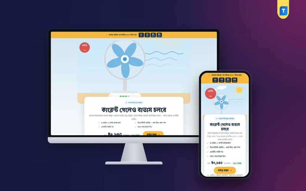
Sales page ecommerce website design is the craft of building one page that explains a product and takes the order, without sending the buyer anywhere else. If you sell a single item through Facebook or Google ads, this page matters more than your whole shop. It is the place where a click becomes money, or where it is lost.
This guide shows how to plan, write and build a sales page that works for a Bangladeshi seller. It covers the sections to include, the order of those sections, how to take payment, and the mistakes that cost sales. Examples use a rechargeable fan sold during the hot, load-shedding months, but the steps suit any product.
What a sales page is, and how it differs from a shop
A sales page is one long page about one product. The visitor scrolls from the headline down to an order form. There is no large menu, no category list and no links that lead away.
A normal shop does the opposite. It helps people browse. That is useful when buyers do not know what they want, but it is a weakness when your ad already told them. On a shop, a visitor can wander off to another item and forget why they came.
A sales page works best when:
- You sell one hero product, maybe in a few sizes or packs.
- Most visitors arrive from one ad or one Facebook post.
- The buyer needs a few questions answered before paying.
- You want to test a new product before you build a shop.
Plan the page before you design it
Good design starts on paper. Write down three things before you touch any tool.
- Who is the buyer? A mother buying for the family, a student, a shop owner. Each cares about different things.
- What is the one question that stops the sale? For a rechargeable fan, it is "how long does the battery last?"
- What action do you want? Usually a placed order, sometimes a phone call or a WhatsApp message.
Put these answers at the top of your plan. Every section of the page should help one of them. If a section does not, remove it.
The structure of a sales page ecommerce website design
Most strong pages follow the same flow. You can reorder some parts, but keep the logic: first attention, then trust, then proof, then the order.
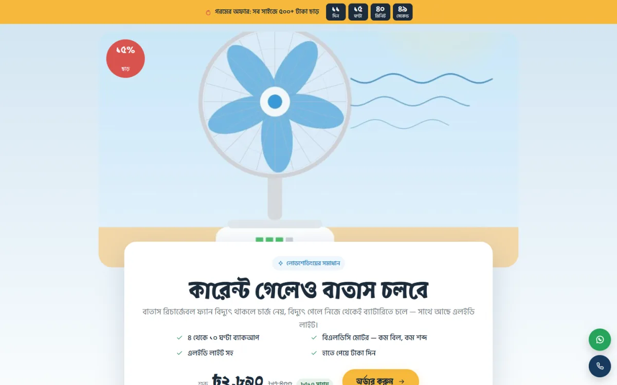
- Hero. A short headline, a clear product photo and a visible button or price.
- Offer. What is on sale, for how long, and what delivery costs.
- Key benefits. Three to five points in plain words.
- How it works or what it does. A simple demonstration of the main benefit.
- Where to use it. Pictures of real situations.
- Sizes or packages. Cards that make choosing easy.
- Reviews and comparison. Proof from other buyers.
- Order form. Short, with payment choices.
- Questions and answers. Delivery, warranty, returns.
Each block should fit on one or two phone screens. Long blocks get skipped.
Write the headline and the first screen
The first screen decides whether people stay. It needs to say what the product is, who it is for and why it is worth a look, in under ten seconds.
Tips for the headline:
- Use the same words as your ad. If the ad said "fan that runs all night", the page should say it too.
- State one benefit, not five.
- Avoid vague praise. "Best fan in Bangladesh" proves nothing.
- Show the real product in the first photo.
- Place the price or a clear order button in view without scrolling.
An offer card placed on top of the main product picture is a good way to show a discount without a separate banner.
Answer the question that blocks the sale
Every product has one question that buyers ask in the comments again and again. If you answer it on the page, you save time and win sales. For a rechargeable fan, buyers ask how many hours it runs on battery.
A simple calculator can do this well. The buyer picks the fan size, the speed and whether the light is on, and the page shows the hours of backup. A rule of thumb is useful too: lower speed gives more hours, and a light on uses more power.
The same idea works for other products:
- A size finder for clothes.
- A quantity guide for food or oil.
- A room-size guide for a cooler or a light.
- A "which one is right for me" picker when you sell several versions.
Look at your own comments and inbox. The most common question is the block your page needs.
Sales page ecommerce website design for phones
Most of your visitors will arrive on a mobile phone, often on a slow connection. Design the phone view first.
- Use one column. No side-by-side boxes that need zooming.
- Keep text large and lines short.
- Make buttons wide enough for a thumb.
- Compress images so the page opens in a few seconds.
- Add a sticky order bar at the bottom, so the buyer can order from any point on the page.
- Add a floating hotline and WhatsApp button for people who want to talk first.
Test the page on a cheap Android phone, not only on your own good one. If it feels slow there, it will lose buyers.
Photos do much of the selling. You do not need a studio, but you do need clean, honest pictures.
- One main photo on a plain background, in daylight.
- Close-ups of the parts that matter, such as the controls, the light or the charging port.
- Photos of the product in use at home, at a study table or in a shop.
- A photo showing size, with a hand or a common object beside the product.
- A photo of the box and what is inside it.
Do not use pictures from another seller. Buyers notice, and it harms trust.
Packages, sizes and prices
Show choices as cards rather than a long drop-down list. Each card should have the size or pack name, the price, and what is included. If you sell a fan in 12, 14 and 16 inch sizes, put them side by side so the buyer can compare in one look.
Make the same choice available in the order form, so there is no need to scroll back up. Mark one option as the popular choice if it truly is.
Always show the full price, including delivery. Hidden charges are one of the main reasons for cancelled orders.
Build the order form for Bangladesh
The form should be short. Every extra field loses some buyers.
- Name, phone number, full address, and the package.
- Cash on delivery as the default, plus bKash and Nagad.
- Delivery charges for inside and outside Dhaka, shown before submitting.
- A clear total price.
- A short promise about warranty or exchange, placed next to the button.
After the order, show a thank-you message that tells the buyer you will call to confirm. Then call. A confirmation call reduces fake and mistaken orders, and it lets you check the address for the courier.
New buyers worry about being cheated, especially when the page is new. Give them reasons to relax.
- Show real reviews with a name and a district.
- Show a phone number that you answer.
- Write your warranty in simple words, with the number of days.
- Mention the courier you use and the usual delivery time.
- Add your shop address or Facebook page if you have one.
Never invent reviews. If you have none yet, start by giving the product to a few friendly buyers and ask for honest feedback.
A ready-made option for fan sellers
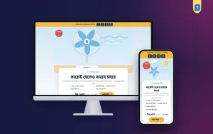
If you want to skip the build, Batash is a WordPress theme made for selling a rechargeable fan from ads. It is one long page with no site header or footer, and the order form is built in.
From the theme's feature list:
- A backup calculator by size, speed and light.
- Where-to-use picture cards.
- 16 sections you can switch off or reorder.
- Size packages shown as cards, with a picker in the form.
- An order form with cash on delivery, bKash and Nagad.
- An offer card on the hero picture, plus an offer line with a countdown.
- A floating hotline and WhatsApp button, and a sticky order bar on phones.
- Four summer colour palettes and three font choices.
With Batash you can follow the same setup order as above and hide any section you do not need, such as the comparison or the reviews, until you have real material for them. The demo shows a fan in 12, 14 and 16 inch sizes, and any page can sell any product, so you can reuse the layout for other items. You still add your own text and photos. It needs WordPress 6.0 or later and PHP 7.4 or later.
Fan landing page website design ideas you can copy
If you sell a fan or a similar summer product, here are practical fan landing page website design ideas that fit the season:
- Open with a line about power cuts and a hot night, since that is the real reason people buy.
- Show the battery backup in hours, not in technical numbers.
- Use picture cards for the home, the study table and the shop.
- Add a size guide that says which fan suits which room.
- Offer a small discount for the first week of the season.
- Run the offer before the heat peaks, not after.
The same approach works for a rechargeable light, a cooler, a charger or a power bank.
Set it up step by step
- Buy a domain and hosting.
- Install WordPress and your sales page theme.
- Write all your text first, in a document.
- Prepare and compress your photos.
- Fill in each section and hide those you do not need.
- Set packages, prices and delivery charges.
- Connect the form to the phone or email where you take orders.
- Place a test order and check that it arrives.
- Open the page on a slow phone connection.
- Start your ads with a small budget.
Good sales page ecommerce website design always includes this check. Many sellers skip the test order. A broken form during a busy week costs far more than the hour it takes to test.
Mistakes that weaken a sales page
- A top menu that lets visitors leave.
- No price, so buyers must ask in messages.
- Many different offers on one page.
- Technical words the buyer does not know.
- A fake countdown that resets every day.
- Heavy images that load slowly.
- An order form with ten fields.
- No follow-up call after the order.
Fix these first. In sales page ecommerce website design, small changes to the first screen and the form often lift orders more than a new design would.
After launch, watch a few numbers: visits, orders, and cost per order. If visits are high and orders are low, improve the page. If visits are low, improve the ad.
Change one thing at a time, such as the headline, the main photo or the offer, and give it a few days of traffic. Keep notes on what you changed, so you remember what worked. If you start from Batash, you can copy the finished page for the next product and change only the text, photos and prices.
If you want to read more on the technical side, the official WordPress documentation is a good, reliable reference.
Frequently asked questions
What is sales page ecommerce website design?
It is the design of a single page that presents one product and takes the order inside the same page. It leaves out menus and extra links so the buyer focuses on one decision.
Is a sales page better than an online shop?
For one product sold through ads, usually yes. For many products that buyers browse, a normal shop is better. Many sellers use both.
How many sections should the page have?
Ten to sixteen short sections is common. Keep only the sections that answer a buyer question or build trust.
What payment methods should I offer?
Cash on delivery, bKash and Nagad. Cash on delivery helps new buyers feel safe, while bKash and Nagad suit repeat customers.
Can I use a WordPress theme for sales page ecommerce website design?
Yes. A ready-made theme saves time because the layout, form and mobile view are already built. You add your text, photos and prices.
Do I need a separate page for every product?
It is best to have one page per product and per ad, so the page matches the promise the buyer clicked on.