Single product website examples are the fastest way to learn what a page that sells one item must contain. If you sell one model of a fan, a watch, a bag or an air conditioner, a full shop with menus and categories can hurt you. A focused page keeps the buyer on one decision.
This guide explains what a single product site is, shows the patterns that good examples share, and gives you a section-by-section plan you can copy. It also covers payment, delivery and ads for small sellers in Bangladesh. Use it as a checklist before you build.
What is a single product website?
A single product website is one page, or a very small site, built to sell one product or one product family. There is usually no top menu, no category list and no footer full of links. Every part of the page pushes toward one action: order now.
It is different from a normal online shop in a few ways:
- One goal. The visitor either orders or leaves. There is nothing else to click.
- One story. The page tells why this product is worth buying, in a set order.
- One form. The order form is on the page, so the buyer does not need a cart and checkout.
- Ad friendly. The page matches the ad that sent the visitor, so the message stays consistent.
When a single product page is the right choice
This format is not for every seller. It works best in these cases:
- You run Facebook or Google ads for one hero product.
- The product needs some explanation, such as an AC, a gadget or a health product.
- You want to test a new product before building a whole store.
- You sell seasonal items, such as mangoes, winter wear or Eid gifts.
- You take orders by phone, WhatsApp or cash on delivery.
If you sell fifty products, a normal shop is better. If you sell one or three, a single page is easier to manage and usually converts better.
Single product website examples by product type
Different products need different proof. These patterns show how the best pages adjust the same structure.
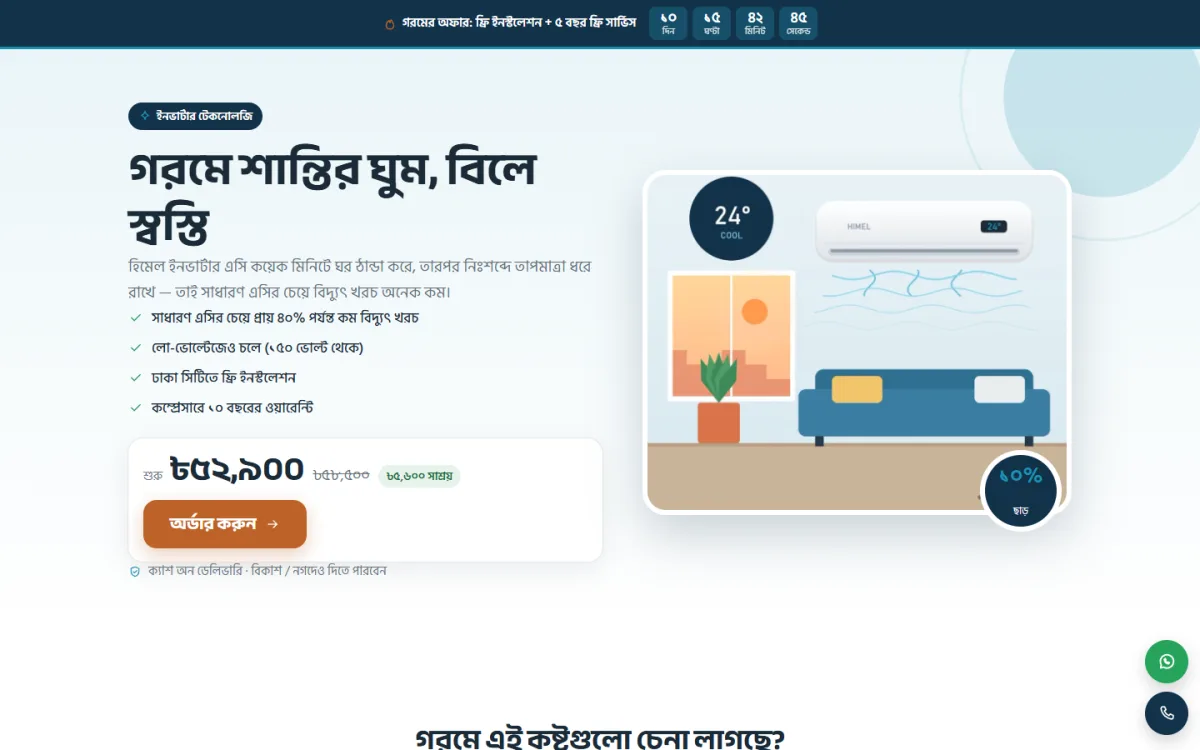
Home appliances (AC, fan, water purifier)
Buyers are careful because the price is high. Good pages answer: which size do I need, how much will it cost to run, who installs it, what is the warranty. A size finder and a bill calculator work well here, because they replace phone calls with instant answers.
Gadgets (smartwatch, earbuds, power bank)
Buyers want to see features quickly. Tap-to-open hotspots on the product photo, a colour picker, a comparison table and a clear "what is in the box" section work well.
Food and seasonal items (mango, dates, honey)
Trust and freshness matter. Show the source, the season, the box sizes and real customer messages. A harvest or availability calendar helps buyers pick the right variety.
Beauty and health products
Use ingredients, usage steps, before and after photos with permission, and clear safety notes. Avoid claims you cannot prove.
Fashion and accessories
Photos matter most. Show size charts, fabric details, colour choices and easy exchange rules.
Sections you will find in most single product website examples
Look at ten strong examples and you will see the same order again and again. Here is the basic structure.
- Hero: product name, one benefit, a clear photo, price and an order button.
- Quick benefits: three to five short points with icons.
- Product details: photos from several angles, specifications, what is in the box.
- How it works or how to use it: three simple steps.
- Proof: reviews, photos from real buyers, number of orders delivered.
- Comparison: why this model, or why this type.
- Packages and price: one to three options, with the best choice marked.
- Offer: a limited-time price or a free gift, with an honest deadline.
- Order form: short and simple.
- FAQ: delivery, payment, warranty, returns.
- Contact: phone number and WhatsApp button.
You can switch some parts off. A page with fewer, stronger sections beats a long page of filler.
What single product website examples teach about the hero
The top of the page does most of the selling. In the best single product website examples, the hero follows a simple rule: a buyer should understand the product and the price within five seconds.
- Use a large, sharp product photo on a clean background.
- Write a headline about the result for the buyer, not the product name alone. "Cool a 12 by 12 room for less" says more than "Premium air conditioner".
- Show the price clearly, with the old price crossed out only if it is true.
- Put the order button above the fold, on mobile too.
- Add one trust line: "Cash on delivery in all districts" or "Warranty card included".
Skip slideshows in the hero. One strong picture loads faster and converts better than three that rotate.
Sales page website design: layout and writing rules
Good sales page website design is mostly about reading ease. The layout should feel like a short conversation with a helpful shop assistant.
- One column on mobile. Most traffic from ads comes from phones.
- Short blocks. Two or three lines per paragraph, with a heading for each block.
- Big buttons. Use one colour for the order button across the whole page, so it is easy to spot.
- Real photos. Show the product in use, in a normal Bangladeshi home or street, not only studio shots.
- Plain words. Write the way you would speak to a customer in your shop.
Avoid long blocks of text, tiny grey fonts and too many different colours. When buyers have to think about the page, they stop thinking about the product.
How to study an example properly
When you open a page that sells one product, do not just admire it. Take notes. Write down the headline, the first three sections, the price display and how many fields the form has. Then ask yourself why the seller put each part in that order.
Compare three pages for the same kind of product. The parts that appear on all three are almost always needed. The parts that appear on only one are choices you can test. This simple habit teaches more than reading ten articles, and it keeps your own sales page website design grounded in what buyers actually respond to.
Design the order form carefully
The order form is where sales are won or lost. Every extra field loses some buyers.
- Ask for name, mobile number, full address and district. That is usually enough.
- Let the buyer choose a package inside the form.
- Show delivery charge before the final click.
- Offer cash on delivery, bKash and Nagad, and say so near the button.
- Show a clear confirmation message, and call or message the buyer soon after.
Do not ask people to create an account. Do not add a long cart. The aim is to place the order in under a minute.
Prices, packages and offers
Give the buyer two or three options. A common pattern is a basic package, a recommended package with a small gift, and a bundle. Mark the middle one as the recommended choice.
If you use a countdown or a limited offer, make it honest. Reset it only when you really start a new offer. Fake urgency harms trust, and Facebook buyers notice quickly when a "last day" offer shows up every week.
For high-price products, show what the buyer gets in simple lines: the unit, installation, warranty, free delivery or a service visit. A list of included items makes the price feel clearer.
Trust signals that work in Bangladesh
Many buyers have been disappointed by online sellers, so trust is the main barrier. These signals help:
- A phone number that actually answers, and a visible WhatsApp button.
- Your shop address, a trade licence mention or a Facebook page link.
- Screenshots of real customer chats, shown with permission.
- Clear return and exchange rules in plain language.
- Cash on delivery for first-time buyers.
- Photos of the real packaging and delivery.
Say exactly how many days delivery takes inside and outside your city, and name your courier. Vague promises create doubt.
Connect your ads to the page
A single product page is only half the job. The ad and the page must match.
- Use the same product photo, name and price in the ad and on the page.
- Send each ad to the right page. If you have three models, build three pages.
- Keep the page fast. Compress images and avoid heavy animations.
- Track orders by ad, so you know which one pays for itself.
- Test one change at a time: headline, photo or price.
Start with a small daily budget, check results after a few days and change one thing at a time. Do not judge an ad after one day.
A ready-made option: Himel
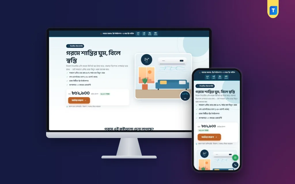
If you sell air conditioners, you can see the ideas above in a ready theme. Himel is a landing page WordPress theme for shops that sell one inverter AC from Facebook and Google ads. It is one long page with no site header or footer.
- A room size finder that picks the right ton.
- A bill calculator that compares running cost with an ordinary AC.
- 16 sections you can switch off or re-order.
- An order form built into the page, with cash on delivery, bKash and Nagad.
- Package cards, an offer line with a countdown, and floating hotline and WhatsApp buttons.
- A sticky order bar on phones, 4 cool palettes and 3 font choices.
Any page can sell any product, so you can reuse the layout for another item later. It needs WordPress 6.0 or newer and PHP 7.4 or newer. You can read more on the Himel product page.
Common mistakes to avoid
- Adding a full menu. It gives people a way to leave.
- Too many products. If you add five items, it stops being a single product page.
- Stock photos only. Buyers want to see the real item.
- Hidden delivery cost. Surprises at checkout cause cancelled orders.
- Slow loading. A heavy page loses mobile visitors before they read anything.
- No follow-up. Call or message every new order to confirm it.
Launch checklist
- Write a one-line promise and three main benefits.
- Take clear photos of the product from several angles.
- Collect at least three real customer messages.
- Decide packages, price and delivery charge.
- Set up cash on delivery, bKash and Nagad details.
- Build the page and test the order form on two phones.
- Place a test order and check that you receive it.
- Match the ad to the page, then start a small budget.
When the page is live, read your first ten orders carefully. They will show which questions buyers ask on the phone, and those answers belong on the page.
Keep a short log of changes and results. If a new headline raises orders, keep it. If a new photo does nothing, go back to the old one. After a month of small, careful changes, you will have a page that fits your own buyers better than any copied layout. Study more single product website examples now and then, but always test ideas against your own numbers.
If you want to read more on the technical side, the official WordPress documentation is a good, reliable reference.
Frequently asked questions
What do the best single product website examples have in common?
They have one goal, a clear hero with price and order button, proof from real buyers, an order form on the page and a simple FAQ. They also load fast on a phone.
Can I use WordPress for a single product website?
Yes. A landing page theme gives you a ready layout, and you edit text and photos from the page editor. You do not need a developer for every change.
How long should the page be?
Long enough to answer every question a buyer asks. For a high-price item, that may be 12 to 16 short sections. For a cheap item, six may be enough.
Do I need a payment gateway?
Not at the start. Many sellers in Bangladesh use cash on delivery plus manual bKash and Nagad payment. Add other options once orders grow.
Where can I find good single product website examples to study?
Look at the pages that appear in ads for products like yours, and note their sections, price display and form. Do not copy text or images. Use the structure and write your own words.
How is a sales page different from a normal product page?
A normal product page sits inside a shop with menus and other products. A sales page stands alone and leads the visitor step by step to one order.
How many orders should I expect?
It depends on the product, price, trust and ad quality, so no honest number fits everyone. Track your own results and improve one part at a time.