Good t shirt website design starts with one plain fact: buyers cannot touch the fabric. They judge a tee by its photos, its size chart and the words you write about it. This guide covers the layout, photos, sizes, product pages, checkout and launch habits that help a small T-shirt brand in Bangladesh turn Facebook followers into steady orders.
Every idea here is simple and cheap. Pick the ones that fit your brand, try them for a few weeks, and keep what works.
Why t shirt website design is its own job
A T-shirt looks simple, but buying one online is full of small doubts. Will it fit? Is the cotton thick or thin? Will the print crack after three washes? Is the black really black? A gadget buyer reads specs. A tee buyer reads your photos and your size chart.
- Fit doubts mean sizes and measurements must be easy to find.
- Fabric doubts mean you need close-up photos and the fabric weight in words.
- Print doubts mean you should show the print on a real body, front and back.
Answer these doubts on the page and you answer them once, instead of in a hundred inbox messages.
Start with your collections
Write down everything you sell, then group it the way buyers think. Most tee brands need five to eight groups, such as Men T-Shirts, Women T-Shirts, Oversized, New Arrivals, Polo, Hoodies & Shirts, Packs and Sale.
Show three to six of these as large cards near the top of the homepage, each with one strong photo, a short line and a "Shop now" link. A card that says "Oversized: drop shoulder, heavy cotton" tells the buyer more than a plain name.
Keep the main menu short. Men, Women, New Arrivals, Best Sellers, Collections and Sale are enough. A buyer who meets fifteen menu items on a phone usually scrolls past all of them. Clear groups are the backbone of good t shirt website design.
Name fits the same way every time
Pick your fit words and stick to them: Regular, Slim, Oversized, Boxy. Use them in product titles, in collection names and in the size chart. If one tee says "loose" and another says "relaxed" for the same cut, buyers get confused and order the wrong size.
A homepage order that works for a tee brand
Buyers scroll a tee shop like a rack in a store. Each block should answer one question. Here is an order many small brands use:
- Hero slider with your newest drop or a real offer.
- Collection cards so people can jump to Men, Women or Oversized.
- New arrivals for regular buyers who check every week.
- Best sellers as social proof.
- A collection row for the current drop, such as oversized prints.
- Promises: delivery days, size exchange, cash on delivery and fabric.
- Customer reviews, with photos when you can get them.
- FAQ about sizes, fabric, delivery and exchange.
- Blog posts with styling and care tips.
Each row should have a "See more" button that opens the full list. Keep rows to four or eight products, so the page stays short on a phone.
A bold t shirt website design can carry a strong colour such as orange, red or deep green. Keep it to one brand colour plus black and white, so the shirt colours in your photos stay the main thing on the page.
Photos that sell T-shirts
Photos do most of the selling in a clothing shop. Plan them before you plan the design.
- A front photo on a plain light background, the same for every product.
- A back photo when the print or the label is on the back.
- One photo on a model, so buyers see the length and the fit.
- A close-up of the fabric and the print.
- The same light and angle for every colour.
Shoot in daylight near a window, or with two cheap soft lights. Avoid strong filters. A buyer who gets a navy tee that looked black in the photo will ask for a return, and that costs you twice: the courier fee and the trust.
Square photos work best for shop grids, cards and Facebook posts. Crop every photo to the same square before you upload it, and compress it; 1000 to 1200 pixels wide is enough for most tees.
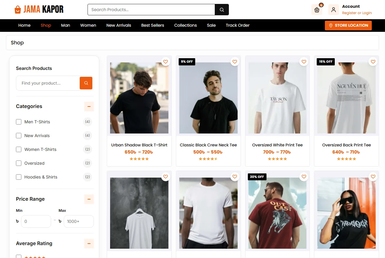
Consistent photos are the cheapest upgrade in t shirt website design. Ten products shot the same way look like a brand. Ten products shot ten different ways look like a reseller.
Sizes, fit and the size chart
Size questions are the biggest source of returns in this trade. Put the answer on every product page.
Give each size its chest, length and shoulder in inches. Add one line on how to measure: lay a tee that fits you flat, measure across the chest from armpit to armpit, then compare. For oversized tees, tell buyers whether to take their usual size or one smaller.
Set sizes up as a real product option, such as M, L and XL, with stock for each one. When XL costs more, show it in the price instead of hiding it in the checkout. Sold-out sizes should show as unavailable, so nobody orders a size you do not have.
Make exchange easy to find
Write your exchange rule in plain words: "Size exchange within 7 days if the tee is unworn with its tag." Put it in the promise strip, the FAQ and the Return Policy page. A clear exchange rule makes first-time buyers far more willing to order.
Product pages that answer questions
A buyer on a product page wants six answers: what is it, what is the fabric, which size fits me, how much, how fast, and what if it is wrong. Put all six near the top.
- A gallery with zoom and three or four photos.
- The price, with the old price crossed out on sale items.
- The fabric and weight, such as "100% combed cotton, 180 GSM".
- The size choice, with sold-out sizes shown clearly.
- Add to Cart and a Buy Now button that goes straight to checkout.
- Short promises: delivery days, cash on delivery and a 7-day exchange.
Write the description yourself. Say how the tee feels, how it fits, how to wash it and whether the print is screen print, DTF or embroidery. Many tee buyers in Bangladesh still message before ordering, so keep your phone number and WhatsApp easy to find.
T shirt website design for phones
Most tee orders start from a Facebook or Instagram post opened on a phone, often on mobile data. Design the phone view first, then the desktop.
- A clean top bar with the logo, the cart and a menu button.
- A bottom tab bar with Home, Shop, Cart, Track and Account.
- Product cards two per row, with the price easy to read.
- Size buttons big enough for a thumb.
- No pop-up that hides the cart or the size choice.
Test the shop on a cheap Android phone over 4G. If the homepage feels slow there, it is slow for most of your buyers. A light t shirt website design loads fewer heavy pieces and keeps buyers scrolling.
Keep the shop light
Every extra second of loading costs orders. Compress photos before upload. Use a shop theme with small files instead of a heavy page builder. Keep plugins few, and remove the ones you do not use. Check your shop speed once a month, especially after adding a new plugin.
Drops, offers and the season calendar
Tee brands live on drops. A new print, a new colour or a limited oversized run gives regular buyers a reason to come back.
Give each drop its own hero slide and its own collection row. Say what is limited and for how long, but only when it is true. A "limited" label on stock that never runs out hurts trust.
Plan around the Bangladeshi calendar: Pohela Boishakh with red and white tees, Eid with new collections and gift packs, Victory Day and Independence Day prints, the start of the university year, and hoodies for winter. Change the hero, the first collection cards and the promise lines for each season.
Smart t shirt ecommerce website design also uses coupons with care. A first-order coupon shown in the sign-up box brings new buyers in. A coupon on every page all year makes the full price look fake.
Checkout, delivery and payment in Bangladesh
A long checkout loses orders. Ask only what the delivery needs: name, mobile number, district, area and a short address line.
Show delivery charges early. Many tee shops charge about ৳80 inside Dhaka and ৳120 outside Dhaka. Put this in the FAQ, on the product page and in the cart, so nobody feels tricked at the last step. Delivery in one or two days in Dhaka and two to four days elsewhere is a common promise.
Cash on delivery is still the main payment method. Add bKash, Nagad and card payments with a payment plugin as you grow, and show the logos you accept on the product page and in the footer.
Packing tees
Fold each tee the same way, put it in a clear bag with a size sticker and add a small thank-you card. Write the order number on the parcel. A neat parcel gets photographed and shared, which is free marketing.
Accounts and fake orders
Fake cash on delivery orders cost real money: the rider's time, the courier fee and the return. Many tee brands start with guest checkout and ask for an account once fake orders grow.
Make sign-up quick when you ask for it. A popup that accepts a Bangladeshi mobile number (01XXXXXXXXX) or an email with a password is enough. The address is saved, so the next order is faster.
Repeat buyers are where a tee brand earns its profit. Someone who liked one black tee often orders the same cut in three more colours. A saved account, a wishlist and a Track Order page make that second visit easy, which is a quiet win of good t shirt website design.
Common mistakes in t shirt website design
- No size chart, or a chart with no measurements.
- Photos with different backgrounds, light and angles.
- The back print missing from the gallery.
- Fabric shown only as "premium quality" with no detail.
- Delivery charges shown only at the last step.
- Countdown timers that never end.
- Product text copied from a supplier, word for word.
Google's guide to helpful content is a good reminder here. Write product text for buyers, in your own words, and answer the questions they really ask.
Content and trust pages
A clothing brand needs clear help pages. Buyers check these before their first order:
- About: who makes the tees and where you are.
- Shipping: areas, charges and delivery days.
- Return and exchange: sizes, days and how to send a tee back.
- FAQs: the questions you hear most.
- Contact: phone, WhatsApp, address and a form.
- Track Order: order number and email.
- Privacy and Terms.
A small blog helps too. Short posts such as how to pick the right size, how to keep white tees white and five ways to style a black tee bring visitors from search and answer questions before they reach your inbox. Good t shirt website design gives those posts a place on the homepage.
A launch checklist
- Every product has front, back and close-up photos in one style.
- Every product has sizes with stock and a size chart.
- Fabric and weight are written on every product.
- Collection cards sit near the top of the homepage.
- Delivery charges and the exchange rule are visible before checkout.
- Help pages are written and linked in the footer.
- You placed three test orders from a phone.
Growing after launch
Add new collections slowly. Before you add one, ask whether you can keep stock, photos and sizes up to date. Twenty well-kept tees sell more than eighty half-empty listings.
Ask happy buyers for a review after delivery, ideally with a photo of them wearing the tee. Reply to every review, including the unhappy ones, with a calm answer. New buyers read those replies.
Track a few numbers every week: visitors, orders, average order value, returns by size and returning buyers. If one size comes back often, fix the chart. Change one thing at a time in your t shirt website design and watch whether the numbers move.
Turning these ideas into a shop with Jamakapor
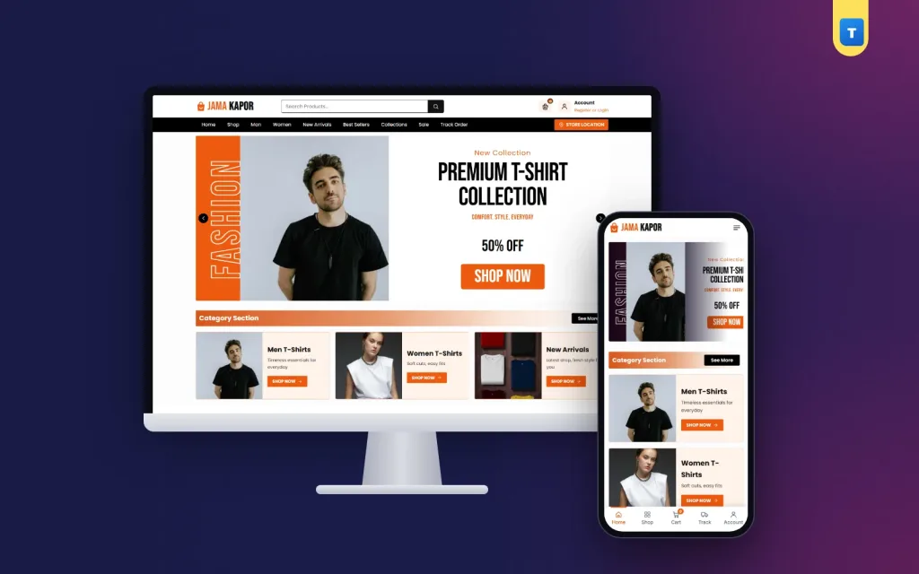
Good t shirt ecommerce website design is easier when the theme already follows these rules. The Jamakapor T-shirt brand theme for WordPress and WooCommerce has a bold hero slider, three collection cards, product rows for new arrivals, best sellers or any collection, a trust strip, reviews, an FAQ and a blog block.
Every demo product has sizes, and the product page has the size choice with Add to Cart and Buy Now. Buyers get mobile number or email sign-in, a wishlist and a Track Order page, and phones get a bottom tab bar. Every homepage block can be switched on or off. Import the demo, add your tees, and you can take orders the same week.
Frequently asked questions
How many products should a new t shirt website design start with?
Start with 15 to 40 tees you always have in stock, in two or three fits, then grow.
What is the best colour for a t shirt website design?
One strong brand colour with black and white works well. It lets the shirt colours in your photos stand out.
Do I need online payment from day one?
No. Cash on delivery is enough at first. Add bKash, Nagad or cards later.
Should I offer a size exchange?
Yes. A clear 7-day size exchange for unworn tees removes the biggest worry of first-time buyers.
Is t shirt ecommerce website design different on phones?
Yes. Phones need two cards per row, big size buttons and a bottom tab bar.