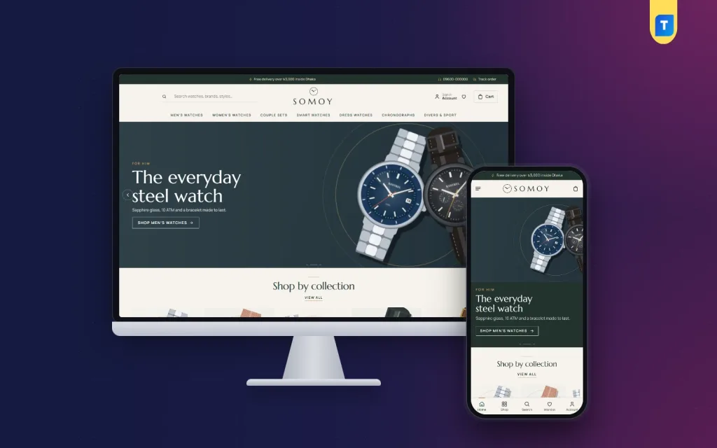
Choosing between watch website design templates is easier when you know what a watch buyer looks for before paying. A watch is a considered purchase. People compare case sizes, check the movement, read the warranty and often sleep on it. Your design has to support that slow, careful decision.
This guide explains what a good watch shop template needs, page by page. It covers layout, specs, compare tools, photos, payments and delivery for Bangladesh, plus a checklist for choosing and launching. It is written for dealers, boutiques and gift shops that want a calm, professional site.
How watch buyers shop
Understanding the buyer comes before looking at any design. Watch shoppers behave differently from people buying a T-shirt.
- They compare two or three models, often in separate tabs.
- They want facts: case size, movement, strap, water resistance, warranty.
- They worry about fakes, so trust signals matter.
- They return to the site several times before they buy.
- Many shop by budget first, then by style.
- Gift buyers need help choosing for someone else.
So the best template does not rush people. It gives them facts, space and tools to compare.
What to look for in watch website design templates
When you compare options, use this checklist. A good template should have most of these built in, not as extra plugins you must add later.
- Specs on the tile: case size and movement visible without opening the product.
- Compare tool: a button on each tile and a page that shows two or more watches side by side.
- Watch finder: a short quiz or filter by person, style and budget.
- Product page with open specs: not hidden in tabs.
- Big image gallery: zoom, wrist shots and close-ups.
- Brand and collection pages.
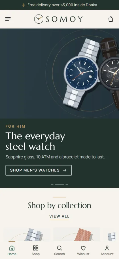
- Mobile layout: a simple header and compact cards.
- Local checkout: bKash, Nagad, cash on delivery and courier support.
- Block control: turn homepage sections on or off, and re-order them.
- Demo import: a sample shop to learn from.
If a template lacks specs and compare tools, it was probably built for general products, not for watches.
Features that sound good but matter less
- Heavy animation on scroll. It slows phones and hides the product.
- Autoplay background video. It eats data, which many buyers pay for by the megabyte.
- Dozens of colour options. Two or three well-chosen palettes are enough.
- Pop-ups that cover the watch. Use at most one welcome offer.
Spend your attention on specs, photos, speed and trust. Those four things decide most orders.
Watch website design templates and the homepage
A watch homepage should feel like a quiet showroom. Here is a plan that works for most boutiques.
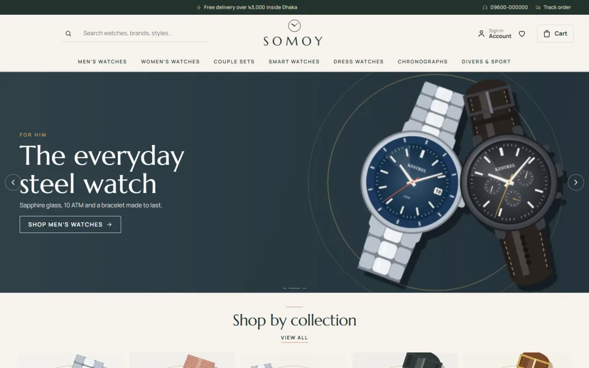
- Header: centred logo, spaced capital menu, search and cart.
- Editorial slider or hero: one watch, one line, one button.
- Find your watch: choose for whom, style and budget.
- Watch of the month: one piece, with key specs and warranty.
- Brand row: logos of the makers you sell.
- Best sellers and new arrivals.
- Shop by budget: price steps such as under ৳5,000, ৳15,000 and ৳30,000.
- Collections: dress, sport, smart, couple sets, divers.
- Warranty and service note.
- Reviews.
- Footer: showroom address, hours, policies.
You do not need every block. A shop with 30 watches can run well with six or seven. When you test watch website design templates, check how easy it is to switch blocks off, because a small shop should never be forced to show empty sections.
Think about the order too. Put the finder and the best watch near the top, since they help people start. Put reviews and warranty notes lower, where a buyer who is already interested will look for reassurance.
Colour, type and mood
Watches suit calm, premium styling. Loud colours distract from the dial.
- Ivory with pine green and brass: classic and warm.
- Black, white and gold: bold and formal.
- Navy and silver: clean and modern.
- Soft grey with one accent colour: good for sport and smart watches.
Use a refined serif or a spaced capital font for headings. Keep the body text plain. Give each product a lot of white space. The less clutter, the more premium the watch looks.
Specs: the heart of a watch page
Specs are not a detail. They are the content. A buyer who cannot find the case size will leave.
Show these on every watch
- Brand and model name.
- Case size in millimetres and thickness.
- Movement: quartz, automatic or smart.
- Case and strap material.
- Water resistance.
- Glass type.
- Warranty length and who honours it.
- Included items: box, papers, extra strap.
Present them well
- Open the spec list by default, not behind a tab.
- Use a simple two-column table.
- Repeat the key three specs on the product tile.
- Explain jargon briefly, such as "automatic: powered by wrist movement".
When specs are clear, you answer most questions before anyone calls you.
Compare tools that help people decide
A compare feature is one of the most useful tools for watch shops. It lets a buyer put two models side by side without opening many tabs.
- A Compare button on each tile.
- A small bar that collects the chosen watches.
- A compare page with rows for price, size, movement, strap and warranty.
- A button to add the chosen watch to the cart from the compare page.
Keep the limit to three or four watches so the table stays readable on a phone.
Think about how buyers will use it. Someone might compare a 40 mm automatic with a 42 mm quartz, and the table should make the trade-off obvious: price, size, power source and warranty in one glance. Highlight the differences, not the rows that match.
Photos and video for watches
Watches have reflective glass and metal, so photos need care.
- Use soft light and a dark or neutral background.
- Avoid glare on the glass. Tilt the watch slightly or use a diffuser.
- Shoot a front view, a side view for thickness, a back view, a clasp view and a wrist view.
- Show the dial time at about 10:10 for a balanced look.
- Use the same background and angle for all products.
- Add one photo beside a hand or a ruler to show size.
A short wrist video helps with larger watches. Keep it small so the page stays fast.
Edit all photos in one batch so the colour looks the same across the catalogue. A gold case that looks warm in one photo and pale in the next makes buyers doubt the whole shop.
A watch store website design template for Bangladesh
A watch store website design template made for global shops may not cover local needs. In Bangladesh, plan for these.
- bKash and Nagad: show the logos near the cart.
- Cash on delivery: popular, but for higher-priced watches ask for an advance or offer showroom pickup.
- EMI or instalments: if you offer them, show a "from" monthly figure on the tile.
- Courier: Steadfast or Pathao with tracking, plus a Track Order page.
- Warranty: state whether it is the maker's warranty or your shop's, and where service is done.
- Authenticity: say where you buy from, and show invoices or authorised dealer status if you have it.
Buyers are careful about fakes. Honest, visible information is your best defence.
Many good watch website design templates leave a place for a trust note near the price. Use it. A single line such as "Authorised dealer, 2-year warranty, invoice with every watch" can lift confidence more than a long About page.
Move from Facebook to a proper website
Many watch sellers in Bangladesh work through Facebook pages and Messenger. It helps you start, but it has limits. Specs are buried in captions, prices change, and the same questions arrive daily.
- Keep Facebook for photos and reach.
- Put every watch on the website with specs and clear photos.
- Share product links, not only pictures.
- Use the website order system rather than copying orders by hand.
The site becomes your permanent showroom. Facebook becomes the window that sends people in.
Start by moving your best ten watches. Write the specs once, take clean photos and publish. Then add the rest week by week. Update your Facebook posts to link to the product pages, and pin a post that says where to find the full catalogue.
A ready-made option
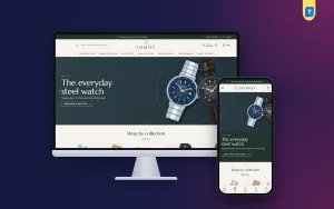
If you want a working design, Somoy is a watch boutique WordPress theme in ivory, pine green and brass. It has a Find your watch finder with whom, style and budget, a watch of the month with key specs, tiles with case size and movement, and a compare button on every tile with a Compare page.
Specifications open by default on product pages. There are 24 homepage blocks, 14 on in the demo, a centred logo header with a spaced-capital menu, 5 palettes and 4 font pairs. The demo has 32 watches from 5 watchmakers. bKash, Nagad, SSLCommerz, cash on delivery and Steadfast or Pathao courier support work through the bundled Themeve Commerce plugin. More details are on the Somoy product page.
How to test a template before you commit
- Open the demo on your phone and on a laptop.
- Try the watch finder and see if it filters well.
- Add two watches to compare and check the table.
- Open a product page and look for case size, movement and warranty.
- Run a test checkout with a payment option you plan to use.
- Switch some homepage blocks off and on, and see how easy it is.
- Check how long the pages take to load.
- Look at the support and update terms.
If the template passes all eight, it is likely a good fit. Whichever of the watch website design templates you choose, ask what you get if something breaks: support, updates and a clear way to ask questions. A template is only useful if you can keep it working next year.
Mistakes to avoid
These slips appear on many watch sites. Each one is easy to fix.
- Specs hidden in tabs: buyers miss them.
- Glare on glass: the dial cannot be read.
- Stock photos of watches you do not sell.
- No warranty details: buyers fear fakes.
- Auto-playing video with sound.
- Too many sliders: one hero is enough.
- Crowded tiles: show only the few facts that matter.
- Poor mobile layout: most visitors use phones.
Launch checklist
Before you announce the shop, go through this list slowly. The best watch website design templates still need good content to work, and a few hours of checking now can save you many returns later. Ask a friend to place a test order from their own phone and tell you where they got stuck.
- Every watch has five photos and a full spec list.
- Warranty and authenticity notes are written.
- Compare and finder tools work.
- bKash, Nagad and cash on delivery are tested.
- Courier and delivery charges are set.
- Return rules are clear.
- Showroom address, phone and hours are visible.
- Pages load in under four seconds on mobile data.
If you want to read more on the technical side, the official WordPress documentation is a good, reliable reference.
Frequently asked questions
What should I look for in watch website design templates?
Look for specs on the tiles, a compare tool, a watch finder, open specifications on product pages, a clean mobile layout and local checkout options. These matter more than animation.
Do I need WooCommerce for a watch store?
Not necessarily. Some themes come with their own shop engine, so you do not need to add a separate shop plugin. Check what the template includes before you buy.
How many watches should I list at launch?
Around 30 is a good start. Make sure each one has clear photos and a full spec list.
Which specs matter most to buyers?
Case size, movement, strap material, water resistance and warranty. Show them clearly on the tile and the product page.
Are watch website design templates only for luxury brands?
No. They suit men's and women's watches, couple sets, smart watches and dress watches at many price points. The same calm layout can also work for pens, sunglasses and small leather goods.
Can I sell watches with cash on delivery?
Yes, and many buyers expect it. For higher-priced watches, ask for an advance or offer showroom pickup. State the rule clearly on checkout.
How do I choose a watch store website design template?
Open the demo on a phone, try the finder and compare tools, check a product page for specs, and run a test checkout. If it feels calm and clear, it is probably a good choice.