
Looking at beauty website examples is the fastest way to learn what works before you build your own. You see how others show products, explain ingredients and ask for the order, and you can copy the ideas that suit your shop.
This guide does not list brand names. It describes the patterns that good online beauty shops share, with practical notes for small sellers in Bangladesh, such as a home-grown serum brand, a beauty importer or a counter inside a pharmacy. Use it as a checklist when you plan your site.
What good beauty website examples have in common
These beauty website examples all share the same base. Strong beauty sites look very different, but they follow the same rules. A visitor should feel calm, understand the products and trust the shop.
- Clean space. Soft colours, generous white space and large product photos.
- Helpful choices. The site guides the buyer by skin type, concern or ingredient.
- Clear facts. Size, ingredients, how to use and who the product suits.
- Visible trust. Reviews, delivery details and a clear return rule.
- Easy buying. A short checkout and payment options that people already use.
When you review any site, ask whether it does these five things. The best ones do them without making the visitor think.
Beauty website examples by shop type
Not all beauty shops need the same design. The right layout depends on what you sell and how people buy it.
The skincare shop
Skincare buyers read labels and worry about breakouts. The best sites guide them: pick your skin type, see a routine, learn the order of steps. Ingredient and concern pages carry a lot of weight here.
The makeup shop
Makeup is about colour. These sites use swatches, shade finders and close-up photos. Good ones show every shade clearly and let buyers filter by skin tone.
The body care and hair shop
Here buyers think in terms of problems and results, such as dry skin or hair fall. Pages are built around the concern, with the products that help.
The multi-brand beauty store
A store with many brands needs strong filters and a brand page for each. Search should be fast and the homepage should highlight offers.
The single-brand shop
A brand that makes its own products can tell a story. The site shows the founder, the formula and the process, and sells a few products very well.
Homepage patterns that work
The homepage of a good beauty site is quiet but useful. Here is a layout that many successful sites follow.
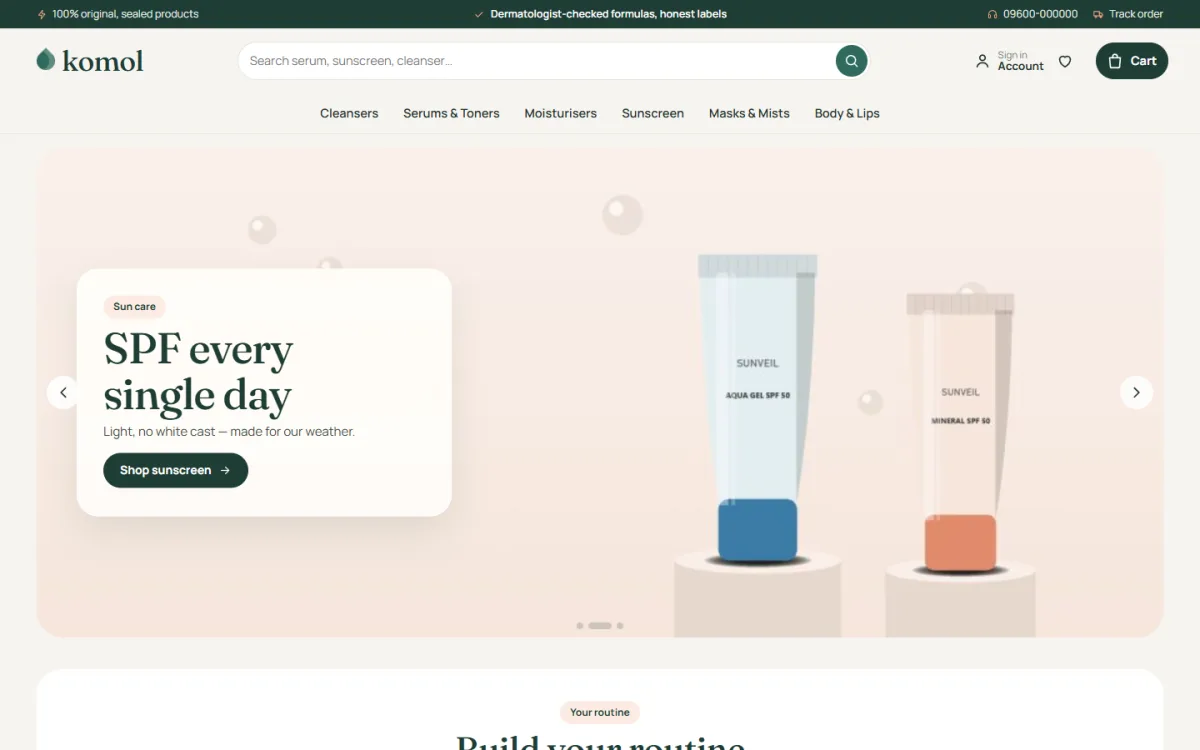
- A soft hero image with one headline and one button.
- A strip of promises: genuine products, fast delivery, easy returns.
- Shop by skin concern or by category.
- Best sellers in a clean row.
- A guided block, such as a routine builder or shade finder.
- Offers with a real end time.
- Reviews and customer photos.
- A short brand story and contact details.
A phone layout starts with fewer blocks, and many beauty website examples keep the number of blocks small on a phone. Fewer blocks load faster and are easier to scroll.
Product cards and product pages
A beauty product card is small, so it must be clear. Good cards show the photo, the name, the size, the price and a quick add button.
Useful touches seen on good sites:
- A size pill on the card, such as 30 ml or 100 g
- A second photo that appears when you hover over the card
- A star rating next to the name
- A small label for new, sale or low stock
On the product page, put the key facts above the long text:
- What the product is and who it suits
- Key ingredients, in short words
- How to use it and how often
- Size and shelf life
- Skin types it is safe for, and any warning
- Reviews from real buyers
Avoid medical claims. Say what the product does in simple terms, and let reviews speak for results.
Guided shopping: routines, ingredients and concerns
This is what separates great beauty website examples from average ones. A shopper who is unsure what to buy needs a guide, and a guide turns browsing into a basket.
- Build your routine. Tabs for oily, dry, combination and sensitive skin, each showing one product per step: cleanse, treat, moisturise and protect, with the total price.
- Shop by ingredient. Tiles for ingredients such as niacinamide, vitamin C or hyaluronic acid, each showing how many products include it.
- Shop by concern. Cards for acne, dryness, dark spots or dullness.
- Quiz or finder. A short set of questions that ends with a few suggested products.
These tools also help you sell more per order, because a routine often includes three or four items.
Building trust in a beauty shop
People put these products on their face, so trust matters even more than in other shops. Fake and expired products are a real worry in Bangladesh.
Trust signals to add:
- State where the products come from: brand, importer or your own factory.
- Show batch or expiry information, or explain how you check it.
- Use your own photos of real stock.
- Publish verified reviews, with photos if possible.
- Explain returns for damaged or wrong items.
- Give a phone number and a Messenger link that you answer.
A good shop makes these points easy to find. A small trust strip near the buy button is better than a long page that nobody reads.
Beauty website design for mobile buyers
Most of your visitors will use a phone, often after seeing a Facebook or Instagram post. Mobile is not a smaller version of the site. It is the main site.
- Show two product cards per row, with clear prices.
- Keep the header simple: menu, logo and cart.
- Use large, well-spaced buttons.
- Put the add-to-cart button where the thumb reaches.
- Make sure photos load quickly on a mobile network.
- Test the checkout with one hand.
If a feature is hard to use on a phone, remove it or simplify it.
Payments, delivery and checkout
A lovely design means little if checkout is hard. Local payment habits matter here.
Offer these methods:
- bKash and Nagad
- Cash on delivery
- A card gateway for those who want it
Show delivery details early:
- Charges for inside and outside Dhaka
- Expected days for each area
- Courier names, for example Steadfast or Pathao
- A Track Order page so buyers can follow their parcel
Good beauty website examples treat checkout as part of the design. Keep checkout to one page if you can. Ask for name, phone, address and payment method, and show a clear order confirmation.
Colour and photography in beauty website examples
Beauty brands sell a feeling as much as a product, so the look matters. Keep it simple.
- Colours. Choose one main colour and one accent. Warm white with deep green and a touch of apricot feels gentle. Pink and rose gold feel soft and glamorous.
- Type. One serif font for headings and one clean sans-serif for text is enough.
- Photos. Use the same light and background for every product. Show texture, such as a swatch of cream, when you can.
- Icons. Keep them thin and few.
Many beauty website examples look expensive because they use fewer elements, not more.
Beauty website design: step-by-step plan
Here is a plan for a small shop. You can finish the first version in a week.
- Write down your main customer and the three questions she asks most.
- Choose your product groups and the filters you need.
- Collect photos and write short, clear descriptions.
- Pick a WordPress theme made for shops, with local payments.
- Build the homepage from the layout above.
- Add policy pages for delivery, returns and privacy.
- Test the shop on your phone with every payment method.
- Launch, share the link and watch the first orders closely.
Treat your first version as a draft. Fix problems as they appear. Early customers will tell you what is unclear.
Small-budget ideas from beauty website examples
You do not need a large budget to build a shop that looks professional. Most beauty website examples that feel premium rely on a few simple choices that cost almost nothing.
- Take your own photos near a window, on a plain white or cream surface.
- Write one short paragraph per product, and keep the same order every time.
- Use a single hero image instead of a slider with five slides.
- Add a short "How to use" video made with your phone.
- Ask each buyer for a review a few days after delivery.
- Share your best-selling routines on Facebook, with a link to the page.
Spend your money first on good photos and reliable hosting. Everything else can improve over time.
Content that helps beauty customers decide
A shop with only product pages leaves questions unanswered. A few helpful articles bring in visitors from Google and make buyers feel looked after.
Topics that work well for a small beauty shop:
- How to find your skin type at home
- The right order to apply skincare in the morning and at night
- How to read an ingredient list
- Sunscreen for the Bangladesh climate, and how much to use
- Skincare mistakes that cause breakouts
- A simple routine for a small budget
Link each article to the products it mentions. Use plain words, and never promise a medical result. When you study beauty website examples, notice that the best ones teach first and sell second.
Keep a simple posting plan. One useful article each month is enough to start. Over a year, that builds a library of twelve pages that answer real questions, and each one can be shared on Facebook or in a customer chat.
A ready-made option for a skincare shop
If you do not want to design every block, a theme built for beauty can help. Komol is a WordPress theme for shops that sell cleansers, serums, toners, moisturisers, sunscreen, masks and body care. It uses warm white, deep green and soft apricot, with Fraunces headings.
It includes several of the patterns described above:
- A Build your routine block with tabs by skin type and a routine total
- Shop by ingredient tiles with product counts
- Shop by concern cards for acne, dryness and more
- Rounded product cards with a size pill and a second picture on hover
- 24 homepage blocks you can switch off or move
- One-page checkout, wishlist and Track Order pages
- bKash, Nagad, SSLCommerz and cash on delivery, with Steadfast and Pathao courier support
The Themeve Commerce plugin is bundled, so WooCommerce is not needed. The demo has 38 products from 6 brands. Read more on the Komol product page.
Mistakes seen on weak beauty sites
- A wall of bottles. No guidance, so buyers leave.
- Missing ingredients. Careful buyers will not order without them.
- Edited photos that look unreal. Buyers feel cheated when the product arrives.
- Fake reviews. They are easy to spot and hard to recover from.
- Slow pages. Large uncompressed photos are the usual reason.
- Long forms at checkout. Remove every field you do not need.
- No contact details. Add a phone number and a real address.
If you want to read more on the technical side, the official WordPress documentation is a good, reliable reference.
Frequently asked questions
Where can I find good beauty website examples?
Search for beauty shops in your country and study the homepage, product cards and checkout. Note what helps you choose a product, then build those ideas into your own design.
What should I look for in beauty website examples?
Look at how the site guides the buyer, how products are described, how trust is built and how easy checkout is. Check each site on a phone as well as a computer.
How many products do I need to launch?
Fifteen to thirty products are enough to start. Choose a few well-known items in each group and describe them properly.
Do I need WooCommerce for a beauty shop?
No. Some themes include their own shop plugin. Komol comes with the Themeve Commerce plugin, which installs from the theme's setup screen.
What is the best beauty website design for a small Bangladeshi shop?
A simple one: soft colours, clear photos, short descriptions, guided shopping, bKash and Nagad payment, cash on delivery and courier tracking.
Should I sell skincare and makeup on the same site?
Yes, if the menu is clear. Give each its own category and use filters for skin type, shade and brand.
How do I show ingredients without long text?
Use short ingredient tiles or labels, each linking to products that contain it. Keep a full list on the product page for those who want it.