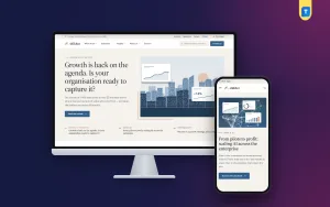
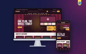
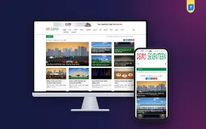
Looking at good corporate website examples is the quickest way to learn what your own company site needs. You see what to put on the home page, how to explain services and how to make a visitor send an enquiry. You also see what to leave out.
This guide does not list brand names. It breaks down the patterns that the best company sites share, with simple lists you can apply to a consultancy, an audit firm, a law practice, an engineering company or any firm that sells expertise.
What a corporate website must do
A corporate website is not an online shop. Nobody adds a service to a cart. The site exists to build trust, answer questions and start a conversation.
Most strong company sites do five jobs:
- Say clearly what the firm does and for whom.
- Prove it with client stories, figures and real people.
- Show depth through articles, reports and opinions.
- Help the right visitor find the right page fast.
- Make it easy to send an enquiry or apply for a job.
When you study corporate website examples, ask of each page: which of these five jobs is it doing?
Corporate website examples: the home page
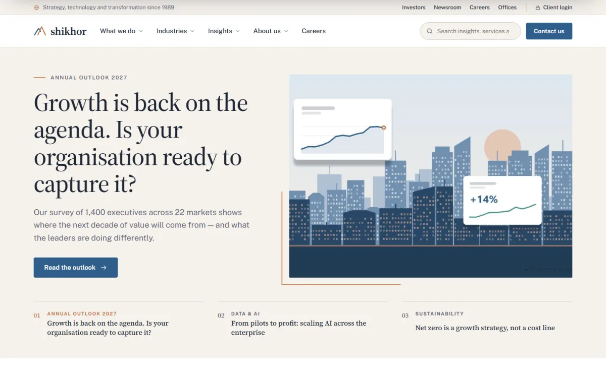
The home page of a firm that sells expertise is a map, not a brochure. It should show the main routes and let visitors choose their own.
Blocks that appear again and again:
- A featured story with a big headline and picture.
- Client logos in a quiet row.
- Who we are: one clear statement and three or four key figures.
- What we do: cards for each service.
- Industries: a list of sectors you serve.
- Client stories: each with its headline result.
- Latest thinking: your newest articles.
- Offices: where you work.
- Careers and contact: a clear next step.
Looking at corporate website examples from your own sector will show which of these blocks your competitors rely on. You do not need all nine. A small firm can start with four or five and add more later.
Write a clear statement of what you do
Many company sites fail in the first line. They say things like we provide innovative solutions, which says nothing. Compare two versions.
- Weak: We deliver excellent solutions for modern businesses.
- Better: We help garment exporters cut audit costs and pass buyer checks.
The second tells a visitor exactly who you help and how. Write your statement, then test it on a friend. If they cannot repeat it back, rewrite it.
Show your services in a simple structure
Visitors rarely read a services page from top to bottom. They scan for their own problem, so each service needs a clear name and a short summary that a non-expert can follow. Avoid internal jargon and long lists of buzzwords.
Services pages are the heart of the site. Keep them consistent.
Each service page can follow the same pattern:
- A one-sentence summary.
- The problem the client usually has.
- What your firm does, in plain steps.
- What the client gets at the end.
- A short client story related to this service.
- A button to ask a question.
Group services in a parent page and place each one underneath it. Visitors then see a tidy list, and search engines see a clear structure. Add a small icon and a few key facts to each service so a busy reader can skim.
Corporate website examples that use client stories
Proof beats claims. The strongest company sites lead every client story with the result, not the process.
A good client story has:
- A headline with a number, for example costs cut by a fifth in six months.
- A short description of the client and their problem.
- What your team did, in three or four lines.
- The measured result.
- A quote from the client, with their name and role, if they agree.
Ask for permission before you publish. If a client cannot be named, describe them by size and sector instead. Do not invent numbers. A true small result is worth more than a large doubtful one.
Help visitors find the right page
Many corporate website examples fail here, not because the content is poor but because it is hard to reach. A visitor who cannot find the right page in three clicks usually leaves.
Corporate sites hold a lot of content. Visitors come with different needs: a buyer looking for a supplier, a student looking for a job, a journalist looking for a contact. Good navigation separates them.
- Keep the main menu to six items or fewer.
- Use wide menu panels for deeper links, with one featured article.
- Add a simple finder: choose your industry and your priority, then see matching services and a client story.
- Put search in the header.
- Place a visible contact link in the top bar and the footer.
The finder idea is common among larger firms because it saves the visitor from reading five pages to find one.
Build trust with insights and articles
Firms that sell expertise should show it. A news and insights section does this better than any slogan.
What to publish:
- Short explainers on questions clients ask you.
- Annual or quarterly reports on your sector.
- Opinion pieces by named partners.
- Case notes from past work, with permission.
- Event announcements and speaking slots.
Use topic tabs so readers can filter by subject. Put an author name and date on every piece. Publish less often, but make each piece useful. One good article a month is better than ten thin ones.
Show your people and your places
Clients are cautious when they hire an adviser, because they cannot test the service first. Seeing the people behind it lowers that worry. Short profiles, honest photos and visible office details make a firm feel real, and that is often what turns a quiet visitor into an enquiry.
Clients hire people. Many corporate website examples include a leadership message, a team page and a list of offices.
- Use real photos, not stock images of smiling strangers.
- Write a two-line profile for each leader with their field of work.
- List each office with its address, phone and a map or region.
- Add a careers page with open roles and a filter by team.
If you have more than one office, a simple world or country map with office points gives a quick sense of your reach.
Plan the enquiry path
The whole site leads to one action: an enquiry. Make that step short.
- A contact page with a short form: name, company, email, phone, message.
- The same form available on service pages through a shortcode or block.
- An email sent to the right person the moment the form is filled.
- A copy saved in your dashboard, so no message is lost.
- A reply within one working day, written by a person.
Keep the form short, and tell the visitor what happens next, for example that someone will reply within one working day. A visitor who knows what to expect is more likely to press send. Test the form every month. Broken contact forms are one of the most common and most costly faults on company websites.
Corporate website examples for investors and careers
Larger firms often add two special areas. Even a smaller company may need them as it grows.
An investors page
This holds annual reports, results, a financial calendar and a contact for shareholders. Keep documents in PDF with clear dates.
A careers page
List open roles, describe life at the firm and let applicants filter by team. Say how long the hiring process takes. Good candidates read this page before they apply.
Design rules that most good company sites follow
The best corporate website examples look calm. They do not try to impress with effects.
- Use a serif or a clear sans-serif for headings and keep body text large enough to read.
- Choose one accent colour and use it sparingly.
- Leave generous white space between sections.
- Use thin lines and light bands to divide content.
- Keep animations minimal.
- Check contrast so text is easy to read.
Make sure every page works on a phone, since even the best corporate website examples lose visitors if the layout breaks on a small screen. Many decision makers will first open your link on a mobile from a message or an email.
Business website design templates: what to look for
Not every firm can afford a custom build. Business website design templates can give you a strong start, if you pick well.
Check these points:
- Does it include service, industry, about, careers and contact pages?
- Can you re-order and switch off home page blocks without code?
- Is there a place for client stories and articles?
- Does the contact form save messages in your dashboard?
- Can you change colours and fonts?
- Does the demo load quickly on a phone?
Compare two or three options side by side before you pay. Open each demo on your own phone and try the menu, the contact form and the longest page. Business website design templates differ a lot in how they handle long pages and article lists.
Avoid a template that carries shop features you will never use. Extra features slow the site and clutter the menu.
A ready-made option on WordPress
Shikhor is a WordPress theme made for consulting, advisory, technology and professional-services firms. It follows the pattern described above: calm, editorial and built around services, industries, stories, insights, careers and enquiries.
What it includes:
- 17 homepage blocks that you can switch off or re-order.
- A finder that asks where the visitor wants to go next.
- Client stories with headline results.
- Latest thinking with topic tabs.
- A dotted world map with offices by region.
- A careers template with a team filter.
- An investors template with reports and a calendar.
- Contact form messages kept under Enquiries in your dashboard.
- Wide menu panels with a featured article.
- 6 colour palettes, 5 font pairs and a one-click demo of an advisory firm.
The Themeve Commerce plugin is bundled, and the theme's Setup screen installs it in one click. To see the details, read the Shikhor page and open the demo.
Mistakes to avoid on a company site, and a simple plan
- Vague claims with no proof.
- Stock photos instead of real people.
- Too many menu items.
- No client stories, or stories without results.
- Articles with no author or date.
- A contact form that fails silently.
- A site that is slow or hard to read on a phone.
- Old news and expired roles left on the site.
A quick audit of these eight points, once every quarter, keeps a company site in good shape.
A simple plan to build your own
- Write your one-line statement of what you do and for whom.
- List your services and group them under one parent page.
- Gather three client stories with permission.
- Collect photos of your real people and office.
- Choose a template that fits your pages.
- Publish the first three articles.
- Test the contact form and the phone view.
- Launch, then review once a month.
Work through the list in order. Each step is small, and the finished site will be clear and honest.
If you want to read more on the technical side, the official WordPress documentation is a good, reliable reference.
Frequently asked questions
What are the best corporate website examples to study?
Study sites of firms in your own field, such as consulting, audit or engineering. Note their menu, home page blocks, client stories and how they ask for an enquiry. Copy the structure, not the words.
How many pages does a corporate website need?
A small firm can start with home, about, services, a few industry or service pages, insights, careers and contact. Add more only when you have real content for them.
What do good corporate website examples have in common?
They explain what the firm does in plain words, prove it with client stories and show their people. They also make it easy to send an enquiry.
Can a small firm use business website design templates?
Yes. A good template saves time and cost. Choose one with service, about, careers and contact templates, and check that you can change colours, fonts and block order.
Where do contact form messages go in Shikhor?
Each message is emailed to you and also kept under Shikhor, Enquiries in the dashboard.
How do I add offices to the world map?
Type them in Theme Options under Offices, one per line as City, Address and Phone.