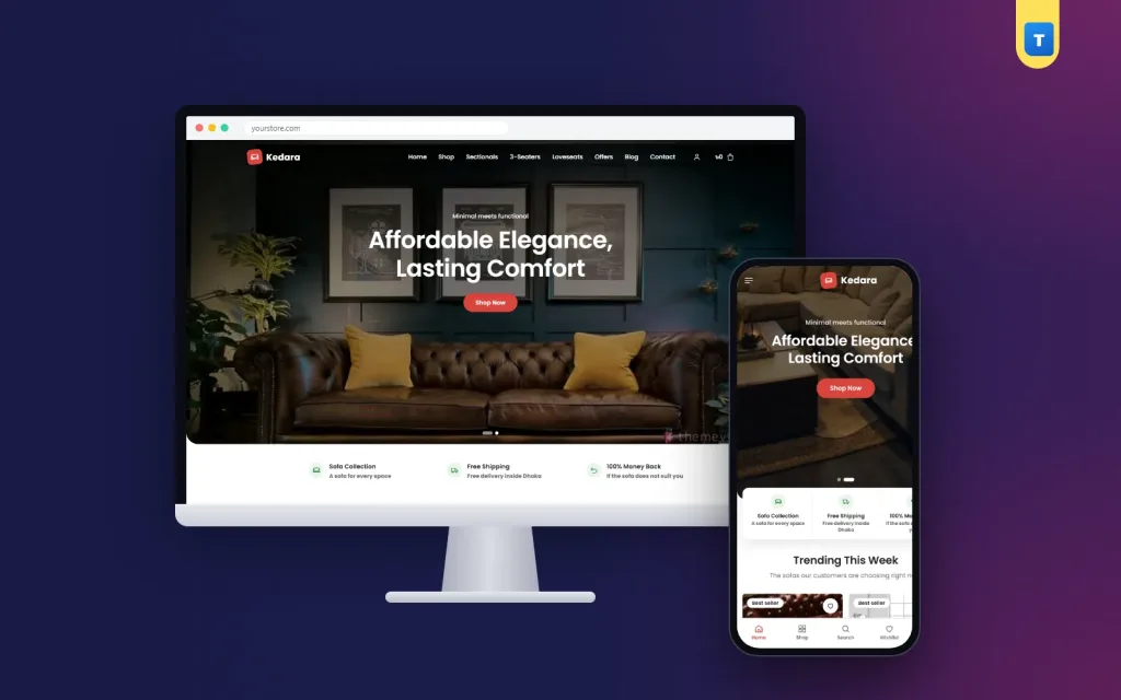
Furniture store website design decides whether a visitor books a delivery or closes the tab. This guide covers the pages, sections and small details that turn browsers into buyers, with practical examples for sofa and home furniture shops.
We set up furniture stores online every month. The shops that sell well are rarely the ones with the most effects. They are the ones that answer buyers' questions quickly and make ordering easy.
Start with the pages a furniture store needs
Before you think about colours, plan the pages. A complete furniture store website design usually needs these:
A homepage that shows your best ranges. Category pages for each furniture type. Product pages with sizes and materials. A cart and a one-page checkout. A Delivery & Assembly page. A Returns & Warranty page. An About page with your story and workshop. A Contact page with your showroom. A Track Order page. A blog for buying guides.
The policy pages do not bring much traffic, but buyers open them just before they pay. If they are missing, many people stop at that moment.
A homepage that guides, not just impresses
Think of the homepage as a short conversation. First, a strong room photo and one sentence about what you sell. Then three promises that remove fear, such as free delivery in your city, a warranty and cash on delivery.
Next, show what is popular this week and your main categories. Then help undecided buyers with a "need help choosing?" section that explains the difference between a sectional, a 3-seater and a sofa-cum-bed. Close with offers, reviews and your blog.
Good home furniture website design keeps this order simple. Every section should lead to a product or a category, never to a dead end.
Use white space to make furniture look premium
Crowded pages make furniture look cheap. White backgrounds and generous spacing let the colour and shape of each sofa stand out. Use one accent colour for buttons, such as coral or teal, and keep everything else calm.
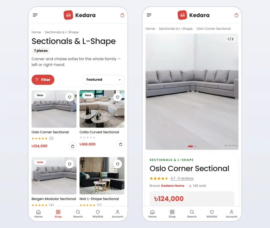
Square product cards with a clear photo, the name, star ratings and the price are easy to scan. A small add button on the card lets returning buyers order without opening the product page.
Show proof: reviews, videos and real homes
Furniture buyers trust other buyers. Collect reviews after every delivery and show them on the homepage and product pages. Ask happy customers for a short video of the sofa in their home. Video testimonials are rare in local furniture shops, so they make you stand out.
Your furniture store website design should also show where you are. A showroom photo, address and opening hours tell buyers that you are a real business they can visit.
Answer questions with an FAQ block
In furniture store website design, the FAQ is often forgotten. Yet most phone calls to a furniture shop ask the same things: how long is delivery, is assembly free, can I change the fabric, is there a warranty? Put these answers in a frequently asked questions block on the homepage and on a full FAQ page.
It saves your team hours every week, and buyers who find answers on their own are more likely to order straight away.
Make offers visual
Instead of a plain "20% off" banner, use a room photo with hotspots. Buyers tap a sofa in the photo and see its price and a link to the product. A handwritten offer line adds a personal touch. A deal block with a countdown timer creates a reason to buy this week.
Navigation and filters
Keep the main menu short and clear: sofas by type, living room, offers, blog and contact. On category pages, offer filters for seats, material, colour, firmness and price, and show how many sofas match each filter. Let buyers sort by price or by newest. A buyer who narrows eighty sofas down to six good options in a minute is close to ordering.
Photos that show scale
Buyers struggle to judge size from photos. Include at least one photo of each sofa in a real room, with a person sitting on it if possible. Add a straight-on photo with the measurements written beside it. Take detail shots of the fabric, the stitching and the legs. Consistent daylight photos across the whole shop make every sofa look its best.
Trust details in the footer
Put your phone number, showroom address, opening hours, social links and payment logos in the footer of every page. Add links to delivery, warranty and returns pages. Many buyers scroll to the footer to check that a store is real and reachable before they order anything.
Keep the checkout short and local
Ask only for name, phone, address and district. Show the delivery charge for the selected district. Offer bKash, Nagad and cash on delivery, and for expensive pieces, consider a small advance to filter out fake orders.
After the order, show a clear confirmation, send the order to your courier and let the buyer follow it on a Track Order page. These steps build the trust that brings repeat orders.
Bundles and room sets
Many families furnish a whole living room at once. Offer room sets, such as a sofa with a coffee table and a rug, at one price with a small saving. Show the set in a room photo with hotspots, so buyers can see and open each piece. Room sets raise the order value and make the decision much easier for buyers who do not want to match pieces themselves.
Corporate and bulk orders
Offices, hotels, cafés and clinics buy sofas and seating in quantity. A short corporate quote form with quantity prices and a direct contact turns these enquiries into orders quickly. Mention on the homepage that you supply businesses, so these buyers know to ask, and reply to their requests within a day.
Design for phones first
Most furniture shoppers begin on a phone, often from a social media ad. Check that the header shows the menu, logo and cart in one line, that cards are easy to tap and that the checkout fits on one screen. Slow sliders and heavy effects hurt more than they help.
Home furniture website design for a growing range
Many shops start with sofas and later add beds, dining tables or wardrobes. Plan for this early. A good home furniture website design uses clear top-level categories, such as living room, bedroom and dining, with sofa types or bed sizes underneath.
Keep the same card style, the same size line and the same product page layout for every category. Buyers learn your shop once and then move between ranges without thinking. Use filters for seats, material and firmness, so a buyer can narrow 80 sofas down to the six that suit them.
Seasonal collections, such as an Eid living room or a new-home bundle, are easy to add as separate sections on the homepage. They give regular visitors something new to see and support your social media posts. A flexible home furniture website design lets you add these without rebuilding pages.
Product pages that answer every question
A sofa product page should show large photos from several angles, the price, the size, fabric or colour options and one clear add-to-cart button, all visible on a phone without scrolling. Below, add the frame and foam details, care instructions, the warranty, delivery and assembly information and reviews.
Fabric options work best as swatches with their own photos. Buyers want to see the exact colour on the exact sofa, not a small square of fabric. This detail alone reduces returns and repeated phone calls.
Furniture store website design for showrooms
If you have a showroom, your website should invite people to visit. Add a showroom block with a photo, address, opening hours, a map link and a "book a visit" button. Mention which pieces are on display. Many buyers like to sit on a sofa before ordering, and a site that helps them do so earns their trust.
Online buyers who visit the showroom often order more, and showroom visitors who see your website often order again later from home. Good furniture store website design connects the two.
Pricing and advance payments
Be clear about money. Show the full price, any discount and the delivery charge for each district before checkout. For expensive pieces, many stores ask for a small advance by bKash or Nagad on cash-on-delivery orders. Explain the rule in one sentence on the product page, so buyers are not surprised at checkout.
Blog content that sells
Buying guides bring visitors who are planning a purchase: how to choose a sofa for a small room, leather or fabric, how to measure for an L-shape sofa. Each guide should answer one question clearly and link to two or three matching products. A blog section on the homepage keeps the latest guides visible.
Over months, these articles become one of the most valuable parts of your furniture store website design, because they bring steady visitors from Google without paying for ads.
Seasonal offers and campaigns
Furniture demand rises before Eid, before weddings and when families move house. Plan a campaign for each: a hero photo, an offer banner with hotspots and a deal block with a timer. Prepare them a month in advance, so the homepage changes on exactly the right day without a last-minute rush.
After the sale
Send an SMS when the order is confirmed, when the sofa is on its way and after delivery with a short care tip. Ask for a review and a photo of the sofa in the buyer's home. Real home photos are the strongest proof a furniture store can show, and they encourage the next buyer to order with confidence.
Measure and improve
Check which sofas get the most views, which ones are added to the cart and where buyers leave the checkout. Add more photos to popular pieces with few orders, simplify any confusing step and move best sellers higher on the homepage. Small, steady improvements make website design work better every month.
Common furniture store website design mistakes
Hiding the price until the buyer calls. Using only small product cut-outs and no room photos. Long checkouts with fields you never use. No delivery or warranty information. A homepage slider with five slides nobody waits for. Each of these costs orders, and each is easy to fix.
Build your furniture store website design with a ready theme
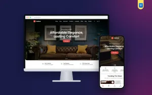
You can design all of this from scratch, or start from a theme made for the job. Our sofa WordPress theme, Kedara, follows this exact structure: a clean white design, three promises, trending sofas, "need help choosing?", an offer banner with hotspots, video testimonials, an FAQ block, deals with a timer and a blog.
It also includes the full shop: bKash, Nagad, cash on delivery with an optional advance, district delivery charges, Steadfast and Pathao courier and order tracking. A one-click demo adds ready pages for delivery, returns and warranty, offers and contact, so your website design is complete from day one.
Quick checklist
Before launch, check on a phone: are prices visible, are sizes on every product, are delivery and warranty explained, are there real reviews, and does the checkout take less than a minute? Five yes answers mean you are ready.
Look at these pages again after the first month of orders, since real customer questions show exactly what is still missing.
Want to see these ideas on a working website? Open the Kedara live demo and browse it on your phone and your computer.
Frequently asked questions
What pages does a furniture store website design need?
Home, categories, products, cart and checkout, Delivery & Assembly, Returns & Warranty, About, Contact, Track Order and a blog.
Is white or dark better for furniture store website design?
White or light backgrounds usually work best, because they make furniture photos look bright and premium.
How do I show customer videos on my site?
Upload them to YouTube and add the link to a testimonial block that opens the video in a popup.
How long does it take to launch a furniture website?
With a ready theme and demo content, a few days. Most of the time goes into product photos and descriptions.