Good kids clothing website design is not about cartoons and bright colours. It is about helping a busy parent find the right size, trust your shop and finish the order on a phone in a few minutes. This guide walks through what parents look for, page by page, and shows how to build each part without writing code.
We build online shops for clothing sellers in Bangladesh every week. The same questions come up again and again, so we have put the answers in one place.
What parents expect from a kids clothing website design
Parents are not shopping for themselves. They shop for a child who keeps growing, often late at night, often with a baby on one arm. Three things decide whether they buy or leave.
First, they need to see the age or size straight away. Second, they need to believe that the shop is real and will deliver. Third, the checkout must be short, with a payment method they already use, such as bKash or cash on delivery.
Every choice in your kids clothing website design should make one of these three things easier. If a section does not help with size, trust or speed, it can usually go.
Start the homepage with ages, not with a logo
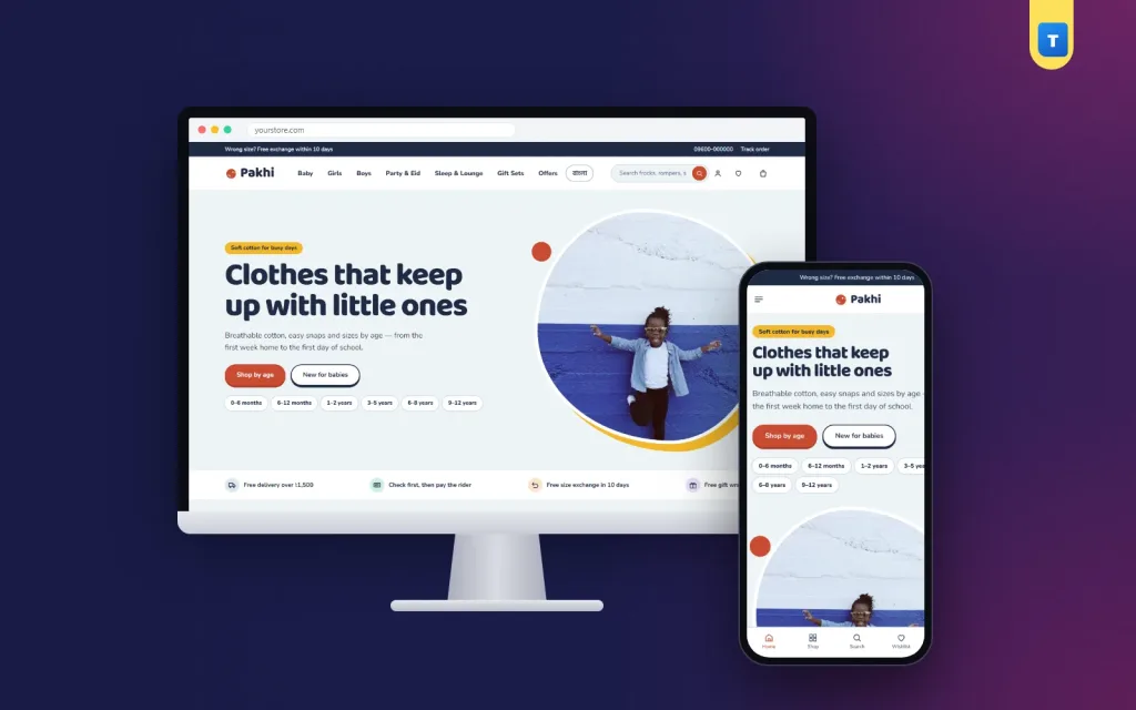
The first screen is where most visitors decide to stay. A large banner with only a brand name wastes it. Put the age groups right under the headline, so a parent can tap "6–12 months" or "3–5 years" and see only what fits.
Colourful age circles are one of the most useful ideas in kids clothing website design. They are easy to tap with a thumb, and they tell new visitors in one look that you sell for every stage, from newborn to pre-teen.
After the ages, show your main categories, such as baby basics, girls, boys, party wear and sleepwear, and then a row of new arrivals. Parents who visit often want to know what has changed since last week.
Solve the size problem on the page itself
Wrong sizes cause most exchanges in a kids shop, and every exchange costs you a delivery charge. A simple size tool on the page prevents many of them.
The easiest tool to use is a height finder: the parent slides to the child's height and the page suggests an age size. It is faster than a size table, and it works well on small screens.
On every product card, print the age range under the name. When the age is visible in the grid, parents do not have to open each product to check, and they add to cart more often.
Baby clothing website design: softer, calmer, simpler
If most of your range is for newborns, the rules change a little. A baby clothing website design should feel calm. Use soft colours, plenty of white space and close-up photos that show fabric and stitching.
New parents care about comfort and safety more than trends. Short notes such as "100% cotton", "snap buttons" or "no labels at the neck" help more than long descriptions. A gift-box section also sells well, because many baby orders are presents for a new arrival.
The same baby clothing website design rules apply to gift pages too. Keep the same layout for baby and kids pages, so parents with older children do not feel lost when they move between age groups.
Product pages that answer questions before they are asked
A good product page in a kids clothing website design has large photos, the price, the available ages and one clear "Add to cart" button. Anything else should support these four things, not hide them.
Reviews from other parents are very persuasive, but they do not need to fill the screen. A fold that opens with one tap keeps the page tidy while still showing that real people bought and liked the item.
Let shoppers save items to a wishlist and sign in through a small popup. A full-page login on a phone often means the parent never comes back to the product.
Build trust before the checkout
Parents order from shops they trust. Show your delivery promise, your exchange policy and your contact number near the top of the homepage and again in the footer.
Payment logos help as well. When a parent sees the familiar bKash, Nagad, Rocket, Visa and Mastercard logos, the shop feels established. Add a Track Order page, so customers can follow their parcel without calling you.
Pages such as Delivery, Returns & Exchange and FAQ do not bring many visits, but they answer doubts at the exact moment a parent is about to pay.
Make the checkout one short page
Long checkouts are the main reason for lost orders on mobile. Ask only for what you need: name, phone, address and district. Offer cash on delivery next to bKash and Nagad, and show the delivery charge for the selected district before the order is placed.
After the order, show a clear confirmation and send the order to your courier. Shops that connect Steadfast or Pathao save hours of copying addresses every week.
Design for the phone first
Most parents in Bangladesh shop from a phone. Test every page on a small screen before you look at it on a laptop. The header should fit the menu, the logo and the cart in one line, and the side menu should be easy to reach with a thumb.
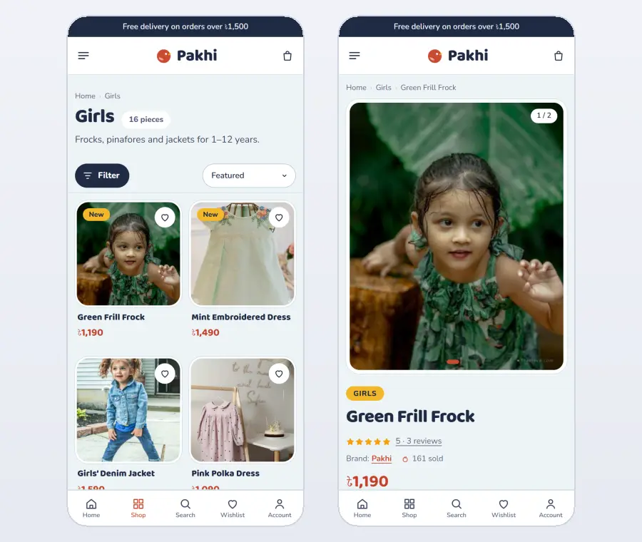
Keep product cards compact, so parents see two products side by side. In a kids clothing website design, large buttons and fast photos beat fancy effects. Short text and quick checkout steps finish the job.
Kids clothing website design: navigation and filters
Keep the main menu short and familiar: baby, girls, boys, party and Eid, sleepwear, jackets and rainwear, gift sets and offers. On category pages, add filters for age, size, colour and occasion. Age should always be the first filter, because it is the first thing a parent thinks about.
Show how many products match each filter and let parents sort by newest or price. A busy parent who finds the right section in two taps is far more likely to order than one who has to scroll through everything. Simple navigation is a quiet but essential part of kids clothing website design.
Seasonal collections and festivals
Kids clothing sells in waves: Eid, the start of the school year, winter, the rainy season and birthdays all through the year. Plan homepage edits for each moment a month ahead. An Eid edit with matching outfits for siblings, a back-to-school edit with uniforms and bags, or a rainy-day edit with jackets and boots gives parents ready answers.
Change the hero photo and the edits with each season. A homepage that changes regularly gives parents a reason to come back, and it gives you fresh content to share on social media.
Photos that parents trust
Parents want to see how clothes look on real children, not only on hangers. Show each piece on a child of the right age, plus a flat photo and close-ups of the fabric, buttons and seams. Mention the age and height of the child in the photo.
Use soft natural light and simple backgrounds. Consistent photos make the whole shop look calm and trustworthy, which is exactly how good website design should feel. If you use photos of children, always have permission from their parents.
Safety and fabric information
Parents care deeply about what touches their children's skin. List the fabric clearly, such as 100% cotton or soft jersey, and note anything that matters for comfort and safety: no loose buttons on baby clothes, soft labels, snap fastenings for easy changes. A short care note helps clothes last through many washes.
Baby clothing website design for gifts
Many baby clothes are bought as gifts by relatives and friends. A gift section with ready sets, such as a newborn bodysuit pack or a first-Eid outfit, makes buying easy for people who are unsure about sizes. Offer gift packaging and a note, and explain that sizes can be exchanged. Good baby clothing website design treats these buyers as a separate audience with their own simple path.
Loyalty and repeat orders
Children grow out of clothes every few months, so a happy parent will order again and again. Reward that with points on every order, a birthday offer for the child and a refer-a-friend discount.
Send an SMS when the next size of a favourite item arrives or when a new season begins. Repeat customers are the most valuable part of any kids clothing business, and a few simple loyalty tools keep them close.
Measure and improve
After launch, look at which ages and sizes sell out first, which products are returned most and which pages parents visit before buying. Restock popular sizes early, rewrite unclear size notes and move your best sellers higher on the homepage. Small monthly changes like these make your website design work harder over time.
How to build this kids clothing website design without coding
You can build everything above from scratch, but it takes weeks and a developer. The faster way is a ready-made theme made for this kind of shop.
Our kids clothing WordPress theme, Pakhi, already includes the age circles, the height size finder, the gift-box band, age ranges on every card, the one-page checkout with bKash, Nagad and cash on delivery, courier sending and a Track Order page. A one-click demo imports 60 sample products and 17 ready pages, so you can see the finished shop first and then replace the samples with your own items.
Colours, fonts, text and photos all change from one settings page, so the design stays yours. If you sell for the whole family, look at our other clothing themes as well.
Delivery that parents can plan around
Parents often order for a specific day: a birthday, Eid or the first day of school. Show expected delivery times clearly, and if you can, let them choose a delivery date. Send an SMS when the parcel leaves and when it is close, so nobody misses the delivery.
Content that brings parents from Google
Parents search for help all the time: what size to buy for a two-year-old, what to pack for a newborn, how to dress children for Eid. Short, practical articles answer these questions and link to the right products. Each article becomes a new way for parents to find your shop.
Write in plain, friendly words and use your own photos. End each article with a few product suggestions for the right age. Over months, this content brings steady visitors who already trust your advice.
Quick checklist
Before you launch, check these points on a phone. Can a parent find their child's age in one tap? Is the age printed on every product card? Is there a size tool? Are your delivery and exchange rules easy to find? Does the checkout fit on one page with cash on delivery? If the answer to all five is yes, your shop is ready for its first orders.
Want to see these ideas on a working website? Open the Pakhi live demo and browse it on your phone and your computer.
Frequently asked questions
What colours work best for a kids clothing website design?
Light backgrounds with one or two soft accent colours, such as sky blue with coral or mint with berry. Keep the product photos as the brightest thing on the page.
Do I need a separate website for baby clothes?
No. One shop with clear age groups works better for most sellers. Use calmer sections for newborn items and keep the same checkout for everything.
How long does it take to build a kids clothing website?
With a ready theme and demo content, a basic shop can be ready in a day. Most of the time goes into taking good product photos.
Which theme should I use for a kids clothing website design in WordPress?
Choose a theme made for children's clothing, with age-based shopping and a size tool built in. Pakhi was made for exactly this kind of shop.