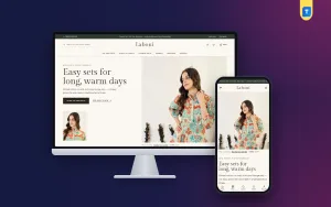
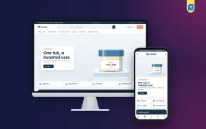
Landing page website design is the work of building one page that has a single purpose: to turn a visitor from an ad into a buyer. If you sell honey, ghee, dates or any natural food through Facebook and Google ads, a well-planned landing page can do more for you than a full online shop.
This guide explains how to plan the page, which sections to include, how to write for buyers who doubt you, and how to take orders with cash on delivery, bKash and Nagad. The examples come from honey, because honey sellers face the hardest trust problem, but the steps apply to any single product.
What a landing page is
A landing page is the first page a person sees after clicking your ad. It is built for that one click. Unlike a home page, it does not try to describe your whole business. It talks about one product and asks for one action.
A good landing page has these traits:
- One product and one offer.
- No distracting menu or footer links.
- A headline that matches the ad.
- Trust-building content before the order form.
- A form on the page itself, so the buyer does not wait for another page to load.
If a visitor can understand and order in a minute or two on a phone, the page is working.
Why landing page website design matters for honey sellers
Every honey buyer asks the same thing first: is it pure? An ad cannot answer that. Pictures of a jar look the same whether the honey is real or not. So the page has to do the explaining.
Buyers also want to know:
- Where the honey comes from.
- How it is collected and stored.
- How one kind differs from another, such as khalisha, mustard or sundarban honey.
- Which jar size to buy.
- What happens if the jar arrives damaged.
A shop with many items cannot answer these well. A focused page can answer them one by one, in the order a buyer thinks of them.
A page cannot prove purity by itself. What it can do is give you room to show your real photos, your real process and your buyers' own words.
Plan before you design
Good landing page website design begins with thinking, not with colours. Take half an hour with a notebook and answer these questions:
- Who will buy? A family, a health-minded office worker, a gift buyer?
- What is the main worry? Purity, price, delivery, taste?
- What is your offer? A discount, a combo, free delivery over a certain amount?
- What proof do you have? Photos of the hive, the collection, lab reports, reviews.
- What is the one action? Usually a placed order.
Here is a short example. A small apiary sells mustard honey at 650 taka per kilo to families in Dhaka. The main worry is purity, the offer is free delivery above two kilos, and the proof is a short video of the collection plus ten reviews. With those answers written down, the page almost plans itself: story and proof first, jar sizes next, then the form.
The answers decide the page. If your worry is trust, put proof high up. If your worry is price, explain the value early.
The sections a landing page needs
This order works for most food and natural products:
- Hero. A short headline, a clear jar photo and a button.
- Offer line. Price, discount and the end date if the offer is real.
- Which one is for me. A short guide if you sell more than one kind.
- The story. Where the honey comes from and how it travels to the jar.
- Benefits. Taste, use and storage, in plain words.
- Jar sizes and combos. Cards with prices.
- Reviews. Real quotes with names.
- Comparison. How your honey differs from loose market honey, stated honestly.
- Order form. Short, with payment choices.
- Questions and answers. Delivery, returns, storage.
Keep each part to one or two screens on a phone.
Tell the story from the forest to the jar
People pay more for honey when they know its story. Show the journey in simple steps with a picture beside each:
- Where the bees feed, such as a mangrove forest or a mustard field.
- How the honey is collected.
- How it is filtered, if at all.
- How it is stored and bottled.
- How it is packed and sent.
Write your real steps. Do not borrow a story from another seller. If your process is simple, say so; honest and simple is more believable than grand and vague.
Help buyers pick the right honey
If you sell more than one type, buyers get stuck. A buyer between khalisha and mustard honey may give up and leave. A short guide solves this.
For each honey, show:
- The season it is collected.
- The colour and taste.
- The best use, such as tea, cooking, winter cough or daily spoonful.
- A button that selects that jar in the order form.
That last point matters. Every extra scroll or tap between the idea and the order loses some buyers.
Write copy that feels honest
Buyers of natural foods have been disappointed before. Avoid big claims, and let facts do the work.
- Say what is in the jar: honey, nothing added. Only say so if it is true.
- Do not claim a cure for any illness.
- Give the weight and the number of days it keeps.
- Explain how to check honey at home without calling any test perfect.
- Use your own voice. A few short sentences from the person who collects the honey are worth more than polished marketing.
- Write in Bangla if your buyers read in Bangla.
- Keep sentences short, so a buyer can read them while holding a phone in one hand.
Honest copy brings fewer returns, and returns are expensive when each jar needs a courier.
Honey landing page website design: photos and layout
Photos carry most of the trust. For a honey landing page website design, plan these pictures:
- A clear jar photo in daylight on a simple background.
- A close-up of the honey on a spoon, showing colour and thickness.
- The place where the honey is collected.
- The hands that collect and pack it.
- The package ready to ship.
You do not need a studio. A phone camera, a window with daylight and a clean cloth are enough. Take more photos than you need, then choose the three clearest. Avoid filters that change the colour of the honey, because the buyer will compare it with the jar that arrives.
For the layout, use one column, large text, wide buttons and compressed images. Most visitors come from a Facebook app on a phone with a slow connection. Add a sticky order bar and a floating hotline button so a buyer can act from any point on the page.
Show the jar sizes as cards: half kilo, one kilo, two kilo. Put the price and the price per kilo on each card. A combo of two kinds of honey can raise the order value, and it gives the buyer a reason to try both.
Offer a clear delivery charge for inside and outside Dhaka. Hidden charges cause cancelled orders. If you give free delivery above a certain amount, say the amount in the offer line.
The order form
A short form converts better than a long one.
- Name, phone number, full address, jar size.
- Cash on delivery, bKash and Nagad as payment choices.
- Delivery charge and total shown before submitting.
- A note about replacement if a jar leaks or breaks in transit.
Think about delivery before the first order arrives. Decide these points in advance:
- Which courier you use inside Dhaka and which for other districts.
- How many days delivery takes, and what you tell the buyer.
- Who pays for a return if the buyer refuses at the door.
- How you track each parcel and tell the buyer when it ships.
Pack jars well, since glass breaks. Use bubble wrap, a sturdy box, and tape on the lid. A damaged parcel costs the sale and the review.
After the order, call to confirm. This checks the address and cuts fake orders.
A ready-made option for honey sellers
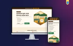
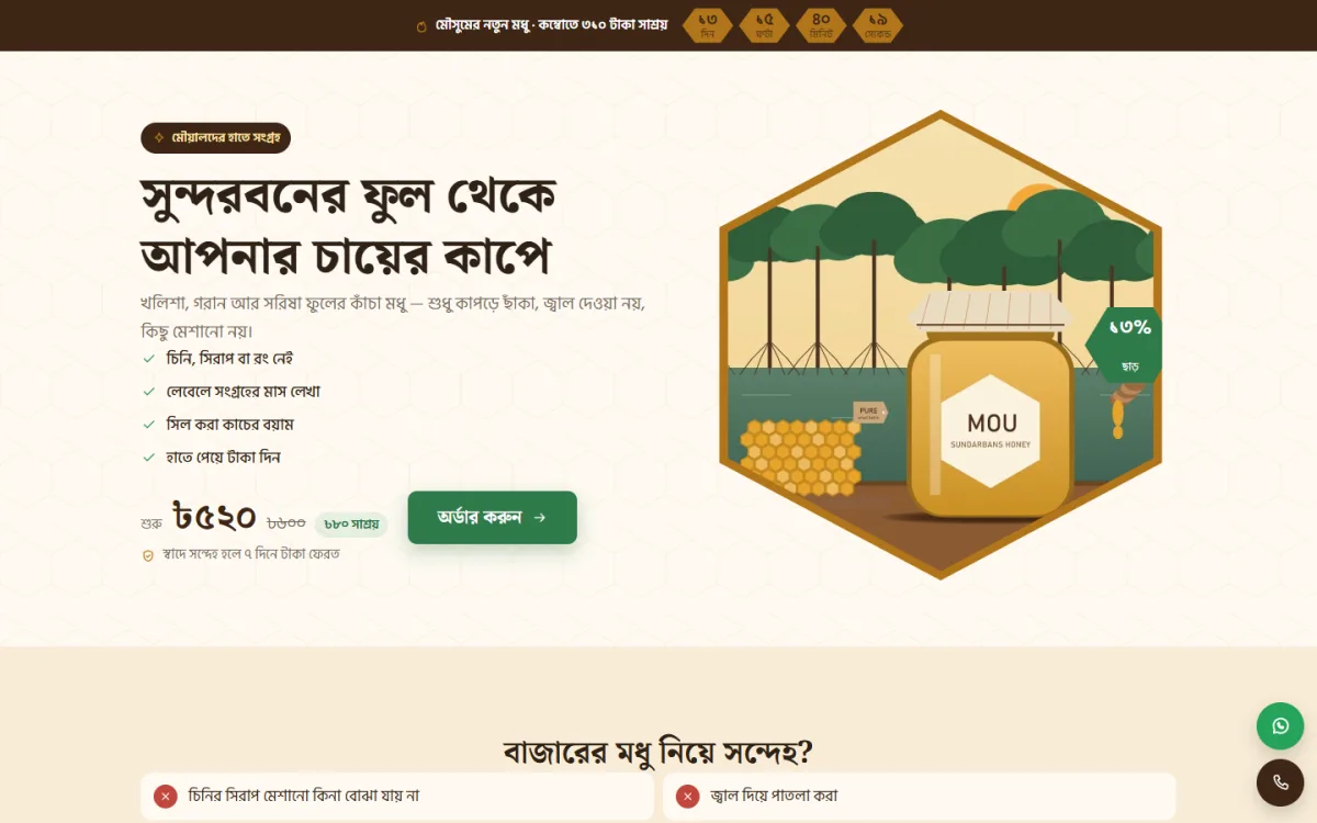
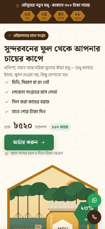
If you would rather not design everything yourself, Mou is a WordPress theme for beekeepers and natural food sellers who take orders from ads. It is one long page for one product, with no site header or footer, and the order form sits inside the page.
It includes:
- A which-honey-is-which guide, with a hexagon for each kind and a button that picks its jar.
- A forest-to-jar journey shown in honeycomb cells, where you write your own steps.
- 16 sections to hide or reorder.
- Jar packages as cards, with a picker in the form.
- An order form with cash on delivery, bKash and Nagad.
- A review wall and comparison sections.
- An offer line with a countdown, a floating hotline and WhatsApp button, and a sticky order bar on phones.
- Four honey colour palettes and three font choices.
The theme cannot prove purity for you. It gives you the space to show it with your own photos and words. It also suits ghee, dates or other food sellers with a similar story. It needs WordPress 6.0 or later and PHP 7.4 or later.
Build the page step by step
- Buy a domain and hosting.
- Install WordPress and your theme.
- Write your text in a document: headline, story, honey guide, questions.
- Collect and compress your photos.
- Fill in the sections and hide any you cannot support yet.
- Enter prices, jar sizes and delivery charges.
- Connect the form to your phone or email.
- Place a test order.
- Check the page on a cheap phone.
- Start the ads with a small budget.
When you pick a theme or a builder, look for a layout that stays simple on a phone. A landing page website design with fewer moving parts is easier to keep working, and easier to fix at midnight when an offer goes live.
Run the test order every time you change the form. It takes five minutes and can save a week of lost ad money.
Mistakes to avoid
- Using photos of honey that is not yours.
- Claiming medical results.
- Hiding the price.
- Adding a menu that sends buyers away.
- A fake countdown that resets daily.
- No answer to the question "is it pure?"
- A form with too many fields.
- Poor packing that breaks jars.
Fix these before spending more on ads. If you use Mou, hide the review wall and comparison until you have real content for them.
Track results and improve
Watch visits, orders and the cost of each order. High visits with few orders mean the page needs work. Low visits mean the ad needs work. Change one thing at a time, and wait a few days before judging.
Good test ideas for landing page website design are the headline, the first photo, the offer and the order of the sections. Numbers worth watching are the share of visitors who start the form, the share who finish it, the share of orders confirmed by phone and the share delivered without a return. Keep notes. You will learn which changes help your own buyers.
If you want to read more on the technical side, the official WordPress documentation is a good, reliable reference.
Frequently asked questions
What is landing page website design?
It is the planning and building of one page for one purpose, usually an order. The page speaks to one kind of buyer, one product and one offer.
How is a landing page different from a home page?
A home page introduces the whole business and sends people to many places. A landing page keeps visitors on one product and one action.
How can I build trust on a honey page?
Show your real process with photos, explain where the honey comes from, add genuine reviews, and offer a clear replacement promise.
Which payment methods should I offer?
Cash on delivery, bKash and Nagad. Cash on delivery makes first-time buyers feel safe.
Can I use a WordPress theme for landing page website design?
Yes. A ready-made theme gives you the layout, the form and the phone view, and you add your own text and photos. You can see a honey page built with Mou on its live demo.
How many products can a landing page sell?
Aim for one main product with a few sizes or a combo. More than that confuses the buyer and weakens the page.