Summer clothing sells on feel: light fabric, easy fit and colours that look fresh in strong sunlight. A website cannot let buyers touch the fabric, so it has to describe the feeling in other ways. This guide gathers practical summer clothing website design ideas for linen, cotton and resort wear shops, from the first screen to the checkout.
We have built shops for linen labels, cotton clothing brands and summer boutiques in a hot, humid climate. The ideas below are the ones their customers respond to most.
What buyers want from a summer clothing shop
In hot weather, buyers care about three things: will it keep me cool, will it look good and is it easy to care for? Every section of a summer shop should answer one of those questions. Pretty pictures alone do not.
The best summer clothing website design ideas turn invisible qualities, such as breathability and weight, into something buyers can see and compare.
Summer clothing website design ideas for the homepage
Idea 1: a wide, airy hero
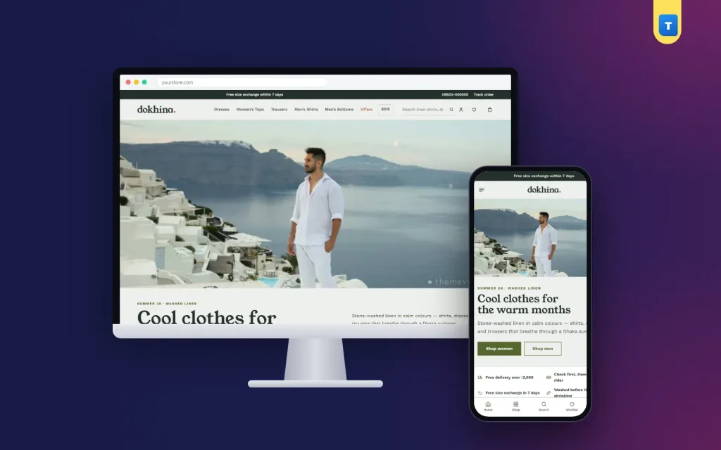
Start with a wide photo in natural light: a beach, a garden or a sunny street, with people wearing your pieces. Add a short introduction beside it in two columns, one sentence about the fabric and one about the look. White space and a light background make the whole page feel cooler.
Idea 2: a promise line about comfort
Under the hero, add three short promises: breathable fabrics, easy exchanges and cash on delivery. Buyers who are unsure about online shopping get their answers in one line.
Idea 3: colour stories instead of plain filters
Summer buyers often shop by mood: soft chalk and oat, fresh sage and sky, warm clay and deep ink. Show six colour stories, each with a close-up fabric photo and a swatch. It feels more inviting than a colour filter and shows the real texture of the fabric.
Idea 4: women and men side by side
Many linen and cotton brands sell to both women and men. Two tall photo links on the homepage, one for women and one for men, split the shop cleanly and help couples shop together.
Summer clothing website design ideas for product cards
Idea 5: show fabric weight on every card
Fabric weight in grams per square metre (GSM) tells buyers how light a piece is. A 140 GSM shirt is airy; a 220 GSM trouser is sturdier. Print the weight under the product name on every card, so buyers can compare from the grid.
Idea 6: add a breathability meter
A small bar or meter under the name, based on the fabric weight, gives a visual sense of how cool the piece will feel. It is one of the most useful summer clothing website design ideas because it answers the main question at a glance.
Idea 7: keep cards calm
Use one clean photo per card, the name, the price, the weight line and a small add button. Avoid badges on every product; save them for real sales and new arrivals.
Linen clothing website design template: what to look for
If you sell linen, choose a linen clothing website design template that supports fabric details out of the box: weight tags, colour stories with real fabric photos and room for care instructions. A general fashion template treats linen like any other fabric and leaves you to explain it in plain text.
Check that the template stays fast with many large photos, because natural fabrics need close-ups to sell.
Explain linen care, wrinkles included
The most common worry about linen is wrinkles. Turn it into a strength. A linen care section with before-and-after photos shows how linen looks after washing, after air-drying and after a quick press. Add short steps for washing, drying and storing.
Buyers who understand how to care for linen are more likely to buy it, and less likely to return it disappointed.
Product pages that sell the feeling
On the product page, show at least one photo in daylight, one close-up of the weave and one of the piece being worn. Describe the feel in plain words: "soft from the first wash", "light enough for a Dhaka afternoon", "relaxed fit through the hips". Add the weight, the composition and the care instructions in a short list.
Reviews that mention comfort in the heat are especially persuasive. Ask every customer for a review after delivery and show the best ones near the add-to-cart button.
Seasonal selling
Summer shops have a clear season. Plan for it. Before the heat arrives, highlight summer bestsellers in tabs. At the peak, run a bundle offer for shirt-and-trouser sets. When the season turns, switch on an end-of-summer sale block to clear stock before autumn.
Rotate your colour stories with the season too: lighter tones in early summer, deeper earthy tones as the weather cools. These small changes keep the homepage fresh for returning customers and give you new photos to share every few weeks.
Colours, fonts and photography
Earthy palettes such as olive and clay, sea and sand, terracotta or ink and chalk suit natural fabrics. Pair a friendly serif for headings with a clean sans-serif for text. Shoot in natural light, avoid heavy filters and keep backgrounds simple. Consistent, airy photos are one of the easiest summer clothing website design ideas to put into practice.
Gift-friendly summer shopping
Light shirts, scarves and linen sets make good gifts for Eid, birthdays and holidays. Add a small gift section with pieces in common sizes and a note about easy exchanges. Buyers who are not sure about the size will order more confidently when they know the receiver can swap it.
Content that brings visitors from Google
People search for help with summer clothing: what to wear in humid weather, how to wash linen, which fabrics breathe best. A journal with short, practical articles brings these visitors to your shop and links them to the right products. Each article is a new door into your store, and it keeps working long after you write it.
Write in plain words, add your own photos and end each article with two or three product suggestions.
Navigation and filters
Keep the menu simple: women, men, new in, bestsellers and sale. On category pages, offer filters for size, colour and fabric weight. Show how many products match each filter, and let buyers sort by newest or price. Simple navigation keeps a calm shop feeling calm.
A short, local checkout
Keep the checkout on one page: name, phone, address and district. Show the delivery charge for the selected district straight away and offer bKash, Nagad and cash on delivery. Confirm the order clearly and let buyers follow their parcel on a Track Order page.
Design for phones first
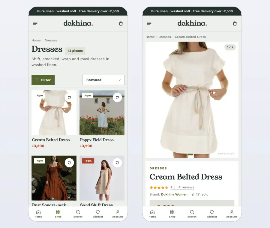
Most summer shoppers browse on their phones, often outside in bright light. Use clear contrast, large tap areas and short text. Make colour stories scroll sideways with a thumb, keep the weight line readable on small cards and keep the checkout on one screen.
Keep the site light. Avoid heavy page builders and long sliders, and load lower photos only when they come into view. A fast site keeps buyers browsing even on slow mobile data.
Sizing for relaxed fits
Summer clothes are often cut loose, which makes sizing tricky online. Add a simple size guide for each category with chest, waist and length measurements, and note whether a piece runs relaxed or true to size. Mention the model's height and size under the photos. These small details prevent most exchanges and help buyers order with confidence, especially for linen trousers and dresses where length matters.
Sustainability and trust
Many linen and cotton buyers care about how clothes are made. If your fabrics are natural, locally woven or dyed with care, say so in a short "Why us" section, with real photos from your workshop or suppliers. Honest details build trust; vague claims do not.
Summer clothing website design ideas for outfits and bundles
Summer buyers often want a complete, easy outfit: a linen shirt with matching trousers, a dress with a light overshirt, or shorts with a relaxed tee. Show these combinations as ready looks on the homepage and on product pages, with one button to see each piece.
A small saving for buying a set, such as a shirt and trouser pair, raises the order value without cutting your prices. Present bundles as outfits for a holiday or a hot workday, not as discounts, so they feel desirable.
Use short videos
A few seconds of video shows what photos cannot: how linen moves in a breeze, how a dress falls when walking and how soft the fabric looks after washing. Add short clips to your best sellers and share them on social media. Video is one of the newer design ideas, and it works especially well for natural fabrics.
Linen clothing website design template features that save time
A good linen clothing website design template lets you change the hero, colour stories, bestseller tabs and sale blocks from one settings page, without a developer. That matters in a seasonal business, where the homepage needs updates every few weeks. Look for a template that also lets you export your settings as a backup before big seasonal changes.
After the sale
Send an SMS when the order is confirmed and when it is on its way. After delivery, ask for a review and share a short linen care tip. Customers who learn how to care for their linen stay happy with it longer and are more likely to buy again next summer. When a sold-out colour returns, an automatic back-in-stock message brings them straight back.
Keep a simple list of what sold best each season. Next year, it tells you which colours, weights and cuts to order in larger numbers, which is the quiet side of good design ideas: they help your planning as much as your sales.
Common mistakes
Showing linen without any fabric close-ups. No information about weight or breathability. Hiding care instructions. Using only studio photos with heavy filters. A homepage that looks the same all year. A long checkout. Each of these makes summer clothing harder to sell online.
Build it with a ready theme
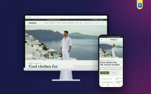
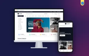
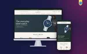
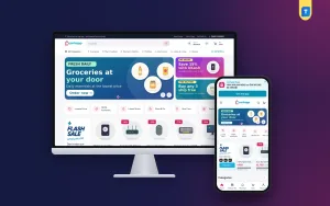
You can build all these design ideas yourself, or start with a theme that already includes them. Our linen clothing ecommerce website template, Dokhina, was designed for washed linen and summer wear.
It includes a wide hero with a two-column introduction, colour stories with fabric photos and swatches, a women and men split, summer bestsellers in tabs, a linen care block with before-and-after photos, an end-of-summer sale, reviews and a journal. Every card shows the fabric weight and a breathability meter.
The included shop plugin handles sizes and colours, bKash, Nagad and cash on delivery, district delivery charges, courier sending, bundle offers and back-in-stock alerts. A one-click demo shows a finished shop that you then make your own.
Checklist before launch
On a phone, check: does the homepage feel light and airy, are colour stories easy to browse, is the fabric weight shown on every card, is linen care explained, are women and men easy to find and does the checkout fit on one screen? If all six are yes, your shop is putting the right design ideas to work.
Linen looks best in natural light, so refresh product photos each season and keep the care notes short and clear.
Want to see these ideas on a working website? Open the Dokhina live demo and browse it on your phone and your computer.
Frequently asked questions
What are the best summer clothing website design ideas?
An airy hero, colour stories with real fabric photos, fabric weight on every card, a linen care section and a short checkout.
Why show fabric weight on a summer clothing website?
It tells buyers how light and cool a piece will feel, which is the main question in hot weather.
Which colours suit summer clothing website design ideas?
Earthy, natural palettes such as olive and clay, sea and sand or ink and chalk, with plenty of white space.
How do I handle the wrinkle worry with linen?
Show before-and-after photos and simple care steps, so buyers see that wrinkles are easy to manage.