Vintage clothing website design is about atmosphere. People who love vintage and retro fashion are not just buying a dress or a jacket; they are buying a feeling from another decade. A website that captures that feeling, while staying easy to shop, stands out from every plain fashion store. This guide explains how to design a retro-inspired clothing shop that feels nostalgic, tells stories and still sells quickly.
We have built shops for retro-inspired labels and vintage-style boutiques. The ideas below come from what their customers comment on most and what makes them buy.
Why vintage clothing website design needs its own approach
Most fashion sites aim for a clean, modern look. That works for many brands, but it can make a vintage label look like any other shop. Vintage buyers are drawn by details: old fonts, warm colours, film-photo textures, a sense of history. Good vintage clothing website design brings those details into the layout without making the shop hard to use.
Set the scene with the header and hero
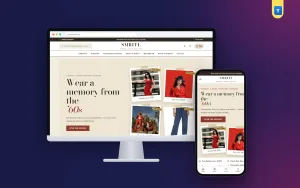
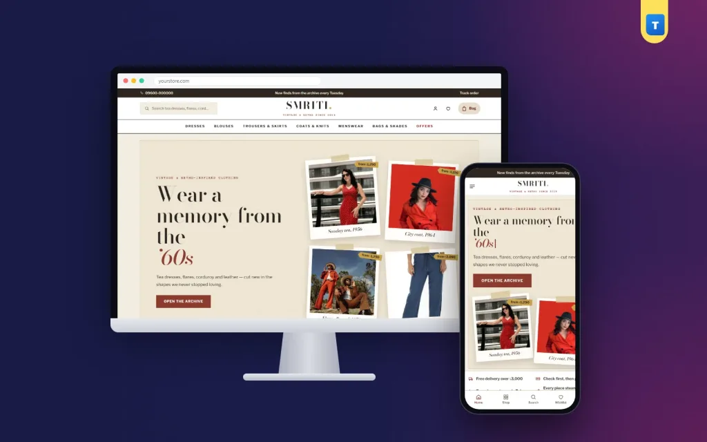
Start with a header that looks like the masthead of an old newspaper or magazine: a classic serif logo, a thin rule and a small line of text such as an issue date or a motto. It sets the tone before the visitor scrolls.
For the hero, a memory board works beautifully: a few polaroid-style photos taped at slight angles, beside a headline that types itself out like an old typewriter and cycles through the decades. It is playful, memorable and easy to change each season, so the homepage never feels stale to regular visitors.
Let customers shop by decade
Many vintage fans love one era above all others: the swing of the fifties, the colour of the sixties, the flares of the seventies or the grunge of the nineties. Record-sleeve tiles, one per decade, let them jump straight to their favourite era.
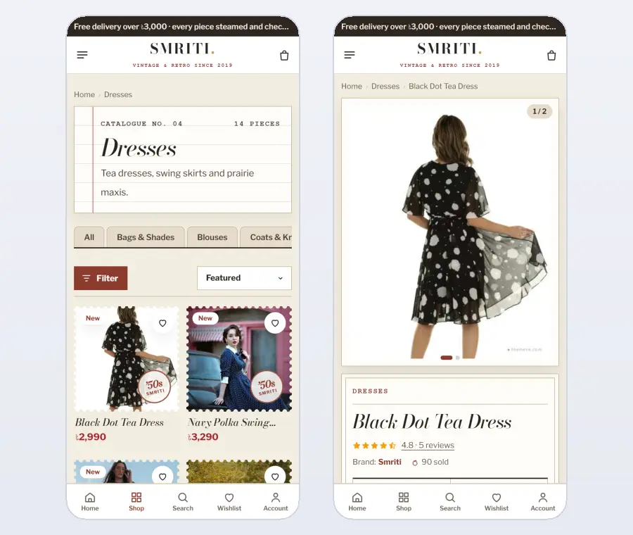
Tag every product with its decade and show it on the product card, for example as a round postmark in the corner of the photo. Shoppers can then spot the style of each piece while scrolling, without opening every product.
Vintage fashion ecommerce website design for product cards
Product cards are where atmosphere meets shopping. A stamp-style frame around each photo, a small decade postmark and a classic serif name give the grid a collectible feel. Keep the price clear and the add-to-cart button simple, so the charm never gets in the way.
In vintage fashion ecommerce website design, consistency matters: use the same frame, the same photo ratio and the same type style on every card, so the collection looks curated rather than random.
Tell the story behind each piece
Stories sell vintage. Add one or two lines to every product about the era that inspired it, such as "a seventies flare cut, made in a softer modern denim" or "the tea dress our grandmothers wore to the cinema". These lines turn a simple product into a small memory.
Longer stories belong in a journal: the colours of each decade, how to style a sixties shift dress today, the history of a classic leather bag. Each article links to matching pieces and brings visitors from Google.
Photography for vintage clothing website design
Shoot in warm daylight against simple, textured backgrounds such as brick, wood or old plaster. Film-style colours and a little grain suit the mood. Keep the same style across all photos, so the whole shop feels like one curated collection.
Add close-ups of fabric, buttons, collars and stitching. Vintage-style buyers care about craft, and close details show the real quality behind the look.
Colours and typography
Warm, rich palettes suit retro fashion: walnut and rust, bottle green, navy and mustard, or plum and rose. Pair a classic high-contrast serif, such as Bodoni, for headings with a clean sans-serif for text. Use colour sparingly, mainly for buttons, prices and small highlights. In vintage clothing website design, a restrained palette feels more authentic than a rainbow.
Navigation that stays simple
Atmosphere should never make navigation hard. Keep the main menu clear: dresses, blouses, trousers and skirts, coats and knits, menswear, bags and shades, and sale. Add filters for size, colour and decade on category pages. A shopper looking for a mustard seventies blouse in a medium should find it in a few taps.
Fresh arrivals and clearance
Regular visitors want to see what is new. A "fresh from the archive" section highlights new arrivals, and a "most loved" section shows best sellers. A clearance rail at the bottom of the homepage moves older stock without cheapening the main collection.
Sizing for retro cuts
Retro-inspired cuts can fit differently: high waists, fitted bodices, wide legs. Provide a clear size guide with measurements and short notes on each product, such as "high-waisted, sits at the natural waist". Add the model's height and size. Clear sizing reduces exchanges and builds trust, especially with first-time buyers.
Product pages that feel special
On the product page, show several photos, the decade, the story line, sizes with stock, the price and one add-to-cart button. Below, add fabric details, care instructions, the size guide and reviews. Suggest a bag or a pair of shades from the same era to complete the look.
Menswear and accessories
Retro style is not only for women. Classic shirts, knitwear, high-waisted trousers and leather bags sell well to men too. Give menswear its own category and include it in the decade tiles. Accessories such as leather bags and sunglasses complete outfits and raise the order value. They also make easy add-ons at checkout, because they rarely need a size exchange.
Content and SEO
People search for vintage inspiration constantly: seventies outfits, how to dress like the sixties, retro wedding guest looks. Use the words they search for in product names and category introductions. Write journal articles that answer these questions and link to your products. Good content turns your vintage clothing website design into a place people return to for ideas.
Pricing and value
Retro-inspired pieces often cost more than fast fashion, because of better fabrics and careful cuts. Explain the value in short lines on each product: the fabric, the lining, the finish and how long it will last. Show prices clearly and avoid constant discounts, which make a curated brand feel cheap. A clearance rail for older stock and occasional seasonal offers are enough.
Payments and delivery
Offer bKash, Nagad and cash on delivery, show the delivery charge for each district before payment and send an SMS when the order is on its way. Customers who receive a well-wrapped parcel with a small note about the decade behind their piece remember the experience and come back. Even the delivery can be part of vintage clothing website design when the details are thought through.
Trust and service
Show your exchange policy, contact details and address clearly. A short "Why us" section with honest promises, such as careful packing, easy exchanges and cash on delivery, answers doubts quickly. Packaging with a vintage touch, such as kraft paper and a handwritten note, adds to the experience and gets shared on social media.
Accessibility within the mood
Old-paper backgrounds and thin serif fonts can be hard to read on a phone. Keep body text dark enough on light backgrounds, use at least 16-pixel text and make buttons large and clear. Save the textures for headings, frames and decorative areas. A readable shop keeps the nostalgic mood while making sure every visitor can browse and buy comfortably.
A simple checkout
Keep the checkout to one page with name, phone, address and district. Show the delivery charge straight away and offer bKash, Nagad and cash on delivery. Confirm the order clearly and let customers track their parcel.
Design for phones first
Most visitors find vintage brands on Instagram and shop on their phones. Make sure the memory board stacks neatly, decade tiles scroll sideways, postmarks remain readable on small cards and the checkout fits on one screen. Keep the site light: textures and fonts should not slow it down.
Seasonal stories
Vintage shops can follow the seasons with themed edits: a fifties summer picnic, a seventies autumn, a nineties winter. Each edit is a small collection with a hero photo, a short story and a few pieces. Change the memory board photos and the typewriter headline to match. Seasonal stories give regular visitors a reason to come back and give you fresh content for social media every month.
Vintage fashion ecommerce website design for gifts
Retro pieces make thoughtful gifts: a leather bag, a pair of classic shades, a silk scarf or a knit. A small gift section with safe sizes, gift-ready packaging and a clear exchange promise helps buyers who are shopping for someone else. Good vintage fashion ecommerce website design makes gifting feel as special as the pieces themselves.
Using video and sound of the era
Short videos of a dress swinging, a coat being buttoned or a model walking down an old street bring the decade to life. Keep them short and silent on the page, so they load quickly and do not disturb visitors.
Share longer versions with music from the era on social media. Video is one of the most effective ways to show the character that vintage clothing website design is all about.
Building a community
Vintage fans love to share how they style their finds. Invite customers to post photos with your hashtag and feature the best ones on your homepage and in the journal. A loyalty programme with points and a refer-a-friend offer rewards your most passionate customers. A community turns a shop into a small movement, and people return to movements, not just stores.
Measure and improve
After launch, look at which decades get the most visits, which pieces are saved most and which sizes sell out first. Add more pieces from the favourite eras, restock popular sizes and rewrite product stories that do not attract interest. Small monthly improvements keep the collection fresh and make your website design work harder every season.
Common vintage clothing website design mistakes
Going so heavy on textures and effects that the shop becomes slow or hard to read. Mixing too many fonts. Hiding prices or sizes for the sake of style. Using only modern studio photos that clash with the theme. Having no stories behind the pieces. Each of these weakens the mood or the sales.
Build it with a ready theme
You can build all of this yourself, or start with a theme designed for retro fashion. Our vintage clothing ecommerce website template, Smriti, includes a newspaper-style masthead, a memory board hero with a typewriter headline and taped polaroids, and shop-by-decade record sleeves.
It also has stamp-framed product cards with decade postmarks, "fresh from the archive", "most loved", a clearance rail, reviews and a journal, with its own category page, product page and footer layouts. The included shop plugin handles sizes and stock, bKash, Nagad and cash on delivery, district delivery charges, courier sending and back-in-stock alerts.
Checklist before launch
On a phone, check: does the first screen feel nostalgic, can customers shop by decade, is the era visible on every card, does each piece have a short story, are sizes clear and does the checkout fit on one screen? If all six are yes, your website design is ready to welcome its first customers.
Share the story behind each collection, since retro buyers enjoy knowing where a style comes from.
Want to see these ideas on a working website? Open the Smriti live demo and browse it on your phone and your computer.
Frequently asked questions
What makes good vintage clothing website design?
A nostalgic header and hero, shopping by decade, stories behind each piece, warm photos and colours, and simple navigation and checkout.
Which fonts suit vintage clothing website design?
Classic high-contrast serifs such as Bodoni for headings, with a clean sans-serif for body text.
Should a retro brand still use modern features?
Yes. Fast pages, filters, mobile layouts and quick checkout matter as much as the vintage look.
How do I bring more visitors to a vintage shop?
Write journal articles about each decade and how to style retro pieces today, and link them to your products.