Good website design for digital products starts with one idea: the buyer cannot see or touch what they are paying for. Your design has to do the work of a shop counter. It must show what the product is, what it costs, how fast it arrives and who stands behind it. When a page answers those four points, people pay. When it does not, they message you and wait, or they leave.
This guide is for small sellers who are moving from chat orders to a proper website. It covers planning, page layout, checkout, trust and testing, with examples from Bangladesh such as bKash, Nagad and Facebook traffic. Use the checklists as you build.
What digital products need that physical products do not
Physical shops sell boxes. Digital shops sell results: a top-up, a key, a download, an account or a plan. That changes the design in four ways.
- No delivery address. Nothing ships, so the checkout should not ask for a street, a city or a postcode.
- Delivery speed is a feature. Buyers want to know if they will wait one minute or one hour.
- Input matters. Some products need a detail from the buyer, such as an email, a username or a game Player ID. A wrong entry means a failed order.
- Trust is thin. Many buyers have been burned by fake sellers. They look for signs that you are real.
Design around these four points and most of the work is already done.
Know your buyer before you design anything
A teenager topping up a mobile game and an office manager buying a software plan behave very differently. Spend an hour answering these questions before you open a design tool.
- Which device do they use? In Bangladesh, mostly a phone.
- Where do they come from? Often a Facebook post or a friend's message.
- How do they pay? Usually bKash or Nagad.
- What do they ask you in chat? Those questions belong on the page.
- What makes them nervous? Wrong delivery, fake products, no refund.
Write the answers down. Every section on your site should answer at least one of them.
Website design for digital products: the homepage
The homepage has one job: send the visitor to a product. Do not try to show everything.
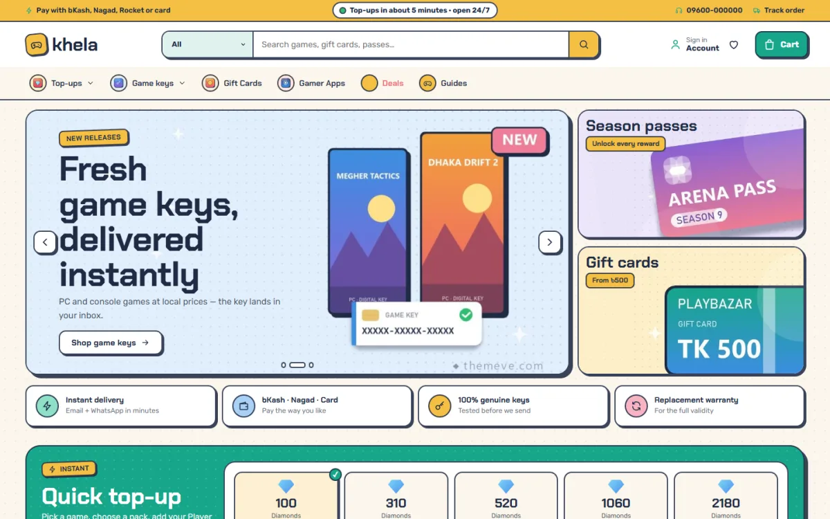
A good top section contains:
- A short headline that says what you sell and how it arrives.
- One strong picture or a clean set of product tiles.
- One main button, such as "Shop now".
- A short line about payment: bKash, Nagad, card.
Below it, show popular products, then a "how it works" strip with three or four steps, then reviews and common questions. Keep each block short. People scroll on phones with one thumb and stop quickly if a section feels long.
Design the product page like a sales counter
This is the page where money changes hands. Treat every element as an answer to a buyer's question.
- Name and one-line benefit at the top.
- Price for each option shown before the buyer clicks.
- Delivery note, for example "Delivered to your email within 10 minutes".
- Required input with a clear label, such as "Player ID".
- One Buy button in a colour that stands out.
- Details below: what is included, limits and steps to use it.
Use the same layout for every product. Once a buyer has used one page, they know where to look on all the others.
Ask for the right input, and check it
If your product needs an ID, an email or a username, ask on the product page, not after payment. Check the format where you can. A field that rejects an empty or obviously wrong entry prevents the most common cause of refunds. Save the value on the order so you can see it later, and remember it for the buyer's next visit.
Make checkout short
Every extra field loses some buyers, and a phone makes it worse. A digital checkout needs only a few items.
- Name
- Mobile number
- Email address for delivery
- Payment method
Remove everything else. No address, no company name, no "order notes" unless the product needs them.
Offer payment methods your buyers already trust. In Bangladesh that means bKash and Nagad first, then a card gateway, then a manual option where the buyer sends money and enters a transaction number. Cash on delivery does not fit a digital order.
After payment, the thank-you page should say what happens next and when. A buyer who has just paid is anxious. One calm sentence, such as "Your top-up will arrive within 5 minutes", removes most of that worry.
Game top up website design Bangladesh players expect
Game credit is one of the busiest digital niches in the country, and it has its own needs. Good game top up website design Bangladesh sellers can rely on focuses on speed and accuracy.
- Show the games as tabs or tiles so players find theirs in one tap.
- Show each pack as a big tile with the amount and the price.
- Ask for the Player ID before the item can go into the cart.
- Remember the ID for the next order.
- Show a delivery time on each pack.
- Accept bKash and Nagad, since most players pay that way.
Many top-up sellers still copy IDs by hand from a chat inbox. A website that captures the ID once, correctly, saves hours each week and reduces mistakes.
Players also compare sellers quickly. A visible weekly best-sellers list, a clear refund note and a fast reply on chat all help a new shop look dependable. Treat game top up website design Bangladesh buyers will trust as a mix of speed, clear IDs and honest promises.
Plan your website design for digital products with a page list
Before you choose colours, decide which pages the store needs. A practical website design for digital products rarely needs more than seven.
- Homepage: promise, popular items and delivery steps.
- Shop page: products grouped by game, platform or type, with filters.
- Product page: plans, prices, required input and Buy button.
- Cart and checkout: as short as possible.
- Thank-you page: what happens next and when.
- Account page: past orders and saved details.
- Help pages: delivery, refund, contact, privacy and terms.
Draw the pages on paper first. Link the shop and the cart from every page. Keep the menu short, with six or seven items at most, because long menus are hard to use on a phone.
When the structure is settled, writing the content is much faster. You know exactly which question each page must answer.
Keep the site fast and easy to find
A slow page loses buyers before the design can help. Many shoppers open your link from a social post on mobile data, and they will not wait long.
- Resize and compress every image before upload.
- Use one or two fonts and load only the weights you need.
- Remove plugins you do not use.
- Choose a hosting plan with decent speed and a free SSL certificate.
- Give each product a clear title and a short description that matches what people search for.
Good website design for digital products also helps search engines understand the page. Use real headings, short paragraphs and descriptive link text. Do not expect quick ranking results, but a clear structure gives your pages a fair chance over time.
Build trust with small, honest details
No single badge makes a store trustworthy. Trust comes from many small facts that all agree.
- A contact page with a real phone or WhatsApp number and working hours.
- A refund policy in plain language.
- Reviews from real buyers, with dates.
- Logos only for payment methods you accept.
- The same name, prices and promises on the site, in emails and on your Facebook page.
- A privacy page that says what you do with customer data.
Never copy reviews or invent order counts. Buyers can tell, and one fake review can undo months of good work.
Colour, type and layout for phones
Most of your visitors will arrive on a phone, so design for that screen first.
- Use large buttons with space around them.
- Keep text at a readable size with strong contrast.
- Choose one main colour and one accent colour.
- Use no more than two fonts.
- Compress images so pages open quickly on mobile data.
- Keep the cart always in reach.
A style with personality can work well, particularly in gaming, where buyers like bold colours and playful shapes. Just keep text easy to read and buttons easy to tap.
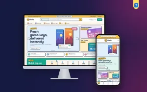
A ready-made theme for this job: Khela
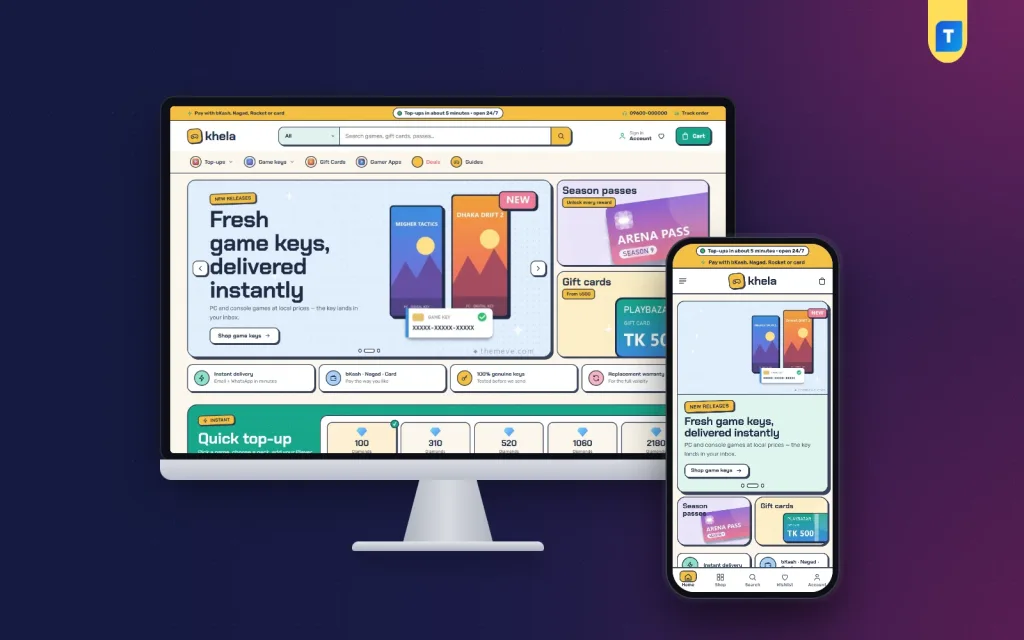
You can build all of the above by hand, or start from a theme that already does it. Khela is a WordPress theme for shops that sell mobile game top-ups, in-game bundles, PC game keys, console credit, gift cards and apps.
Here is what it includes:
- A quick top-up board with game tabs.
- Player ID checked before an item goes into the cart, and saved on every order.
- A weekly top 10 leaderboard with medals.
- A gift card wall with value chips.
- An address-free checkout with a delivery email.
- 28 homepage blocks you can switch on, off and re-order.
- 6 colour palettes and 4 font pairs.
- Payment through bKash, Nagad, SSLCommerz and manual payment.
- A one-click demo with 32 gaming products.
The style is an arcade sticker look in cream, teal and yellow. See the full details on the Khela theme page. If you sell something else, such as software or templates, pick the theme whose layout matches your product type.
Test before you launch
Start with a quick look at the product page itself. Can a stranger answer each of these within ten seconds?
- What exactly am I buying?
- How much does each option cost?
- What do I have to type in?
- How long until I receive it?
- How do I pay, and is it safe?
- Who do I contact if something goes wrong?
If any answer takes longer, change the page. Then move on to the full order test below.
Design looks fine until a real buyer uses it. Run these checks on a phone and a laptop.
- Place a test order for every payment method.
- Leave the required ID field empty and confirm that checkout blocks it.
- Check that the confirmation email reaches the inbox, not spam.
- Open every page on mobile data, not only on Wi-Fi.
- Read the thank-you page as a first-time buyer.
- Check that prices on the card, product page and cart match.
- Ask two friends to buy something and watch where they hesitate.
Fix what you find, then test again. It costs an hour and prevents many angry messages.
Mistakes that hurt sales
Review your own site against this list. These faults appear again and again in weak stores.
- Asking for an address. It is useless for digital goods and slows buyers down.
- Hidden prices. Show them on the card.
- Unclear delivery. Say the real time and keep to it.
- Too many homepage blocks. Keep the ones that help the sale.
- No support contact. One WhatsApp number is better than none.
- Slow pages. Heavy images lose phone visitors.
- Skipping mobile tests. Check every change on a real phone.
If you want to read more on the technical side, the official WordPress documentation is a good, reliable reference.
Frequently asked questions
What is the best website design for digital products?
A clean, fast layout with clear prices, a visible delivery time, a short checkout and a few honest trust signals. Fancy effects matter much less than clarity.
Do digital products need a delivery address field?
No. Ask for a name, mobile number and email. Extra fields reduce completed orders, especially on phones.
How do I design a game top-up website for Bangladesh?
Group packs under game tabs, require the Player ID before the cart, show delivery times and accept bKash and Nagad. Keep text simple, because many players read quickly on small screens.
How many pages should a small digital shop have?
Seven cover most needs: homepage, shop, product, checkout, thank-you, account and help pages. Add a blog later if you want search traffic.
Which colours work best for a digital store?
Choose one main colour and one accent, and keep strong contrast between text and background. The best choice matches your audience; gamers may like bolder colours, software buyers often prefer calm ones.
Why does website design for digital products matter for trust?
Buyers cannot inspect the item, so they judge the seller by the site. Clear details, real contact information and a smooth checkout show that a real business is behind it.