Good beauty website ideas start with one question: what does a customer need to see before she is willing to pay for a lipstick she cannot touch? Most beauty shops in Bangladesh begin on Facebook, where photos and messages do the selling. A website takes over the repeat work, so you answer fewer of the same questions every day.
This guide is for owners of small make-up, skincare and beauty shops. You will find practical ideas for the homepage, the shop, the product page, payment, delivery and photos. Each idea comes with a short list you can copy into your own plan.
What a beauty website has to do
A beauty website is not a catalogue. It has a few clear jobs, and every idea below serves one of them.
- Help a buyer find the right shade, shape or skin type without asking you.
- Build trust with real photos, honest text and visible reviews.
- Make paying easy with the methods people already use.
- Bring customers back with gift ideas, new arrivals and offers.
- Work well on a phone, because most of your visitors will be on one.
If an idea does not help with at least one of these, leave it out. A simple site that does these five things beats a fancy site that does not.
Good beauty website ideas are also cheap to test. You can change a banner, a filter or a gift row in an afternoon, then watch whether orders move. Treat the site as a shop window you can rearrange every week.
Know your customer before you pick beauty website ideas
Before you choose a colour or a layout, spend one evening reading your old Facebook messages. They are free market research.
Ideas only work when they match the person who will use them. A shop selling bridal make-up to women in Dhaka needs a different site from a shop selling homemade face oil to students in Rajshahi.
Write down answers to these questions first:
- Who buys most often: brides, office workers, students, or gift buyers?
- Which question do customers ask you most in messages?
- What is your average order, and what makes people spend more?
- Do they pay by bKash, Nagad or cash on delivery?
- Do they come from Facebook, Instagram, Google or word of mouth?
The second question matters most. For make-up it is usually "Which shade will suit me?" For skincare it is "Is this good for oily skin?" Your website should answer that question on the first screen.
Homepage layout and beauty website ideas that sell on first view
The homepage has about five seconds to show what you sell and why it is worth a scroll. Keep the order simple and let each block do one thing.
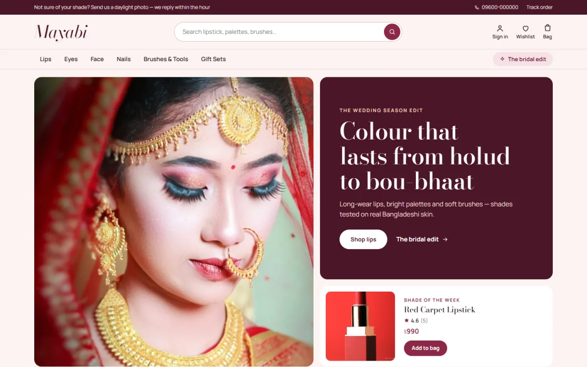
A hero with one clear offer
Use one strong photo, a short headline and one button. Show a single focus, such as a new lip collection or a festive gift set. Two buttons are fine, but three confuse people.
Category photos near the top
Round or square category photos let buyers jump straight to lips, eyes, face, nails or skincare. Use the same photo style for each so the row looks tidy.
A strip of promises
Short lines about delivery time, cash on delivery, returns and original products remove common doubts. Only write what you really offer.
Keep the blocks light
Do not fill the page with everything you sell. Six or seven blocks are enough. Each extra block pushes the useful parts further down, and phone users give up quickly. Move or hide blocks you do not need.
A simple order for the page
- Hero with the main offer
- Category photos
- New arrivals
- Best sellers
- One or two seasonal edits, such as bridal or Eid
- Reviews from real buyers
- Delivery and returns line
Beauty website ideas for shade and skin-type shopping
Shade is the biggest barrier in make-up. A buyer cannot swatch a lipstick through a screen, so help her guess well.
- Show shade dots on every product card, so she sees the colour range without opening the page.
- Let people filter the shop by shade, such as nude, coral, berry or deep red.
- Photograph each shade on more than one skin tone, not only on the model's lips.
- Name shades in plain words, like "dusty rose", instead of codes only.
- Add a short note on who a shade suits: fair, medium or deep skin.
For skincare, use skin type instead. Filter by dry, oily, sensitive or combination skin, and list the main ingredients in simple words. A buyer who finds her skin type in one tap will not need to message you.
Get-the-look ideas that raise order size
Order size is the number that grows your profit without more adverts. Selling two items to one buyer costs less than finding two buyers.
People love to copy a finished look. A "get the look" block shows one photo and lists the products used, step by step: base, eyes, cheeks, lips. The buyer sees how pieces fit together and often adds more than one item.
Some looks that work well for Bangladeshi shops:
- A holud look with warm yellow and gold tones.
- A bridal look for the wedding day, with long-wear base and lips.
- An Eid day look that is light and quick.
- An office look with a natural face and a soft lip.
- A no-make-up look for students.
Number the steps and link each one to the product page. Keep the text short. Two lines per step is enough.
Photography ideas that build trust
Many beauty website ideas fail because the photos do not match the promise. Fix the pictures first, and the rest of the site works harder.
Photos are your biggest asset, and bad ones are the quickest way to lose a sale. You do not need a studio. You need a window, a plain background and patience.
- Shoot in soft daylight near a window, not under a yellow bulb.
- Use a white or pale pink backdrop for product shots.
- Take one photo of the product alone and one in use.
- Show the texture: a swatch of cream, a smear of gloss, a dab of foundation.
- Keep the same size and crop for every product so the shop grid looks neat.
- Do not over-edit. Buyers get angry when the lipstick looks different at home.
A short video of a swatch or a pour of serum can help too, but a clear photo is enough to start.
Product page ideas
The product page is where the sale is made. Keep it calm and complete.
What to include
- A clear name, price and size or weight.
- Shade or variant choices as dots or buttons.
- A short description of what the product does and who it is for.
- How to use it, in two or three lines.
- Ingredients, if you sell skincare or hair care.
- Delivery time and return rules written once, not repeated in every description.
- Reviews with the buyer's first name and the product she bought.
Small touches that help
A "frequently bought together" row suggests a brush beside a palette or a cleanser beside a moisturiser. A back-in-stock alert lets a buyer wait for a sold-out shade instead of leaving. A wishlist lets her save a product and return before payday.
Payment and delivery ideas for Bangladesh
Website design for skincare shops has one extra duty: it must look clean and safe, because people put these products on their face. A tidy layout, clear labels and honest claims all say that you care.
Payment is where many local shops lose customers. Offer the ways people already trust.
- bKash and Nagad for quick mobile payment.
- A card gateway such as SSLCommerz for those who prefer cards.
- Cash on delivery, with a small advance for high-value orders if you want to cut fake orders.
For delivery, say clearly how long it takes inside Dhaka and outside. Connect a courier such as Steadfast or Pathao so you can print labels and share a tracking page. Customers feel safer when they can check a parcel without calling you.
A short returns note builds trust. For make-up, many shops accept returns only for unopened or damaged items. Whatever your rule is, write it where the buyer can see it before paying.
Mobile-first ideas
A mobile-first view is one of the simplest beauty website ideas to put in place, and it affects every sale.
Most of your visitors will arrive from a Facebook or Instagram link on a phone. Test every page on a small screen before you launch.
- Keep the menu short and the bag icon always visible.
- Make buttons big enough for a thumb.
- Show two products side by side so people scroll less.
- Let shoppers add a shade to the bag without opening the page.
- Keep the checkout to one page with few fields.
- Check that pages load fast on a mobile data connection.
Compress your photos before upload. A heavy photo can make a page slow on a weak signal, and slow pages lose buyers.
Gift and seasonal ideas
Seasonal planning is where beauty website ideas pay back fastest, because shoppers arrive already wanting to buy.
Beauty is a popular gift, and a website can sell it better than a message thread. Plan a few gift ideas through the year.
- Gifts by budget: links for under 500, under 1,000 and under 2,000 taka.
- Eid and Puja edits with matching products.
- A wedding season edit for brides and guests.
- Mother's Day, Valentine's Day and Pohela Boishakh sets.
- A countdown on a sale band, but only for a real end date.
A gift by budget block is simple and effective. The buyer picks a price and sees a row of products. No searching needed.
A ready-made option for a make-up shop
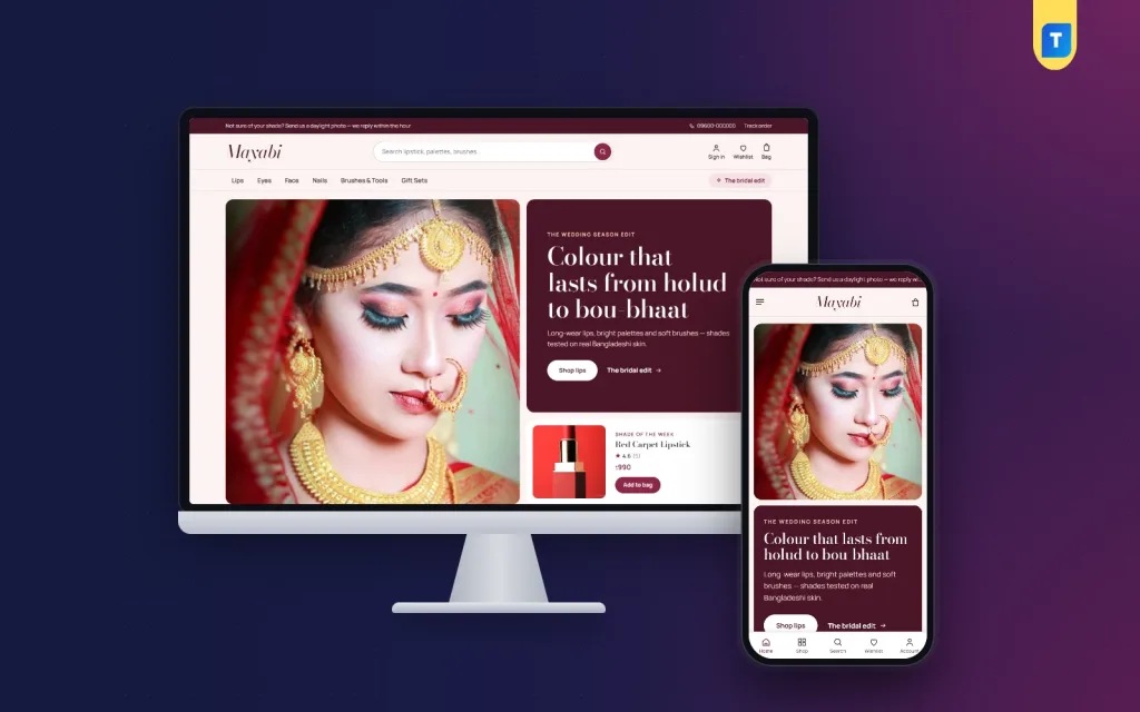
You can build these ideas from scratch, but it takes time to get each block right. If you use WordPress, a ready-made theme saves many hours. Mayabi is one option made for make-up shops.
It has 17 homepage blocks you can switch off or move, a "shade of the week" hero, shade dots that filter the shop, and a get-the-look block with numbered steps. It also supports bKash, Nagad, SSLCommerz and cash on delivery, with Steadfast and Pathao courier tracking. A one-click demo loads 35 make-up products so you can see the layout before adding your own.
If you want to see how these ideas look in a working shop, you can view the Mayabi page and try the demo. Whatever tool you pick, check that it fits your products and that you can edit every block yourself.
Mistakes to avoid
Even good website design for skincare and make-up can go wrong in small ways. These are the slips we see most often.
- Too many colours and fonts. Pick a small set and stay with it.
- Photos with different backgrounds and sizes.
- No shade or skin-type help, which brings back the message flood.
- Hidden delivery charges that appear only at checkout.
- Copying product text from other sites. Write your own.
- Fake reviews. Buyers can tell, and it harms trust.
- Skipping the phone test.
A launch checklist
Use this list to turn your beauty website ideas into a live shop. Tick each line before you share the link.
- Choose a short domain that matches your Facebook page name.
- Add at least 20 products with clear photos.
- Set up shades or skin types as filters.
- Write delivery, return and contact pages.
- Connect bKash, Nagad and cash on delivery, then place a test order.
- Connect your courier and test a parcel.
- Add a privacy page and your shop address or phone number.
- Test on two different phones.
- Share the link on your Facebook page and in your messages.
After launch, look at which products get views but no orders. Often the fix is a better photo or a clearer shade guide, not a lower price.
If you want to read more on the technical side, the official WordPress documentation is a good, reliable reference.
Frequently asked questions
What are the best beauty website ideas for a small shop?
Start with shade or skin-type filters, clear product photos, a get-the-look block and simple payment with bKash, Nagad and cash on delivery. These four ideas answer the questions customers ask most.
How many products do I need before I launch?
Twenty well-photographed products are enough to start. It is better to have fewer products with good photos and descriptions than many with weak ones.
Do I need a website if I already sell on Facebook?
Facebook is good for reach, but a website gives you your own shop, order records, reviews and a place customers can find on Google. Many shops use both together.
Can I use these beauty website ideas for skincare only?
Yes. Swap shade filters for skin-type filters, add an ingredient list and a simple routine in steps. The rest of the ideas work the same.
How do I handle returns for make-up?
Most shops accept returns for damaged or wrong items, and for unopened products within a set number of days. Write the rule on the product page and the return page.
Should I offer cash on delivery?
Yes, in most cases. Many buyers still prefer to pay at the door. If fake orders are a problem, ask for a small advance on large orders.