The best grocery store website design is the one that lets a busy shopper fill a weekly basket in a few minutes and trust the delivery. It is not the one with the most animation or the most colours. It is calm, clear and fast.
This guide shows what to put on such a site and what to leave out. It is written for small and mid-size grocers in Bangladesh who are moving online or fixing a site that does not bring orders. Each section ends with something you can do this week.
What "best" really means for a grocery site
There is no single perfect layout. A site is good when it helps your own customers do what they came to do. For a grocery store, that means:
- Finding products quickly
- Adding many items without effort
- Seeing the full price, including delivery, before paying
- Knowing when the order will arrive
- Paying in a familiar way
Measure your site against this list. If a shopper can do all five on a phone without calling you, your design is working.
Study the shop you already run
You already know a lot about grocery design, because you run a store. Think about how your physical shop is laid out.
- Which goods are near the door?
- Which items do people ask for by name?
- What do people often buy together?
- Which questions do you answer ten times a day?
Your website should copy the good habits of your shop. Put daily items near the top. Group items that go together. Answer the common questions on the page, so that the shopper does not need to ask.
Best grocery store website design starts with departments
A grocery store often carries thousands of items. The first design task is to give them a clear order. Departments and aisles do this.
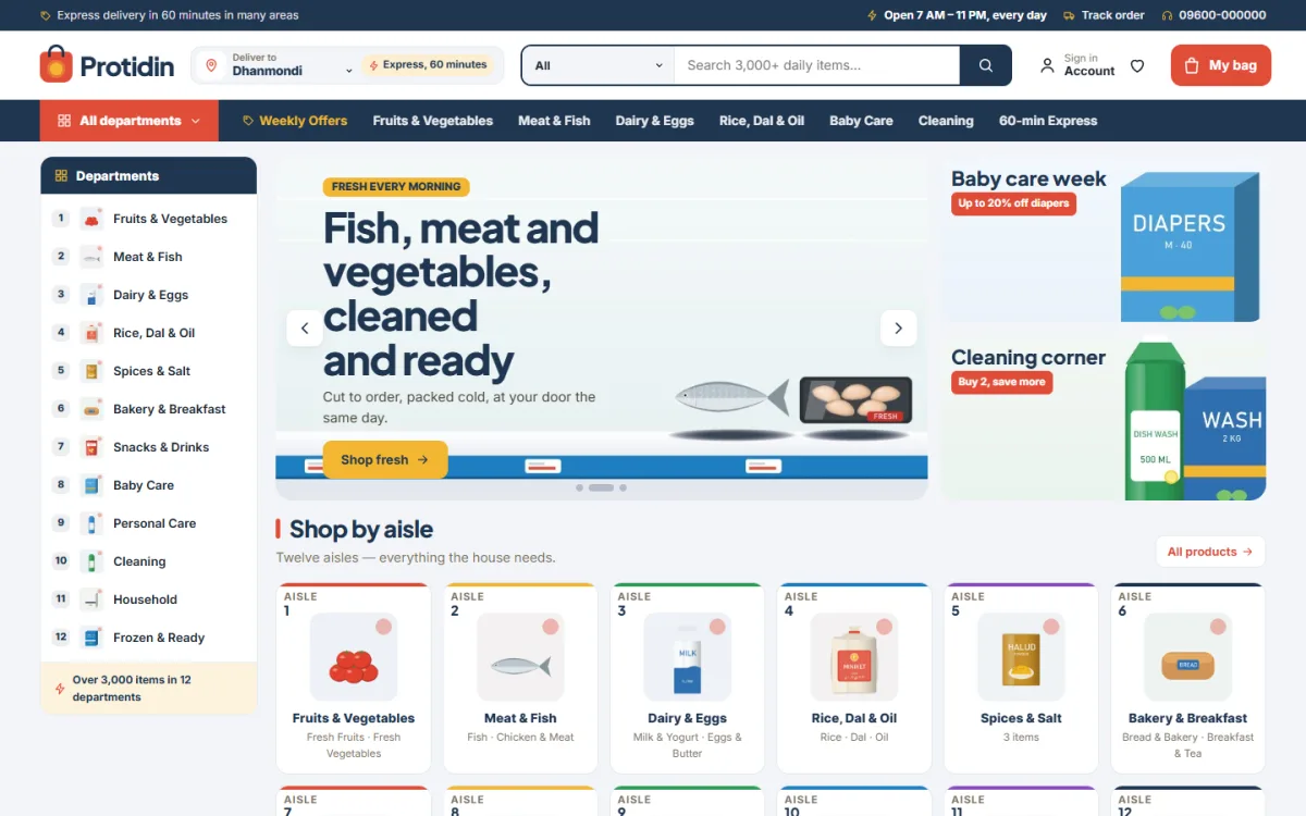
A simple set of departments might be:
- Fresh produce
- Meat and fish
- Dairy and eggs
- Rice, dal and oil
- Bakery and snacks
- Baby care
- Cleaning and household
- Frozen food
Give each department two to four aisles, such as "Cooking oil" and "Ghee" under "Rice, dal and oil". Use the words your customers use. If they say "chal", add it to the name or the tags.
Keep the departments in view
On a wide screen, a side list of departments that stays visible while the shopper scrolls is very helpful. On a phone, a single "All departments" button that opens a clean list works better than a crowded row of tabs.
Ask for the delivery area first
One of the most useful features on a grocery site is a "Deliver to" selector. It asks the shopper for an area at the start, then shows the delivery time and fee.
This helps in three ways:
- The shopper knows early if you can reach their home.
- You avoid orders from areas you do not serve.
- Delivery fees are no surprise at checkout.
List your areas, the fee for each and the usual delivery time. Keep the list short at launch. You can add areas as your rider team grows.
Design the homepage like a tidy store entrance
The homepage of a good grocery site is simple. It points to the main departments and to this week's offers.
A layout that works for most stores:
- A header with logo, search, account and cart
- The delivery area selector
- One banner with one clear offer
- Department tiles with real photos
- Daily needs, such as eggs, milk and bread
- A weekly offers page, with a start and end date
- Best sellers
- Customer reviews
- A footer with phone, address, hours and payment icons
Resist the urge to add more. Every extra block pushes the products further down.
Make product cards quick to read
A shopper scans dozens of cards in a minute. Each card should give the main facts and one clear action.
- A clean photo on a plain white background
- The name and the pack size
- The price, plus the old price when on sale
- An add button that turns into a plus and minus control after one tap
On the product page, add brand, weight, origin, shelf life and storage tips. Keep text short and use a list for details. For items sold by weight, explain how the final price is worked out.
Photograph products the simple way
Photos sell groceries. You do not need a studio, but you need a method.
- Use a white sheet or board as the background.
- Shoot near a window in daylight, without flash.
- Keep the same angle and distance for every product in a group.
- Crop to a square so that cards line up in a grid.
- Resize each file to about 800 pixels before you upload it.
- Name files clearly, for example "masoor-dal-1kg".
A hundred plain, even photos look far better than a mix of fifty fancy ones and fifty blurry ones.
Write product data once, in a fixed pattern
Set a pattern for names and use it everywhere: brand, product, pack size. For example, "Teer Soybean Oil 5 L". The same pattern helps search, helps filters and helps the shopper compare. Add the unit price in the same place on every card. Decide how you show weight and keep it the same.
Add tools that save time for repeat buyers
People buy groceries again and again. The best sites make the second order faster than the first.
- A daily checklist of basics that adds the rest in one tap
- A "Buy again" list on the account page
- A saved basket for the weekly shop
- A weekly flyer that runs for a fixed week, for example Saturday to Friday
The weekly flyer is a quiet way to guide buyers. Instead of ten banners, you publish one page of real offers with a clear end date. People understand it, because it works like the paper flyer they already know.
Best grocery store website design for checkout
If the basket is full and the shopper still does not order, the checkout is usually the cause. Keep it short and honest.
- Show the cart with editable quantities.
- Ask only for name, phone, address and area.
- Offer delivery time slots.
- Show the fee and total before payment.
- Offer bKash, Nagad, card and cash on delivery.
- Show one large confirm button.
Let people check out as guests. A forced account page is a common reason for abandoned baskets. You can ask them to save their details after the order.
Think about couriers and tracking
Your delivery plan shapes your design. If you use your own riders, you control the time slots. If you use a courier such as Steadfast or Pathao, you need booking and tracking to be simple.
- Send an order confirmation with the order number.
- Send a message when the order leaves for delivery.
- Give the buyer a tracking page or link.
- Keep a phone number for delivery problems.
Write short, polite messages in Bangla and English. Customers forgive a small delay if they are told early. They do not forgive silence.
Build for phones and slow connections
Most of your visitors will use a phone, and many will use mobile data. This changes design choices.
- Fold the header into a menu button, logo and cart.
- Use compact cards, two per row.
- Keep text large and buttons easy to press.
- Avoid pop-ups and auto-playing video.
- Keep the cart close at all times.
Speed matters as much as looks. Use resized photos, load images only when needed, and avoid heavy page builders and slider plugins. A long catalogue should not mean a slow page. A good "load more" link, which opens the next page of products, is better than endless scrolling.
Show who you are
New customers worry about freshness and honesty. A few details settle most of those worries.
- A real address, phone number and opening hours
- An "Our stores" page if you have branches
- Photos of your own shelves and team
- A clear return and refund policy
- Reviews from real customers
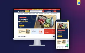
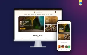
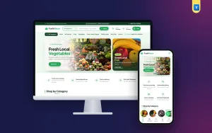
Good grocery website design template choices also help here, because a clean template leaves room for your own photos and notes. Skip stock images of fields and smiling models. A plain photo of your real shop is more believable.
A ready-made option
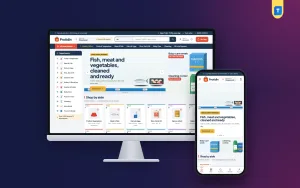
If you do not want to design every part yourself, start from a theme. Protidin is a grocery ecommerce website template for WordPress, made for shops that stock a bit of everything. The name means "every day".
What it includes, from the theme itself:
- A sticky departments sidebar on wide screens
- A "Deliver to" area picker with delivery times
- An All departments panel with aisle pictures
- A weekly flyer valid Saturday to Friday
- A daily checklist that adds the rest in one tap
- 25 homepage blocks you can switch and re-order
- bKash, Nagad, SSLCommerz and cash on delivery
- Steadfast and Pathao courier support
- A one-click demo with 54 products
It comes with our own shop plugin, so you do not need WooCommerce. If you sell only a handful of products, a lighter theme is easier to manage. If your range is wide, look at Protidin and its live demo.
Mistakes that hurt orders
Check your site for these common problems:
- Too many products at launch with poor photos
- Prices shown without a unit
- Delivery fees revealed at the last step
- Out-of-stock items still on sale
- A search box that fails on simple spellings
- Pop-ups that cover the page on a phone
- No test orders before launch
Any of these can turn the best grocery store website design into a poor one. Fix them in order of how many shoppers they affect.
Launch checklist
Before you tell your customers, go through this list.
- Place test orders with cash on delivery, bKash and card.
- Check the order emails and messages.
- Confirm that stock goes down after each order.
- Read every page on a phone.
- Check each delivery area, fee and time slot.
- Test the search with a real shopping list.
- Add your phone, WhatsApp and store addresses.
- Set up daily backups.
- Connect analytics.
- Announce the site on your Facebook page.
After launch, look at the numbers each week. Note the searches that return nothing, the products that are viewed but not bought, and the point where shoppers leave checkout.
Your first 30 days after launch
The first month tells you more than any plan. Use it to learn, not to chase perfection.
- Week 1: fix any bug found by real buyers and answer every message the same day.
- Week 2: read the search terms. Add products or tags for anything that returned no result.
- Week 3: remove slow movers from the homepage and raise the items that sell.
- Week 4: ask ten buyers what they liked and what annoyed them, then write a short fix list.
Keep a simple record of orders per day. A steady rise is a better sign than one big day. This habit is how a plain site grows into the best grocery store website design for your own area, because it is shaped by what your neighbours actually buy.
If you want to read more on the technical side, the official WordPress documentation is a good, reliable reference.
Frequently asked questions
What makes the best grocery store website design?
Clear departments, fast search, readable product cards, a short checkout and honest delivery information. Looks matter less than how quickly a shopper can fill a basket.
How many colours and fonts should I use?
One main colour, one accent and one or two fonts are enough. Plain white product cards keep a long catalogue calm and easy to scan.
Can I use a grocery website design template instead of custom work?
Yes. A good grocery website design template saves weeks of work and costs far less than custom design. Check that it supports your payments, couriers and number of products.
Do I need a mobile app?
Not at first. A fast, mobile-friendly website is enough for most Bangladeshi grocers. Think about an app once you have steady repeat orders.
Which payment methods should a grocery site accept?
Cash on delivery, bKash and Nagad are the basics. Add card payment through a gateway if you can.
How do I know if my best grocery store website design is working?
Watch four numbers: visitors, add-to-cart rate, completed orders and repeat orders. If visitors add items but do not finish, look at your checkout and delivery fees first.