Good boutique website design ideas start with one question: what does a shopper need to see before she trusts you with her money? A boutique has no shop window online, so the website has to do the job of the window, the counter and the shopkeeper all at once.
This guide is for small clothing and fashion sellers in Bangladesh who are moving from a Facebook page to their own website. It covers layout, colours, photos, product pages, checkout, mobile use and the mistakes that cost sales. You can use it as a plan whether you build the site yourself or hire someone.
What a boutique website must do
Before you think about colours or fonts, be clear about the job. A boutique site has four jobs, and every design choice should serve one of them.
- Show the clothes clearly. Big, sharp photos that load fast on a phone.
- Answer questions on the page. Size, fabric, fit, price and delivery time should not need a chat message.
- Make buying easy. Few steps, familiar payment methods, no forced account creation.
- Build trust. Real contact details, clear return rules, honest reviews.
If a design idea looks nice but does not help with one of these four jobs, drop it. A plain page that sells beats a fancy page that confuses.
Boutique website design ideas for the homepage
The homepage is a shop window. Most visitors arrive on a phone, look for a few seconds and decide whether to stay. Give them a clear path from the first screen.
A strong homepage for a small boutique usually follows this order:
- Header with your logo, search, cart and a menu. Keep the menu short: four to seven items.
- A hero banner with one clear message, one photo or a short slider, and one button such as "Shop new arrivals".
- Shop by category. Tiles with a photo and a name, so people jump straight to what they want.
- New arrivals. Eight to twelve products, newest first.
- Best sellers. Social proof in product form.
- An offer block with an end date, if you run sales.
- Trust strip. Delivery time, exchange rule, cash on delivery, support hours.
- Footer with address, phone, social links and policies.
Do not put twenty things on the homepage just because you can. Pick the blocks that match how your customers shop, and switch the rest off.
Ideas for an activewear boutique
Sportswear buyers ask different questions from fashion buyers. Will these leggings stay put in a squat? Does this tee dry fast on a morning run? A good activewear website design template answers these on the page, not in your inbox.
- Group by activity. Let people shop by gym, running, yoga or football instead of only by item type.
- Rate the fabric. A simple 1 to 5 score for sweat-wicking, stretch and breathability helps people compare.
- Show fit clearly. Compression tights and a loose cotton tee should not look the same on screen.
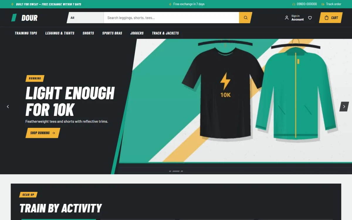
- Use a sporty look. Strong lines, bold headings and one bright accent colour suit this kind of shop.
When you compare any activewear website design template, check whether it has room for these details. If it does not, you will end up typing the same answers to every customer.
Colour, fonts and mood
Your site should look like your shop. A bridal boutique, a kids' wear shop and a gym wear store should not feel the same. Choose the mood first, then pick colours that support it.
Choosing colours
- Pick one main colour, one accent colour and a neutral background.
- Use the accent colour only for buttons and sale labels, so buttons stand out.
- Check that text is easy to read. Light grey text on white looks smart but is hard to read outdoors on a phone.
- Look at your best product photos and match the site to them, not the other way round.
Choosing fonts
- Use two fonts at most: one for headings, one for body text.
- Keep body text at 16 pixels or larger.
- If your customers also read Bangla, test that the font handles Bangla properly, or use a clean system font for body text.
Photos that sell clothes
Many boutique website design ideas fail because the photos let them down. Even the best layout cannot fix a dark or blurry picture.
Photos matter more than any other part of the design. Customers cannot touch the fabric, so the picture has to do it for them.
- Use the same background and light for all products. A consistent catalogue looks professional even when the photos are taken with a phone.
- Show at least four views: front, back, a close-up of the fabric and the item worn.
- Use natural light near a window. Avoid flash.
- Keep the file size small. Resize to about 1200 pixels on the long side and compress. Heavy photos are the most common reason a boutique site loads slowly.
- State the model's height and the size she wears. It helps buyers choose a size.
Colours look different on different screens. Add a line such as "Colour may vary slightly by screen" and describe the shade in words too.
Product page ideas that cut questions
Among all boutique website design ideas, the product page is the one that pays back fastest. It is where the buying decision is made.
Every question a buyer has to ask you in chat is a chance that she leaves instead. A good product page answers the usual questions before they are asked. Put these on every product page:
- Price, and the sale price if there is one.
- Sizes with a simple size chart in centimetres or inches.
- Fabric and care instructions.
- How the item fits: slim, regular or loose.
- Expected delivery date for her area.
- Exchange and return rules in one or two lines.
- Reviews from real buyers.
A short "fit" guide is especially helpful. Wrong size is the top reason for returns in online clothing, and returns eat your profit.
Boutique website design ideas for mobile
In Bangladesh, most online shoppers use a phone, often on a mobile connection that is not always fast. Design for the phone first and treat the desktop as the extra.
- Use big tap targets. Buttons should be easy to press with a thumb.
- Keep the cart visible. A cart icon with a count in the header helps.
- Use a sticky "Add to cart" button on product pages so it stays in reach.
- Avoid pop-ups that cover the page. One small login or offer pop-up is the most you should show.
- Test on a cheap phone. If it works there, it works for everyone.
Speed is part of design. Fewer plugins, small images and lazy loading make a real difference. A page that opens in two seconds sells more than a beautiful one that takes eight.
Checkout and payment ideas for Bangladesh
Many good boutique sites lose the sale at checkout. Make this step as short as possible.
- One-page checkout. Name, phone, address, delivery area and payment method on a single page.
- Offer cash on delivery. Many first-time buyers will not pay in advance to a new shop.
- Offer bKash and Nagad for customers who prefer to pay at once. Show the number or the payment button clearly.
- Add a card or bank gateway if you expect buyers from outside the mobile wallets.
- Ask for a phone number first. Couriers call before delivery, and you can follow up on abandoned carts.
- Do not force account creation. Let people buy as guests, or offer a quick login pop-up.
Show the delivery charge before the last step. A surprise charge at the end is the fastest way to lose an order.
Delivery, couriers and order tracking
Delivery is part of the shopping experience, so it belongs in the design. Customers want to know three things: how much, how long and where their parcel is.
- List delivery charges for inside and outside the city.
- Show an expected delivery date on the product page, not only at checkout.
- Connect your site to a courier such as Steadfast or Pathao, so you can book parcels from the dashboard.
- Give each order a tracking page or status message.
- Send an SMS or message when the parcel leaves.
When a customer can see her order moving, she messages you less and trusts you more.
Trust signals a new boutique needs
A new shop has no name yet, so the site must borrow trust from clear information.
- A real address and phone number in the footer.
- An About page with your name, your story and a photo of the team or the shop.
- A plain-language return and exchange policy.
- Reviews with names and dates. Never invent reviews.
- Links to your Facebook and Instagram pages with real activity.
- A padlock (HTTPS) on every page.
Show your photos from real customers if they allow it. It does more than any slogan.
A ready-made option for sportswear sellers
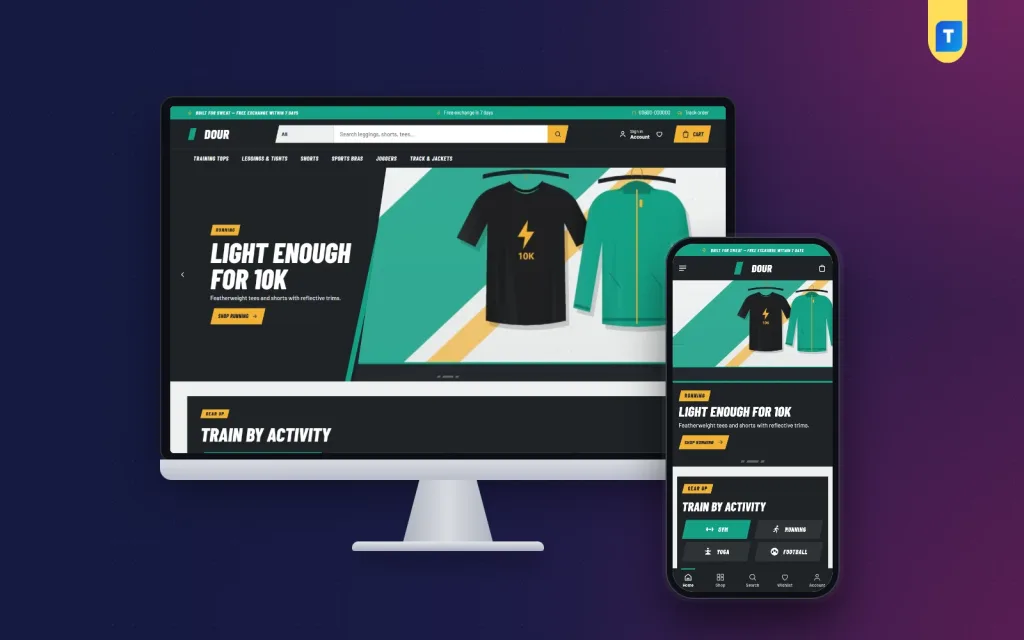
If you sell gym, running, yoga or football gear, you can build these ideas yourself, or start from a ready-made theme. Dour is an activewear WordPress theme made for that kind of shop. It is a complete online store, so you do not need a separate shop plugin.
Some features that match the ideas in this guide:
- A "Train by activity" block with tabs for gym, running, yoga and football.
- Fabric ratings from 1 to 5 for wicking, stretch, breathability and compression.
- A fit meter and expected delivery date on product pages.
- 24 homepage blocks that you can switch on or off and drag into order.
- A sale block with a countdown and stock bars.
- Five colour palettes and a one-click demo with 27 sample products.
- bKash, Nagad, SSLCommerz and cash on delivery, plus Steadfast and Pathao courier tools.
As an activewear website design template, it leaves the sporty look to the theme and the product details to you. You still bring your own photos and products. The theme gives you the structure, so you spend your time on the clothes instead of the code. You can look at the Dour activewear theme and its live demo to see whether the layout suits your range.
Common mistakes to avoid
Most failed shops do not fail because of the idea. They fail on small things. Here are the ones to watch for when you apply these boutique website design ideas.
- Too many fonts and colours. It looks messy and slows the page.
- Dark, blurry or inconsistent photos.
- No size guide. This leads to wrong sizes and returns.
- Slow pages. Large images and heavy plugins are the usual cause.
- Hidden delivery charge. Show it early.
- Forced sign-up before checkout.
- No contact details.
- Copying another shop's photos or text. It is unfair and can get your site removed.
A simple checklist before you launch
Go through this list on your phone, then on a computer.
- Homepage has a clear message and one main button.
- Menu has seven items or fewer.
- Every product has at least four photos, a size chart and a price.
- Fabric, fit and care details are filled in.
- Delivery charges and times are listed.
- Cash on delivery, bKash and Nagad all work in a test order.
- Courier booking works for a test parcel.
- Return and exchange policy is written.
- Contact page, address and phone number are correct.
- The site loads in under three seconds on a mobile connection.
- HTTPS is active and no page shows a warning.
- Backups are set up.
Place two or three real test orders yourself. You will find small problems no checklist can show.
Keep improving after launch
Think of your first design as a draft. Shops that grow keep a small list of changes and test them one at a time. Change the hero banner this week, the size chart next week, and watch what happens to orders. Moving one thing at a time shows you what really works.
It also helps to keep a simple notebook of customer questions. If three people ask the same thing, the answer belongs on the page. Over a few months, the site starts to answer almost everything itself, and your chat inbox gets quieter.
A website is never finished. Look at your sales every week for the first month. Which products get views but no orders? Where do people leave the checkout? Small changes, such as a clearer size chart or a shorter form, often lift sales more than a full redesign.
Ask your first ten customers what almost stopped them from buying. Their answers are the best source of boutique website design ideas you will ever get, because they come from real shoppers.
If you want to read more on the technical side, the official WordPress documentation is a good, reliable reference.
Frequently asked questions
What are the best boutique website design ideas for a beginner?
Keep it simple. Use one main colour, clean photos, a short menu, a size guide on every product and a one-page checkout. Add cash on delivery and bKash from day one. Simple sites load faster and are easier to trust.
How many products do I need to launch a boutique website?
Start with 15 to 30 well-photographed products. A small, tidy catalogue looks better than a large one with poor photos. Add more as you learn what sells.
Which boutique website design ideas work best on mobile?
Large buttons, a sticky add-to-cart button, small images, a short menu and a one-page checkout work best. Test on a low-cost phone with a normal mobile connection.
Do I need WooCommerce to sell clothes on WordPress?
No. Some themes come with their own store system, so you can sell without a separate shop plugin. Check what the theme includes before you buy.
Can I use bKash, Nagad and cash on delivery on my website?
Yes. Many Bangladeshi store themes support all three, and some also support card payments through a gateway. Always test each method with a small order before launch.
How long does it take to set up a boutique website?
With a ready-made theme and a demo import, you can have a basic shop ready in a day. Adding good photos and descriptions for your products takes most of the time.