Digital agency website design has a strange problem: you build great websites for clients, but your own site is often the last thing anyone updates. Yet it is the first thing a new client checks. This guide explains, section by section, how to plan an agency website that wins projects, with practical advice for web design, marketing and IT agencies.
We have built company sites for agencies, software houses and studios. The ones that bring steady enquiries share a few simple habits, and none of them depend on flashy effects.
What a client looks for in digital agency website design
A potential client visits your site with four questions in mind. What exactly do you do? Have you done it for someone like me? How do you work? Roughly how much will it cost? If your site answers these in the first minute, they keep reading. If not, they open the next agency in their search results.
Good digital agency website design is therefore less about style and more about order. The sections should follow the client's questions, and every section should lead closer to the contact form.
Start with a clear hero
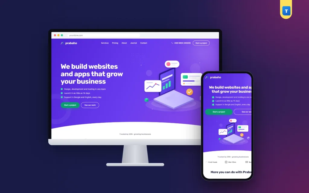
The first screen should say what you do and for whom, in one sentence. "We build fast online shops for Bangladeshi brands" is better than "We create digital experiences". Add two or three short points, such as "Delivered in 30 days" or "Local payment setup included", and two buttons: one to contact you and one to see your services.
An illustration or a product shot works better than a stock photo of people in an office. Visitors have seen that photo on a hundred other agency sites.
Show proof early
Right under the hero, show the logos of clients you have worked with. If you are new, use the logos of tools and platforms you specialise in instead, but never claim clients you do not have.
Add a row of numbers further down: projects completed, years in business, team size or client satisfaction. Real, specific numbers, such as "126 websites launched", are far more convincing than round claims.
Explain your services in plain words
List your main services as cards, six at most. Each card needs a name, one sentence about the result the client gets and a link to more detail. Avoid jargon. "We make your shop appear when people search for your products" beats "We provide holistic SEO solutions".
If you serve several industries, add a section that shows them, such as e-commerce, healthcare, education or real estate. A client who sees their own industry named feels you understand their problems.
Your portfolio: show work as real websites
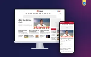
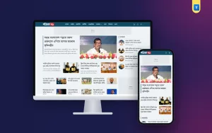
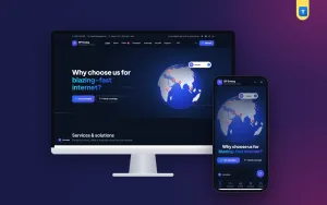
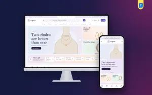
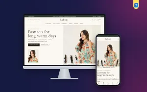
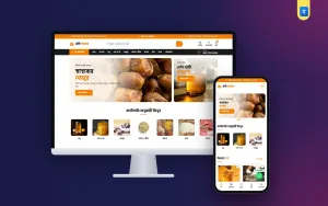
Screenshots floating on a page look like images. Screenshots inside browser frames look like real websites. Show six of your best projects this way, each with a short line about the client and the result, and a link to the live site where you can.
In digital agency website design, quality matters more than quantity. Six strong projects are better than thirty mixed ones. Update the selection every few months so returning visitors see fresh work.
Marketing agency website design: show results, not just pretty pages
Marketing agencies have an extra challenge. Their work is often invisible: ads, campaigns and reports. Good marketing agency website design turns that work into numbers and stories. Show results such as "Cost per order cut by 38% in two months" or "Organic traffic doubled in six months", with a short case study behind each one.
Add a simple process for campaigns, a list of the platforms you manage and a few client quotes about results, not just about how friendly you were. Marketing clients buy outcomes, so your site should talk about outcomes.
Describe your process in four steps
Clients worry about the unknown: how long it takes, what they need to provide and when they pay. A short process section removes that worry. Four numbered steps are enough, such as discovery, design, build and launch, each with one sentence.
Mention what the client receives at each step. "You approve a design before we write any code" is reassuring, especially for clients who have had a bad experience before.
Be open about pricing
Many agencies hide prices and ask visitors to "get a quote". That filters out some time-wasters, but it also scares away good clients who just want a rough idea. A pricing section with a comparison table and two or three starting packages answers the budget question and makes the contact form feel safer to use.
You do not have to show every price. "Starter websites from 25,000 taka" is enough to set expectations. Larger projects can still say "custom quote".
Introduce the team
People hire people. A team section with real photos, names and roles turns a faceless company into a group of experts a client can talk to. Four key people are enough for the homepage. A full team list can live on the About page.
Testimonials that sound real
Short quotes with a name, a company and ideally a photo are the most convincing. Ask clients to mention a specific result or moment, such as "They had our shop taking orders in three weeks". Rotate several quotes in a slider so the section stays compact.
Talk to technical buyers
IT managers and founders often want to know which tools you use. A technology section with the platforms, languages and services you work with, shown beside a small code window, speaks their language without overwhelming non-technical visitors.
Write copy that sounds like a person
The words on your site matter as much as the layout. Write the way you speak to a client in a meeting: short sentences, real examples, no buzzwords. Replace "We deliver innovative digital solutions" with "We build your shop, connect bKash and train your staff". Clients trust plain language, and Google rewards pages that people actually read to the end.
Every heading should tell the reader what they will learn in that section. Every service card should name a result. When the words are this clear, digital agency website design does not need heavy effects to impress; the clarity itself feels professional, and that is the quality clients want to buy.
Answer common questions
An FAQ section saves calls and builds trust. Cover timelines, payment terms, revisions, hosting, maintenance and ownership of the finished website. Use an accordion, so the section stays short until a visitor opens a question.
Publish a journal
A blog, or journal, is the easiest way for an agency to be found on Google. Write about problems your clients search for, such as how to choose a domain, how to set up bKash payments or how to improve page speed. Each helpful article brings visitors who may later become clients.
Make contact quick and simple
End every page with a contact band: one line and one button. The contact form itself should ask only for name, email or phone, the type of project and a short message. Save every enquiry in your dashboard, not just in your inbox, so no lead is lost to a spam filter.
Show your phone number and office address in the footer. Many clients in Bangladesh still prefer a quick call before a meeting.
Colours and typography in digital agency website design
Colour tells a visitor what kind of agency you are before they read a word. Violet and deep blue feel modern and technical. Green feels fresh and growth-focused. Burgundy and plum feel premium. Pick one main colour, one action colour for buttons and plenty of white space. In digital agency website design, restraint looks more professional than a rainbow of gradients.
For fonts, choose one clear sans-serif for text and, if you like, a slightly more characterful font for headings. Make body text at least 16 pixels on desktop and keep lines short. Clients read your site to judge whether you understand clarity; your typography is part of that test.
Service pages that rank on Google
Your homepage cannot rank for every service. Give each main service its own page with a clear title, such as "Ecommerce website development in Dhaka", a short introduction, the problems you solve, your process, examples and prices. This is how digital agency website design supports search: one page per service, each answering one search intent.
Link each service page from the homepage cards and from your articles. Add a contact band at the end of every service page, so a visitor who arrives from Google can enquire without going back to the homepage.
Speed is part of your portfolio
A slow agency website is a bad advertisement. Clients notice if your own site takes five seconds to load. Avoid heavy page builders and long lists of plugins. A light theme with clean code, optimised images and few scripts loads quickly on mobile data and scores well in Google's tests, which also helps your search rankings.
Design for phones
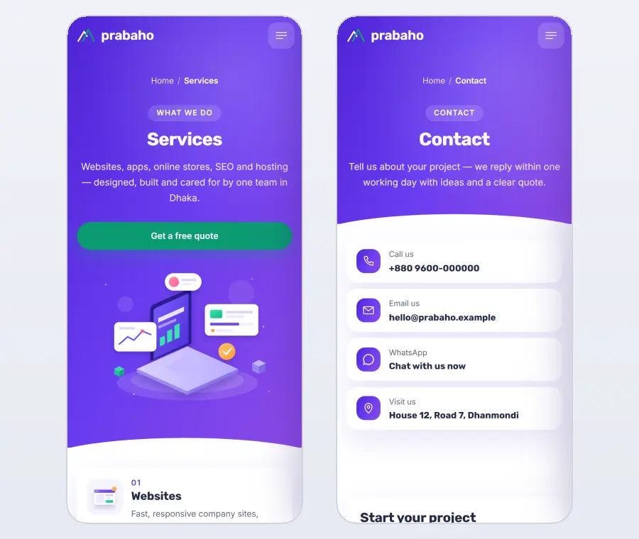
Many clients first see your site on a phone, often from a social media post or a shared link. Keep the logo on the left and the menu button on the right, stack the hero neatly, keep cards compact and centre section headings. Test the contact form on a phone, too.
Measure what your website brings in
After launch, check monthly how many enquiries arrive, which pages people read before contacting you and which services they ask about. Good marketing agency website design always includes this feedback loop: if most enquiries mention one service, move that service higher on the homepage and write more articles about it.
Keep the enquiries in one place, answer each within a day, and note which ones became projects. Over a few months, this shows you exactly which parts of your website design work and which need another look.
Common digital agency website design mistakes
Vague headlines that could describe any company. Stock photos instead of real work. A portfolio with thirty small thumbnails and no context. No prices at all. A contact form with fifteen fields. A slow site built with three page builders. Each of these makes visitors doubt you, and each is simple to fix.
Build it quickly with a ready theme
Building your own site from scratch is a project that agencies rarely finish, because client work always comes first. A ready theme solves that. Our digital agency WordPress theme, Prabaho, follows the structure in this guide.
It includes a hero with points, two buttons and an illustration, client logos, six service cards, four figures, recent work in browser frames, industry solutions, a "why us" section, four process steps, pricing with a table and plan cards, a team block, sliding testimonials, a technology band with a code window, an FAQ, a journal and a contact band.
Prabaho needs no plugin. The license, updates, demo import and contact form are built in, and every enquiry is saved in your dashboard. It loads one stylesheet and a single small script, so your own site finally reflects the quality of your client work.
Checklist before launch
Open your site on a phone and check: does the headline say what you do and for whom, can a visitor see real work within one scroll, are prices or starting prices shown, is the process clear, and can they contact you in under a minute? Five yes answers mean your website design is ready to win projects.
Want to see these ideas on a working website? Open the Prabaho live demo and browse it on your phone and your computer.
Frequently asked questions
What sections should digital agency website design include?
A clear hero, client logos, services, numbers, portfolio, process, pricing, team, testimonials, FAQ, journal and a contact form.
Should an agency show prices on its website?
Showing starting prices helps good clients decide to contact you. Large projects can still be quoted individually.
How many portfolio projects should I show?
Six strong projects with context are better than many small thumbnails.
Which colours suit digital agency website design?
A confident main colour, such as violet or blue, with white space and one action colour for buttons works well and looks modern.