Digital product web design is the work of building a website that sells things people receive online: plans, files, courses, gift cards and codes. It is different from designing a normal shop, because nothing is posted and the buyer cannot touch the item. The page itself must do all the convincing.
This guide explains how to plan and build such a site step by step. It covers structure, pages, price display, checkout, payment methods for Bangladesh and the small details that turn visitors into buyers. Use the lists as a working checklist.
What makes digital product web design different
A shop that sells shoes can show a photo and a size chart. A shop that sells a streaming plan, an ebook or a game top-up has no object to photograph. The buyer has to trust a description and a price.
That changes your priorities:
- Clarity matters more than decoration. The buyer must see what they get in seconds.
- Delivery is part of the product. Say how and when it arrives.
- There is no address, no courier and no delivery charge.
- Trust signals do more work: reviews, clear refund rules, a real phone number.
- Speed matters, because many visitors use a phone on mobile data.
Keep these five points in front of you through every decision below.
Start with the buyer's question
Every digital product answers a question in the buyer's head. A family asks, how many of us can share this plan? A student asks, which format is this file in? A gamer asks, will the top-up reach my account today?
Write down the three questions your buyers ask most. Then make sure your home page and product pages answer them without a message to you. If the same question reaches your inbox every day, your design has a gap.
A quick method:
- Open your chat inbox and list the last twenty questions.
- Group them into themes: price, delivery, sharing, compatibility, renewal.
- Give each theme a clear place on the product page.
- Check after two weeks whether the same questions still arrive.
Plan the site structure first
Before you open any design tool, draw the structure on paper. A small digital shop needs very few pages.
- Home: what you sell, top products, trust signals.
- Category pages: for example movies, music, sports, gift cards.
- Product page: price, what is included, how it arrives.
- Cart and checkout: one short page.
- Account: orders, downloads or plan details.
- Help pages: payment steps, refunds, contact.
Many sellers also want a set of digital download website design templates to start from, rather than a blank page. That is a sensible choice if the template has product pages, a cart and a checkout built in, because those are the parts that are slow to build by hand. Make sure you can change the colours, fonts and block order without touching code.
Keep the menu short. Five or six items are enough. A visitor who sees twenty menu items on a phone usually leaves.
Digital product web design for the home page
The home page has one job: send the visitor to the right product page. It should not try to show everything.
A good order for the blocks:
- A headline and one line that says what you sell and who it is for.
- Your most popular products with price and a button.
- A way to browse by need, such as by category or by mood.
- Proof: reviews, order counts, a real photo of your team or page.
- How buying works, in three short steps.
- Questions and answers.
Do not stack ten sliders at the top. One clear banner is better than five that rotate. If you want to try different blocks, use a theme that lets you switch blocks on and off and change their order without code.
Show prices the way buyers think
Price is the biggest design choice on a digital shop. A single number rarely tells the story. Show the buyer the comparison they would do in their head.
Show the solo price and the shared price together
For plans that several people can use, show the full price and the price per person side by side. A family plan at a total of 600 taka sounds expensive until the page shows that five people pay 120 taka each.
Show the saving for a longer plan
If a yearly plan costs less per month, say so with the actual number. Avoid vague words such as great deal. Numbers are easier to trust.
Keep the currency and the unit clear
Write the amount in taka, say whether it is per month or one time, and put the main price near the button.
Write a product page that sells without pressure
Many visitors reach a product page straight from a social post or a search result and never see your home page. Treat each product page as the first page of your site.
The product page is where the sale happens. Keep it calm, complete and easy to scan.
Include these parts, in this order:
- The product name and a one-line summary.
- The price, with a clear button.
- Quick facts: platform, plan length, number of devices, format or region.
- What the buyer receives and how it arrives.
- What happens at the end of the plan.
- Refund and support rules in plain words.
- A few common questions.
Use short sentences and short lists. Avoid long blocks of text. If the product has limits, say them on the page. A buyer who finds a limit after paying will not come back.
Keep the checkout short
A long checkout feels like work. A short one feels like a favour. For a digital order, the buyer already knows what they want, so your job is to get out of the way and take the payment safely.
Checkout is where many carts are lost. For digital goods you can make it very short.
- Ask for name, mobile number and email. Nothing else.
- Remove address and delivery fields completely.
- Show the total before the buyer clicks pay.
- Offer guest checkout, or a sign-in popup that does not leave the page.
- Show payment options as clear buttons with their logos.
Test your checkout on a phone, with a real small order, before you tell anyone about the site. Do this again after every change.
Payment methods for Bangladesh
Most buyers in Bangladesh prefer a mobile wallet. Your design should make the choice obvious.
- bKash and Nagad: the first two options most people look for.
- SSLCommerz: card and mobile payment through one gateway.
- Manual Send Money: the buyer sends money to your number and enters the transaction ID. It is simple and works for a new shop.
Cash on delivery does not fit a digital order, so leave it out. After payment, show a clear thank-you page that says what happens next and when.
Digital product web design and delivery
Delivery should be visible in the design, not hidden in the terms. Tell the buyer, near the button, how the product arrives.
Common delivery patterns:
- A download link by email for files.
- An invite or login by email and WhatsApp for plans.
- A code in the order page and in an email for gift cards and top-ups.
Add an order page where the buyer can find the product again. People lose emails. A page that keeps the download or the plan details saves you many messages.
Design for phones first
In Bangladesh, a large share of your buyers will browse and pay on the same phone. They may open your link from a Facebook post, read for half a minute and pay with bKash in the same session. Your site has to work well in that short window.
Open your site on a mid-range phone with a slow connection. That is closer to your real visitor than your own laptop.
A phone checklist:
- Buttons large enough to tap with a thumb.
- Text readable without zooming.
- No heavy videos at the top.
- Images compressed and loaded only when needed.
- Few web fonts, or fonts that can be switched off.
- Sign in and register that opens as a small popup instead of a new page.
A page that loads in two seconds will sell more than a beautiful page that takes eight.
Choose a look that fits what you sell
Good digital product web design is not about decoration for its own sake. It is about helping a stranger decide in a few seconds that your shop is real, tidy and safe to pay.
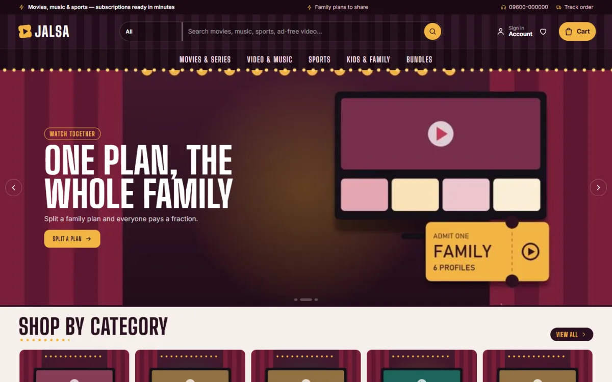
Design style sends a message before a word is read. A shop for movie plans can borrow the feel of a cinema: dark colours, gold, ticket-shaped cards. A shop for study notes should feel plain and tidy.
When you pick a style, keep to a few rules:
- Use two or three colours, not seven.
- Use one font for headings and one for text.
- Keep plenty of space between blocks.
- Use the same button style everywhere.
- Make sure text has strong contrast against its background.
A distinct look also helps people remember you. Many resellers use the same grey layout, and buyers cannot tell them apart. If you choose among digital download website design templates, pick one whose style matches your product and then add your own logo, colours and photos.
A ready-made option on WordPress
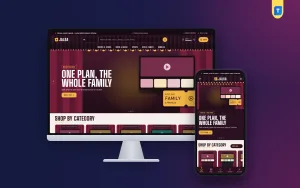
You can design every part yourself, but a ready theme saves weeks of work. If you use WordPress, Jalsa is a theme made for shops that sell streaming, music, sports and family plans, and it also fits gift cards, top-ups, courses and ebooks.
What it gives you:
- A split with family slider that shows each person's share, the solo price and the yearly saving as the shopper moves it.
- Mood chips that help a visitor choose by genre or need.
- 17 homepage blocks that you can switch off or re-order.
- Quick facts on each product for platform, plan and devices.
- A one-page checkout with no address, and sign in and register in a popup.
- bKash, Nagad, SSLCommerz and manual payment.
- The Themeve Commerce plugin, so WooCommerce is not needed.
- 5 palettes, 4 font pairs and a one-click demo with 21 sample plans.
The demo plans are invented samples, so you replace them with your own. See the full list on the Jalsa page and open the demo to judge the look yourself.
Mistakes that hurt digital shops, and a launch checklist
These come up again and again. Check your site against the list.
- An address field on checkout.
- No clear statement of how the product arrives.
- A home page with too many sliders and pop-ups.
- Prices without a unit or a period.
- Stock photos that say nothing about the product.
- No refund rule.
- Pages that are slow on mobile data.
- A contact page with only a form and no phone or WhatsApp number.
Fix these first. They cost nothing and make a real difference. Ask a friend who has never seen the site to buy one item while you watch quietly. Note every place they stop, scroll back or look confused.
Launch checklist
- Five or fewer menu items.
- Every product page has price, quick facts and delivery details.
- Checkout asks only for name, mobile number and email.
- All payment options tested with small real orders.
- Thank-you page and delivery email checked on a phone.
- Refund rule and contact details visible.
- Site speed tested on mobile data.
Once these are done, share the site with ten people you trust and ask them to buy something small. Watch where they hesitate, then fix that spot.
If you want to read more on the technical side, the official WordPress documentation is a good, reliable reference.
Frequently asked questions
What is digital product web design?
Digital product web design is the planning and building of a website that sells online goods such as plans, files, courses and codes. It focuses on clear pricing, fast checkout and visible delivery details.
How much does digital product web design cost?
It depends on how you build. A custom job from a developer can be costly. A ready WordPress theme and a shop plugin cost far less and can be set up by one person in a few days.
Do I need WooCommerce?
No. Jalsa uses the Themeve Commerce plugin, which handles cart, checkout, payments, invoices and orders. It installs in one click from the theme's Setup screen.
Can I sell different kinds of products in one shop?
Yes. A shop can mix plans, gift cards, top-ups, courses and ebooks. Keep each one in a clear category so visitors find it fast.
Which payment methods work for Bangladeshi buyers?
bKash, Nagad, card and mobile payment through SSLCommerz, and manual Send Money with a transaction ID.
Should the checkout ask for an address?
No. Nothing is posted, so ask only for name, mobile number and email.
Where should a beginner start?
Start with the buyer's questions. List what they ask, answer it on the page, keep the checkout short and test on a phone before you launch.