Good electronics store website design helps a buyer who already knows a model and a budget to find it in seconds. People who shop for laptops, phones and gadgets compare prices, read specs and want to know about warranty before they pay. Your website must answer those questions at once.
This guide explains how to plan and design an electronics shop site step by step. It covers the layout, categories, product pages, deals, trust and checkout, with examples for shops in Bangladesh that sell through Facebook, bKash, Nagad and cash on delivery.
Know how people buy electronics
Electronics buyers are not browsing for fun. They have a short list and a budget. Before you design anything, understand their habits.
- They search by model name or by type, for example "gaming laptop".
- They compare two or three products before choosing.
- They care about warranty, genuine products and after-sales help.
- They check the price on several sites and on Facebook pages.
- They ask where the shop is and whether stock is available today.
- Many pay by bKash or Nagad, or pay in cash on delivery.
Every design choice should make one of these steps easier. This habit is the base of all good electronics store website design: look at the steps a real buyer takes, and remove whatever slows them down.
Try it yourself. Pick a product you sell and write down every step a customer takes from a Facebook post to a paid order. Count the taps, the forms and the waits. Most shops find two or three steps that can be cut, and each cut raises the chance of a sale.
Plan your categories first
A deep catalogue needs a clear structure. Planning it on paper saves a lot of rework.
- List your main departments, for example computers, phones, accessories and gadgets.
- Split each into sub-categories, for example laptops, desktops, monitors and printers.
- Choose brands you carry and decide where they appear.
- Limit the top menu to eight to twelve items.
- Name categories in words customers use, not internal codes.
Keep the structure at two levels where you can. Three levels are fine for large shops, but four is too many on a phone.
An example category plan
Take a shop that sells computers and gadgets. A simple plan could look like this.
- Laptops: office, gaming, student, refurbished.
- Desktops and parts: processors, motherboards, memory, storage, power supplies.
- Monitors and printers: by size and by use.
- Accessories: keyboards, mice, headphones, cables, bags.
- Gadgets: power banks, smart watches, speakers, cameras.
Each branch should have at least six products. A category with one product looks empty and makes the shop feel small.
Design the header and category bar
The header is the most used part of any electronics store website design. It must be quick to read and always available.

- A logo on the left that links to the home page.
- A wide search box in the middle.
- Cart, wishlist and login on the right.
- A category bar directly below, showing your departments.
- A phone number or WhatsApp link, since many buyers like to call first.
On mobile, keep search at the top and move the category list into a clear menu button.
Build a home page that sells
The home page is a shop window. Use a few well-chosen blocks, in an order that follows how people decide.
- Banner slider: your best offers, with side banners for the next best.
- Quick-link cards: four shortcuts, such as laptops, gaming gear, today's offers and store list.
- Timed deals: a countdown block for today's discounts.
- Featured categories: large tiles with clear photos.
- New arrivals and best sellers: two rows each.
- Brands: logos of the makers you stock.
- Articles: buying guides that answer common questions.
Ask your designer for banners in the exact sizes your theme needs. A wide desktop banner and a separate phone version look much better than one image squeezed to fit.
Product pages for electronics store website design
The product page is where the sale is won or lost. Follow a steady order.
- Clear photos of the front, back, ports and box contents.
- Price and discount at the top.
- Stock status: in stock, low stock or pre-order.
- Three to five key specs as short bullets.
- Warranty length and what it covers.
- Delivery time and cost for the buyer's area.
- A specification table, open by default.
- Reviews and questions below.
For electronics, an open specification table is better than a hidden tab. Buyers want to compare numbers.
Photo and spec rules
Set rules for your team before you upload fifty products. Consistent data makes the store look professional and makes compare and filters work.
- Use one background colour and one image size.
- Write specs in the same order for every product in a category, for example processor, memory, storage, screen.
- Use the same units everywhere: GB, inch, hour.
- Name the model exactly as the maker does, since buyers search by model.
- Add the warranty as its own line, not buried in the description.
Add compare and brand pages
Because buyers weigh several models, a compare feature is valuable. It lets them line up products side by side and see the differences in one view.
Brand pages work in a similar way. Many people think "I want this brand" before they think of a model. A page for each brand with its products makes that route simple.
- Add a Compare button to cards and product pages.
- Limit comparison to three or four products so the table stays readable.
- Create a Brands page with logos that link to filtered lists.
- Keep spec names consistent across products so the comparison lines up.
Run time-limited deals
Deals drive electronics sales. A short, honest timer gives people a reason to decide today. There are two common types.
- Daily deal: repeats every day between set hours. It builds a habit, and regular visitors come to check.
- Campaign deal: runs between two dates for Eid, a brand week or a year-end sale.
Back it with an Offers page that has its own banner and a list of discounted products. Point your Facebook ads at that page, so the buyer lands exactly where the deal is.
Never run a fake timer that resets for every visitor. Buyers notice, and trust is hard to win back.
Build trust in an electronics store website design
Electronics are expensive, and fakes exist. Show buyers that you are a real business.
- Show your shop address, phone and opening hours.
- If you have several branches, add a store locator or a stores page.
- State clearly that products are genuine and who provides the warranty.
- Publish return and replacement rules in plain words.
- Show photos of your counter or your team.
- Display payment logos only for methods you really accept.
Checkout, payment and delivery
A long checkout loses sales. For Bangladesh, plan it like this.
- Allow the buyer to order from the product page, without a long sign-up.
- Use one page for name, phone, address, payment and confirmation.
- Offer bKash, Nagad and cash on delivery, and a card gateway if needed.
- Show the delivery cost before the final step.
- Send an SMS or email confirmation.
- Connect your courier and give the buyer a tracking page.
For high-value items, call the buyer to confirm. It reduces fake orders and returns.
What makes the best electronics store website
People often ask what the best electronics store website looks like. There is no single winner, but the strong ones share a few habits.
- They load quickly, even on a slow connection.
- They let a buyer reach a product in three taps.
- They show real stock, real prices and real warranty terms.
- They offer more than one way to pay and to get help.
- They keep the design plain, so the products stand out.
Use this list as a score card. Rate your own site from one to five on each point, and fix the lowest score first. Ask a friend who has not seen the site to buy a charger on their phone while you watch silently. Where they hesitate, your design needs work.
Design for phones and speed
Most shoppers visit from a phone, many of them from a Facebook link. Test your pages the way they will see them.
- Compress images before upload.
- Do not stack heavy sliders on top of each other.
- Keep buttons large enough for a thumb.
- Open filters as a panel on small screens.
- Test on a mid-range Android phone with mobile data.
Write content that supports sales
Good photos and specs sell, but guides help buyers choose. Write short articles for the questions you hear every day.
- How to choose a laptop for study or office work.
- What RAM and storage you need.
- How to read warranty terms.
- How to check that a phone is genuine.
Pin your best guides to the blog or home page. They bring in search visitors and help undecided buyers.
Simple search basics
Search engines read the same things your buyers read. Help both.
- Give each product a clear title with brand, model and type.
- Write a short original description, not text copied from the maker.
- Give category pages a short intro paragraph.
- Use descriptive file names and alt text for images.
- Link from guides to the products they mention.
Search work takes months to pay off, so treat it as a steady habit and not a launch task.
A ready-made option: Tech Bazer
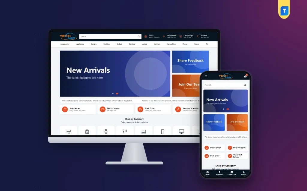
If you sell computers, accessories and everyday gadgets, Tech Bazer is a WordPress theme built for that kind of shop. It includes the pieces described above, so you start with a working store instead of an empty page.
- A one-click demo with more than 60 products, 12 categories and 28 sub-categories.
- A header category bar built from your own menu.
- A banner slider with an optional phone-size image, plus four quick-link cards.
- Daily or one-time Happy Hour deals with a countdown.
- An Offers page with a banner and ten discounted products.
- Brands, Compare and Our Stores pages.
- Login popup and one-page checkout.
- bKash, Nagad, SSLCommerz and cash on delivery.
- Steadfast and Pathao courier with order tracking.
You can see how it works in the demo before you decide, and then replace the sample products with your own.
Mistakes to avoid
Most weak electronics store website design comes down to a short list of errors.
- Stock photos that do not match the real product.
- Specs missing or different from the box.
- A home page with ten sliders and no clear offer.
- Hiding the warranty terms until after payment.
- Prices that differ from your Facebook page.
- No way to see which branch has stock.
Fix these before you spend money on ads. A small, honest site beats a large confusing one.
Launch checklist
- Categories and sub-categories are named clearly.
- Every product has photos, price, specs and warranty.
- Search finds products by name and brand.
- Deals have correct start and end times.
- Payment and courier have been tested with real orders.
- Return and warranty pages are live.
- Contact details and shop address are visible.
- The site loads fast on mobile data.
When these are done, announce the site on your Facebook page and link to the Offers page. For a deeper look at the theme, see Tech Bazer and its demo.
If you want to read more on the technical side, the official WordPress documentation is a good, reliable reference.
Frequently asked questions
What is the best layout for electronics store website design?
A wide search box, a visible category bar, a banner with offers and a few product rows. Keep product pages simple, with specs and warranty near the top.
How many products do I need to start?
Thirty to fifty well-described products are enough to look serious. Add more each week.
Should I show a compare feature?
Yes, if buyers choose between models. It saves them from opening many tabs and keeps them on your site.
How do I design a store for both phone and desktop?
Start with the phone layout, then check the desktop. Use one set of content, banners in two sizes and filters that open as a panel on mobile.
Which payments should my shop accept?
bKash, Nagad and cash on delivery cover most buyers in Bangladesh. Add a card gateway for those who prefer it.
Do I need WooCommerce for good electronics store website design?
No. Tech Bazer runs on the bundled Themeve Commerce plugin, which handles products, orders and payments, so you do not need WooCommerce.