Fashion store website design is not about making a page look pretty; it is about helping a shopper find a piece, trust the shop and pay without trouble. Brands that get this right sell more with the same traffic.
This guide walks through the whole job for a clothing brand in Bangladesh. You will see the pages you need, how to plan the homepage, what to put on product pages, how to handle payment and delivery, and which mistakes to avoid. Lists and checklists are included, so you can work through it step by step.
Start with the goal of your fashion store website design
Before you pick colours or a theme, write down what the site must do. A clear goal keeps every later choice simple.
- Who is the buyer: women, men, kids, or a mix?
- What is the average price of one order?
- Do you sell by season, such as Eid and Puja, or all year?
- Is your brand about low prices or about a style and a story?
- How will people reach you: Facebook, Instagram, search or word of mouth?
A brand that wins on story needs big photos and room to breathe. A brand that wins on price needs deals, budget filters and speed. The same layout cannot do both well.
The pages every fashion shop needs
A clothing site is more than a homepage and a product list. Plan these pages from the start.
- Homepage: the shop window.
- Category pages: Women, Men, Kids, Accessories, and sub-categories.
- Product page: photos, price, sizes, colours, details, reviews.
- Cart and checkout: short and phone-friendly.
- Account page: orders, tracking, wishlist, exchange request.
- About page: your brand story and your makers.
- Contact page: phone, address, map and showrooms.
- Policy pages: delivery, return and exchange, privacy.
- Size guide: measurements in inches and centimetres.
Homepage planning for fashion store website design
Good fashion store website design treats the homepage as a short story with a clear ending: the visitor opens a product. Plan it as a set of blocks and give each block one job.
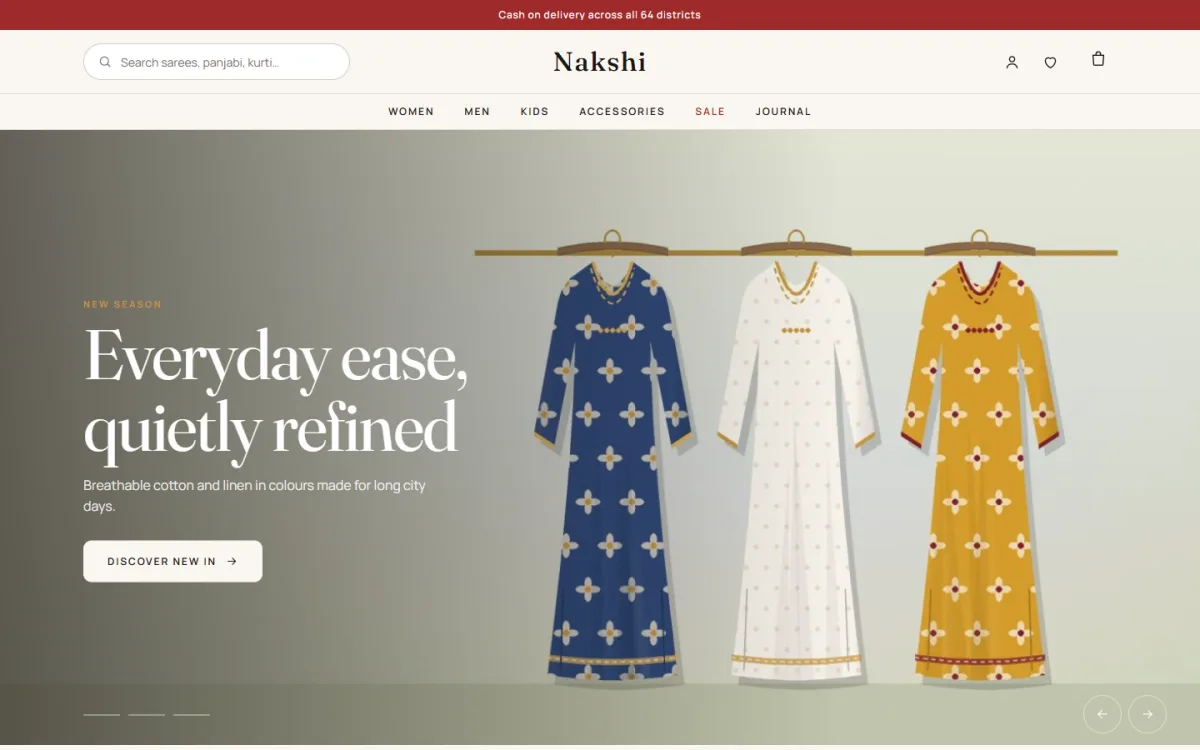
- Hero slider: your newest collection or biggest offer, with one button.
- Category circles: quick links to the main departments.
- Just landed: a row of new pieces.
- Collections: a mosaic of large category tiles.
- Women and Men banners: your two main departments.
- Occasion tabs: Eid, wedding, office and casual, each showing the right products.
- Product spotlight: one piece shown big, with sizes and an add-to-bag button.
- Lookbook: outfits with clickable dots on each item.
- Campaign banner: a sale with an end date.
- Reviews and Instagram-style photos: proof from real buyers.
Do not copy all of them. Pick six or seven and do them well.
Photography sets the tone
For a fashion brand, photos do most of the selling. Customers cannot touch the fabric, so the picture must answer their questions.
- Shoot every product in the same light and on the same background.
- Take front, back, side and a close-up of the fabric or print.
- Add at least one photo on a person, with their height and the size worn.
- Show colours as they look in daylight, not edited too strongly.
- Keep one aspect ratio for all product photos, so the grid is neat.
- Compress files so a page still opens fast on mobile data.
If your budget is small, spend it on photos before you spend it on animations or fancy effects.
Fashion store website design for clothing brand stories
Some brands sell more than clothes. They sell a place, a craft or a festival feeling. The words and pictures should tell that story at every step. A brand story does not need long text. Three short lines on the About page, a line on each collection and a caption on each photo are enough.
Many shops use a lookbook for this. A lookbook is a photo of a full outfit with small dots on each item. A shopper clicks a dot and sees the product, the price and the sizes. It turns a styled photo into a shop shelf.
- Use a lookbook for each new collection.
- Use three to five items per photo.
- Name the collection after the occasion, such as Eid or Boishakh.
- Link each dot to a real product with stock.
Product pages that help a shopper decide
This page is where fashion store website design earns money. A shopper is already interested. Your job is to remove doubt.
Must-have details
- A clear title, such as Cotton Panjabi, Navy.
- Price and old price if on sale.
- Size buttons and colour swatches.
- A size guide popup.
- Fabric, fit and washing notes.
- Delivery charge and expected delivery time.
- Stock status for each size.
Helpful extras
- A short line on how the piece fits, such as relaxed or slim.
- Reviews with photos.
- Related products to complete the outfit.
- A wishlist button.
Sizes: the biggest cause of returns
Wrong size is the top reason for exchanges in clothing. Fix it on the site, and you save on courier costs and phone calls. Every exchange costs you two courier fees, staff time and sometimes a lost customer, so a few minutes spent on a good size chart pays back quickly.
- Measure your garments, not just the label size.
- Publish a size chart in inches and centimetres.
- Show the model's height and the size they wear.
- Make the shopper choose a size before the item goes into the bag.
- Let customers request an exchange from their account.
For sarees and free-size items, say so clearly. For three-piece sets, list the length of the kameez and the width of the trouser, because buyers often care about both. Keep a record of which sizes are returned most, and adjust the chart when the same complaint appears three times.
Choosing a theme for your fashion store website design
Most clothing brands do not build a site from zero. They pick a theme and shape it. Check these points on any theme before you pay.
- Does it suit your style: editorial, bright, minimal or busy?
- Can you re-order and hide homepage blocks without code?
- Are size guides and size and colour options included?
- Does it support bKash, Nagad and cash on delivery?
- Does it connect to Steadfast or Pathao?
- Is it light, with few scripts, and does the demo open fast on a phone?
- Does the demo import in one click?
A ready-made option for editorial fashion brands
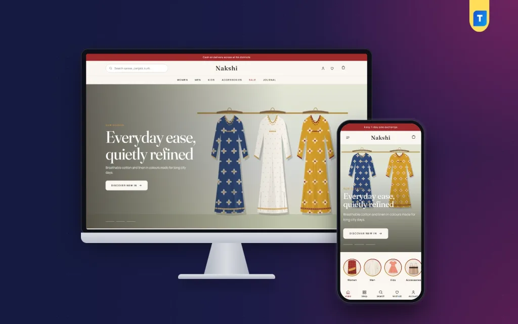
Nakshi is a fashion store theme for clothing brands that sell sarees, three-piece sets, kurtis, panjabi, kidswear and accessories. It reads like a fashion magazine but works like a shop.
These are the main features from its page.
- 15 homepage blocks you can hide or re-order.
- A shoppable lookbook with dots on the outfit.
- Occasion tabs driven by your product tags.
- A campaign banner that hides itself after the end date.
- A collections mosaic with five magazine-style tiles.
- Six colour sets, from maroon to charcoal.
- A one-click demo with 40 products and size guides.
- Sign in and register in a popup, plus a reviews fold.
- bKash, Nagad, SSLCommerz and cash on delivery.
- Steadfast and Pathao courier with order tracking.
- Telegram alerts, SMS and Facebook Pixel.
The shop plugin, Themeve Commerce, is included and installs in one click, so the cart, checkout and payments work from the first day. You can read more or open the demo on the Nakshi product page.
Writing the words: copy that sells clothes
Photos get attention, but short, honest words close the sale. You do not need long text. You need clear text in the right places.
Product titles and descriptions
- Put the item, the fabric and the colour in the title.
- Write two or three short lines on fit and feel.
- List the details in bullets: fabric, length, sleeve, care.
- Say what is in the box, for example a three-piece set with dupatta.
- Avoid vague words like best or amazing. Use facts a buyer can check.
Buttons and short messages
- Use plain buttons: Add to bag, Checkout, Track order.
- Write the delivery charge in the cart, not only at the end.
- Explain exchange rules in two lines near the buy button.
- Offer Bangla and English if your buyers use both.
Seasonal planning
Clothing sells in waves. Eid, Boishakh, Puja, winter and wedding season each bring a peak. Plan your banners, tags and stock a month before each one. Tag products by occasion, so an Eid tab on the homepage fills itself from the right items. Good fashion store website design for clothing brand shops depends on this kind of planning more than on any visual trick.
Payment, delivery and order handling
A beautiful shop that cannot take orders properly is only a gallery. Set these up and test them with real small orders.
- Cash on delivery for first-time buyers.
- bKash and Nagad for quick payment, with a transaction ID for manual send money.
- Card payment through a gateway for those who prefer it.
- Courier booking from the order screen.
- Order tracking so customers stop calling to ask where the parcel is.
- Order alerts by SMS, email or Telegram for your team.
Marketing hooks to build into the site
A shop with no visitors earns nothing. Build a few simple marketing tools into the site from day one.
- A Facebook Pixel, so you can show ads to people who viewed a product.
- A sale banner with an end date, so offers feel real.
- A WhatsApp or Messenger button for quick questions.
- Email or SMS capture for new collection alerts.
- Share buttons on product pages, so happy buyers spread the word.
- Photo reviews, which act as free advertising.
Keep each tool simple. One banner, one button and one signup box are better than ten popups.
Speed and mobile checks
Most visitors will use a phone, often on mobile data. A slow site loses them quietly.
- Choose a theme without a heavy page builder.
- Compress every photo.
- Use no more than two fonts.
- Avoid full-screen popups on arrival.
- Test the menu, search, product page and checkout on a cheap Android phone.
- Check the site on both Wi-Fi and mobile data.
Launch checklist
- Every product has photos, sizes, colours, price and stock.
- The size guide opens on every product page.
- Delivery charge is clear for Dhaka and outside Dhaka.
- Payment methods work and have been tested.
- The courier is connected.
- Policy pages are written and linked in the footer.
- Demo content has been removed.
- The contact page shows a phone number that is answered.
- Facebook page and Instagram links are on the site.
- You have placed a test order from a phone.
Mistakes to avoid
- Using too many banners that all shout at once.
- Hiding the price until the product page.
- Photos in many styles.
- No size guide.
- Making the shopper create an account before the first order.
- Leaving sample products live.
- Choosing colours that make text hard to read.
If you want to read more on the technical side, the official WordPress documentation is a good, reliable reference.
Frequently asked questions
What is the best fashion store website design for a small brand?
A clean layout with big photos, a short menu, clear sizes and a quick checkout. Keep the homepage to six or seven blocks and add more only when you have the products to fill them.
How much does fashion store website design cost in Bangladesh?
It depends on the route. A custom design from an agency costs the most. A ready-made theme with your own photos and products costs far less and can be set up in days.
Do I need a lookbook?
No, but it helps brands that sell outfits and collections. It lets a shopper buy from a styled photo.
How many products should I launch with?
Twenty to forty well-photographed products are enough to start.
Which payment methods should I offer?
Cash on delivery, bKash and Nagad at least. Add a card gateway if your buyers ask for it.
Can I build a fashion shop without coding?
Yes. With a ready-made theme you set blocks, colours and menus from the dashboard, then add your products.
How do I reduce wrong-size returns?
Publish a measured size chart, show the model's size and make shoppers pick a size before adding to the bag.