Good fashion website design templates save you weeks of work, but only if you pick one that fits the way your customers shop. A template is a starting layout. It decides where the banner goes, how products are shown and how easy it is to buy. If those choices are wrong, even great clothes sell slowly.
This guide is for small shop owners who are moving from a Facebook page or a physical shop to a proper website. It explains what to look for, how to plan your pages, which mistakes to avoid and how to get ready for launch. The examples come from Bangladesh, where bKash, Nagad, cash on delivery and couriers shape the whole buying process.
What good fashion website design templates have in common
Open ten of the fashion website design templates on the market and you will notice that the good ones share a few habits. They are quiet, fast and clear. They let the photo of the shirt or dress do the work.
- A clear top section. One strong banner, a short promise line and a visible menu.
- Easy category access. A visitor should reach shirts, trousers or shoes in one tap.
- Product cards with real information. Price, sizes, stars and a plain add-to-cart button.
- A simple checkout. One page, few fields, local payment options.
- Pages for trust. Delivery, exchange, size guide, contact and store address.
- Fast loading. Lazy images and no heavy slider effects.
If a template looks beautiful in the preview but hides these basics, it will cost you more time later than it saves now.
Start with your customer, not the template
Before you look at any layout, write down who buys from you. A shop that sells office shirts to men aged 25 to 40 needs a different homepage from a shop that sells panjabi for Eid.
Answer these questions on paper:
- Who is the main buyer, and who else buys as a gift?
- What do they search for first: a fit, a fabric, an occasion or a price?
- How do they pay today: bKash, Nagad or cash on delivery?
- What makes them hesitate: size, quality, delivery time or returns?
- Which device do they use? In most Bangladeshi shops the answer is a phone.
Your answers become your shopping list for a template. If buyers hesitate about size, you need a size guide near the add-to-cart button. If they come from Facebook ads, you need a fast mobile page that matches the ad.
The pages every clothing shop website needs
Many owners build only a homepage and a shop page. Buyers expect more. They want proof that a real business stands behind the site.
- Home
- Shop with categories and filters
- Product page with size and colour choices
- Cart and one-page checkout
- Delivery information, with charges for Dhaka and outside Dhaka
- Exchange and return policy
- Size guide
- About us and store address
- Contact with phone and WhatsApp
- Track order
- Privacy policy and terms
Good fashion website design templates include most of these pages or make them easy to create. Check the list before you buy, because writing eight missing pages from scratch takes longer than you think.
Plan the homepage before you edit it
A homepage is a short conversation. In the first screen you tell a visitor what you sell. In the next few screens you show your best products, answer doubts and invite them to shop.
A sensible order for a clothing shop looks like this:
- Hero banner with one offer or one new collection
- A promise strip: delivery, cash on delivery, exchange
- Shop by category or by fit
- New arrivals
- Best sellers, ideally in tabs by category
- One deal with a countdown, used sparingly
- Brand or collection spotlight
- Reviews or a short story about your shop
- Latest blog posts or style tips
- Footer with contact details, payment icons and links
Do not put everything on the homepage. Five or six well-chosen blocks beat twenty crowded ones. If your template lets you switch blocks off and re-order them, you can start small and add more later.
How to choose between fashion website design templates
When you compare options, test each one against the same checklist. Do not trust the preview image alone. Open the live demo on your phone.
- Mobile first. Does the header stay simple? Do product cards show two to a row without crowding?
- Speed. Does the demo load fast on mobile data?
- Customisation. Can you change colours, fonts and homepage blocks without code?
- Shop features. Wishlist, quick view, size guide, reviews, coupons and order tracking.
- Local payments. bKash, Nagad, a card gateway and cash on delivery.
- Courier booking. Steadfast or Pathao, so you do not copy addresses by hand.
- Demo import. One click to load sample content so you can see the layout filled.
- Updates and support. Who answers when something breaks?
Give each point a score from one to five. The template with the best total is usually the right one, even if it is not the prettiest.
Photos and product pages that sell clothes
Clothes are bought with the eyes first. Weak photos lose sales no matter how good the layout is.
- Shoot on a plain background in daylight. A window and a white wall are enough to start.
- Show at least four views: front, back, side and a close-up of fabric or stitching.
- Use the same crop and ratio for every product so the grid looks tidy.
- Add one photo on a model if you can, with the model's height and the size worn.
- Compress images before upload. A 3 MB photo on a phone connection loses a customer.
On the product page, put these items in order: title, price, size and colour choice, add to cart, a short list of fabric and care details, size guide link, delivery note and reviews. Keep the description short and scannable. Bullets work better than long paragraphs.
Size, fit and exchange: remove the biggest doubt
Size is the number one reason for returns in clothing. Your website can reduce it.
- Add a size chart with measurements in inches and centimetres.
- Explain how to measure at home, with two or three simple steps.
- Name your fits clearly: slim, regular, relaxed.
- State the exchange rule in one sentence near the buy button, for example, "Exchange within 7 days if unworn."
- Show who pays courier charges on an exchange.
Menswear buyers often shop by fit before colour. A block that lets them start from slim, regular or relaxed makes the website feel like a shop assistant who knows the job.
Payments and delivery for Bangladesh
A website that ignores local habits loses orders at the last step. Plan these items before launch:
- Cash on delivery. Still the most trusted option for first-time buyers. Consider a small advance for high-value orders.
- bKash and Nagad. Show the number or the payment button clearly, and ask for the transaction ID if you use manual payment.
- Card payments. A gateway such as SSLCommerz covers cards and mobile banking in one place.
- Delivery charges. Fix one rate for inside Dhaka and one for outside. Show them before checkout, not after.
- Courier booking. Steadfast and Pathao let you send parcel details from the order screen.
- Order tracking. A track-order page cuts the number of "where is my parcel" calls.
Send an SMS or email when the order is confirmed and when it ships. Customers who know what is happening call you less and return more often.
Menswear shop design ideas that work
Menswear has its own rhythm. Men tend to shop fast, know what they want and read less. These menswear shop design ideas fit that habit:
- Shop by fit. Four large cards for slim, regular, relaxed and made-to-measure pieces.
- A tailoring row. For blazers and waistcoats, show a banner with hemming or alteration details.
- Occasion cards. Office, wedding, Eid, casual weekend. Each opens matching products.
- Price tiles. "Under 1,500" or "Under 3,000" helps men who shop by budget.
- Brand or house spotlight. If you stock several labels, give each one a stage.
- A deal of the day. One shoe or blazer deal with a countdown and stock bar. Use one, not five.
Keep the colour calm. Navy, grey, tan, olive and off-white suit most menswear. Let one accent colour mark buttons and prices.
Colours, fonts and layout rules
A clean store follows a few simple rules, whatever the theme.
- Use two fonts at most: one for headings, one for body text.
- Keep body text at 16 pixels or more on phones.
- Pick one main colour and one accent. Do not add a third unless you have a reason.
- Leave white space around product photos.
- Keep buttons the same colour and shape across the site.
- Check contrast. Light grey text on white looks stylish and reads badly.
Among fashion website design templates, the useful ones offer a few ready palettes and font pairs. Such a template lets you test options in minutes. Choose the one that matches your logo and packaging, so the website, the box and the Facebook page feel like one brand.
A ready-made option: Babu
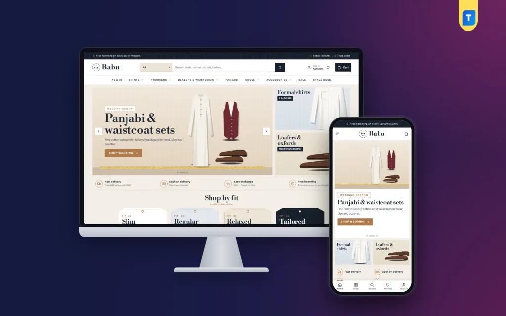
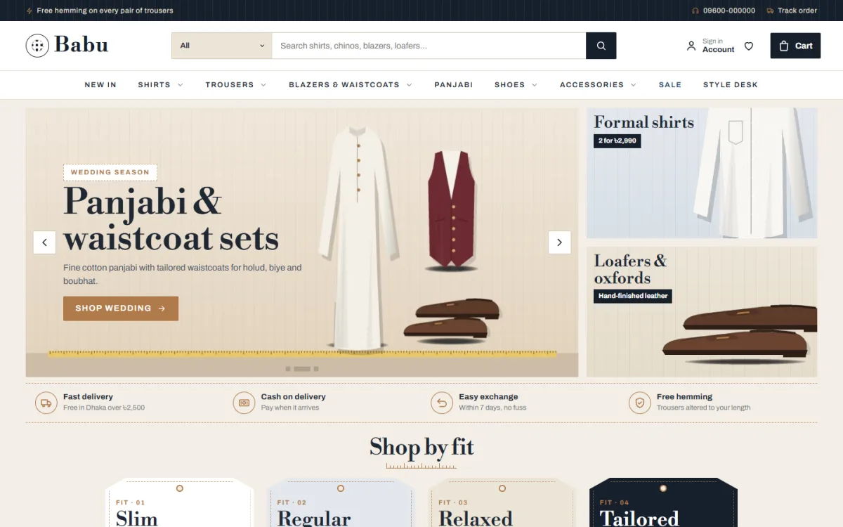
Babu is one of the fashion website design templates we sell at Themeve. It is built for menswear shops that sell shirts, trousers, blazers, waistcoats, panjabi, shoes and leather goods.
Here is what it includes, so you can compare it with your own checklist:
- 20 homepage blocks you can switch off and re-order from Theme Options
- A shop-by-fit block with hang-tag cards
- A suit-up banner with a tailoring row
- Deal of the day with a countdown and stock bars
- Best sellers in tabs by category
- Five palettes and four font pairs
- Login popup, wishlist, one-page checkout, size guide and Our Stores pages
- bKash, Nagad, SSLCommerz and cash on delivery
- Steadfast and Pathao courier booking
- A one-click demo with 39 sample products
The shop plugin comes in the package, so you do not need to install another one. If you want to see how it feels before deciding, open the demo on your phone and walk through checkout. You can read the full details on the Babu product page.
Common mistakes to avoid
- Too many banners. Visitors cannot tell which one matters.
- Copying a big brand. A small shop with a global brand's layout looks empty. Show your real range.
- Slow pages. Large images and many plugins are the usual cause.
- Hidden delivery charges. Surprises at checkout end sales.
- No size guide. Expect more returns and more phone calls.
- Stock photos only. Buyers can tell. Use your own pictures as soon as you can.
- Ignoring the phone. Test every page on a real phone, not only in a desktop preview.
- Skipping the policy pages. They build trust and are often required by payment gateways.
A simple launch checklist
Before you tell customers about the new site, go through this list. It works for any of the fashion website design templates you might pick:
- Replace all sample text, prices and photos.
- Place three test orders: one cash on delivery, one bKash or Nagad, one with a coupon.
- Check emails and SMS arrive and look correct.
- Open every page on a phone and a laptop.
- Test the courier booking with a dummy parcel.
- Add your logo, favicon and contact details.
- Connect Google Analytics and the Facebook Pixel if you run ads.
- Back up the site and set a regular backup schedule.
- Share the link on your Facebook page and pin the post.
After launch, look at your orders every week. See which products get views but no sales and fix their photos, prices or descriptions first.
If you want to read more on the technical side, the official WordPress documentation is a good, reliable reference.
Frequently asked questions
Are fashion website design templates good enough for a real business?
Yes. A good template gives you a tested layout, so you spend your time on products and customers. Pick one with local payment support and keep your own photos and words on top of it.
How much should I spend on fashion website design templates?
Set your budget by what the template saves you. A fair price includes the theme, the shop features you need and updates. Avoid paying for extras you will not use in the first year.
Do I need coding skills to use a clothing template?
No. Modern themes let you change colours, fonts, banners and blocks from an options panel. You only need basic computer skills and clear product photos.
What are the best menswear shop design ideas for beginners?
Start with shop by fit, occasion cards and one clear deal block. Keep the colours calm and the photos consistent. Add more blocks only when you have enough products to fill them.
Can I accept bKash and Nagad on my shop?
Yes. Use a gateway for automatic payments, or use manual Send Money with a transaction ID field. Keep cash on delivery as an option for first-time buyers.
How many products do I need before I launch?
Twenty to thirty well-photographed products are enough to look like a real shop. Add more every week instead of waiting for a perfect catalogue.