Footwear website design is the work of turning a shoe counter into a page a stranger can trust. The buyer cannot try the pair, feel the leather or ask the shopkeeper about the fit, so your site has to do all of that for you. When it does, a small shoe house can sell to a whole district from one phone screen.
This guide is written for shoe shops, leather workshops and family footwear businesses in Bangladesh. It covers the pages you need, how to organise the range, how to show leather and size honestly, how to take payment, and how to launch without surprises.
What good footwear website design must achieve
Before you think about colours, be clear about the job. A shoe website has to do five things well.
- Show each pair clearly, from several angles.
- Help the buyer pick the right size and fit.
- Prove that the pair is original or well made.
- Take payment the way local customers prefer.
- Make exchange and delivery simple to understand.
Everything else is decoration. If your page does these five things on a cheap phone and a weak connection, you have a good site.
Know your range and your buyer
Planning starts on paper, not on screen. Footwear website design goes smoothly when the range is clear before you open a theme.
A shoe house in Bangladesh often sells to the whole family. Office shoes for men, sandals for women, school pairs for children, soft comfort shoes for elders, plus nagra, kolhapuri and chappal. Your site must make each of these easy to find.
- List the groups you sell: by age, by type and by occasion.
- Write the three questions buyers ask most, such as size, price and exchange.
- Note where buyers come from: Facebook, a walk-in shop or word of mouth.
- Decide whether you also want walk-in visitors, and add your shop address.
This shapes your menu. A mother looking for a toddler's first shoes should not need to search through men's formal pairs.
Plan the pages of your footwear website
A simple set of pages keeps footwear website design affordable and easy to maintain.
You need fewer pages than you think. Build these first.
- Home: a clear offer and routes into the range.
- Shop with filters: by size, colour, type, price.
- Product page: photos, size, material, price, reviews.
- Size guide: a chart and a how-to-measure note.
- Delivery and exchange: short, plain rules.
- Store locations: for buyers who prefer to visit and try.
- About: your workshop, your people and your story.
- Order tracking: so buyers can see where the parcel is.
Organise the homepage around the way people shop
A good homepage guides without pushing. Think of it as a walk through your shop.
- Hero: one season or one offer, such as Eid shoes.
- Shop by age: a path from first steps to comfort shoes for elders.
- Shop by occasion: office, Eid and weddings, rainy days, home.
- Categories: framed tiles for men, women, kids.
- New arrivals: two rows of fresh pairs.
- Family favourites: tabs by category.
- Made by hand: short cards about your craft and workshop.
- Offer band: with a real end date.
- Promise strip: exchange, try at door, cash on delivery, repairs.
Write only promises you can keep. If you do not offer try at door, do not show it.
Footwear website design for sizes, fit and comfort
Size is the main reason shoes come back. Treat it as a design problem, not a customer problem.
Show sizes on the product card
A small label such as "Size 39 to 45" saves clicks. Buyers who cannot find their size will not open the page.
Add a size guide
Make a chart that converts foot length in centimetres to your size. If you stock different makers, add a note that sizes vary. Link the guide from every product page.
Describe fit in words
- Is the pair narrow, regular or wide?
- Does it run small or large?
- Is the sole soft, firm or flexible?
- Is it good for long walking, work or occasions?
Honest notes reduce returns. A buyer who is told the pair runs half a size small will order up and keep it.
Photos and words that show leather honestly
Photography is the most visible part of shoes website design, and the easiest to improve with a window and patience.
Leather sells by touch, so your page has to substitute for that. Photos and words must carry the quality.
- Shoot in daylight near a window against a plain wall.
- Take side, front, back and sole photos of each pair.
- Add a close-up of the stitching and the grain.
- Show the pair on a foot for scale.
- Use the same crop and light for every product.
- Write the leather type, lining, sole material and heel height.
- Add care tips: how to polish, how to dry after rain.
If your shoes are handmade, say where and by whom. A short note about the workshop adds more trust than any badge.
Design details that give a shoe house its character
Good shoes website design is not about showing off. It is about making the page feel like your counter. A few small touches do this well.
- Use warm, earthy colours such as cream, cognac and olive for a leather brand.
- Pick a serif heading font that feels like a painted shop sign.
- Add thin stitched lines under headings if they suit your style.
- Make cards look like shoeboxes with a size sticker on the lid.
- Keep body text clean and easy to read.
Pick a small set of colours and fonts, and keep them the same on every page. Consistency makes a small shop feel established.
Payment, delivery and exchange rules
These settings decide whether a visitor becomes a customer.
- Offer bKash, Nagad and a card gateway such as SSLCommerz.
- Keep cash on delivery for buyers who want to see the pair first.
- Take a small advance on costly pairs if you face fake orders.
- Show delivery charge and time on the product page.
- Connect a courier such as Steadfast or Pathao.
- Give buyers a tracking page.
Write your exchange rule in two lines and place it on every product page. Example: "Exchange within 3 days if unworn and in the original box." Buyers trust shops that are clear about problems.
Footwear website design for phones
Phone buyers decide in seconds, so a mobile-first view is the biggest part of footwear website design today.
Most of your visitors will arrive from Facebook on a phone. Check every page on a small screen.
- Show two compact cards side by side.
- Keep buttons large enough for a thumb.
- Let buyers swipe through photos.
- Use one-page checkout with a sign-in popup.
- Compress photos before upload.
- Test on a low-cost phone and a slow connection.
A fast, simple phone view is worth more than any extra feature.
How to judge a theme before you commit
A theme is the frame for your pictures, so test it with your own pairs. Do not decide from the demo alone.
- Upload five of your real photos and see how the cards look.
- Add a pair with a long name and a wide size range.
- Open the site on a phone and scroll the home page.
- Try the checkout with bKash and cash on delivery.
- Switch homepage blocks off and on to see how easy it is.
- Check that you can change colours and text without a developer.
If the theme feels clumsy with your own content, move on. A good fit saves hours every week.
A ready-made option for family shoe houses
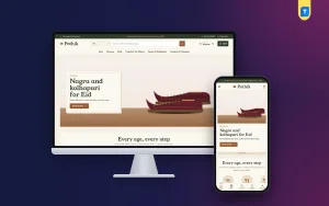
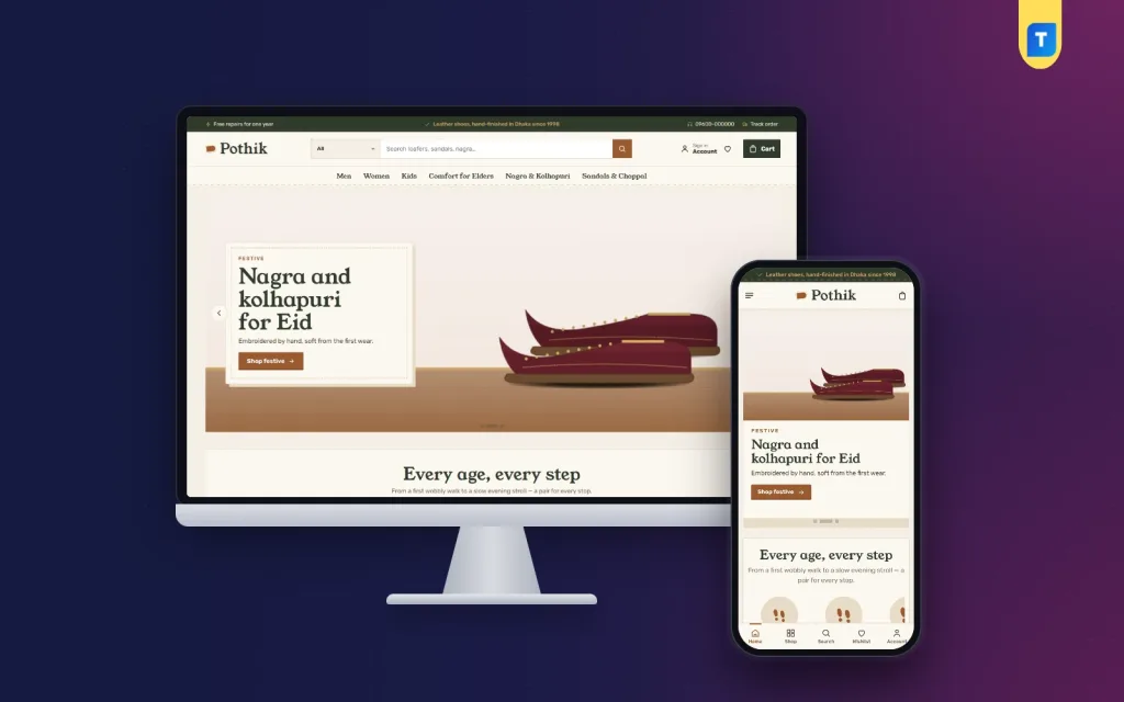
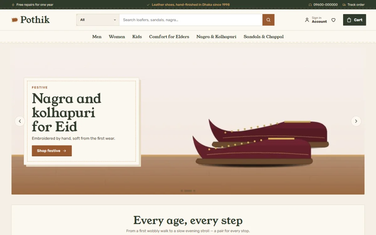
If you use WordPress and want a head start, a theme made for shoe houses saves time. Pothik is a leather shoe theme for family shoe houses and workshops.
It has 24 homepage blocks you can switch off or re-order, a footprint path that sorts shoes by age, and an occasion shelf with wooden shelves and brass name plates. Product cards look like shoeboxes with a size sticker, and on phones two compact cards sit side by side.
Checkout is one page with bKash, Nagad and SSLCommerz, and there is Steadfast and Pathao courier support with order tracking. A store locations page helps walk-in buyers, and the one-click demo has 35 pairs from 6 workshops.
You can open the Pothik page to see the demo and decide if the style fits your shop. Whichever tool you pick, load your own photos and check how they look.
Build it in a sensible order
- Write your range plan and size chart on paper.
- Photograph your first ten pairs.
- Set up the shop, payment and delivery.
- Add products with sizes and colours as attributes.
- Write the delivery, exchange and about pages.
- Switch on only the homepage blocks you need.
- Place a test order and track a test parcel.
- Ask two friends to buy a pair on their own phones.
- Launch, then share the link with past buyers.
- Add the rest of the range over the next weeks.
Content, trust and upkeep for a shoe site
Once the site is live, the work shifts to words, proof and regular care. This part of footwear website design is often forgotten, yet it decides how well the site grows.
Words that help buyers decide
- Give every pair a unique name: type, maker, colour.
- Start the description with who it is for and when to wear it.
- Use words buyers type, such as "office shoes for men" or "school shoes for girls".
- Write a few lines on every category page.
- Avoid copying text from the maker or other shops. Write your own.
Publish short guides now and then: how to measure a foot, how to care for leather, how to choose school shoes. These bring in visitors from Google who are not yet ready to buy but will remember you.
Reviews and proof
Ask buyers for a review after the parcel arrives. Show the pair she bought beside her words. A few honest reviews are worth more than a page of big claims. If a pair has no reviews yet, a gentle invitation to write the first one is enough.
Weekly upkeep
- Restock sizes that sell out first.
- Hide pairs that are gone in every size.
- Replace seasonal photos on the home page.
- Update the offer band when a sale ends.
- Keep WordPress, the theme and plugins updated, with a backup before each update.
- Read exchange requests monthly and fix the page that caused them.
If many exchanges are for size, improve your size guide and photos. If many are for colour, retake photos in better light. Good footwear website design improves with every exchange you read.
Handling repairs and care
Repairs are a strength of a shoe house, so say so on the site. Add a short page that lists what you repair, such as soles, heels, stitching and polish, and how long it takes. Buyers feel safer buying a pair from a shop that will still look after it next year.
Add a care card to each parcel and a care note on the product page. It costs little and cuts complaints about marks and water damage.
Mistakes that hurt shoe sales
- No size information on cards.
- One photo per pair.
- Different photo styles across the shop.
- Hidden delivery charges.
- Unclear exchange rules.
- Copying product text from other sites.
- Leaving demo content on the live site.
- Forgetting to test checkout.
If you want to read more on the technical side, the official WordPress documentation is a good, reliable reference.
Frequently asked questions
What is the best footwear website design for a small shop?
A simple one: clear photos, sizes visible on each card, an honest size guide, local payment options and a fast phone view. Extra features can come later.
How many photos do I need for each pair?
At least four: side, front, back and sole. For leather, add a close-up of the stitching.
Is shoes website design different from other shop design?
Yes, in one way: size and fit. A shoe site must help the buyer choose the right size, or exchanges will eat the profit.
Can a family shoe shop sell to men, women and kids on one site?
Yes. Use a shop-by-age path and an occasion shelf so each person finds their own pairs fast.
Should I keep cash on delivery?
For most shops in Bangladesh, yes. Take a small advance on costly pairs to cut fake bookings.
Do I need a footwear website design if I already sell on Facebook?
A website gives you your own shop, order records, reviews and a place people can find through Google. Many owners use Facebook for reach and the website for sales.