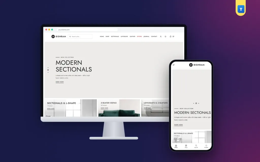
Furniture interior website design is about one feeling: the visitor should feel they are walking through a well-styled showroom. This guide explains how to plan the layout, photos, categories and shopping flow for a furniture and interior store, with ideas you can use today.
Interior and furniture buyers are visual. They react to light, space and how pieces sit together long before they read a price. The design of your site has to deliver that feeling and still make ordering simple.
What furniture interior website design should achieve
Three goals matter most. Inspire the buyer with real rooms. Help them find the right piece quickly. Make them trust you enough to pay for something large and expensive online.
Every page and section should serve at least one of these goals. A beautiful section that does none of them is decoration, and decoration slows a site down.
Plan a gallery-style homepage
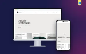
Start with a calm hero: a light background, a short headline in thin capitals and a room photo. Two or three slides are enough, because most visitors never wait for the fourth.
Then show your categories as a mosaic, with one large tile for your main range and smaller tiles for the rest. Product counts under each tile tell buyers how much choice you have.
After that, show best sellers in tabs, a wide room banner with hotspots, new arrivals, a weekly deal and one strong customer quote. This order moves the visitor from inspiration to products to proof.
Photography: rooms first, details second
Good furniture interior website design relies on two kinds of photos. Room photos show scale, colour and style. Detail photos show stitching, fabric, legs and joints. Use room photos on the homepage and category tiles, and detail photos on product pages.
Keep the light and colour consistent across photos. A shop where every photo has a different background looks less trustworthy than one with a simple, steady style.
Categories and search that respect the buyer's time
A good furniture shop website design lets buyers narrow down quickly. Use clear categories, such as sectionals, 3-seaters, loveseats, leather and recliners, and add filters for seats, material and firmness.
Search inside a category is very useful in a large catalogue. A buyer looking for a grey recliner should not see dining chairs in the results. Category pages should show how many products there are and offer sorting by price or newest.
Product cards and product pages
Square cards with one clean photo, the name, a heart for the wishlist and the price are easy to scan. Keep prices black and use red only for sale prices, so offers stand out. An "Add to cart" bar that appears on hover keeps the grid tidy on desktop. On phones, a small round icon works better.
On the product page, show several angles, the size, the fabric options and delivery details. Customer reviews and photos from real homes add the proof that interior buyers look for.
Offers that still look premium
Big red "SALE" banners can cheapen a premium store. Instead, use a styled room photo with a short line such as "Living Room Sofas — Discount 50%" and hotspots on the pieces. A "Deals of the Week" block with a simple outlined timer creates urgency without shouting.
Trust and service
Show three service promises with clear icons: delivery, payment options and warranty or returns. Add a showroom address, opening hours and a contact number in the footer. A journal with room ideas and buying guides shows your expertise and gives Google more pages to find.
Accessories and small pieces
Lamps, rugs, cushions, side tables and wall art complete a room and are easy add-ons. Suggest them on every sofa page and in room photos with hotspots. They raise the order value and bring in buyers who are not ready for a large piece yet, giving you a chance to win them for the big purchase later.
Pricing that feels premium
Premium stores rarely shout about discounts. Show clear prices, explain what makes each piece worth it, such as solid wood frames or high-density foam, and keep sales tasteful and occasional. A weekly deal and an end-of-season sale are usually more than enough. Constant discounts make buyers wait for the next sale instead of ordering now.
Trust signals in a premium store
Show your warranty, your delivery promise and your contact details on every page. Add a short story about your brand and your makers, with real workshop photos. Display customer reviews with photos of real homes. These details matter even more in a premium store, where buyers expect a high standard of service.
Checkout and delivery
Keep the checkout to one page: name, phone, address and district. Show the delivery charge for each district, offer bKash, Nagad and cash on delivery, and consider a small advance for very expensive pieces. Send orders to a courier and give buyers a Track Order page.
Wishlists and saved rooms
Interior buyers plan slowly. They save pieces, compare them with their partner and come back days later. Make the wishlist easy to find in the header and keep saved pieces available after sign-in on any device. A gentle SMS when a saved piece goes on sale or is almost sold out often brings the buyer back to complete the order.
Room sets and bundles
Offer complete room sets, such as a sofa, coffee table and rug, at one price with a small saving. Show the set in one styled photo with hotspots. Room sets suit buyers who are furnishing a new home and want a finished look without choosing and matching every piece themselves.
Mobile layout
Most visitors arrive on a phone. Keep the header short, make the category picker easy to use with a thumb, show service promises in a compact row and make sure the checkout fits on one screen. Test real loading speed on mobile data, not just on office Wi-Fi.
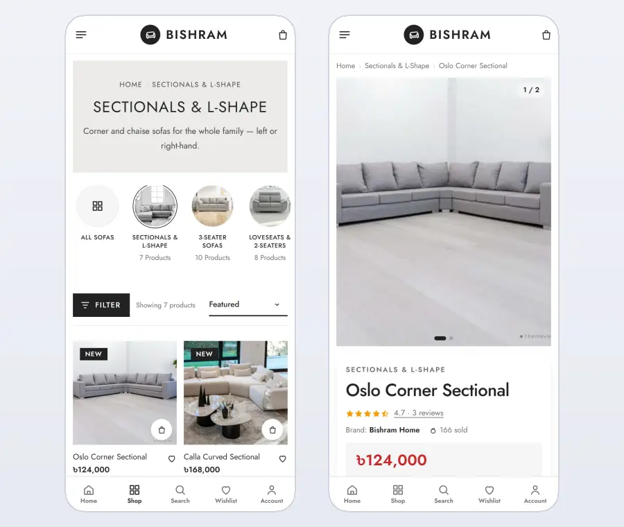
Furniture shop website design for a large catalogue
As a range grows past a hundred pieces, structure matters more than style. A good furniture shop website design groups products the way buyers think: by room first, then by type, then by size or material.
Give each category its own banner photo and a short line of text, so the page feels curated, not like a list. Show related categories as round pictures at the top, so a buyer looking at loveseats can jump to 3-seaters in one tap.
Keep the filters simple. Seats, material, colour and price cover most needs. Too many filters confuse buyers more than they help. Sorting by newest and by price is enough for most shops.
Finally, keep furniture shop website design consistent. When every category page follows the same pattern, buyers learn your shop once and browse much longer, which is exactly what furniture interior website design is meant to achieve.
Styling rooms for your photos
Interior buyers want to see a complete room, not a sofa alone. Style each room photo with a rug, a lamp, a side table, a plant and a few cushions. Keep the room simple and uncluttered, with one or two colours that match your brand. A well-styled room helps buyers imagine the piece in their own home and often sells the accessories too.
Shoot at eye level in daylight, and keep the same style across all room photos. A consistent look is what makes furniture interior website design feel like a real showroom instead of a catalogue.
Colours and typography
Calm palettes such as black and white, navy and grey, olive and cream or walnut and sand let your furniture photos stand out. Use thin capital headings for a gallery feel and a clean sans-serif such as Jost for text. Keep prices black and use red only for sale prices, so offers are easy to spot without making the shop look cheap.
Furniture interior website design for interior designers
Interior designers and decorators are valuable repeat buyers. Offer them trade prices, a simple account to save projects and quick quotes for several pieces. A short page that explains your trade programme brings these professionals to you. Good furniture interior website design treats them as a separate audience with their own path through the shop.
Content and inspiration
Interior buyers love inspiration: room ideas, colour combinations, how to mix leather and fabric, how to arrange a small living room. A journal with short, visual articles answers these questions and links to your products. Each article becomes a new way for people to find your store on Google and Pinterest.
Use your own room photos in every article. Original photos build trust and give search engines unique content to show.
Showroom visits
Many interior buyers want to see and touch pieces before ordering. Add your showroom address, hours, a map link and a "book a visit" option. Mention which pieces are on display. Online and showroom sales support each other: buyers browse online, visit in person and often order more later from home.
Delivery and setup
Large pieces need careful delivery. Explain who carries the furniture, whether assembly is included and how long delivery takes for each area. Show the delivery charge per district at checkout. Send an SMS when the order leaves the warehouse and when it is close. Clear delivery information removes one of the last worries before a buyer pays.
After the sale
Ask every buyer for a review and a photo of the piece in their home. Real interiors from customers are inspiring proof for the next visitor. Share simple care tips by SMS and suggest matching pieces a few weeks later. Over time, these small steps turn one purchase into a long relationship, which is the real goal of furniture interior website design.
Measure and improve
Watch which rooms and categories get the most visits, which pieces are saved to wishlists and where buyers leave the checkout. Add more styled photos to popular pieces, simplify confusing steps and refresh the homepage each season. Steady improvements keep a premium store feeling fresh and working well.
Common mistakes in furniture interior website design
Too many slides in the hero. Photos with mixed backgrounds and lighting. No category counts or filters in a large range. Sale banners that clash with a premium style. No showroom or contact details. Each one makes the shop look less professional and costs orders.
Build it faster with a ready theme
You can create this website design from scratch, or start with a theme built for it. Our furniture shop WordPress theme, Bishram, includes the light-grey hero with slides, the category mosaic with counts, a header search with a category picker, best sellers in tabs, a room banner with hotspots, weekly deals, large testimonials and a redesigned category page with round category pictures and flat filters.
The full shop is included too: bKash, Nagad, cash on delivery with an optional advance, district delivery charges, Steadfast and Pathao courier and order tracking. Import the demo with one click and replace the samples with your own range.
Checklist
Test your website design on a phone: does the homepage feel calm and premium, can buyers find a category in one tap, can they search inside it, are prices and sizes clear, and does the checkout fit on one screen? If yes, your store is ready.
Walk through your own shop on a phone once a week; small problems are easier to spot when you shop like a customer.
Want to see these ideas on a working website? Open the Bishram live demo and browse it on your phone and your computer.
Frequently asked questions
What is furniture interior website design?
It is a website layout for furniture and interior stores that focuses on styled room photos, clear categories and an easy path from inspiration to order.
How many hero slides should a furniture site use?
Two or three. More slides are rarely seen and slow the page down.
Which fonts suit furniture interior website design?
Clean sans-serif fonts such as Jost or Poppins, with thin capitals for headings, look modern and premium.
Should a premium furniture store show discounts?
Yes, but in a styled way: a room photo with a short offer line and a simple timer, not loud banners.