Good furniture website ideas start with one fact: nobody buys a three-seater sofa on impulse. Buyers want to see it in a room, check the size, feel the fabric in their mind and know when it will arrive. A site that answers those worries wins the order. A site that only shows white-background photos usually does not.
This guide gives you practical ideas you can use on a furniture showroom website, whether you sell sofas, beds, dining sets or office chairs. It covers layout, product pages, photos, checkout and delivery, with examples for Bangladesh. You will also find a checklist you can copy and a short list of questions to ask before you start building.
Start with how people really buy furniture
Furniture is a slow, expensive and bulky purchase. A shopper often visits your page three or four times before ordering. They show the page to a spouse, a parent or a friend. They measure the wall. They ask about delivery to the fifth floor with no lift.
Good furniture website ideas follow this habit instead of fighting it. Your site should help a buyer do four things:
- Imagine the piece in a real room.
- Check that it fits the space and the door.
- Understand the material, finish and care.
- Know the price, the delivery date and the payment options.
Write these four jobs on a sheet of paper. Every idea below should help at least one of them. If it does not, leave it out.
Furniture website ideas for the homepage
Your homepage has one task: send people to the right room or category in two taps. It does not need to show everything you sell. Use the blocks below, in this order, and cut anything that does not earn its place.
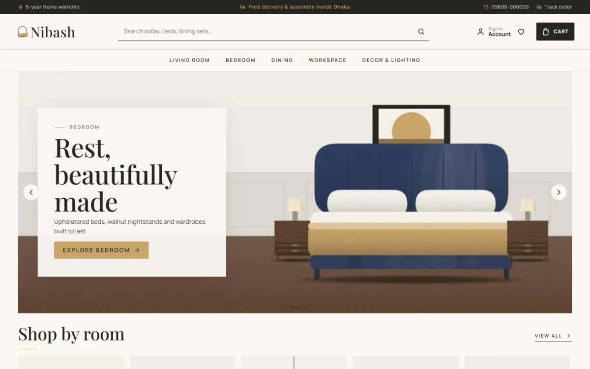
- A calm hero. One large room photo, one short line and one button such as "Shop living room". Avoid sliders with five messages.
- Shop by room. Tiles for living, bedroom, dining, workspace and decor. This matches how people think about a home.
- Best sellers. Six to eight pieces with price, size and a short material note.
- Materials and finishes. Teak, oak, walnut, velvet, leather and linen, each with a short note.
- Delivery and assembly. A short strip that says where you deliver, how long it takes and who assembles.
- Customer rooms. Real photos from homes you have furnished, with permission.
- Showroom visit. Address, opening hours, a map link and a WhatsApp button.
Keep white space generous. A showroom feels expensive because it is not crowded. A web page works the same way.
Shop the room: the best idea for styled photos
A styled room photo sells more than ten single-product photos, because it shows scale and mood. The next step is to make that photo clickable. Place small dots on the sofa, the lamp, the rug and the side table. Each dot opens a small card with the product name, price and a link.
This idea is sometimes called "shop the room". It works well on mobile too, because people tap instead of hunting through menus. Under the photo, add a numbered list of every piece in the room, so nothing depends on a tiny dot.
A few tips for good room photos:
- Shoot in daylight, near a window, with curtains open.
- Keep the room simple: one sofa, one table, one plant, one lamp.
- Take a wide shot and a close shot of the same room.
- Use the same camera height for every room so the site looks consistent.
- Add the room to the homepage, the category page and the product page.
Show sizes on every product card
Size is the number one question in furniture. If a buyer must open each page to find the width, they will leave. Put width, depth and height right on the product card, in centimetres or inches, whichever your customers use.
On the product page, add a small dimensions box with a simple drawing. Also add:
- Seat height and arm height for sofas and chairs.
- Mattress size for beds, with the frame size as well.
- Door and lift width the piece needs to pass through.
- Weight, if your delivery team cares about stairs.
Many city flats in Dhaka and Chattogram have narrow stairwells. A line such as "Fits a standard 90 cm door when the legs are removed" saves you a returned order and a bad review.
Materials and finishes as a feature
People buy wood and fabric with their eyes and their memory. A finishes library solves this online. Create one page, or one block, that shows each finish as a clear swatch with a short note.
- Teak: warm, heavy, good for outdoor-facing balconies if treated.
- Oak: light grain, clean look, fits modern rooms.
- Walnut: dark and rich, shows a premium feel.
- Velvet: soft, strong colour, needs gentle cleaning.
- Leather: long life, easy to wipe, warm in summer.
- Linen: breathable, relaxed, wrinkles slightly.
Let a visitor click a finish and see every piece in that finish. A buyer who already knows they want walnut should reach the walnut range in one tap. Offer to post a small fabric sample for a fee, and say so on the page.
Furniture website design ideas for product pages
The product page is where the order is won. Many furniture website design ideas focus on the homepage, but the product page deserves more care. Build it in this order:
- A large main photo, then three to five more: close-up, side view, in-room view.
- Name, price and stock status near the photo, without scrolling.
- Finish or colour choice, shown as swatches.
- A dimensions card with width, depth and height.
- Delivery date, such as "Delivered by 24 October", based on the buyer's area.
- Assembly note: ready-built, or flat-pack with free fitting.
- Care and warranty, in two or three lines.
- Related pieces, such as a table that matches the sofa.
Short video helps too. Fifteen seconds of someone opening a drawer or sitting on a sofa answers more than a paragraph of text. Keep it silent so it loads fast and plays without sound on a bus.
Furniture website ideas for photos and content
Photos decide the first impression. You do not need a large studio, but you do need discipline. Use the same background, light and angle for all product shots. Mix in lifestyle photos that show people using the furniture.
Text should be plain. Write for a family, not for a designer. Use these rules:
- Start each description with what the piece is and who it suits.
- List the material, size and weight as bullet points.
- Add one honest limit, for example "Not suitable for very low ceilings".
- Avoid long stories. Two short paragraphs are enough.
Also write two or three guide pages, such as "How to measure a room for a sofa" or "How to choose a mattress". These help buyers and bring search visitors, with no promise of any ranking.
Checkout, payment and delivery in Bangladesh
Even the best furniture website ideas fail if checkout is painful. Most Bangladeshi buyers expect mobile payment and many still prefer cash on delivery for large orders. Offer a short list of options and explain each one.
- bKash and Nagad: good for advance payment or booking money.
- Cards and bank payment: through a local payment gateway such as SSLCommerz.
- Cash on delivery: allowed on small items, or with a booking amount for big pieces.
Keep checkout on one page with few fields: name, phone, address, area and payment. Ask for a phone number first, because your delivery team will call. Add a clear note on delivery cost by city and the expected number of days.
Large furniture needs its own delivery plan. Many shops use their own truck inside the city and a transport company for other districts. Write that on the site. For outside Dhaka, say who unloads the piece and who is responsible for damage.
Mobile first: where most visitors are
Most of your visitors will arrive from Facebook or Instagram on a phone, so every idea in this guide must work on a small screen first. Test every idea on a small screen before you approve it. Tap targets must be large. Prices must be readable without zooming. Hotspot dots must be easy to hit with a thumb.
A quick mobile test list:
- Open the site on a mid-range Android phone over mobile data.
- Check that the first photo appears in under three seconds.
- Try adding a sofa to the cart with one hand.
- Complete a test order with bKash.
- Tap the WhatsApp button and confirm it opens a chat.
Compress every image before you upload. A 4 MB photo on a phone connection is a lost sale.
A ready-made option for furniture showrooms
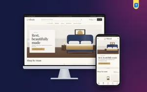
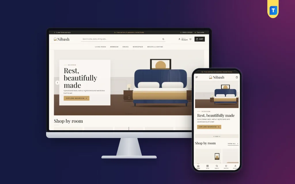
If you do not want to design all this from nothing, you can start from a theme built for furniture. Nibash is a luxury furniture WordPress theme made for showrooms that sell sofas, beds, dining sets, workspace pieces and decor. It uses charcoal, smoked oak and brass with Playfair Display headings.
It includes several of the furniture website ideas above:
- Shop the room, with tappable hotspots on a styled photo.
- A finishes library with teak, oak, walnut, velvet, leather and linen.
- Dimensions on every card, plus an assembly note and a delivery date.
- Tall room tiles to shop by room.
- 24 homepage blocks you can re-order, and a Theme Options dashboard that works on phones.
- One-page checkout with bKash, Nagad and SSLCommerz.
- 5 colour palettes and 4 font pairs, plus a one-click demo with 35 sample pieces.
The sample names and pictures are invented, so you replace them with your own collection. You can look at the live demo before you decide, and the full feature list is on the Nibash page.
Common mistakes to avoid
These are the errors we see most when shop owners copy furniture website ideas without testing them with real buyers. Check your own site against the list:
- Photos without any size information.
- No delivery date, so buyers must message you to ask.
- Too many fonts, colours and animations.
- Product pages with one photo and one line of text.
- Slow pages because of oversized images.
- A checkout that asks for an account before the order.
- Stock shown as available when it is not.
Fix them one at a time, and keep a short notes file with the date of each change so you can see what helped. Start with sizes and delivery dates, because they cost nothing and help at once.
Launch checklist for your furniture website
Use this list before you publish. Tick each item.
- Home, category, product, cart and checkout pages all work on a phone.
- Every product has width, depth, height and a material note.
- Every product shows a delivery estimate.
- At least three room photos are on the homepage.
- Payment options are listed with simple instructions.
- Returns, damage and warranty rules are written in plain words.
- Your address, phone and WhatsApp number are in the footer.
- Site speed is checked on mobile data.
- A test order has been placed and received.
Treat these furniture website ideas as a living plan, not a one-time job. After launch, review the site every month. Ask three or four recent customers what nearly stopped them from buying, and write down their answers word for word. Look at which pages people leave and which rooms they tap most. Then change one thing at a time.
If you want to read more on the technical side, the official WordPress documentation is a good, reliable reference.
Frequently asked questions
What are good furniture website ideas for a small shop?
Start small. Show five or six room photos, put sizes on every product, add a delivery date, and offer bKash and cash on delivery. Add a WhatsApp button so people can ask questions. You can add finishes and room tiles later.
How many photos does a furniture product need?
Four to six is a good number: a front view, a side view, a close-up of the material, a size drawing and one in-room photo. Add a short video if you can.
What are the best furniture website design ideas for mobile?
Use large tap areas, one clear button per section, compressed photos and a short checkout. Put the price and delivery date near the top of the product page so a buyer sees them without scrolling.
Should I use cash on delivery for furniture?
Many shops take a booking amount through bKash or Nagad and collect the rest on delivery. This protects you from fake orders on expensive pieces while keeping buyers comfortable.
Do I need a separate site for each showroom?
No. One site can list every showroom address and stock. Show the nearest showroom on the product page if you have more than one.
Where can I find more furniture website ideas?
Visit local showrooms and note what staff explain to customers, because those answers belong on your site. Read customer messages on Facebook and WhatsApp as well. The questions people repeat are your best furniture website ideas.