A good grocery store website design template saves you weeks of work, but only if it fits how people actually shop for food. A grocery customer has a list, a budget and very little time. The template you pick must help that person finish the basket fast.
This guide explains what to look for, how a good layout is built, which blocks matter on the home page, and how to set the whole thing up for a small shop in Bangladesh. You will also find a checklist you can use to judge any template before you buy.
What a grocery store website design template really is
A template is a ready layout. It gives you the header, the home page blocks, the product cards, the cart and the checkout, already styled. You add your logo, colours, products and prices.
For a food shop, the template should come with three things:
- Layouts made for products with a pack size, such as 1 kg or 500 ml.
- A cart and checkout that work for daily orders.
- Blocks for offers, categories and repeat buying.
A general business template with a big photo and three text boxes will not do. Grocery sites are busy pages, and the design has to keep them calm.
Know how grocery shoppers behave
Design follows behaviour. Before you compare templates, remember these habits.
- They shop from a list. They search for "rice" or "eggs", not browse for fun.
- They buy many items at once. A basket of ten products is normal.
- They compare pack sizes and prices. A clear label matters more than a pretty banner.
- They reorder. The same dal and oil come back every month.
- They use a phone. Most visits start from a Facebook link on mobile.
- They care about price. Deals, combos and budget shopping get attention.
If a template makes any of these harder, move on to the next one.
The parts of a good grocery store website design template
Use this list when you review a demo. Open the demo on your phone, not only on your computer.
The header
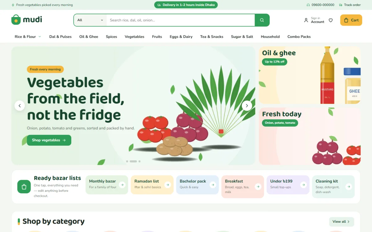
The header should hold the logo, a large search box with a category picker, the cart and the account link. On a phone it should shrink to a menu, the logo and the cart. A small bar at the top for a delivery note is useful, such as "Free delivery above 1,500 taka".
Product cards
A grocery card needs the name, the pack size, the price and a quick way to add. The best cards turn the Add button into a quantity control, so a shopper changes from one to three packs without leaving the page.
Category navigation
Round or square category tiles with pictures help people who do not want to type. A mega menu suits shops with a long list of departments.
Search and filters
Live search that shows products while the customer types saves time. Filters for price, brand and category help on the shop page.
Cart and checkout
The cart should be easy to open from any page. Checkout should be one page, with delivery area, payment method and a clear total.
Home page blocks that earn their space
A food shop home page is a shelf. It should show the best things first and let the shopper scroll without effort. These blocks work well for most stores.
- Hero banner: one or two offers, not five.
- Category tiles: the main departments with pictures.
- Daily essentials: rice, oil, dal, eggs, milk, in tabs.
- Today's price drop: a short list with a countdown or stock bar.
- Combo packs: a bundle at one price, such as a monthly kitchen set.
- Shop by budget: tiles such as "under 200 taka" and "under 500 taka".
- Best sellers: items others buy again and again.
- Brands: logos of the makers you stock.
- Promise strip: fast delivery, cash on delivery, fair price.
- Blog or tips: recipes and kitchen notes that bring search visitors.
You do not need all of them. A shop with 60 products should use five or six blocks. A big store can use more. Good templates let you switch blocks off and move them into any order.
Food website ideas that make a shop feel local
Many shops copy the look of big overseas sites and lose their character. A few simple food website ideas can make your store feel closer to the customer.
- Ready bazar lists: a list such as "Weekly bazar for a family of four" with a link that adds the usual items.
- Local names: use words customers use, like "mudi dokan", "bazar" and "sobji".
- Seasonal sections: mangoes in summer, dates before Ramadan, winter vegetables.
- Festival packs: Eid and Puja bundles of rice, oil, sugar and spices.
- Price honesty: a note that prices change with the market, and the date they were last updated.
- Delivery by area: a clear table of areas, charges and times.
These are cheap to build and make a shop memorable. They also give you something to share on Facebook each week.
Choose colours, fonts and photos with care
Green, yellow and warm orange feel natural for food, but you can pick any palette if the text is readable. Keep these rules.
- Use one main colour for buttons and one for sale badges.
- Keep body text dark on a light background.
- Choose a friendly heading font and a plain body font.
- Use photos with the same light and angle.
- Show the real pack with the label visible.
A template that offers a few ready colour palettes and font pairs lets you test looks quickly. You can choose one, view it on your phone and change it in minutes.
Plan products and pack sizes before you build
Spend an afternoon on your product list. Messy data makes any grocery store website design template look bad.
- List every product in a sheet: name, pack size, price, category, brand.
- Write names in one style, such as "Miniket Rice 5 kg".
- Decide on 8 to 10 main categories.
- Take one photo per product.
- Mark 10 products as best sellers and 5 as deals.
Start with 40 to 60 products. You can add more after your first orders. If your template has a demo import, use it to see how a full store looks, then replace the sample content with your own.
Set up payment and delivery for Bangladesh
A pretty template fails if checkout is weak. Check these points on the demo.
- One-page checkout with name, phone and address.
- Cash on delivery as an option.
- bKash and Nagad payment.
- Delivery charge that changes by area.
- Courier booking with Steadfast or Pathao if you ship outside your city.
- An order tracking page.
Test it as a customer. Add four items, change one quantity, enter an address and pay by cash on delivery. If you feel any friction, your buyers will feel it too.
A ready-made option: Mudi
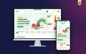
Mudi is a grocery shop WordPress theme made for the neighbourhood mudi dokan that now takes orders online. It is built for rice, dal, oil, spices, vegetables, eggs, dairy, snacks, household goods and combo packs.
Here are the points that matter for this kind of shop:
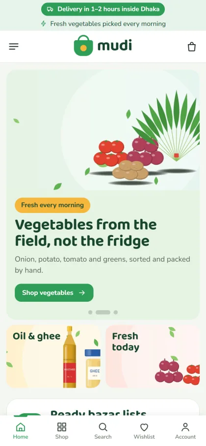
- A quantity stepper on every product card, with the pack size shown under the name
- Six ready bazar lists, each with its own link
- Today's price drop with a countdown and stock bars
- Shop by budget tiles with price steps you choose
- A combo packs block with a banner
- 22 homepage blocks that you can switch off and re-order
- One-page checkout with bKash, Nagad and cash on delivery
- Steadfast and Pathao courier with order tracking
- Five colour palettes and four font pairs
The one-click demo adds 51 products from 6 brands, all with invented names, so you can see a full store and then replace it with your stock. You can view the Mudi demo and decide if the layout suits your customers.
Check any grocery store website design template with this list
Before you buy or install a template, go through this checklist.
- Does the demo look good on a small phone screen?
- Is the pack size shown on product cards?
- Can customers change quantity without opening the product page?
- Can you turn off blocks you do not need?
- Is there a place for deals, combos and budget shopping?
- Does checkout support cash on delivery, bKash and Nagad?
- Can you set delivery charges by area?
- Does it load fast with real images?
- Can you change colours and fonts without code?
- Is there a demo import so you are not starting from a blank page?
If a template gets eight of ten, it is a good fit. If it gets five, keep looking.
From install to first order: a simple plan
Once you have picked a template, follow a short plan so the work does not drift.
Day 1: install and import
Install WordPress, activate the theme and run the demo import. Walk through every page to see what you have. Do not change anything yet. Just note what you want to remove.
Day 2: brand and settings
Upload your logo, pick a colour palette and a font pair, and write your top bar note. Set your shop name, phone number and address in the footer.
Days 3 and 4: products
Delete the sample products and add your own. Put the pack size in its own field. Add the price, a photo and a short line of text. Assign each item to one category and one brand.
Day 5: home page
Switch off blocks you do not need. Keep the order simple: banner, categories, daily essentials, deals, combos, best sellers, brands. Write your own bazar lists and budget steps. Several more food website ideas can wait until the shop is running.
Day 6: delivery and payment
Set your areas and charges. Turn on cash on delivery, bKash and Nagad. Connect your courier account if you use one.
Day 7: test and launch
Place three test orders on your phone. Fix anything unclear. Then share the link on your Facebook page, in your shop and on your parcels.
Speed, SEO and trust basics
Design is only part of the result. A few technical habits help every shop.
- Compress images before upload.
- Use a clear product title that includes the pack size.
- Write a short description of two or three sentences for each product.
- Add your phone number, address and trade licence details if you have them.
- Write a Delivery page and a Return page.
- Turn on SSL so the browser shows the lock sign.
Search engines and shoppers both like pages that are clear and honest. Do not copy product text from another site.
Mistakes to avoid when you set up
- Choosing a template for its looks and never testing checkout.
- Showing too many sliders and pop-ups.
- Leaving demo text and sample photos on the live site.
- Hiding the delivery charge until the last step.
- Using tiny buttons that are hard to tap.
- Adding 500 products with poor pictures.
Fewer, better products and a simple layout will beat a crowded page every time.
Another mistake is ignoring the data after launch. Look at which products are added to the cart most, which categories get few clicks and where people leave checkout. A grocery store website design template gives you the frame, but you improve the shop with small changes week after week. Move a popular item higher, rename a weak category, or change a banner that nobody taps.
If you want to read more on the technical side, the official WordPress documentation is a good, reliable reference.
Frequently asked questions
What is the best grocery store website design template for a small shop?
The best one is the one that matches your products and your customers. Look for pack sizes on cards, a quantity control, a simple checkout and a layout that works on a phone.
Can I use a grocery store website design template without coding?
Yes. A good template lets you change colours, fonts, blocks and text from settings. You only need to add your products and photos.
How many products do I need at launch?
Between 40 and 60 is enough for a neighbourhood shop. Add more as you learn what customers ask for.
Which payments should the site support?
Cash on delivery, bKash and Nagad cover most customers in Bangladesh. A card gateway is a useful extra.
Do I need a separate app?
No. A fast, mobile-friendly website is enough to begin with. Customers can add it to their phone home screen.
How do I make my site different from other shops?
Use local touches: weekly bazar lists, seasonal packs, honest prices and clear delivery times. Your own photos and your own brand names matter too.