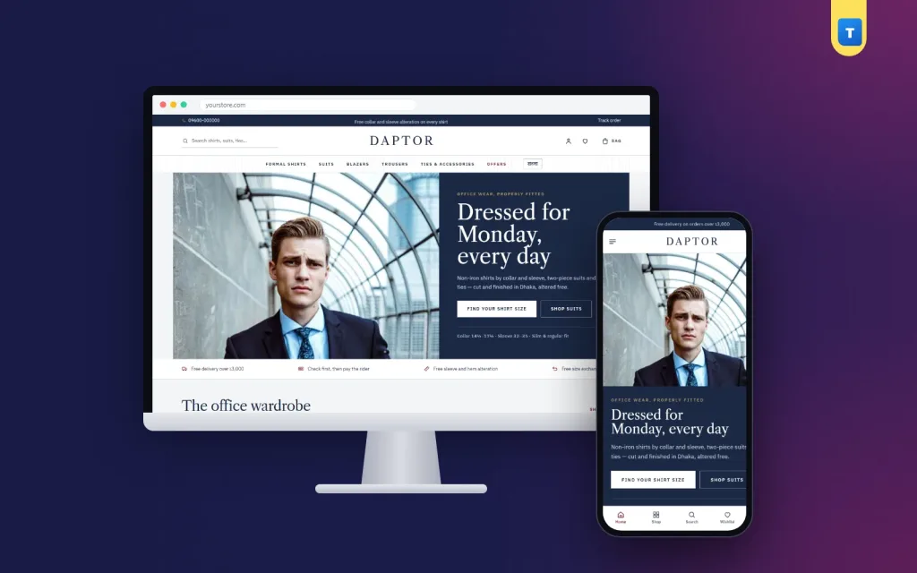
Men clothing website design is often treated as an afterthought: take a women's fashion layout, swap the photos and hope for the best. But men shop differently. They want to find the right size quickly, understand the quality and order without fuss. This guide walks through how to design a men's clothing website that suits the way men actually buy, with a special focus on shirts, suits and office wear.
We build menswear shops for formal shirt brands, tailors and smart-casual labels. The lessons below come from watching what makes men order and what makes them leave.
How men shop online
Most men are mission shoppers. They come to a site with a clear need, such as "a white shirt for Monday" or "a navy suit for a wedding", and they want to finish quickly. They rarely browse for fun, and they hate guessing sizes.
Good men clothing website design respects that. It puts sizes and fits up front, keeps navigation simple, shows quality clearly and makes the checkout short. Decoration that slows them down costs sales.
Start with a clear, confident homepage
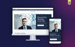
The first screen should say what you sell in a few words, with one strong photo and one button. "Formal shirts that fit, delivered across Bangladesh" tells a visitor more than any slogan. A navy or charcoal panel beside a wide photo looks classic and masculine without feeling heavy.
Right below, add a short promise line: free alteration, easy exchange, cash on delivery. These three answers remove the most common doubts before the visitor has to search for them.
Make size the first thing they see
Sizing is the biggest barrier in menswear. A man who is not sure about his size often does not buy at all. Solve it in three places.
First, add a size block on the homepage with links for each collar size and fit, such as 15, 15½, 16 and slim or regular. Second, print the size range under the name on every product card, such as "Sizes 15 – 17", so buyers can compare from the grid. Third, add a clear size guide on every product page with measurements in inches and centimetres.
These three steps alone can change your conversion rate more than any redesign of colours or fonts.
Organise by how men dress, not only by product type
Categories such as shirts, trousers, suits, blazers and ties are necessary, but men also think in situations: the office, a wedding, a weekend. Add sections that group pieces by use, such as "The office wardrobe" or "Build your work week".
A work-week block with five shirts, one for each day, is a strong example of smart men clothing website design. It answers "what should I wear this week?" and sells five shirts instead of one.
Men formal wear website design: the details that matter
Formal wear buyers pay attention to details: collar shape, cuff type, fabric weave and how well the shoulders sit. Men formal wear website design should show those details clearly. Use close-up photos of the collar and cuffs, and write short notes on the fabric.
A fabric library is a simple way to explain quality. Show four or five weaves with close-up photos and one line each about feel and use. When a buyer understands why one shirt costs more, he is more likely to pay for it.
Suits deserve their own section with their own photo and link. A suit is a bigger decision than a shirt, and buyers want to see it presented with care.
Product pages that close the sale
On the product page, show several photos: front, back, a close-up of the collar and one worn by a model. List the available sizes and fits clearly, with a link to the size guide. Put the price and the add-to-cart button where they can be seen without scrolling on a phone.
Under the main details, add the fabric, care instructions and any alteration service you offer. Reviews from other men, especially about fit, are very persuasive. Keep them close to the add-to-cart button.
Show the people behind the fit
Men trust craft. A short section about your tailors, with a photo and a few lines about their experience, makes your shop feel like a real business with skilled people behind it. It also explains why your fit is better than a random online seller's.
If you offer free or express alteration, promote it in its own band. For many buyers, the promise that the shirt or suit can be adjusted is what turns hesitation into an order.
Photography in men clothing website design
Photos do most of the selling in a menswear shop. For each shirt, show a front view, a back view, a close-up of the collar and cuff, and one photo on a model. Keep the background and light the same across the whole shop, so the grid looks calm and organised.
Use models of different builds if you can, and write the model's height and size under the photo. Men compare themselves with the model, and this one line answers the question "how will it fit me?". Good photography is the cheapest upgrade any men clothing website design can get.
Reviews and proof
Men trust other men's opinions on fit and quality. Ask every buyer for a short review after delivery and show the best ones on the homepage and product pages. Reviews that mention fit, such as "the 15½ slim fits perfectly", are the most useful. Customer photos are even better. In men clothing website design, a few honest reviews near the add-to-cart button often do more than a big discount banner.
Colours and typography for menswear
Classic menswear sites use deep colours such as navy, charcoal, burgundy or olive, with plenty of white space. One accent colour for buttons is enough. Serif headings with a clean sans-serif body text, such as a Caslon-style serif with a modern sans, give a sharp, trustworthy feel.
Avoid loud gradients and too many fonts. In men clothing website design, restraint looks premium.
Write a dress-code guide
Many men are unsure what to wear to an interview, a wedding or a business dinner. A simple dress-code guide on your site answers those questions and links to the right products. It is helpful content that ranks well on Google and brings in visitors who are ready to buy.
Add short articles for seasonal moments too, such as what to wear to an Eid gathering or a winter wedding. Each one is a new entry point to your shop, and each can end with a small set of recommended pieces.
SEO for a menswear shop
Search engines send buyers who are already looking for what you sell. Name your products the way men search: "white formal shirt slim fit" works better than "Classic 01". Give every category page a short introduction, such as two sentences about your formal shirts and the fits you offer.
Write helpful articles that answer common questions, like how to measure a collar size or how to choose a suit colour for a wedding. Each article should link to the right products. Over time, this content brings steady visitors from Google, and your website design turns them into buyers.
Plan your year
Menswear sales follow the calendar: office season after holidays, Eid, the wedding season in winter and end-of-season clearance. Plan homepage changes for each of these a month in advance. Swap the hero photo, update the work-week block and add a seasonal edit. A shop that changes with the season gives regular buyers a reason to come back.
Corporate and bulk orders
Office wear has a second market: companies, banks, schools and hospitals that order uniforms. Make it easy for them. Add a bulk order or corporate quote form, show that you offer quantity prices and give a contact number for business buyers.
A good men formal wear website design template includes this from the start, so a corporate buyer can request a quote for fifty shirts in different sizes without long phone calls.
Navigation and search in men clothing website design
Keep the main menu short: shirts, trousers, suits and blazers, ties and accessories, and offers. Five or six items fit on one line and are easy to scan. Put the search box where it is easy to find, and make sure it understands simple words such as "white shirt" or "navy blazer".
Filters for size, fit, colour and fabric help men narrow a large range in seconds. On category pages, show how many products match and let buyers sort by price or newest. Simple navigation is one of the quiet strengths of good website design: buyers rarely notice it, but they notice immediately when it is missing.
A checkout built for busy men
Keep the checkout on one page: name, phone, address and district. Show the delivery charge for the district straight away. Offer bKash, Nagad and cash on delivery. For suits and larger orders, a small advance by bKash or Nagad reduces fake orders without scaring real buyers.
After the order, show a clear confirmation and let buyers follow the parcel on a Track Order page. Fewer "where is my order?" calls means more time for your team to sell. A short thank-you SMS after delivery, with a link to leave a review, closes the loop and brings the next order closer.
Design for phones first
Many men shop in short breaks: on the commute, at lunch, between meetings. Test every page on a phone. The header should show the menu, logo and cart in one line. Sizes must be visible on the cards. The size guide must be readable without zooming. The checkout must fit on one screen.
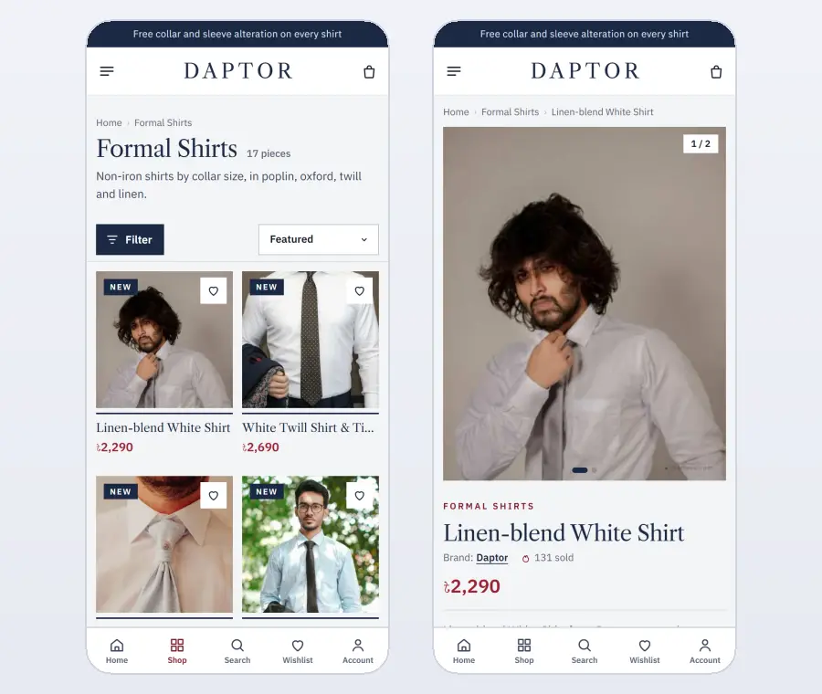
Speed matters too. Avoid heavy page builders and long sliders. A light site opens fast on mobile data and keeps the buyer moving.
Common men clothing website design mistakes
Hiding sizes until the product page. Using only model photos and no close-ups. Long category lists with no grouping by use. No information about fabrics. No mention of alteration or exchange. A slow homepage with a five-slide carousel. Each of these sends men to a competitor, and each is easy to fix.
Build it with a ready theme
You can build all of this from scratch, or start with a theme designed for menswear. Our men's clothing website template, Daptor, was made for office wear.
It includes a navy hero panel, a shirt size block with collar and fit links, collar sizes printed on every card, a Monday-to-Friday work week, a fabric library, a suits department, a free-alteration band, an "Our tailors" block, bestsellers in tabs and a dress-code guide page.
Behind it, the included shop plugin handles sizes and stock per combination, bKash, Nagad and cash on delivery with an optional advance, district delivery charges, Steadfast and Pathao courier, order tracking and corporate bulk quotes. A one-click demo shows a finished shop that you then make your own.
Checklist before launch
Open your site on a phone and check: can a buyer find his collar size in one tap, are sizes shown on every card, is there a size guide, are fabrics explained, is alteration or exchange mentioned, and does the checkout fit on one screen? If all six are yes, your website design is ready to sell.
Ask a few regular customers to place a test order and tell you where they slowed down or felt unsure.
Want to see these ideas on a working website? Open the Daptor live demo and browse it on your phone and your computer.
Frequently asked questions
What is the most important part of men clothing website design?
Clear sizing. Show sizes on the homepage, on every product card and in a size guide on every product page.
Which colours suit men clothing website design?
Deep classic colours such as navy, charcoal, burgundy or olive, with white space and one accent colour for buttons.
Should a menswear shop offer alteration?
If you can, yes. Free or express alteration removes the biggest worry about buying formal wear online.
How do I attract corporate uniform orders?
Add a bulk order or quote form, show quantity prices and give a direct contact for business buyers.