Mobile accessories website design is different from designing a general online shop, because your customers buy small, cheap, urgent things, and they buy them in large numbers. A charger, a cable or a phone case costs a few hundred taka, so the buyer will not read long pages. They want the right item, fast.
This guide explains how to plan and build an accessories and phone shop website that is easy to use on a phone. You will find layout advice, product page tips, payment and courier setup for Bangladesh, a launch checklist and a list of mistakes to avoid.
Who buys mobile accessories online
Your visitors fall into a few clear groups. Knowing them helps you decide what goes on the homepage.
- The urgent buyer. A cable broke or a phone is at 5 percent. This person wants a charger today.
- The new phone owner. They need a case, a screen guard and maybe earbuds, all for one model.
- The budget shopper. They start from a number, such as "phones under 20,000 taka".
- The brand loyal buyer. They look for one maker and compare only within it.
- The gift buyer. A smartwatch or power bank for a family member.
A good layout gives each of these people a short path. If they must scroll through twenty rows to reach their need, they will go back to Facebook or a marketplace.
Plan your mobile accessories website design before you build
Before you open any design tool, put your stock on paper. This step saves hours later.
- List every product group: phones, tablets, earbuds, chargers, power banks, cables, cases, screen glass, smartwatches.
- Pick your top 25 to 40 items to feature first.
- Note the phone models each accessory fits.
- Decide on four to six price bands for phones.
- Write your warranty, return and delivery rules in plain words.
- Take clean photos of every item, on a light background.
Accessories are tricky because of compatibility. A case for one model does not fit another. Put the model name in every title, such as "Clear case for Galaxy A15". It helps buyers and it helps search.
Mobile accessories website design: homepage structure
The homepage should work like a shop window with signs. A reliable order looks like this:
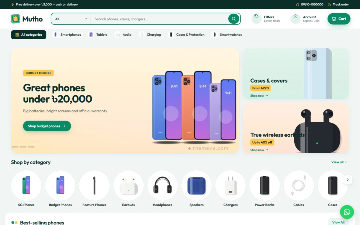
- A slim offer line at the very top, for example free delivery over a set amount.
- A white or light header with a wide, rounded search bar and a cart button.
- A category bar underneath for phones, audio, power, cases and watches.
- A main slider with one or two current offers and two small side banners.
- A row of category tiles with pictures.
- A price-based block, such as phones by budget.
- Best sellers, split into tabs by category.
- Today's deals with a countdown.
- One block for a featured brand.
- A promise strip covering delivery, warranty, EMI and payments.
- A footer with contact details, policies and social links.
Each block should be easy to switch off or move. Your stock changes with seasons, launches and Eid sales, so the page must change with it.
Shop by budget and brand
Many phone buyers do not know which model they want. They know what they can spend. A "Shop by budget" block with price tiles lets them start there. Show tiles such as under 10,000, under 15,000, under 25,000 and above 25,000, and show a few phones right beside the tiles.
A brand block works in a similar way. Feature one maker at a time. Use it for a launch month, a new official range or simply the brand that sells best in your area. Rotate it every few weeks so the homepage never looks stale.
- Keep the budget tiles to four or five.
- Check the tiles again after every price change in your stock.
- Link each tile to a filtered list, not the whole shop.
- Show the real price range on the tile.
- Change the featured brand when a new model arrives.
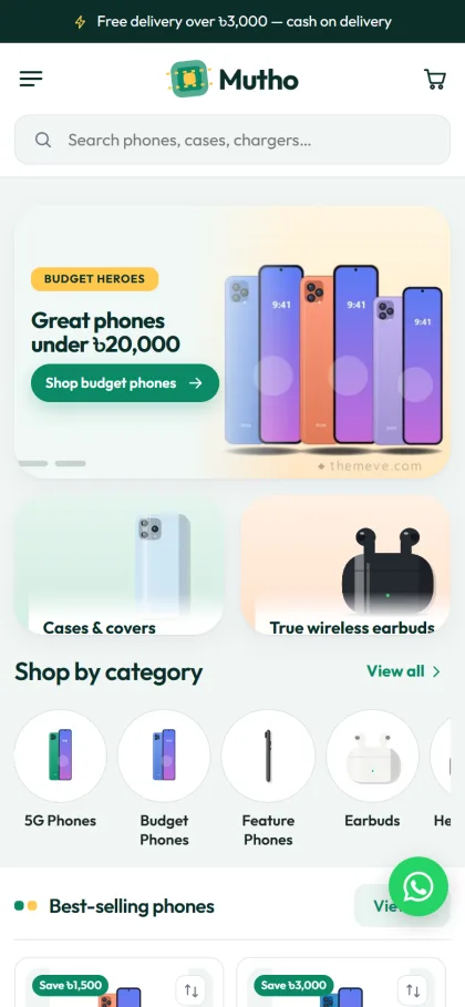
Mobile accessories website design for small screens
More than eight in ten Bangladeshi shoppers will visit from a phone. Design for the thumb first, and the desktop version will follow.
- Use large product cards, two per row.
- Make buttons at least 44 pixels tall.
- Keep the search bar visible at the top of every page.
- Avoid pop-ups that cover the whole screen on load.
- Keep the checkout to one page.
- Compress photos so a page loads fast on mobile data.
Test on a low-cost Android phone, on a weak connection. Good mobile accessories website design is judged on that kind of device, not on a new laptop. If your own shop feels slow there, it will feel slow to many customers.
Product pages for phones and accessories
A phone page and a cable page need different things, but both need clarity. For phones, use this order:
- Title with brand, model and storage.
- Photos from several angles, and one of the box contents.
- Price, old price and the saving.
- A short list of key specs.
- Grouped specs under clear headings: display, camera, battery, memory.
- Warranty length and who provides it.
- EMI details, if you offer them.
- Related accessories such as cases and chargers.
For accessories, add a short "fits" line that names compatible models. For chargers, show the wattage and port type. For power banks, show capacity and output. Facts like these cut down on messages asking "does this fit?"
Phone case website design: getting the details right
Cases are the best-selling accessory in most shops, and they are also the hardest to organise. One case design may come in forty model sizes. A good phone case website design handles this in a clear way.
- Let buyers choose their phone brand first, then the model.
- Use variation options for colour, not separate products for each colour.
- Show the case on a real phone in at least one photo.
- State the material: silicone, hard plastic, leather or clear TPU.
- Add a screen guard and a cable as related items.
If your range is large, consider adding a "find by phone model" filter on the shop page. It is more work at the start, but it can lift sales a lot.
Compare pages and spec clarity
Shoppers who spend more than 15,000 taka on a phone want proof that they are making the right choice.
When two phones sit close in price, buyers compare them. If you do not offer a comparison, they will open two tabs, or leave to find another site that does.
A compare page puts two products side by side with grouped specs. Keep it simple: price, screen, camera, battery, memory and warranty. Highlight the differences so the choice is easy. Never invent numbers. Use the maker's published specs and note the source if you can.
Payments, EMI and couriers in Bangladesh
Local payment options decide whether a buyer finishes checkout. Offer these:
- bKash and Nagad, with the sender number and transaction ID.
- A card gateway such as SSLCommerz.
- Cash on delivery for low-value orders.
- An advance payment rule for expensive phones, to cut fake orders.
On the delivery side, connect to a courier such as Steadfast or Pathao so you can print labels and send tracking links. Tell customers the usual delivery time for Dhaka and for other districts, and show the delivery charge before the last step.
If you sell phones on instalment, write the bank names and months in a short note on the product page. Do not promise terms you cannot confirm.
Trust, speed and policies
Trust is a large part of mobile accessories website design, because buyers cannot touch the product before paying.
Online phone buyers worry about fakes and refurbished stock sold as new. Answer that worry on the page.
- State clearly if a product is official, unofficial or used.
- Show your shop address and a working phone number.
- Publish return, refund and warranty pages in plain language.
- Add your trade licence number to the footer.
- Keep reviews real. Do not post made-up ones.
Speed matters just as much.
Check it with a free page speed tool, and fix the largest images first, since they are usually the cause. Also avoid autoplay videos and large animated banners, which waste mobile data that your customers pay for. Resize photos, avoid heavy sliders with many slides, and remove plugins you do not need. A shop that opens in three seconds sells more than one that opens in eight.
A ready-made option: Mutho
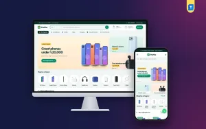
If you want a head start, Mutho is a WordPress theme made for phone and accessories shops. It has a fresh mint-green look with a rounded search bar, and it was built around the points in this guide.
What it includes:
- A Shop by budget block with price tiles and products.
- A brand spotlight block for one featured brand.
- Best sellers in tabs by category.
- Today's deals with a countdown.
- 18 homepage blocks that you can switch off or re-order.
- A promise strip for delivery, warranty and EMI.
- Grouped specs with warranty and EMI details on product pages, and a Compare page for two phones.
- Five colour palettes and eight font pairs.
- A demo with 24 products from 6 brands.
- bKash, Nagad, SSLCommerz and cash on delivery, with Steadfast and Pathao courier and tracking.
The shop plugin, Themeve Commerce, is bundled, so you do not need WooCommerce. If you want a ready-made base for mobile accessories website design, see the Mutho product page and try the live demo.
Launch checklist
Go through this list before you announce the shop:
- Every title has the brand, model and key detail.
- Every product has a clear photo, a price and stock status.
- Compatibility is stated on all cases, chargers and screen guards.
- Warranty wording is the same on every page.
- Test orders work with bKash, Nagad and cash on delivery.
- The courier sends a tracking link.
- Contact, return and privacy pages are live.
- The site loads quickly on mobile data.
- The chat or phone link works from a phone.
Place a test order from your own phone and follow it through.
Ask a friend who has never seen the site to buy a cable, and watch where they hesitate. That ten-minute test is worth more than any amount of guessing, and it costs nothing. You will almost always find one small thing to fix.
Common mistakes to avoid
Most weak accessories shops repeat the same few errors. Read this list and compare it with your own site.
- No model names in titles. Buyers cannot tell if an item fits.
- Too many banners. Two or three are enough.
- Hidden delivery charges. Show them early.
- Poor photos. Dark or blurry pictures lose sales.
- Copying text from other shops. Write your own short descriptions.
- Fake countdowns. Use real end dates for deals.
- Slow replies. Answer messages the same day.
Strong mobile accessories website design is never finished. After launch, check weekly which items get views but no orders. A better photo, a lower price or a clearer title often solves it. Keep the homepage fresh by changing the featured brand, the deals and the best sellers each month.
If you want to read more on the technical side, the official WordPress documentation is a good, reliable reference.
Frequently asked questions
What makes good mobile accessories website design?
Clear categories, a visible search bar, compatibility details in titles, fast mobile pages and local payment options. Keep the homepage short and let buyers shop by budget or brand.
How many products should a new accessories shop start with?
Start with 25 to 40 well-presented items. Add more each week once orders begin and you see what sells.
Is mobile accessories website design different from other shops?
Yes, in a few ways. Items are cheap and bought often, compatibility matters, and most visitors use a phone. So search, model names and fast pages count for more than fancy effects.
Can the same site sell phones and accessories?
Yes. Use budget tiles and a brand block for phones, and tabs for best sellers in accessories. Switch off blocks you do not need.
How should I organise a phone case website design?
Let buyers pick their phone brand and model first, then show matching cases. Use colour variations instead of separate products, and show the material in the description.
Which payment methods should I add?
bKash, Nagad and cash on delivery are the minimum. Add a card gateway for higher-priced phones and ask for a small advance on large orders.
Do I need WooCommerce for an accessories shop?
No, not always. Mutho comes with its own shop plugin that handles cart, checkout, payments and couriers.