Most conversations about news portal website design still start on a big monitor, yet the readers who keep your site alive are holding a phone. In Bangladesh, a typical reader opens your site from a Facebook link on a mid-range Android handset, often on mobile data, sometimes in bright sunlight on a bus. This guide is for publishers, developers and freelancers who want to design for that reader first.
We look at how Bangla readers actually use their phones, how to set type and spacing for Bangla script on a small screen, how to plan menus, tickers and lead stories for thumbs, and how to keep pages light. Then we show how the Bangla News Pro Theme, a lightweight WordPress theme for Bangla newspapers, online magazines and media houses, looks and behaves on a phone.
Why Mobile Comes First in News Portal Website Design
Look at the analytics of almost any news portal Bangladesh readers use, and phones usually account for most visits. Desktop readers still exist, mostly in offices, but they are fewer, and they are less likely to arrive from social media. If the mobile version is an afterthought, you are designing for the smaller audience and hoping the bigger one puts up with the result.
Mobile-first also changes priorities. On a desktop you can show three columns, a sidebar and a large banner at once. On a phone, everything sits in one column, so order becomes the design. What appears on the first screen, what comes second and where the first ad sits matter far more than colours or decorative details.
How Bangla Readers Use Their Phones
Three habits shape how readers use a news portal Bangladesh-wide. First, discovery happens inside Facebook, so many readers see your article page in the in-app browser before they ever see your homepage. Second, data is not free, and many people watch their balance, so heavy pages feel expensive as well as slow. Third, reading happens in short bursts: at a tea stall, in a rickshaw, during a work break.
These habits point to clear design goals. Article pages must load quickly and show the headline and first paragraph straight away. The next story should be one thumb movement away. Images should be compressed and sized for phones. And the site should feel familiar, with sections named the way readers expect, so they do not have to learn a new layout every time they visit.
Typography and Spacing for Bangla on Small Screens
Bangla script has tall letters, vowel signs above and below the line and many joined forms. Set too small or too tight, it turns into a blur on a five-inch screen. Use a Unicode Bangla font made for screens, set the body text a little larger than you would for English, and give it generous line height so vowel signs on one line do not touch the next.
Headlines need weight and contrast, but not shouting. A bold headline font with clear spacing reads better than all-red text or heavy shadows. Keep paragraphs short, because a long Bangla paragraph fills the whole phone screen and feels like a wall. Make links and buttons large enough to tap without zooming, and leave a clear gap between neighbouring links.
Watch out for converted text. Copy pasted from Bijoy documents without proper conversion shows as broken characters, and on a phone readers simply leave. Check every story on a real phone before or right after publishing, especially stories that came from district correspondents or from press releases.
Menus, Tickers and Lead Stories for Thumbs
On a phone the menu competes with the content for space. A common pattern is a compact bar of top sections that readers can swipe sideways, plus a menu button for the full list. Keep the bar short and the labels familiar: latest, national, politics, sports, entertainment. Put search where a thumb can reach it, because many readers come looking for one specific story.
A breaking news ticker helps on mobile if it stays thin and readable. Keep ticker items short, link them to real stories and remove them when they stop being urgent. Below it, give the lead story the full width of the screen with a clear photo, the headline and a short summary. Two smaller stories side by side can follow, which keeps the page varied without making text too small.
Light Pages for Slow Connections
Page weight is the hidden half of news portal website design. Every slider, font file, social widget and ad script adds to what a reader downloads. Choose a theme described as lightweight with clean code, then protect that advantage: compress photos, keep featured images to one standard width, limit plugins and use caching. A CDN helps once traffic grows.
Test with your own data plan, not office Wi-Fi. Open the homepage and two story pages on a mid-range phone, and watch how long it takes until the headline is readable. Google's Search Central documentation explains why mobile-friendly, fast pages matter for search as well, which gives you one more reason to keep the site lean.
How the Bangla News Pro Theme Looks on a Phone
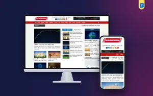
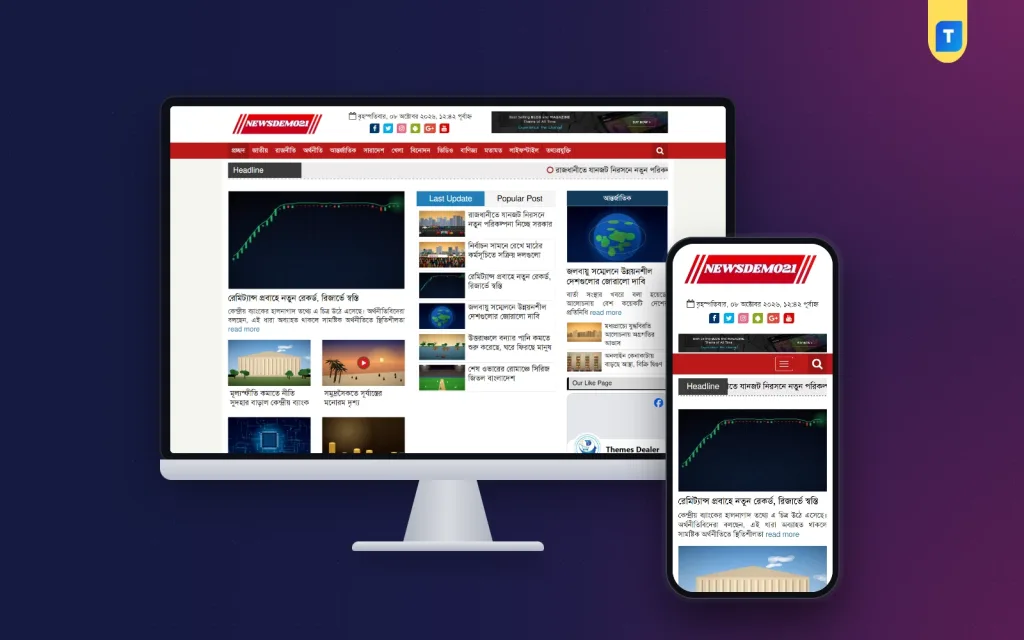
The Bangla News Pro Theme is a lightweight, clean-coded WordPress theme built for Bangla newspapers, online magazines and media houses, made to load quickly on all devices. On desktop, its demo shows a familiar national-daily structure: the logo, a Bangla date line with social icons and a banner at the top, then a full-width red menu bar with sections from latest news to lifestyle and a search icon.
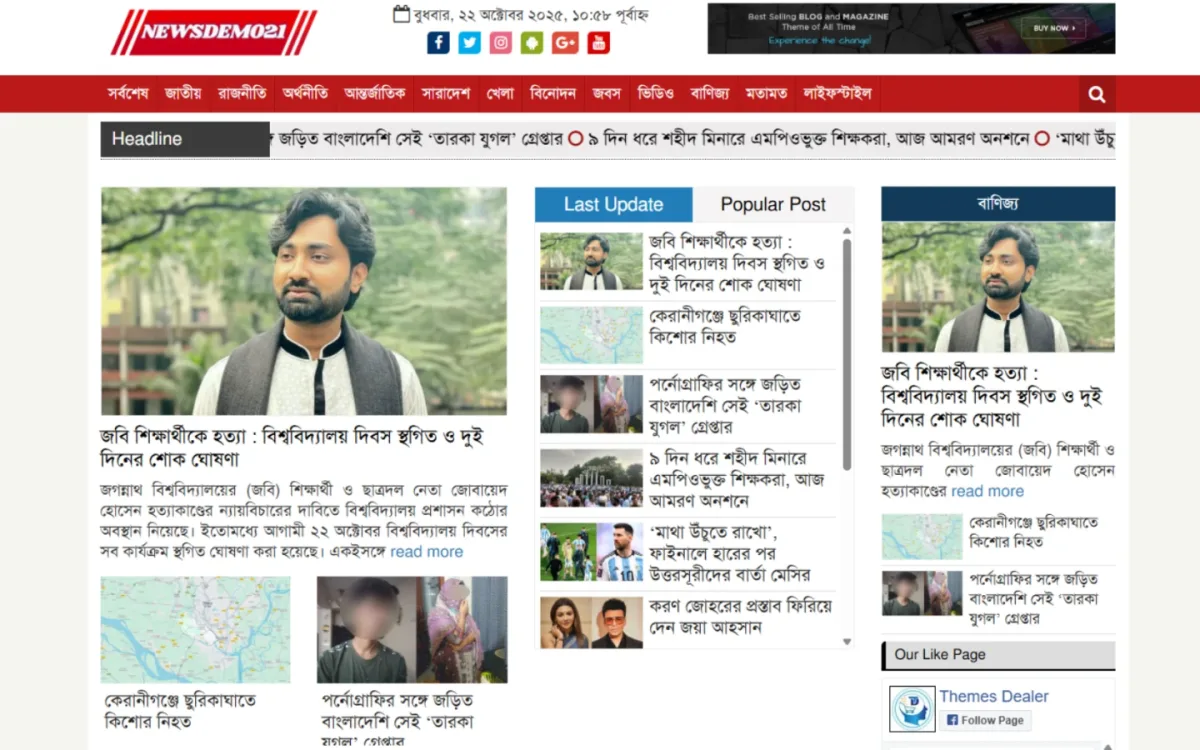
Below the menu a Headline ticker scrolls through current stories. The lead story has a large photo, a headline and a short summary with a read more link, with two smaller stories beneath. In the middle column, tabbed Last Update and Popular Post lists scroll on their own, and on the right a Business block with a navy title bar sits above a Facebook page box. Homepage widgets can highlight trending posts, categories and editors' picks.
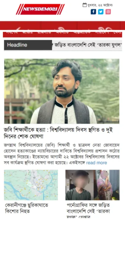
On a phone the order stays sensible. The logo, Bangla date and social icons come first, followed by the red section bar and the Headline ticker. The lead story then takes the full width, with its headline and summary under the photo, and two smaller stories sit side by side below. Photo and video gallery support lets you present multimedia stories and exclusive reports alongside the text news.
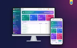
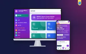
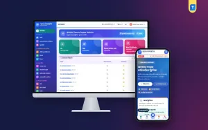
Setup is quick. Use the one-click demo import to get the full layout, then change the logo, fonts, colours and footer credits from the theme dashboard, with no developer needed. The theme comes with a lifetime licence for unlimited websites, and support is offered on WhatsApp around the clock. If your team is new to WordPress, the WordPress documentation covers themes, menus and categories.
Ads on Mobile Without Ruining the Read
Ads keep most portals running, but on a phone a single badly placed unit can push the story off the screen. Keep the first ad below the headline and opening paragraphs, reserve fixed space for each unit so the page does not jump while loading, and avoid full-screen pop-ups. Readers who feel tricked into tapping an ad rarely come back.
The Bangla News Pro Theme is fully Google AdSense optimized and adjusts ad placements for every screen size, so ads stay visible without breaking the layout on mobile, tablet or desktop. For direct deals, local businesses often like the header banner and pay through bKash or Nagad. Start with fewer units, watch time on page, and only add more if readers stay.
Common Mobile Design Mistakes
The usual mistakes are designing on a laptop and checking the phone only at the end, stacking two or three banners above the lead story, and using tiny Bangla text to fit more headlines on screen. Others are sliders that are hard to swipe, search hidden behind several taps, and huge photos uploaded straight from a camera. Each one costs you readers on exactly the screen that matters most.
Avoid nulled themes too, since their hidden code often adds redirects or spam that hit mobile visitors hardest. And do not forget accessibility. Good contrast, readable sizes and clear tap targets help older readers and anyone reading outdoors in bright sun, and they make the whole site feel calmer and easier to use for everyone else as well.
Frequently Asked Questions
What matters most in news portal website design for mobile?
Speed and order. The headline and first paragraph should appear quickly, the text should be easy to read without zooming, and the next story should be close at hand. Colours and decoration matter far less than a clear single-column order and a page that stays light on mobile data.
Which Bangla font size works on phones?
There is no single number, but Bangla usually needs to be a little larger than English text, with generous line height so vowel signs do not clash. Test your chosen size on two or three real phones and ask a few regular readers whether they find it comfortable.
Does the Bangla News Pro Theme need coding to set up?
No. You import the demo in one click and change the logo, fonts, colours and footer credits from the theme dashboard. Basic WordPress knowledge, such as creating posts, categories and menus, is enough to run the site every day, and WhatsApp support is there if you get stuck.
Which related themes should I compare?
See Bangla News Pro – Bangla News WordPress Theme, which adds dark mode, an area news finder and a photo card maker, and the News Bangla Pro Theme 2025 for another fast, lightweight option. Open each one on your own phone before you decide.
Design for the Phone in Your Reader's Hand
Good news portal website design for Bangla readers starts with the phone: fast pages, readable Bangla type, thumb-friendly menus, a clear lead story and ads that wait their turn. Design for that reader first and the desktop version almost takes care of itself. If you want a light theme with a familiar national-daily layout, explore the Bangla News Pro Theme and test it on the phones your readers actually use.