Good website design for single product selling is different from building a normal online shop. You have one item, one buyer in mind and one job for the page: get the order. Most sellers in Bangladesh who run a single herbal or beauty product still copy the layout of a big shop, and then wonder why ad clicks do not turn into orders.
This guide explains how to plan and build a one-product website step by step. It covers what to put on the page, in which order, how to take payment with bKash, Nagad and cash on delivery, and which mistakes cost the most orders. Examples use a hair oil landing page website design, but the same ideas work for honey, ghee, a gadget or a single dress.
What a one-product website really is
A one-product website is a single long page built around one item. It has no big menu, no category list and no footer full of links. The visitor reads from top to bottom and ends at an order form.
It is different from a shop in three ways:
- There is one goal. Every section either builds trust or pushes the buyer toward the form.
- There is no browsing. If the buyer leaves to look at other items, you may lose the sale.
- The page is written for traffic from one source, usually a Facebook or Google ad that already promised something.
This kind of page is also called a landing page or a sales page. The name matters less than the structure. If the page leads one person to one action, it is doing its job.
When website design for single product pages makes sense
A single-product page is not right for every seller. It works best in these cases:
- You sell one hero item and a few small variations, such as 1, 2 and 3 bottle packs.
- Most of your sales come from paid ads or Facebook posts that point to one product.
- Buyers need explaining before they trust you, which is common with hair oil, supplements and food.
- You want to test a new product quickly before you build a full shop.
If you sell more than twenty products and buyers browse before they decide, a normal shop is the better choice. Many sellers run both: a shop for general visitors and a separate one-product page for each ad campaign.
Start website design for single product pages with buyer questions
Before you open any design tool, write down what a buyer wants to know. For a hair oil, the list is usually the same:
- What is in the bottle?
- Will it work for my hair problem?
- How long until I see a change?
- How do I use it?
- Is it safe, and who made it?
- How much, and how fast does it arrive?
- What if I do not like it?
Each question should get its own section. When you plan the page this way, the design nearly makes itself. You are not decorating a page; you are answering questions in the order a buyer asks them.
The sections every product page needs
A strong one-product page usually follows this order. You can hide or reorder parts to suit your product, but the flow should stay close to this.
- Headline and product picture. Say what the product does in one clear line. Show the real bottle.
- Offer line. A short line with the price, the discount and a deadline if the offer is real.
- Problem and promise. Describe the buyer's problem in their own words, then say what your product does about it.
- Ingredients. List what is inside and why each item is there.
- How to use. Three or four short steps with simple pictures.
- What to expect. A week-by-week guide that does not overpromise.
- Reviews. Real words from real buyers, with a name and area.
- Packs and price. Show the choices as cards, so the buyer can compare at a glance.
- Order form. Short, with payment choices.
- Questions and answers. Cover delivery, returns and safety.
Keep each section short. On a phone, a section that needs three scrolls to finish will lose the reader.
Write copy that builds trust
Hair oil buyers have heard every claim. Thick hair in seven days, no more hair fall, a miracle herb. Most of them stopped believing it long ago. Plain, specific words work better than big promises.
Follow these rules when you write:
- Name the actual ingredients and say what each one is traditionally used for.
- Give a realistic time frame. Hair takes weeks to change, not days.
- Explain how to use the product, how often and for how long.
- Say who the product is not for, such as people with a known allergy.
- Do not claim medical results. If you are not sure a claim is true, leave it out.
- Use the language your buyers use. If they write in Bangla, write in Bangla.
Honest copy also protects you. Fewer inflated claims means fewer angry messages and fewer returns.
Photos and layout for phones
Most Bangladeshi shoppers open ads on a phone, often on a slow mobile connection. Design for that first and check the desktop view second.
- Use one clear main photo of the product, taken in daylight, on a plain background.
- Add two or three real photos: the ingredients, the bottle in use, a happy customer if you have permission.
- Compress every image. A page that takes ten seconds to load loses half its visitors.
- Use large buttons and text of at least 16 pixels.
- Put the order button where a thumb can reach it, and keep a sticky order bar at the bottom of the screen.
- Keep a floating call or WhatsApp button, since many buyers want to talk before they pay.
Avoid sliders that move on their own, pop-ups that cover the page and long videos that start with sound.
Build the order form to match local habits
The order form is where the sale happens, so it needs the most care. Buyers in Bangladesh expect simple choices.
- Ask only for name, phone number, full address and the pack they want.
- Offer cash on delivery, bKash and Nagad. Many first-time buyers will only order if they can pay at the door.
- Show delivery charges for inside and outside Dhaka before the buyer submits.
- Show the total price in the form, so there is no surprise.
- Send the buyer to a clear thank-you message that says when you will call to confirm.
Call every new order within an hour if you can. A quick confirmation call cuts fake orders and shows the buyer you are real.
Offers, packs and urgency without tricks
Pack choices raise the average order. A single bottle, a two-bottle pack and a three-bottle pack give the buyer a reason to spend a little more. Show the saving per bottle on each card.
A countdown timer can help, but only if the deadline is true. Buyers in a small market talk to each other, and a fake timer that resets every day will be noticed. If you run a weekend offer, say so and end it when it ends.
A clear return or exchange promise near the form also helps. Write exactly what you will do if the product arrives damaged or the buyer is not satisfied, and then keep to it.
A ready-made option for hair oil sellers
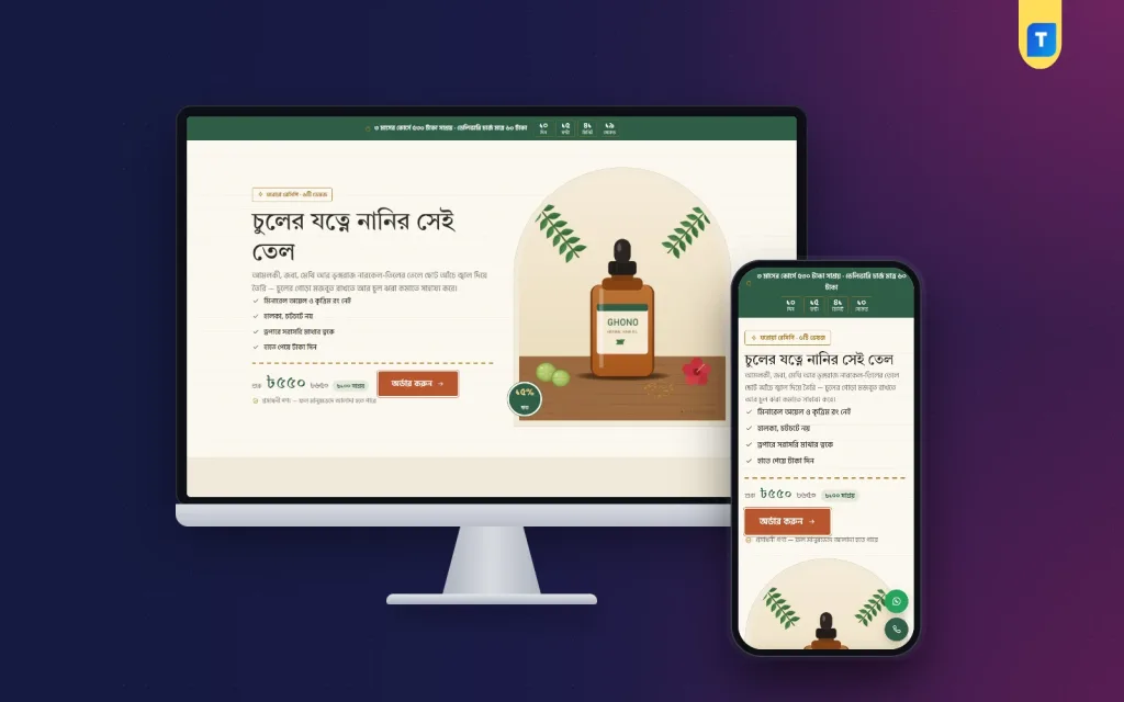
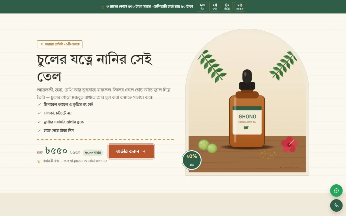
If you do not want to build the page from nothing, a ready-made theme can save weeks. Ghono is a WordPress theme made for herbal hair oil brands that sell from ads. It is one long page without a site header or footer.
Based on what the theme includes, you get:
- Tap-to-open ingredients placed beside the herbs.
- A week-by-week results guide covering up to three months.
- 16 sections you can hide or reorder.
- 1, 2 and 3 bottle packs in the order form.
- An order form with cash on delivery, bKash and Nagad.
- An offer line with a countdown, a floating hotline and WhatsApp button, and a sticky order bar on phones.
- Four herbal colour palettes and three font choices.
If you want a quick start for hair oil landing page website design, this is a fair place to begin. Any page on the site can sell any product, so you can reuse the same design for your next oil or a different item. You can see how it looks on the live demo before you decide. It needs WordPress 6.0 or later and PHP 7.4 or later. You still write your own copy and add your own photos; the theme gives you the structure.
Set up the page step by step
Whatever tool you use, the work follows the same order.
- Buy a domain and hosting. Pick a name that is short and easy to say on the phone.
- Install WordPress and your chosen theme.
- Write all your text in a document first: headline, ingredients, steps, reviews, questions.
- Collect your photos and compress them.
- Paste the text and photos into the sections.
- Set your price, packs and delivery charges.
- Connect the order form to the phone number or email where you receive orders.
- Place a test order from your own phone. Check that the message reaches you.
- Check the page on a cheap Android phone and a slow connection.
- Only then send ad traffic to it.
The test order is the step most sellers skip. A broken form can waste a whole week of ad money.
Connect your ads and track results
A one-product page is only half the job; the ad must match it. If your ad promises a hair fall solution, the first screen of the page should repeat that promise in the same words and show the same product picture.
- Use one page per campaign, so you know which ad brought the order.
- Install the Facebook pixel and Google tag, and mark the order form as a conversion.
- Start with a small daily budget and look at the cost per order, not only the clicks.
- Change one thing at a time: the headline, the main photo or the offer.
- Give each change at least a few days of traffic before you judge it.
If many people visit and few order, the problem is usually the page. If few people visit, the problem is the ad. Keep those two apart when you decide what to fix. This habit matters in every kind of website design for single product work.
Common website design for single product mistakes
These errors show up again and again on weak product pages:
- A top menu that sends visitors away from the order form.
- Copy that talks about the company instead of the buyer.
- Claims that sound too good to be true.
- No price on the page, so buyers must message to ask.
- Stock photos that do not show the real product.
- A long form with too many required fields.
- No mobile test before the ads start.
- No follow-up call after the order.
Fix these before you spend more on advertising. A page that converts one in fifty visitors can often double its result with small changes.
A launch checklist
Use this list before you switch on your ads:
- The headline matches the ad.
- The product photo is real and loads fast.
- Ingredients, steps and results are written in plain words.
- The price and delivery charges are visible.
- Cash on delivery, bKash and Nagad are all working.
- A test order reached your phone.
- The hotline and WhatsApp buttons open correctly.
- You have stock ready, and a courier booked for the first orders.
- Someone is ready to answer the phone.
- If you use Ghono, the unused sections are hidden.
If you want to read more on the technical side, the official WordPress documentation is a good, reliable reference.
Frequently asked questions
What is the best website design for single product selling?
A single long page works best: a clear headline, a real product photo, short sections that answer buyer questions, packs with prices and an order form at the end. Remove the menu and extra links so the buyer stays on the page.
How long should a one-product page be?
Long enough to answer every question, short enough to keep each section quick to read. Ten to sixteen short sections is common. Products that need more trust, such as oil or food, can use more sections than a simple gadget.
Do I need a developer to build it?
Not if you use a ready-made WordPress theme. You install it, replace the text and photos, set your prices and test an order. A basic comfort with WordPress is enough.
Which payment methods should I offer?
Offer cash on delivery first, since many new buyers prefer it. Add bKash and Nagad so people who already trust you can pay at once.
Can I use the same page for more than one product?
Yes. Build a separate page for each product so every ad lands on the matching offer. With a theme that lets any page sell any product, this takes only a few minutes per page.
Is website design for single product pages good for a new brand?
Yes, because it is cheap to test. You can launch with one product, watch the results and decide later whether to build a full shop.