Studying ecommerce website examples is the quickest way to learn how successful online shops are put together. You see how they show products, how they build trust and how they make paying easy. You also notice what they leave out, which is often just as useful.
This guide looks at the main kinds of online stores, the features they share and the choices behind them. It also shows how to turn what you learn into a plan for your own shop, with practical notes for sellers in Bangladesh who use bKash, Nagad, cash on delivery and Facebook to find customers.
Why ecommerce website examples are worth your time
Most new sellers start by choosing colours. Experienced sellers start by watching how customers move through a shop. Good examples show you that path from the first click to the confirmation message.
When you review a few shops carefully, you can answer these questions:
- What does the visitor see in the first five seconds?
- How many clicks lead from the homepage to a product?
- Where are the price, the delivery note and the buy button?
- What makes a stranger feel safe enough to pay?
- How many fields does the checkout ask for?
Write the answers down. After five or six ecommerce website examples you will see which ideas repeat, and those are usually the ones that work.
Main types of online stores to study
Online shops are not all the same. Pick examples that match what you plan to sell.
- General stores. Many categories and brands, strong search and filters. They need good navigation.
- Single-category shops. Fashion, books, electronics, groceries or cosmetics. These can use a layout shaped around one kind of buyer.
- Single-product shops. One item on one long page, common for a new gadget or a special offer.
- Marketplaces. Many sellers in one place. Complex, and not a good first project.
- Digital product shops. E-books, templates, software and downloads. There is no delivery, so checkout is short.
- Course and training shops. Students buy lessons or learning paths and get access after payment.
- Subscription and service shops. Repeat payments or booked services.
A shop that sells recorded courses has different needs from one that sells shoes, and the best ecommerce website examples for you will come from your own type.
Features that appear in nearly every good store
Whatever the category, the shops that sell well share a set of basics.
- A clear homepage offer. One headline, one picture, one button.
- Easy category access. Menu or tiles that lead to the right group of products.
- Search. A visible box that finds products by name.
- Product pages with detail. Photos, price, description, reviews, availability.
- A short checkout. Only the fields that are needed.
- Several payment methods. Mobile wallets, cards and cash on delivery for local buyers.
- Trust signs. Contact details, policies, reviews and real photos.
- Order tracking and confirmation. Customers want to know what happens next.
Notice also how each of these features supports a decision. A search box saves time, a review removes doubt and a clear policy removes fear. When a feature does none of these things, it is probably decoration, and you can leave it out of your own shop.
If a shop you are studying lacks several of these, treat it as a warning, not a model.
WordPress ecommerce website examples and what they show
A large share of small shops runs on WordPress because it is flexible, cheap to host and easy to update yourself. When you look at WordPress ecommerce website examples, pay attention to how the theme and the store tools work together.
- Do products, cart and checkout feel like part of one design?
- Can the owner change homepage blocks without a developer?
- Is the shop fast on a phone?
- Do local payment methods work, or is the checkout built for another country?
- How many extra plugins does the shop need to function?
Fewer plugins usually means fewer updates, fewer conflicts and a faster site. That is worth noticing when you compare shops.
What shops in different niches teach
Fashion and clothing
Large photos, size guides and colour choices lead the page. Good shops show the product on a real person and let buyers zoom.
Electronics and gadgets
Specifications are placed in tables, with a short list of key features above. Warranty and genuine product signs matter a great deal.
Grocery and daily needs
Repeat buyers want speed. Search, quick add and saved lists are more important than big banners.
Books and gifts
Buyers browse by mood, author or budget. Good shops help them decide.
Courses and digital goods
Buyers need to see what they will learn before they pay. Syllabus previews, free lessons and instant access after payment build confidence.
A closer look at an online course shop
Course shops are a useful case to study because they break some usual rules. There is no parcel, no address and no courier, yet trust matters even more. The student pays first and judges the value later.
Strong course sites usually do the following:
- Group courses into goals, such as getting a first freelance client or reaching a target IELTS band.
- Show hours, level and total price for each path.
- Let people peek at the syllabus before paying.
- Offer one free-preview lesson per course.
- Send access by email right after payment.
- Skip the address form, since nothing is shipped.
The lesson applies beyond courses, and many ecommerce website examples in other niches follow it. Whatever you sell, show the buyer what is inside before the purchase.
How to judge any store design in ten minutes
- Open it on your phone, with mobile data, not wifi.
- Time how long the first page takes to become readable.
- Pick a product and find the price in three seconds.
- Add it to the cart and begin checkout.
- Count the form fields.
- Look for contact details and a return policy.
- Check whether bKash, Nagad or cash on delivery are offered, if the shop is local.
- Note what made you hesitate.
Also compare the footer. Careful shops list their contact details, policies, payment methods and social links there, and that tidy ending tells you the owner cares about the details.
Your hesitation points are your best design notes. If a feature made you stop, it will stop your customers too.
Turning ecommerce website examples into your own plan
Notes alone do not build a shop. Convert them into a short plan.
- Layout. List the homepage blocks you want, in order.
- Products. Decide your first twenty items and their categories.
- Payments. Choose the methods and test accounts you need.
- Delivery or access. Courier, pickup or instant digital access.
- Trust. Policies, contact details, a few reviews.
- Content. Photos, descriptions and prices ready before launch.
Keep the plan to one page. If it takes ten pages, you are designing too much before you have sold anything.
A ready-made option for skill schools
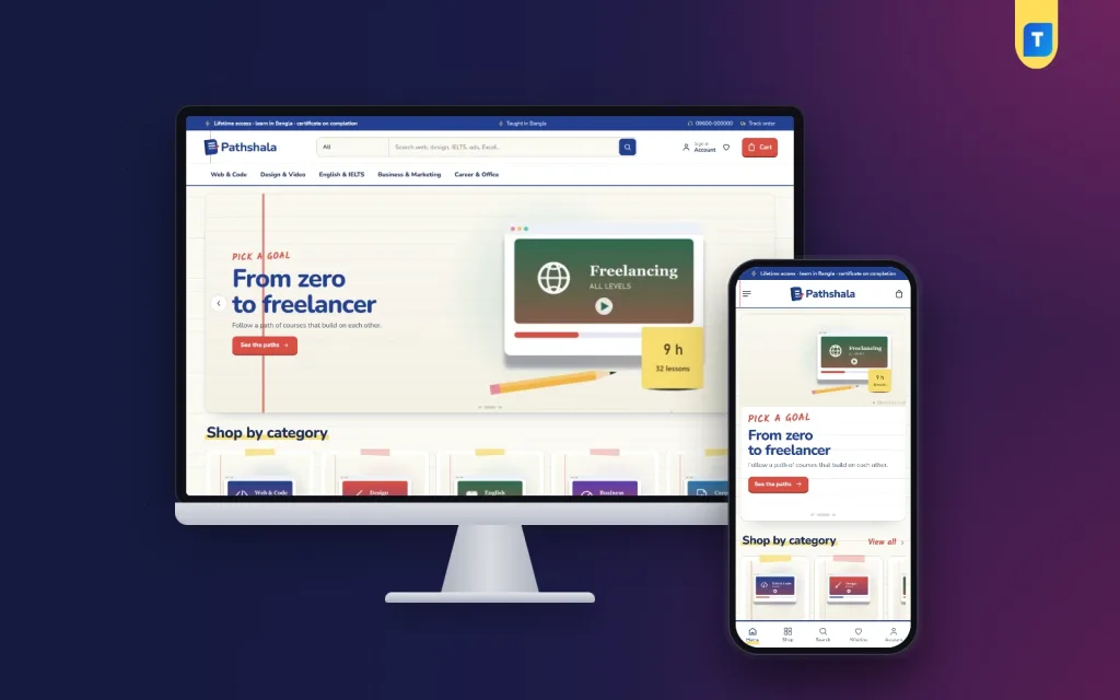
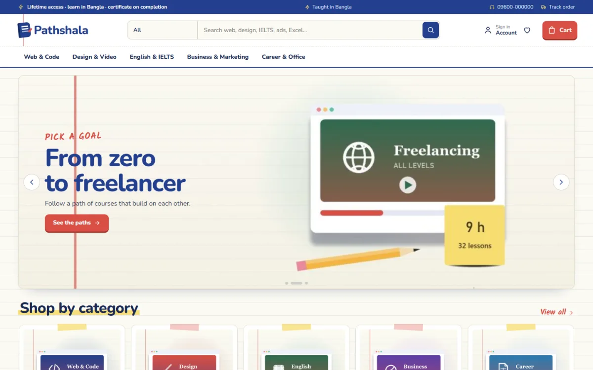
If you teach skills online, Pathshala is an online course WordPress theme worth a look. It is built for web and code, design and video, English and IELTS, business and marketing, and career and office courses. The design is an exercise book, with ruled paper, a red margin, ink-blue text and handwritten notes.
What it includes:
- A Pick your goal block that turns goals into numbered roads of courses, with total hours and total price.
- One button that enrols a student in the whole path.
- Peek inside, with folding modules and a free-preview lesson for every course.
- 17 homepage blocks you can switch off or re-order.
- 5 palettes and 4 font pairs.
- Instant access by email, with no address asked at checkout.
- Sign in and register in a popup.
- bKash, Nagad, SSLCommerz and manual payment.
- A one-click demo with 21 courses.
It suits a single teacher with a few recorded courses, a training centre moving its batches online, or a group of instructors who want one shop with each teacher's logo on the homepage. The demo content is only a sample, so you replace it with your own courses and prices.
Payment, delivery and trust in online stores
Strong ecommerce website examples spend a lot of space on three things: how to pay, when the order arrives and why the shop can be trusted. Look at each one on its own.
Payment
- Show the accepted methods near the cart, not only in the footer.
- Offer cash on delivery for first-time buyers, and mobile wallets for repeat buyers.
- Keep the payment page free of distractions such as banners and menus.
- Send a clear confirmation message after payment.
Delivery or access
- Show the delivery charge before checkout, not after.
- Give a delivery date or a range of days for every product.
- For digital goods and courses, say plainly that access arrives by email.
- Offer order tracking, so customers do not need to call you.
Trust
- Add a real phone number, address and business email.
- Explain returns and refunds in short paragraphs.
- Show reviews from real buyers, with names.
- Keep your Facebook page, your website and your invoices consistent.
When you collect ecommerce website examples, screenshot these three areas for each shop. Compare them later in one folder and the better practice becomes obvious.
Common mistakes seen in weak stores
- Too many banners and pop-ups before the visitor sees a product.
- Prices hidden until checkout.
- No phone number or address.
- Photos copied from another shop, which customers may recognise.
- Forms that demand an account before payment.
- Broken filters or empty categories.
- Out-of-stock items still shown as available.
- Slow pages caused by large images.
Fix these on your own site and you are already ahead of many competitors.
Setting up and launching your first store
- Choose your product type and write your first-twenty list.
- Buy a domain and hosting.
- Install WordPress and your chosen theme.
- Import the demo to see every block in place.
- Replace the sample content one section at a time.
- Set up payments and test each one.
- Write policies and contact pages.
- Test a full order on your phone.
- Ask two friends to buy something and report any trouble.
- Launch, and share the link where your customers already are, such as your Facebook page.
If you picked Pathshala, also open one course page as a student would and check that the free-preview lesson plays.
Growing after launch
- Add new products or courses on a regular schedule.
- Collect and show reviews.
- Write short guides that answer buyer questions. They bring visitors from search.
- Run a limited offer around Eid or the start of a new term.
- Look at which pages visitors open most, and improve those first.
- Reply to messages quickly. Speed builds a name.
Do not wait for a perfect site. Many owners delay for months because the banner is not right, while a simple shop with honest prices would already be earning. Launch with a small range, watch what buyers click, and improve week by week. Keep a notebook of customer questions, because each repeated question is a missing line on a page.
Come back to your list of ecommerce website examples every few months. Shops change, and fresh ideas are easy to find when you look again.
If you want to read more on the technical side, the official WordPress documentation is a good, reliable reference.
Frequently asked questions
What are the best ecommerce website examples to learn from?
The best ones are shops in your own category that look busy and clear on a phone. Study three from your field and three from a different one. Judge them by clarity and ease of buying, not by how fancy they look.
How do I learn from other shops without copying?
Take the structure, not the content, from any of the ecommerce website examples you saved. Note what blocks they use, how many clicks a purchase takes and what builds trust. Then write your own text, use your own photos and set your own offers.
What do WordPress ecommerce website examples have in common?
They usually have a theme that controls the design, a store plugin that handles products and checkout, and a few extras for payment, shipping or reviews. The best ones keep the number of plugins low.
Can I sell courses with an online shop?
Yes. A course shop needs a goal-based catalogue, a syllabus preview and instant access after payment. It does not need delivery or an address form.
Which payment methods should a shop in Bangladesh offer?
bKash, Nagad and cash on delivery are the common choices. A card or internet banking gateway is useful too. Offer the ones your customers already use.
How many products do I need to open a shop?
Start with ten to twenty products with good photos and descriptions. You can grow later.