Good grocery ecommerce website design starts with one simple idea: people want to fill their basket fast and trust what arrives at the door. Everything on the site, from the homepage to the checkout, should serve that goal. If a shopper has to think too hard, they go back to the corner shop or call another seller.
This guide is for small grocery sellers in Bangladesh who want to move from Facebook and phone orders to a proper online shop. It covers planning, page layout, payments, delivery and launch. You can follow it with any platform, and you will find a checklist at the end.
What a grocery shop website must do
A grocery site is different from a fashion or gadget site. Customers buy often, they buy many items at once, and they care about weight, freshness and price per unit. A good site respects these habits.
Before you open any design tool, write down the jobs the website has to do:
- Show what you sell, with clear prices and pack sizes.
- Let a shopper add ten items in a few minutes.
- Take payment by bKash, Nagad, card or cash on delivery.
- Tell the buyer when and where the order will arrive.
- Make it easy to order again next month.
If a design idea does not help one of these jobs, leave it out. Big sliders, spinning banners and long animations rarely sell rice or oil.
Start with how your customers buy
Talk to ten of your regular buyers before you plan anything. Ask them how they shop today. You will learn more in one afternoon than in a week of reading templates.
Questions worth asking:
- Do you buy once a week, once a month, or every day?
- Do you buy one item or a full list?
- Which pack sizes do you choose, and why?
- What makes you nervous about ordering online?
- How do you prefer to pay?
A family that buys a month of rice and dal in one order needs a different site from a student who buys eggs and bread every morning. Write down who your main buyer is. Then design for that person first.
Choose your range and units
Many new sellers upload everything on day one. This makes the shop slow to manage and hard to browse. Start with a range you can keep in stock and deliver well.
A rice and dal shop might begin with these groups:
- Rice, by the kilo and by the 25 kg sack
- Dal and pulses
- Cooking oil and ghee
- Atta, flour and sugar
- Salt and spices
Decide how each item is sold. Price per kilo, price per litre and price per pack all work, but show the same unit across similar products. When one packet shows the price per kilo and the next shows only the pack price, buyers cannot compare, and they leave.
Plan the site structure on paper
Draw your site on a sheet of paper first. A small grocery shop needs fewer pages than most people think.
- Homepage
- Shop page with categories
- Single product page
- Cart and checkout
- My account and order tracking
- Delivery and return information
- About and contact
- Bulk orders page, if you serve offices, messes or shops
Keep the menu short. Five to seven top-level links is enough. Put the categories in a clear drop-down and keep a search box visible on every page.
Grocery ecommerce website design for the homepage
The homepage has one job: send people to the products. Treat it like the front of a shop, where the best things are close to the door.
A strong homepage for a food seller usually has these blocks, from top to bottom:
- A header with logo, search, account and cart
- One clear banner with an offer or a promise, such as free delivery above a set amount
- Category tiles with real photos
- A row of popular products
- Bulk or monthly packs
- A short block on how delivery works
- Customer reviews
- Footer with phone number, address and payment icons
Use plain words. A tile that says "Rice" beats one that says "Premium Grain Collection". Put your phone or WhatsApp number in the header, because many Bangladeshi buyers want to speak to a person before the first order.
Show products the way shoppers think
A product card on a grocery site must answer three questions at a glance: what is it, how much does it cost, and how do I add it.
Put these on every card:
- A clean photo on a plain background
- The product name with the pack size
- The price, and the price per kilo or litre
- A visible add button
The add button matters more than most owners expect. When the button turns into a plus and minus stepper after the first tap, the shopper can change the quantity without opening another page. That small detail saves many taps on a phone.
On the product page, add the weight, origin, shelf life and a short note on how to store or cook the item. For rice, say what it suits: daily meals, polao or biryani. This answers the question before the customer picks up the phone.
Make search and filters work
Search is a core part of grocery ecommerce website design. People who buy groceries online often know what they want. They type "mustard oil" or "masoor dal" and expect it on the first screen.
- Keep the search bar large and in the same place on every page.
- Allow both English and Bangla names where you can, for example "dal" and "daal".
- Offer filters for category, price and pack size.
- Show a clear message when nothing is found, with a link to contact you.
Test the search with ten real items from your own list. If three of them fail, fix the product titles before you launch.
Help buyers who shop by the month
Staples sellers have a special advantage. Their customers repeat. A family that bought 10 kg of rice last month will probably buy it again, and you can make that easy.
Some ideas that work well:
- A price chart that lists 1 kg, 5 kg and 25 kg packs side by side, with the saving on the biggest pack
- A monthly list where the buyer picks the number of people at home and sees a suggested basket
- A reorder button on the account page
- A simple guide that explains the difference between rice types
These tools turn a one-time buyer into a regular one. They also reduce the number of calls you answer each day.
Grocery ecommerce website design for checkout
Most lost orders are lost at checkout. The shopper has filled the basket, then meets a long form, a surprise fee or a payment method they do not trust.
Keep the checkout short:
- Ask only for name, phone number, address and delivery area.
- Allow guest checkout. Do not force an account.
- Show the delivery fee before the final step.
- Offer bKash, Nagad, card and cash on delivery.
- Show a clear order summary and a single large confirm button.
In Bangladesh, cash on delivery is still the first choice for many first-time buyers. Offer it, but consider asking for a small advance on large orders, so that a fake order does not cost you a delivery run.
Plan delivery before you design it
Delivery is where a grocery business wins or loses. A beautiful website does not help if the rice arrives late or the eggs arrive broken.
Decide these points first:
- Which areas you serve, and which you do not
- Your delivery fee for each area
- The time slots you offer, such as morning and evening
- The minimum order for free delivery
- Who delivers: your own rider or a courier such as Steadfast or Pathao
Then show this information in two places: a short "Deliver to" selector near the top of the site, and a full delivery page that people can read. When the shopper sees the fee and the time early, they trust you sooner.
Design for the phone first
Good grocery ecommerce website design begins on the phone. Most of your visitors will arrive from Facebook on a mobile phone. Many will have a slow connection. Design the phone version first, then adjust for the desktop.
- Use large buttons that a thumb can hit.
- Keep text at a readable size, at least 16 pixels.
- Fold the header into a menu, a logo and a cart icon.
- Use compact product cards, two to a row.
- Keep the cart one tap away at all times.
Open your own site on an old, cheap phone. If you feel any delay or frustration, your customers will feel it too.
Keep the site fast
A slow site loses the monthly buyer. Speed is part of design, not a technical extra.
- Resize photos before upload. A product photo rarely needs to be wider than 800 pixels.
- Use a light theme with few scripts and no heavy page builder.
- Load images only when they come into view.
- Turn off fonts you do not use.
- Pick reliable hosting with a server close to your buyers.
Test the homepage on a free speed tool and fix the biggest problem first, which is usually large images.
Build trust with small details
Simple grocery website design can still look careful and honest. Online food buying needs trust. Customers cannot touch the product, so the site has to do that work.
- Add a real phone number, address and trade licence number if you have one.
- Show your own photos of the shop, the warehouse and your team.
- Write a clear return policy for damaged or wrong items.
- Show customer reviews with names and areas.
- Display payment icons only for methods you truly accept.
Avoid stock photos of smiling strangers. A photo of your own shelf, even a simple one, is more believable.
A ready-made option
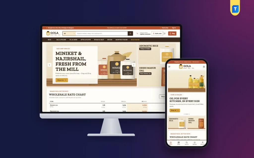
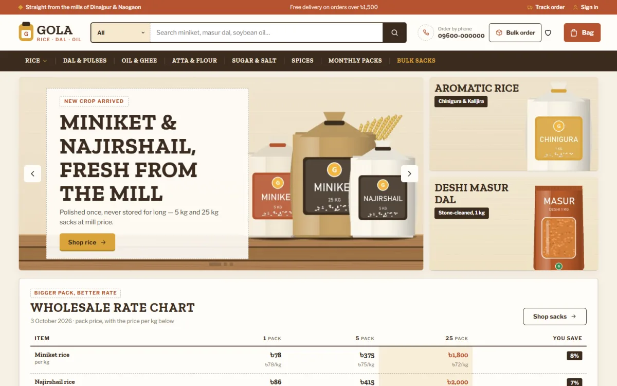
You can build a shop from scratch, but for a small seller a ready-made theme saves weeks. Gola is a WordPress theme made for rice, dal, oil, flour, sugar and spice sellers in Bangladesh.
Facts from the theme itself:
- A wholesale rate chart for 1, 5 and 25 kg packs
- A monthly bazar calculator with an "Add all to bag" button
- A "Know your rice" guide with six cards
- Price per kg on every product card
- An add button that turns into a stepper
- A bulk-order band for messes, offices and shops
- bKash, Nagad, SSLCommerz and cash on delivery
- Steadfast and Pathao courier support
- A one-click demo with 46 staples products
It is not the only way to build a shop, and a very small catalogue may not need all of it. But if your buyers think in kilos and monthly lists, you can see the live demo of Gola and decide for yourself.
Mistakes to avoid
These errors show up again and again on new grocery sites:
- Uploading hundreds of products with poor photos
- Showing prices without the unit
- Hiding the delivery fee until the last step
- Forcing account creation before checkout
- Letting products stay on the site after they are out of stock
- Using too many colours and banners
- Forgetting to test the order flow on a real phone
Weak grocery ecommerce website design is often the real reason ads do not bring orders. Fix these before you spend any money on advertising. Paid traffic only makes a weak site lose money faster.
Launch checklist
Before you share your grocery ecommerce website design with customers, go through this list line by line.
- Place three test orders: one by cash on delivery, one by bKash and one by card.
- Check that the order email and the SMS arrive.
- Confirm that stock numbers go down after an order.
- Read every page on a phone for spelling and broken links.
- Check delivery areas and fees against your real plan.
- Add your phone number and WhatsApp link.
- Set up a backup of the site.
- Connect Google Analytics or a similar tool, so you can see what people do.
- Post the link on your Facebook page and pin it.
After launch, review the numbers weekly. Look at the products people view but do not buy, and the pages where they leave.
How to improve the shop over time
Strong grocery website design is never finished. Small changes every week add up.
- Move the best-selling items higher on the homepage.
- Remove products that never sell.
- Change prices when the market moves, and update the rate chart the same day.
- Ask each buyer for a short review after delivery.
- Send a simple message before the month ends, reminding regular buyers to reorder.
Keep a notebook of customer questions. Every repeated question is a gap on your site that you can close with a short note or a new page.
If you want to read more on the technical side, the official WordPress documentation is a good, reliable reference.
Frequently asked questions
What is the first step in grocery ecommerce website design?
Start with your customers, not with colours. Write down how they buy, how often, in which pack sizes and how they pay. Then plan the pages around those habits.
How many products should I list at launch?
Start with the items you can always keep in stock, often 40 to 100. A smaller range is easier to photograph, price and deliver well. You can add more once orders become steady.
Which payment methods should a grocery site accept in Bangladesh?
Offer cash on delivery, bKash and Nagad at the least. Add card payment through a gateway if you can. Many first-time buyers only trust cash on delivery, so do not remove it.
Do I need a developer for grocery website design?
Not always. A ready-made WordPress theme lets you set up a shop by yourself in a few days. A developer helps if you need custom features, such as a special delivery rule.
How can I make a grocery site fast on mobile?
Use a light theme, resize your images, avoid heavy plugins and keep the layout simple. Test on a cheap phone and a slow connection before you launch.
Is grocery ecommerce website design different from other shops?
Yes. Buyers order often, buy many items and compare prices per unit. The design should favour fast adding, clear units, reordering and delivery time.