Single product website design ideas are most useful when they come with a reason. A page that sells one thing, such as a box of mangoes, a pair of shoes or a water filter, has no room for decoration that does not help the buyer decide. Every colour, photo and button should do a job.
This guide gives you practical design ideas for a one-product page, from layout and colour to photos, reviews and the order form. The examples lean toward food and seasonal sellers in Bangladesh, but the ideas work for most products. Read it once, then use the checklists as you build.
Start with one buyer and one promise
Design starts before you open any tool. Decide two things first.
- The buyer. Who is she or he? A mother ordering fruit for the family, a young man buying a gift, a shop owner buying in bulk.
- The promise. What will this person get? "Sweet, chemical-free Himsagar from our own orchard, delivered in 2 days."
Write the promise in one sentence. Your headline, photos and button text all come from it. If the promise is weak, no design can save the page.
Single product website design ideas for the layout
For a page that sells one thing, a single long column works best. It suits phones and keeps the story in order.
- No site menu. Remove the top navigation and the big footer. Keep only a logo and a call or order button.
- Short sections. Each block carries one idea and ends with an easy reason to keep scrolling.
- Alternate backgrounds. Switch between light and tinted bands so the page has rhythm.
- Repeat the order button. Place it after the hero, after the proof and at the end.
- Sticky order bar on phones. A slim bar at the bottom with the price and an order button keeps the action close.
Use plenty of white space. Crowded pages feel cheap, and cheap-looking pages lose trust, especially when buyers must pay before they can touch the product.
Choose a colour set that matches the product
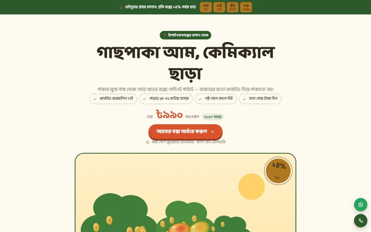
Colour should feel like the product. Mangoes suggest cream paper, leaf green and warm yellow. A smartwatch suggests graphite and a sharp accent. Skincare suggests soft pastels. Pick a set of three colours and stay with it.
- Base: a soft background, such as cream, white or light grey.
- Main colour: used for headings and bands.
- Action colour: used only for the order button, so it stands out everywhere on the page.
Check contrast on a phone outside in the sun. Light yellow text on cream looks lovely on a laptop and disappears on a street. If your theme offers several palettes, try each on your real photos before you decide.
Fonts and text size
Use two fonts at most. A friendly, slightly rounded heading font with a plain body font suits food, gifts and family products. Make body text at least 16 pixels. For Bangla text, use a clear Bangla font and test line height, because some fonts crowd the letters.
Write headings as short promises. "Fresh from the tree, packed the same day" says more than "Our Products". Keep paragraphs to two or three lines.
Photos and video: the heart of the page
On a one-product page, photos do most of the selling. Plan a small photo list before the shoot.
- One clean hero photo on a simple background.
- A close-up that shows quality, such as a cut mango with its colour.
- A photo of the full package or box, with size reference.
- A photo of the product in use or being enjoyed.
- A behind-the-scenes photo: the orchard, the workshop, the packing table.
- A photo of delivery packaging.
Use natural light, a plain surface and the same style for all photos. Compress each image before upload, so the page opens quickly on mobile data. A 15-second video of packing or cutting can help, but do not make it autoplay with sound.
Single product website design ideas for trust and proof
New buyers ask one silent question: will this seller really deliver? Good design answers it with proof, not with big words.
- Chat-style reviews. Screenshots or text bubbles from real buyers feel closer to how Bangladeshis really recommend things. Always ask permission before using one.
- Customer photos. A real photo from a buyer beats any studio shot.
- Numbers. "1,200 boxes delivered last season", only if true.
- Source details. Name the district, the orchard or the factory.
- Clear policy. What happens if the product arrives damaged?
Place proof right after the product details and again near the order form, where doubt is highest.
Show choices without confusion
Many one-product pages still have variants: sizes, colours, varieties or box weights. Design the choice so that the buyer decides in seconds.
- Show variants as a small table or row, with price and a "choose" button.
- Mark the most popular option.
- Connect the choice to the order form, so the selected variant appears there automatically.
- Keep the number of options low. Three is easy. Eight is a puzzle.
For seasonal products, a simple calendar is a clever idea. A mango seller can list each variety with the months it is in season and highlight the current month. The buyer sees at once what is ready, and you answer the question "do you have Langra now?" without a phone call.
Interactive blocks that help buyers decide
Small tools can replace long explanations. Use them only when they answer a real question.
- A quantity helper. "How many people, how many mangoes?" shows the box size that fits a family.
- A size or fit finder. Useful for clothes, appliances and furniture.
- A price calculator. Shows total with delivery for the chosen quantity.
- A comparison table. Your product against the usual market option, in plain terms.
Keep each tool simple and fast. A tool that takes five steps is not a help.
Design the order form for speed
The form is part of the design, not an afterthought. It should feel like the end of the same conversation.
- Ask for name, mobile number, address and district.
- Show the selected package and the total price, including delivery.
- List the payment choices: cash on delivery, bKash and Nagad.
- Use one big button with action words, such as "Order my box".
- Show a thank-you message that tells the buyer when you will call.
Avoid account creation, coupon boxes and extra questions. Each extra field costs some orders. Always test the form on a phone with your own number.
Offers, urgency and honesty
A countdown or limited-stock line can lift orders, but only when it is true. For seasonal products, urgency is natural: the season ends, the batch ends. Say so plainly.
- "Himsagar available until the end of May" is honest and useful.
- A timer that resets every day is not, and buyers learn to ignore it.
- Offer a small gift or free delivery above a set amount instead of constant big discounts.
Trust lasts longer than a one-day price cut, and repeat buyers come from trust.
A ready-made option: Mukul
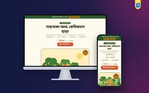
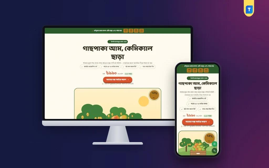
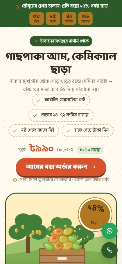
If you want a starting point, Mukul is a landing page WordPress theme made for orchard sellers and fruit pages that take mango box orders from Facebook ads. It is one long page with no site header or footer, and the order form sits inside it.
- A harvest calendar with the current month marked, and a button that picks that variety.
- A mango counter by variety and box size.
- Box packages shown as rows, plus a picker in the form.
- Chat-style reviews from real buyers.
- An order form with cash on delivery, bKash and Nagad.
- An offer line with a countdown, floating call and WhatsApp buttons, and a sticky order bar on phones.
- 16 sections you can hide or re-order, 4 orchard palettes and 3 font choices.
Any page can become a landing page, so you can reuse it for another fruit or product. Mukul needs WordPress 6.0 or newer and PHP 7.4 or newer. More details are on the Mukul product page.
Single product website design ideas for the story order
Design is not only how a page looks. It is also the order in which the page talks. A reliable story order for one product follows how a buyer thinks:
- This is for you. The hero names the buyer's need.
- Here is what you get. Benefits and product details.
- Here is why you can believe it. Reviews, source, photos.
- Here is the choice. Packages and prices.
- Here is how to order. The form and payment options.
- Here are your last questions. The FAQ and contact buttons.
If you follow this flow, you will rarely go wrong, even with a simple design. Move a section only when you have a clear reason, such as moving reviews higher for a product that buyers distrust.
Write each heading as if it were a message from a seller standing in front of the buyer. Read the page aloud. If a sentence sounds odd when spoken, change it. Short, spoken-style lines are easier to read on a phone and feel more honest than polished advertising language.
Mobile first: a quick test
Most of your visitors arrive from a Facebook ad on a phone. Test your page like this:
- Open it on a mid-range phone using mobile data, not Wi-Fi.
- Count the seconds until the hero appears. Aim for about three.
- Scroll with one thumb. Can you reach the order button easily?
- Rotate the phone. Does nothing break?
- Fill the form and submit a test order.
Fix what feels slow before you spend a taka on ads.
Accessibility and small details
Small details make a page feel careful. They also help buyers who are older, tired or using a poor screen.
- Give every image a short description, which helps screen readers and search engines.
- Keep link and button text clear. "Order my box" is better than "Click here".
- Do not rely on colour alone to show a state, such as "sold out".
- Leave enough space between buttons so a thumb does not hit the wrong one.
- Show your phone number as a tap-to-call link.
These single product website design ideas cost almost nothing, yet they remove many small frustrations that quietly lower orders.
Mistakes that make a page look weak
- Using five or six different fonts and colours.
- Putting a menu and a full shop footer on a one-product page.
- Using low-quality photos taken in poor light.
- Promising "100% pure" with no source or proof.
- Hiding the delivery charge until the end.
- Leaving old offers and past-season dates on the page.
Review your page after each season. Remove old dates, update photos and add new reviews.
Plan: from idea to live page in a week
- Day 1: write the buyer, promise and price.
- Day 2: take photos and collect reviews.
- Day 3: choose a theme or sales page website design template and set colours.
- Day 4: write all sections, packages and the FAQ.
- Day 5: build the page and the order form.
- Day 6: test on phones, place test orders and fix issues.
- Day 7: launch with a small ad budget and watch orders.
A good sales page website design template saves the layout work, so you can spend your time on photos and words, which matter most. Whatever you choose, keep improving the page with real feedback from buyers. Their questions on the phone are the best guide for what the page should say next.
If you want to read more on the technical side, the official WordPress documentation is a good, reliable reference.
Frequently asked questions
What are good single product website design ideas for beginners?
Keep one column, one colour for the order button, real photos, a few short sections and a simple form. Add proof from real buyers. Skip menus and extra effects.
How many sections should a one-product page have?
Between eight and sixteen short sections is common. Use more for high-price items and fewer for simple ones. Remove any section that does not answer a buyer question.
Should I add a menu to my landing page?
No. A menu gives people a way to leave before ordering. Keep a logo, a call button and an order button.
What is a sales page website design template?
It is a ready layout for a page that sells one offer. It already has a hero, benefits, proof, packages, an order form and an FAQ, so you only change the words and photos.
Can single product website design ideas work for services?
Yes. Replace product photos with results, add a clear package list and make the contact or booking form the main action.
How do I take payment on a one-product page?
Many Bangladeshi sellers use cash on delivery, bKash and Nagad. Show these choices near the order button and confirm each order by phone.
How often should I update the page?
Check it before every campaign or season. Update prices, dates, photos and reviews, and test the form again.