Good skincare website ideas start with the buyer's worries, not with a pretty banner. Someone looking for a serum or a sunscreen wants to know what is in it, whether it suits their skin and whether the shop is honest.
This guide gives you practical ideas for building an online skincare shop, with steps, lists and checklists. It is written for small sellers in Bangladesh: a home-grown brand, an importer of imported skincare or a beauty counter that wants to sell beyond its own street. You can use the ideas whether you build with WordPress or any other tool.
Start with the skincare buyer
Skincare is a trust purchase. The product goes on the face, results take weeks, and a wrong choice can mean breakouts. This makes buyers slow and careful.
Before you collect skincare website ideas, write down what your buyers want to know:
- Is this product right for my skin type?
- What are the key ingredients, and what do they do?
- In what order do I use it?
- Is it genuine, and when does it expire?
- What if I have a bad reaction?
- How soon will it reach me, and can I return it?
Your site should answer each question on the page, without a chat. Treat this list as your design brief.
Skincare website ideas for the homepage
The homepage should feel calm and clear. A visitor who sees a hundred bottles at once will leave. A visitor who sees a few clear paths will stay.
A simple homepage plan:
- A soft hero with one headline, such as "Skincare for oily and sensitive skin", and one button.
- Paths by skin type: oily, dry, combination and sensitive.
- Paths by concern: acne, dullness, dark spots, dryness and sun care.
- Best sellers, with size and price on each card.
- A strip of promises: genuine products, safe packing, easy returns.
- Customer reviews with photos.
- A short brand story and contact details.
Keep the number of blocks small. Each one should help the buyer move toward a product.
A few more skincare website ideas for the first screen help too. Show the price range in the hero text, such as products from 450 taka, so buyers know the shop fits their budget.
Add a small line about delivery, for example delivery in Dhaka within two days. Put a search box in the header, because many people arrive with a product name already in mind.
Finally, link your Facebook page and WhatsApp or Messenger number, so a buyer with a question can reach you in one tap.
Help buyers pick: routines, tiles and finders
The best skincare website ideas are about guidance. When buyers are unsure, they do nothing. When you guide them, they buy.

A routine builder
Show the steps as cleanse, treat, moisturise and protect, with one product for each. Offer one routine for each skin type, and show the total price. A buyer can then add a full routine to the cart in one click.
Ingredient tiles
Create tiles for ingredients people search for, such as niacinamide, vitamin C, salicylic acid or hyaluronic acid. Each tile links to the products that contain it.
Concern cards
Cards for acne, dryness, oiliness or sun care let buyers start from the problem. This is how most people think.
A short quiz
Three or four questions about skin type, concerns and budget can end with a short list of products. Keep it simple and do not ask for personal details.
Product pages that answer questions
The product page is where doubts are settled. Write it in a fixed order so buyers know where to look.
- A short summary of what the product is and who it suits
- Key ingredients, in plain words
- How and when to use it
- Size and shelf life
- A note on patch testing
- Reviews from real buyers
Use several photos: the front, the back label, the texture and the product in use. A photo of the ingredient list helps careful buyers a lot. Avoid medical claims, and never say that a product cures a condition.
Skincare website ideas for building trust
Fake and expired products are a real worry in the market, so trust is a design job. It should be visible on every page.
- Say where you get your products: brand, official importer or your own lab.
- Show batch numbers or expiry dates where possible.
- Use your own photos of real stock.
- Publish verified reviews, including mixed ones.
- Write the return rule in plain language.
- Give a phone number, an address and a Messenger link.
- Pack parcels safely and show a photo of your packing.
A small trust strip near the buy button works better than a long page that nobody reads.
Reviews deserve special care. Ask buyers to mention their skin type and how long they used the product, because that detail helps the next buyer. Show the review date and, where the buyer agrees, a photo. When a review is negative, reply politely and say what you will do.
Visitors read these replies, and a calm answer often builds more trust than five perfect stars.
Ideas for photos, colour and type
Skincare sells calm, so the look should be calm. You do not need a big budget for this.
- Colour. Choose a main colour and one accent. Soft greens, creams and warm neutrals feel clean. Keep text dark enough to read.
- Type. One headline font and one body font. Keep sizes consistent.
- Photos. Use the same light and background for every bottle. Show texture, such as a drop of serum on a clean surface.
- Space. Leave room around products so they can breathe.
Natural light from a window and a white board give good photos with a phone. Avoid heavy filters, because the product should look as it does in real life.
Mobile, speed and checkout
Most visitors reach your shop from Facebook or Instagram on a phone. Design for the phone first.
- Show two cards per row, with price and size.
- Use large buttons and enough space between them.
- Keep the header light: menu, logo and cart.
- Compress photos so pages open fast on mobile data.
- Make checkout one page, with few fields.
- Show a clear confirmation after the order.
Offer the payment methods people use daily: bKash, Nagad and cash on delivery, with a card gateway as an extra. Show delivery charges and times before the final step, and name your courier, such as Steadfast or Pathao. A Track Order page lowers the number of "where is my parcel" messages.
Cosmetic website design: what changes with makeup
Skincare and makeup shops share many needs, but cosmetic website design adds some. Makeup is about colour, so buyers need to see shades.
- Show swatches on cards and on the product page.
- Offer a shade finder by skin tone: fair, light, medium, tan and deep.
- Use close-up photos of the product on skin.
- Group products into looks, such as "evening lips" or "everyday face".
- Let buyers filter by finish, such as matte or glossy.
Makeup pages also need honest colour photos. Screens change colours, so write the shade name and a short description, such as warm brown or cool pink, beside the swatch. Allow returns or exchanges for shades that do not suit, and say so on the product page. This one rule lowers fear and raises orders.
If you sell both skincare and makeup, give each its own menu item. Share the same trust information across both.
Skincare website ideas for content and SEO
Search engines and buyers both like useful pages. A few helpful articles can bring in people who are not yet ready to buy.
Good topics for a small skincare shop:
- How to find your skin type at home
- The correct order of a morning and evening routine
- How to read an ingredient list
- Sunscreen basics for Bangladesh weather
- Common mistakes that cause breakouts
- A simple routine on a small budget
Your shop name and your photos work as content too. Consistent file names and alt text, such as vitamin C serum 30 ml bottle, help image search and make your pages easier to understand. Write in plain words, link to the products you mention and avoid medical promises. One good article a month is enough to start. Also write a unique title and description for every product, and add alt text to your photos.
Skincare website ideas for small budgets
You can build a professional-looking shop with little money. Spend on what the buyer sees first: photos, speed and clarity.
- Take your own photos in daylight.
- Start with twenty products and describe them well.
- Use one hero image instead of a slider.
- Ask every buyer for a review a few days after delivery.
- Post routines on Facebook and link to the page.
- Reply to every question within the day.
One more of the cheap skincare website ideas is a simple gift option. Offer a small card and a clean wrap for a few extra taka. Many skincare orders are gifts for a sister, mother or friend, and this small service sets a shop apart. You can also bundle three travel-size items as a starter set, which lets new buyers try your range at a low price.
Add features slowly. Each one should solve a problem you have seen in real orders.
A ready-made option for a beauty shop
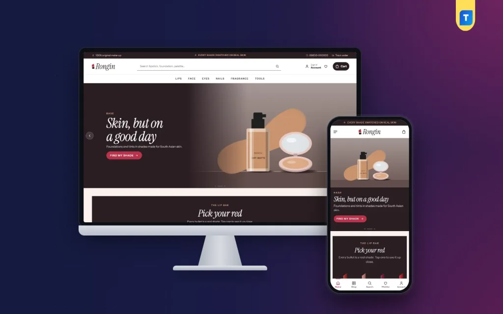
If you prefer to start from a finished design, Rongin is a WordPress theme made for colour cosmetics: lips, face, eyes, nails, fragrance and tools. It is built for makeup first, but it works for a mixed beauty shop too, because you can hide blocks you do not need and use the skin-tone tabs for skin types.
What it includes:
- A Lip bar with one lipstick drawn in each shade
- Find your shade tabs for five skin tones
- A dark editorial hero slider
- Cards with swatches and rose-gold prices
- Get the look cards
- 24 homepage blocks, with 14 on in the demo
- Five palettes and four font choices
- A login popup and one-page checkout
- bKash, Nagad, SSLCommerz and cash on delivery, with Steadfast and Pathao courier support
The Themeve Commerce plugin is included, so WooCommerce is not needed, and the demo has 39 products from 6 brands. Details are on the Rongin product page.
Mistakes to avoid
- A wall of bottles. No guidance means no sale.
- Missing ingredients. Careful buyers will not order without them.
- Photos from the brand only. Add your own to prove the stock is real.
- Fake countdowns and reviews. Buyers notice and stop trusting the shop.
- Heavy pages. Large photos slow everything down.
- Long checkout forms. Ask only for what the courier needs.
- No contact details. Put a phone number and address in the footer.
Launch checklist
- Every product has a price, size, ingredients, usage and at least three photos.
- Skin type and concern paths work from the homepage.
- All payment methods are tested with small real orders.
- Delivery charges, times and courier details are shown.
- Return, privacy and delivery pages are published.
- Your phone number and address are in the footer.
- The site opens fast on a mobile connection.
- Google Search Console is connected.
Check your orders every week after launch. Look for pages that people visit but leave, and improve those first.
If you want to read more on the technical side, the official WordPress documentation is a good, reliable reference.
Frequently asked questions
What are the best skincare website ideas for a new shop?
Start with guided shopping by skin type and concern, clear ingredient information, honest photos and a short checkout. These matter more than animation or extra features.
How many products should a skincare shop launch with?
Twenty to thirty is a good start. Choose a few popular products per group and describe each one properly.
Which skincare website ideas build trust fastest?
Show your own photos, expiry details, a clear return rule and real reviews. Add your address and phone number, and offer cash on delivery to new buyers.
Is cosmetic website design the same as skincare website design?
Not exactly. Cosmetic website design leans on swatches, shades and looks, while skincare design leans on skin type, ingredients and routines. Many shops need a little of both.
Do I need WooCommerce for a skincare shop?
No. Some themes bring their own shop plugin. Rongin includes the Themeve Commerce plugin, which installs in one click from the theme's setup screen.
Can I use a makeup theme for skincare products?
Yes, if you adjust it. Hide blocks you do not need, use the skin-tone tabs for skin types and fill the shop with your own products.
Which payment methods suit a skincare shop in Bangladesh?
Offer bKash, Nagad and cash on delivery. A card gateway such as SSLCommerz is a useful addition.